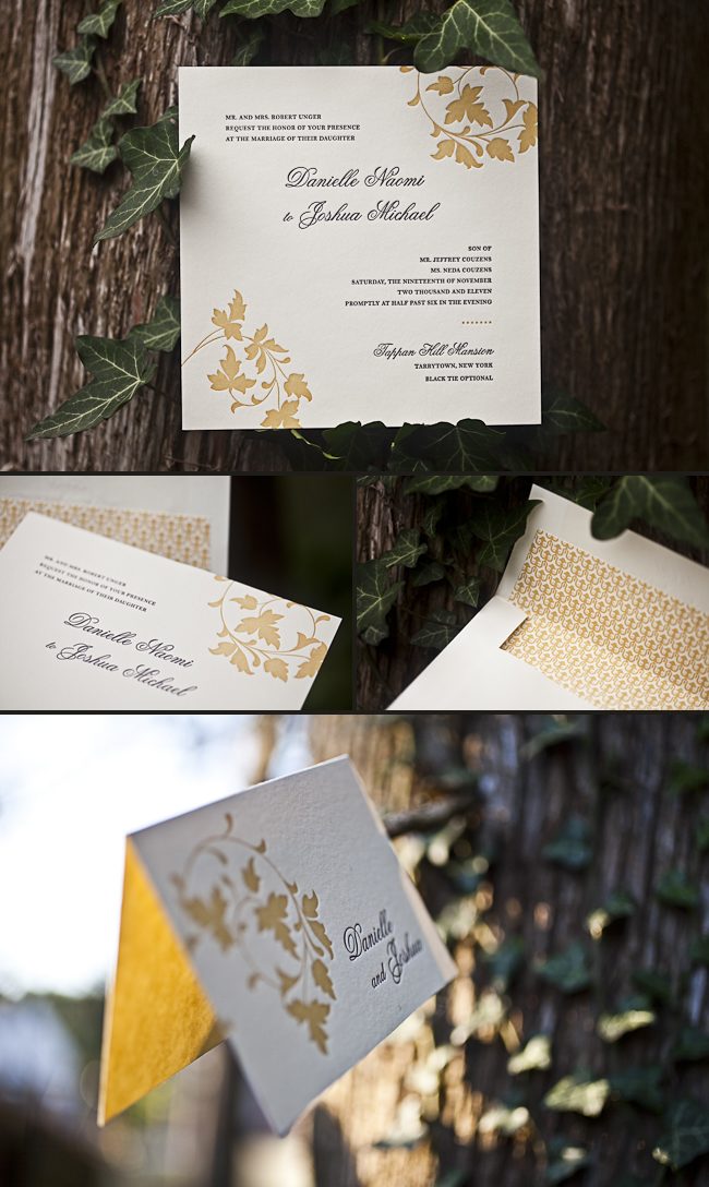
We created a full suite for Michael and Craig’s October wedding at the New England Aquarium using different motifs from our custom library. Their custom invitations paired our pewter and ocean inks together on white bamboo paper, with our coral motif and Harrison calligraphy font adding special touches. The other cards in the suite included our sea turtle, fish, and penguin motifs, which gave subtle nods to the venue.


letterpress inks: pewter + ocean | fonts + design: Smock Harrison + Inigo, custom library design | paper: 1-ply + 2-ply white bamboo | sizes: S-8 + S-5 + S-5F + B-3 + #10 + S-3F | envelope liner: metallic platinum | customization #28530 + #29440 | Invitations & Company
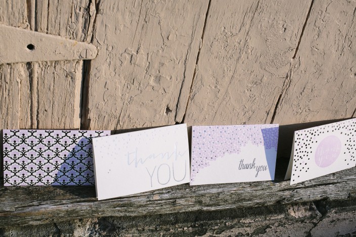
There are lots of exciting events that go hand-in-hand with weddings: engagement parties, bridal showers, rehearsal dinners, welcome parties, and farewell brunches. While many couples will purchase wedding thank you notes to give thanks for gifts as a couple, we think it’s extra special for a bride to have some of her own stationery when it comes to writing bridal shower thank you notes. We rounded up a few of our favorites below — we love these for bridal shower thank you notes, but many of these cards can pull double-duty and work well as wedding thank you notes, too!

Rose gold is both feminine and romantic – and looks gorgeous next to our taupe letterpress ink. Get the look with our Leaves, Cameo, Classic Heart and Sparkling thank you notes.

Our new Papaya suite features pale blue letterpress ink with a pretty coral colored ink for a fresh, fun look. From the left: Papaya, Terrace 2 and Rainier notes.

Is yellow your color? We love seeing yellow inks paired with gold foil, but you can’t go wrong with gold foil by itself, either. From the left: Yellow Rose, Cambridge 2, Gold, and Thank You Script cards.

If purple and silver are more your style, check out our Grayling, Thank You Shine, Mineral Flowers and Platinum Thank You cards.

Can’t get enough of the color pink? Our Aztec and Kersey Note cards are ideal if you love pastel pink, or check out our Thank You Heart, Thank You Laurel, or Pink Heart cards if hot pink is your color.
Be sure to shop all of our note cards and thank you cards to find the styles that are perfect for you! All of our folded thank you cards and notes are available as singles, six packs, and thirty packs — and our thirty packs come in a small keepsake box! Visit our shop now >>
Our purple shine foil stamping makes these save the dates & thank you cards stand out – in a good way! Submitted to us by our friends at The Village Invites in New York City, we adore the playful type on the Tatra design.
foil: purple shine | fonts: cranbrook + smock spencerian | paper: 1-ply white | printing: foil stamping | size: S5 + S6 | customization #: 15628 |

Nothing says “thank you” like pressed foil! For an invitation order, it’s expected that a thank you card would be much simpler. However, Alisa from The Write Stuff in Tampa has found a way to enhance the card without sacrificing writing space. Using the two foils from the Tatra suite is a great way to incorporate foil into additional card types.
foil: gold matte + gold shine | font: smock plaza calligraphy font | paper: 1-ply ivory | printing: foil | card size: S6 | customization #: 16447 |

We thank our friends at Kate’s Paperie for these amazing Odin thank you notes. The offset pattern carried on to the back of this card and liner keep these social notes consistent throughout. The cards are also completed with wonderful edge painting.
inks: silver + sand | fonts: alice + potter | paper: 2-ply white | printing: letterpress + offset | envelope liner: filby in sand offset + silver offset | customization #: 15830 |

Over the past few months we’ve added lots of new foil + letterpress cards to our collection, and we can’t get enough of the shimmer and shine! Here are some of our favorite new gold foil cards, which would be perfect for wedding thank you notes or well wishes to newlyweds. So if you’re about to tie the knot or will be attending a wedding in the near future, check out our new foil cards today!

Clockwise from top: Thank you script | Happy Wedding | Tying the Knot | Heartfelt Congratulations
These letterpressed save the dates were submitted to us by our good friend, Aileen at Aileen Invitations in Miami Beach, Florida. Our Rhon design looks truly sensational printed in our lavender and pewter inks. There are certainly times when a softer color palette works best and this is definitely one of those times! We print save the dates for all sorts of occasions and these save the dates happen to be for an engagement celebration. We can’t help but feel that the lavender ink represents gracefulness and charm while the pewter ink helps keep this set looking refined. Purple hues have always been connected to royalty which makes these save the dates all the more classic. The couple chose our payette pattern in lavender for both the offset back patterning and envelope liner – which ties this whole set together nicely.
inks: lavender + pewter| fonts: etienne + auden | paper: 2-ply white | printing: letterpress | corner rounding |back patterning: payette in lavender |liner: the payette pattern in lavender | size: S6

Submitted to us by our good friend, Elle at Petite & Sweet in Toronto, Canada these letterpressed Hekla baptism invitations are downright swank! I mean talk about being up-to-the-minute! These invitations showcase our royale and inkless blind deboss inks – and the end result makes for some of the most chic invitations we’ve had the joy of printing in quite some time. The envelope liner adds another nice modernistic touch to this anything but simplistic set! We think these invitations are the perfect prelude to such a memorable occasion – and helped achieve the vision the proud parents were hoping for. We look forward to many more unique and current customizations from Petite & Sweet!
inks: royale + inkless blind deboss | fonts: shaw + social | paper: 2-ply white bamboo | printing: letterpress | edge painting in royale | liner: the ridley pattern in royale | invite size: S8

This vintage inspired customization of our Chasseral design was submitted to us by our great friends at LS Amster Company in Scarsdale, New York. We think our eggplant and saffron inks were the perfect pairing for an autumn wedding. The rich colors of the season are seen throughout- so much that it’s easy to see the leaves changing color! The iznik pattern envelope lining in saffron gives off the perfect amount of charm! Complete with direction cards printed on both front and back- these cards tell guests everything they need to know about getting to the celebration! The couple also chose letterpress thank you cards and we cannot think of a better way to show all of your guests your gratitude for being such an important part of your special day. Vintage inspired + autumn color palette = ABSOLUTELY BREATHTAKING!
inks: eggplant + saffron| fonts: graham + tally| paper: 2-ply ivory bamboo | printing: letterpress | edge painting in eggplant |back patterning: sinclair in eggplant |liner: the iznik pattern in saffron | invite size: S8SQ

You just might say we have a soft side for pastel ink colors letterpressed on our thick 2-ply bamboo paper-and you would be right. Take a look at these elegant Engadine invitations submitted to us by our good friends at Salutations in Chapel Hill, North Carolina. Softer hues have a way of looking peaceful and calm, without being over the top. The highlight is of course the gorgeous folio offset printed on the interior and exterior in the coolest colors to keep things modern. There is a real warmth seen throughout this suite and we adore it!
ink: sea mist + wisteria | fonts: smock harrison + graham | paper: 2-ply ivory | printing: letterpress | corner rounding | folio exterior: virelles pattern in wisteria | folio interior: pippen pattern in moss | invite size: 5.125 x 7.75


