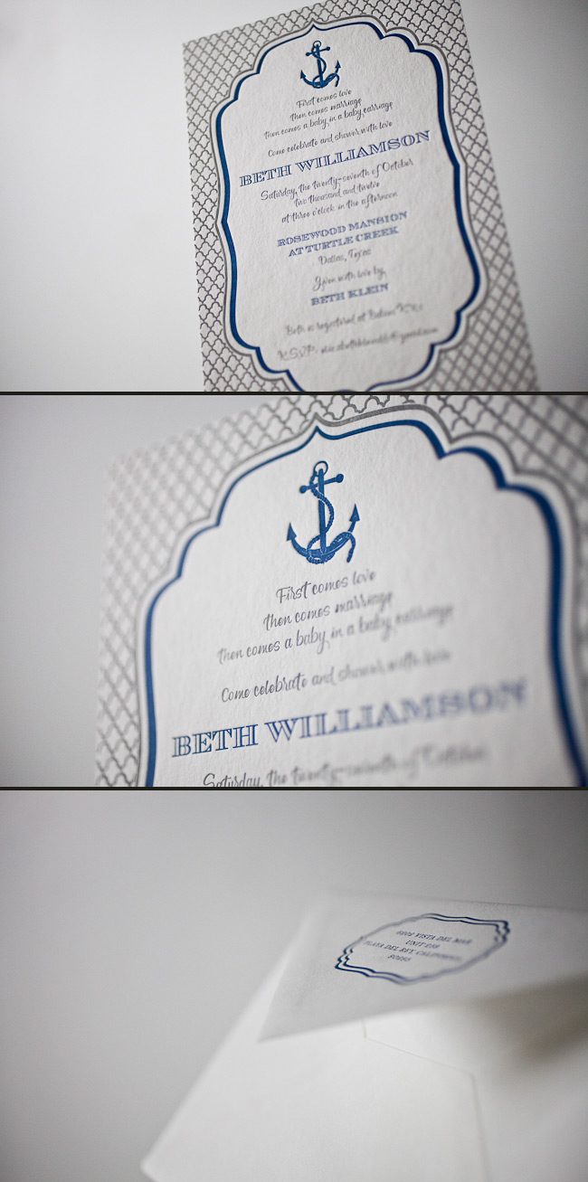
We LOVE getting orders for non-wedding letterpress invitations too! This baby shower invite clearly shows how you can take a wedding design like Dawson and turn it into a perfect shower invitation. Thanks for the great idea Aileen Invitations!
ink: navy + silver | fonts: carrington + smock clermont | paper: 2-ply white bamboo | printing: letterpress | invite size: S8 | customization #: 15618 |

Poeme in Cincinnati, Ohio submitted this beyond beautiful letterpress Robson suite for printing. We adore the soft, subtle combination of our taupe and papaya inks on this set. This set is kept looking classic with traditional font choices. Toss in papaya edge paint on the invitation, another splash of color on the invitation back pattern and a colorful envelope liner – this set truly has everything to make it complete.
inks: taupe + papaya | fonts: cameron + lazlo | paper: 2-ply ivory bamboo | printing: letterpress | edge painting in papaya | corner rounding | back patterning: robson in pool |liner: the taihu pattern in pool | invite size: S8

This wonderful letterpress wedding suite comes to us from our friends at Byrd & Bleecker. We absolutely loved their customization of our Dawson design and wanted to share it with everybody.
inks: eggplant + taupe | fonts: smock spencerian + graham | paper: white 1-ply | printing: letterpress + offset | envelope liner: reverse tesse in taupe offset | sleeve: custom design in eggplant offset | invite size: S7 for sleeve

Our good friend Joanne at Cambridge Street Papers in Chatham, New Jersey submitted these contemporary letterpress bridal shower invitations to us for printing – and we think these are a real treat! We’re big softies when it comes to inkless blind deboss paired with the perfect ink color – and this set has it all! The bodin motif was printed with inkless blind deboss for a chic, subtle look, and the edges of the invitation were painted in grass – a somewhat unexpected edge paint color, but a fabulous embellishment for this set. The bouts of color do not end there – the back of the invitation was offset printed in our sinclair pattern – and this flood of raspberry makes this set all the more sweet.
inks: raspberry + inkless blind deboss | fonts : graham + smock bescal | paper: 2-ply white| printing: letterpress | edge painting in grass |back patterning: sinclair in raspberry| liner: the granby pattern in hot pink | invite size: S8SQ

How do you outdo an awesome save the date? Our good friend Niki at Papery & Cakery in Boca Raton, Florida has the recipe. We posted these lovely save the dates for Niki’s sister back in September!!!

Now that the wedding has passed, we are able to show you the amazing suite she designed, and we couldn’t be happier to share these with everyone! The suite was letterpress printed in our Pewter ink on our beautiful white bamboo 2-ply paper. All of the pieces were fitted with an offset border in pewter and die-cut in our new Chesapeake design. Each piece has a decorative offset backing and is finished with perfect edge painting in Pewter. The invitation, reply cards, and events card are tucked nicely into a custom offset sleeve.
inks: pewter + spring | fonts: submitted fonts | paper: 1-ply white + 2-ply white | printing: letterpress + offset | sleeve: custom pattern offset in pewter + spring | liner: seneca pattern offset in spring | invite size: S-8 sleeve | die-cut: chesapeake

Our second place design contest winner comes to us from Shelley at /di’zain/ loft limited in the Republic of Trinidad and Tobago, a recent addition to the Smock family. The couple chose a dreamy color palette of dusty pinks and greys for their wedding, so invitations in pewter and shell inks on our white bamboo paper fit their theme perfectly and created a soft, sweet feel. The invitation design was modeled after a vintage, “fashionably chic” handwritten love letter, which seems perfectly fitting for Clare-Ann and Joshua as they have had to experience the challenges of an overseas relationship. Shell envelope liners and a pretty script font reminiscent of elegant cursive handwriting complete the look of the invitations.

The couple strove for a sense of romanticism with their invitations, and we definitely think they’ve achieved it! We fell in love – and so did our contest judge, Nole, at Oh So Beautiful Paper, who selected the design as the 2nd place winner. She writes, “The invitation has a clean and modern layout, and I love the use of script and serif fonts that keep the design from looking too fussy. Sweet and simple.”
Congratulations Shelley, and best wishes to the happy couple!
Congratulations again to Di’zain Loft Limited for taking 2nd place in our design contest. This twice-a-year competition recognizes outstanding and inspired designs submitted by our beloved dealers.
Randi, owner of the Printed Page in Atlantic Beach, New York customized a bright and beautiful bridal shower invitation for her daughter, Kelly. We often design small cards for our Smock dealers in order to display our promotions, and the card that we designed for our free envelope printing promotion just so happened to inspire Randi.
Randi had mentioned that the shower would be held in April and would have an “April showers” theme. She explained that the party favors were going to be pink and yellow umbrellas and wanted an elegant invitation to tie everything together. She states, “The inspiration came from one of your designs that reminded me of a modern heart. Since this is a shower invite, I thought it was both feminine and relevant. I bought pink and yellow umbrellas for give away gifts for all of the guests, and I am attaching hang tags with the same design to the umbrellas with ribbon. The tags will be the place cards and the umbrellas will add color and fun to the place card table!”
Randi, congratulations to you and your daughter! These invitations are perfect!
customization = letterpress inks: azalea + yolk | fonts: spence + cooper | paper color: white | paper size: s-6 | edge painting: yolk | envelope liner: sherbrooke reversed in yolk

This design won an honorable mention in our Smock design competition for the first half of 2012. This twice-a-year competition recognizes outstanding and inspired designs submitted by our beloved dealers.
Seeing an order become a design is great. Seeing a design become a letterpress printed invitation is better. But when we get to see photos of our invitations in the hands of the happy couple and shots of their important day…well that just reminds us how much the hard work can pay off. Thanks so much to Michele at the Wedding Company in Hong Kong and well done to Adam Sjöberg for Ira Lippke Studios for the amazing camera work! The reception looked gorgeous and we are very honored to have played some small role in making that day special. Read our previous post about the letterpress wedding invitations.
inks: taupe + pearl + whisper | fonts: cameron + carrington | paper: 1-ply ivory | printing: letterpress | size: s8 | 3-color, bilingual invitations |


We printed these lovely pieces for the ultimate take-two wedding. The couples first attempt was thwarted by a hurricane, but, these newlyweds weren’t going to let a little weather ruin their special day. We went back to the drawing board with our friends at Judy Paulen Designs and whipped up these awesome Part II pieces. They combine beautiful offset and letterpress printing in our Navy ink. We were thrilled to be able to help them with their special day, even if the weather wasn’t going to cooperate.
ink: navy | fonts: smock spencerian + graham | paper: 1-ply white + 2-ply white | printing: letterpress + offset

Submitted to us by our good friend, Elle at Petite & Sweet in Toronto, Canada these letterpressed Hekla baptism invitations are downright swank! I mean talk about being up-to-the-minute! These invitations showcase our royale and inkless blind deboss inks – and the end result makes for some of the most chic invitations we’ve had the joy of printing in quite some time. The envelope liner adds another nice modernistic touch to this anything but simplistic set! We think these invitations are the perfect prelude to such a memorable occasion – and helped achieve the vision the proud parents were hoping for. We look forward to many more unique and current customizations from Petite & Sweet!
inks: royale + inkless blind deboss | fonts: shaw + social | paper: 2-ply white bamboo | printing: letterpress | edge painting in royale | liner: the ridley pattern in royale | invite size: S8


