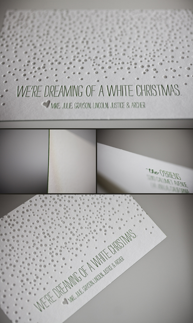
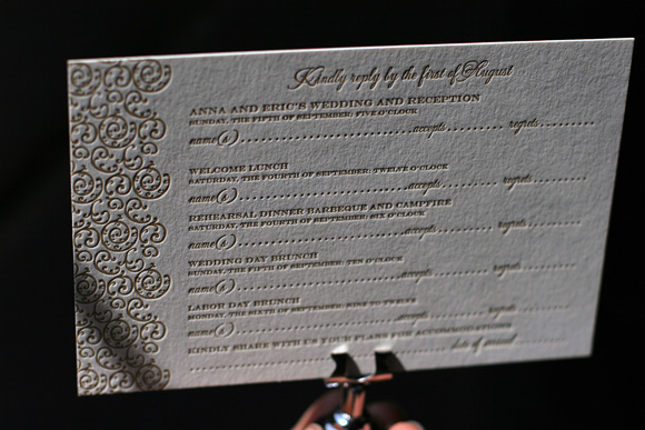
This petite letterpress holiday card may be small, but it won’t get overlooked in the mail! A bright combination of cherry and gold make our spirits bright, while a hopeful message reminds us to believe there is good in the world. Thanks to Buchanan Ink for sending this good cheer our way!
inks: cherry + gold | fonts: gertrude + louise | paper: 1-ply white | printing: letterpress | size: S5 | customization #: 16087 |

Over the past few months we’ve added lots of new foil + letterpress cards to our collection, and we can’t get enough of the shimmer and shine! Here are some of our favorite new gold foil cards, which would be perfect for wedding thank you notes or well wishes to newlyweds. So if you’re about to tie the knot or will be attending a wedding in the near future, check out our new foil cards today!

Clockwise from top: Thank you script | Happy Wedding | Tying the Knot | Heartfelt Congratulations
It’s official: foil stamping has arrived at Smock! Today we’re sharing a special sneak peek of the letterpress invitations we printed for the 2012 National Stationery Show, and we think you’ll love the new additions we’re bringing to the line. We’re adding two gorgeous new fonts to our collection of exclusive Smock calligraphy fonts, and these invitations feature both of those new fonts! Plaza is an elegant, formal script based on Sarah Hanna‘s calligraphy, and Stella (based on a Kelle McCarter hand) has a more playful, whimsical feel. The invitations are just a hint at what’s new: besides foil stamping and new calligraphy fonts, we’re also introducing four inspired new wedding suites, 12 dazzling colors for foil stamping, 100% recycled coasters, and lots of cool new products for our Everyday line (including 6 new styles of double-sided gift wrap, new notebook styles, more man-friendly stationery, and much, much more!). A special thanks to master calligrapher Debi Zeinert from The Blooming Quill for addressing the invitation envelopes – aren’t they gorgeous!? 
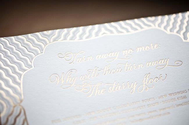


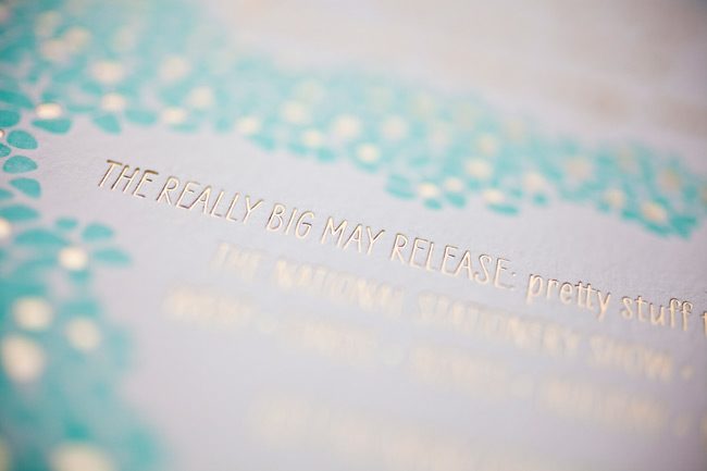
 Foil stamping will be available at Smock dealers in early June, so stay tuned!
For the last week, we’ve been posting the honorable mentions for the Smock Design Contest. Now we’re down to the final three! Our good friend Nole at Oh So Beautiful Paper chose our winners for this competition, and selected Alphagraphics Lyric Opera Invitation as the 3rd place winner. Here’s what Nole had to say about the design: “I don’t think I’ve ever seen a corporate invitation that was so pretty! I love the patterns, the font selections, and the fold out layout. Gorgeous.”

Nole, we couldn’t agree more! It’s not often we get to print letterpress invitations for galas, concerts, or charitable events, so when we do, we tend to get pretty excited. This espresso and gold invitation to the Lyric Opera’s Charitable Subscriber Concert and Dinner was extraordinary! It was, indeed, a ticketed concert (which explains the use of the pocketfold), and the invitation invited 100 of the Opera’s premier patrons to dinner and a concert.

To the untrained eye, this striped, monogrammed pocketfold invitation looks beautiful and classy. For those who spend a lot of time at Chicago’s Civic Opera House, they’ll notice graphic elements that remind them of the gilded gold walls and ceilings of that very building. When designing the invitation, Amy at Alphagraphics used the opera’s Art Deco elements and color scheme as her guide. She created an invitation that was reminiscent of the old stately edifice, glamorous in its timelessness.

Her work was well appreciated by all! Both the Lyric Opera and the event’s attendees thought the invitation was a fantastic bidding to a wonderful evening of music and feasting. Bravo Amy, Bravo!
Congratulations again to Alphagraphics for taking 3rd place in our design contest. This twice-a-year competition recognizes outstanding and inspired designs submitted by our beloved dealers.
Our wonderful friend Cheryl at Paper Studio in Ontario, Canada submitted this remarkable custom invitation suite to us for printing. It’s easy to get lost in the splendor of this simplistic set because it has the coolest customizations! The couple chose our elegant rousseau pattern for offset backing on their invitation, reply cards-and coordinated this with an envelope liner to match! The gold and taupe inks are perfect for a wedding celebration in the middle of the any season! We also printed what we think are the most adorable and whimsical double sided information cards we’ve seen in quite some time. Choosing a text-based invitation is an excellent way to keep your set looking classy!
inks: gold + taupe | fonts : custom| paper: 2-ply ivory | custom artwork: submitted | printing: letterpress | edge painting in gold metallic |back patterning: rousseau in gold + taupe |corner rounding | liner: the rousseau pattern in gold + taupe| invite size: S8SQ

We’re overjoyed to share these recently printed Lashar wedding invitations submitted to us by our friend, Linda at Pen & Paper in Bryn Mawr, Pennsylvania. What better color combination is there than mulberry and gold for a wedding celebration in December? When guests open up the pocketfold they will see the most incredible wash of mulberry and we think this is where the set is most romantic. Around here we LOVE December weddings and the colors that come with the holiday season.
inks: mulberry + gold | fonts: cooper + smock clermont | paper: 1-ply ivory | printing: letterpress |folio exterior: marav pattern in gold | folio interior: sinclair pattern in mulberry| invite size: 5.125 x 7.75

There’s no better compliment than when a store asks us to print their own cards. Julie from Sweet Paper in La Jolla, CA used our Pearl design in such a clever way. I think this might be my favorite Christmas card to date! I may have to steal the idea for myself 🙂 Thanks Julie!
inks: dove + grasss + gold | fonts: percy + harrison | paper: 2-ply ivory | printing: letterpress | Christmas card |


At Smock our goal is to ensure that our brides have one of kind invitations for their big day. With that in mind, we often accept custom artwork to pair with our wide variety of fonts and letterpress (or offset) print in our luscious ink on our luxurious bamboo paper. The artwork submitted to us by Peabody Papers in Grandview Heights, OH once compared with all of the above, blew us away!

The 3-color offset invitation was printed on both the front and the back in pewter, slate and gold inks. The juxtaposition of the flat yet colorful imagery with the black letterpress text created such a dignified look. The subtle hint of masculinity is impeccable. Well done Peabody Papers. Well done!
Meg, from Peabody Papers had the pleasure of working with the happy couple and says, “Working with Shawna has been so much fun! She wanted to convey a sense of elegance while evoking thoughts of champagne bubbles. I drew the “bubbles” and decided that I would use the block for their names vs. a more traditional treatment. The last piece to come together was the kalogram – 5 sheets of proofs! It payed off though as she loves it and is using it & the dot design throughout the reception at the Statehouse. I have a degree in printmaking and enthusiastically convinced her that Smock letterpress would be the most beautiful printing option!!! She really loves the invitations – thanks for everything!”
Excellent thinking Meg!!! Champagne kisses and Caviar Dreams to you!
inks: black + pewter + gold + slate | fonts: cameron + indigo | paper 2-ply white | invite size: S-8 | printing: letterpress + offset | edge painting: pewter | corner rounding
This design won third place in our Smock design competition for the first half of 2011. This twice-a-year competition recognizes outstanding and inspired designs submitted by our beloved dealers.
Printed for the folks at By Invitation Only in Little Rock, Arkansas, we love these custom letterpress holiday invitations we recently printed. They feature a cute Christmas tree motif and corner rounding, printed in gold and grass inks. On our ivory 2-ply paper, the look is elegant and festive, perfect for this holiday cocktail party.


We’re excited today to share another honoree in our recent Smock Design Contest! It’s a custom wedding invitation design brought to us by Details in Philadelphia, letterpress printed in gold ink on our ivory bamboo paper. The motif was inspired by our Pippen pattern, which makes an appearance as a gorgeous liner printed in gold. A big thank you to our friends at Details for sending us this great design!


 Foil stamping will be available at


