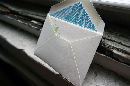
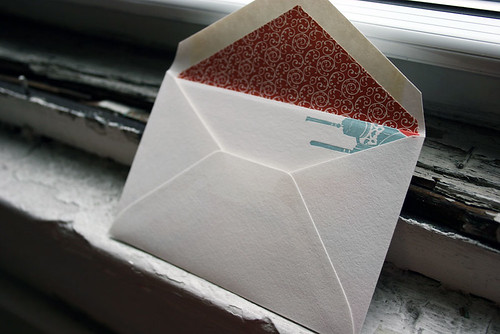
The 2016 National Stationery Show has quickly come and gone, so today we’re sharing a recap of our booth at this year’s show! Each year at NSS we introduce a variety of new products for both our everyday and custom lines, and highlights for this year include a new wedding album, lots of new cards, gift wrap, keepsake boxes, and 2017 calendars. All of these products will be available online soon, but for now here’s a peek at our displays. We decorated the booth with colorful tissue paper flowers to correspond with the new Flora collection envelope liners on display in the Bella Figura side of our booth. Take a look!


We loved having calligrapher Sarah Hanna in our booth during the show offering on the spot calligraphy – it’s mesmerizing to watch her work!

And no Stationery Show would be complete without a trip to the Paper Party hosted by Oh So Beautiful Paper. We loved being sponsors again this year – here’s our team enjoying the event in front of the amazing display that My Mind’s Eye put together. So festive and fun!

Our second place design contest winner comes to us from Shelley at /di’zain/ loft limited in the Republic of Trinidad and Tobago, a recent addition to the Smock family. The couple chose a dreamy color palette of dusty pinks and greys for their wedding, so invitations in pewter and shell inks on our white bamboo paper fit their theme perfectly and created a soft, sweet feel. The invitation design was modeled after a vintage, “fashionably chic” handwritten love letter, which seems perfectly fitting for Clare-Ann and Joshua as they have had to experience the challenges of an overseas relationship. Shell envelope liners and a pretty script font reminiscent of elegant cursive handwriting complete the look of the invitations.

The couple strove for a sense of romanticism with their invitations, and we definitely think they’ve achieved it! We fell in love – and so did our contest judge, Nole, at Oh So Beautiful Paper, who selected the design as the 2nd place winner. She writes, “The invitation has a clean and modern layout, and I love the use of script and serif fonts that keep the design from looking too fussy. Sweet and simple.”
Congratulations Shelley, and best wishes to the happy couple!
Congratulations again to Di’zain Loft Limited for taking 2nd place in our design contest. This twice-a-year competition recognizes outstanding and inspired designs submitted by our beloved dealers.
For the last week, we’ve been posting the honorable mentions for the Smock Design Contest. Now we’re down to the final three! Our good friend Nole at Oh So Beautiful Paper chose our winners for this competition, and selected Alphagraphics Lyric Opera Invitation as the 3rd place winner. Here’s what Nole had to say about the design: “I don’t think I’ve ever seen a corporate invitation that was so pretty! I love the patterns, the font selections, and the fold out layout. Gorgeous.”

Nole, we couldn’t agree more! It’s not often we get to print letterpress invitations for galas, concerts, or charitable events, so when we do, we tend to get pretty excited. This espresso and gold invitation to the Lyric Opera’s Charitable Subscriber Concert and Dinner was extraordinary! It was, indeed, a ticketed concert (which explains the use of the pocketfold), and the invitation invited 100 of the Opera’s premier patrons to dinner and a concert.

To the untrained eye, this striped, monogrammed pocketfold invitation looks beautiful and classy. For those who spend a lot of time at Chicago’s Civic Opera House, they’ll notice graphic elements that remind them of the gilded gold walls and ceilings of that very building. When designing the invitation, Amy at Alphagraphics used the opera’s Art Deco elements and color scheme as her guide. She created an invitation that was reminiscent of the old stately edifice, glamorous in its timelessness.

Her work was well appreciated by all! Both the Lyric Opera and the event’s attendees thought the invitation was a fantastic bidding to a wonderful evening of music and feasting. Bravo Amy, Bravo!
Congratulations again to Alphagraphics for taking 3rd place in our design contest. This twice-a-year competition recognizes outstanding and inspired designs submitted by our beloved dealers.
At long last, we’re excited to share the winner of our Smock Design Contest, a custom letterpress and offset wedding invitation sent to us by our friends at Papery & Cakery in Boca Raton, Florida. This design features offset printing in a custom palm tree design on the front, printed in sand ink, combined with letterpress text printed in midnight ink. It’s a sophisticated combination of texture and color that is exemplified with the perfect finishing touches – corner rounding and edge painting in midnight. The envelope was lined in our payette pattern in midnight, perfectly coordinating with all of the other design elements for a look that is polished and simply beautiful.


Our special guest judge Nole Garey of Oh So Beautiful Paper selected this design as our contest winner, because she fell in love with the combination of letterpress and offset printing. She says, “I love everything about the design, from the color selections to the midnight blue edge painting to the calligraphy details. I love the way the soft palm trees almost look like delicate feathers against the ivory background.”
Thank you so much to Papery & Cakery for sending us this incredible design and to all of our design contest winners for continually inspiring us. Thanks are also due to Nole for helping us out with the difficult task of narrowing down all of the amazing designs to just a few winners. Thank you!
To learn more about Papery & Cakery, check out their recent Smock Store Spotlight.
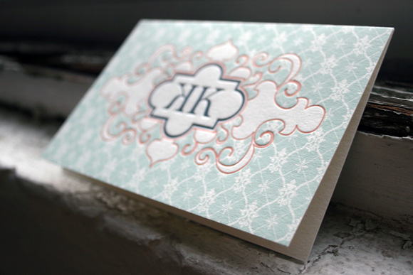
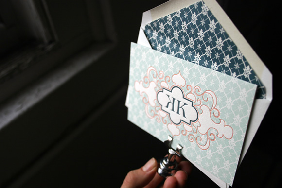
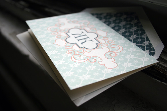
As we near the end of our Smock Design Contest honorees, it’s time to share our 1st runner up – a beautiful custom letterpress social note brought to us by Francis-Orr in Corona del Mar, California. This design is truly unique, printed in seamist, papaya and midnight inks in a vibrant combination of color and pattern. The background of the card is our willoughby pattern in seamist and the patterned envelope liner also features our willoughby pattern in midnight. Guest judge Nole Garey of one of our favorite bogs, Oh So Beautiful Paper, loved this design and says, “A gorgeous mix of pattern and color! The papaya ink around the monogram creates a beautiful contrast against the pale patterned background. I’m also just as smitten with the juxtaposition between the flourish design details and strong serif type of the monogram. Gorgeous!”
Today Smock is thrilled to be sponsoring a giveaway with one of our favorite blogs, Oh So Beautiful Paper. Make sure to visit for all of the giveaway details and your chance to win any three of your favorite letterpressed boxed card sets from Smock’s social line. Thanks, Nole!