These letterpressed save the dates were submitted to us by our good friend, Aileen at Aileen Invitations in Miami Beach, Florida. Our Rhon design looks truly sensational printed in our lavender and pewter inks. There are certainly times when a softer color palette works best and this is definitely one of those times! We print save the dates for all sorts of occasions and these save the dates happen to be for an engagement celebration. We can’t help but feel that the lavender ink represents gracefulness and charm while the pewter ink helps keep this set looking refined. Purple hues have always been connected to royalty which makes these save the dates all the more classic. The couple chose our payette pattern in lavender for both the offset back patterning and envelope liner – which ties this whole set together nicely.
inks: lavender + pewter| fonts: etienne + auden | paper: 2-ply white | printing: letterpress | corner rounding |back patterning: payette in lavender |liner: the payette pattern in lavender | size: S6

Submitted to us by our good friend, Elle at Petite & Sweet in Toronto, Canada these letterpressed Hekla baptism invitations are downright swank! I mean talk about being up-to-the-minute! These invitations showcase our royale and inkless blind deboss inks – and the end result makes for some of the most chic invitations we’ve had the joy of printing in quite some time. The envelope liner adds another nice modernistic touch to this anything but simplistic set! We think these invitations are the perfect prelude to such a memorable occasion – and helped achieve the vision the proud parents were hoping for. We look forward to many more unique and current customizations from Petite & Sweet!
inks: royale + inkless blind deboss | fonts: shaw + social | paper: 2-ply white bamboo | printing: letterpress | edge painting in royale | liner: the ridley pattern in royale | invite size: S8

This vintage inspired customization of our Chasseral design was submitted to us by our great friends at LS Amster Company in Scarsdale, New York. We think our eggplant and saffron inks were the perfect pairing for an autumn wedding. The rich colors of the season are seen throughout- so much that it’s easy to see the leaves changing color! The iznik pattern envelope lining in saffron gives off the perfect amount of charm! Complete with direction cards printed on both front and back- these cards tell guests everything they need to know about getting to the celebration! The couple also chose letterpress thank you cards and we cannot think of a better way to show all of your guests your gratitude for being such an important part of your special day. Vintage inspired + autumn color palette = ABSOLUTELY BREATHTAKING!
inks: eggplant + saffron| fonts: graham + tally| paper: 2-ply ivory bamboo | printing: letterpress | edge painting in eggplant |back patterning: sinclair in eggplant |liner: the iznik pattern in saffron | invite size: S8SQ

With a pairing of our navy and azalea inks we have a real beauty on our hands! These lovely letterpress save the dates were submitted to us by our great friends at By Invitation Only in Little Rock, Arkansas. The couple chose our willoughby pattern for the top and bottom of their save the dates – which we think adds a real elegant factor. We can’t get enough of this stunning color combination because it’s not overly feminine and has just a touch of boyish charm – within the navy ink. And we’re all about couples sending their save the dates early – it’s customary to mail save the dates six months to a year before the big day. This allows your guests enough time to book their accommodations, save enough spending money and request time off work. Mailing your save the dates early also allows your guests to count down the days til the “I Do’s”.
inks: navy + azalea | fonts: cahun + shaw | paper: 2-ply white | printing: letterpress | size: S6

It’s time to say thanks to the fantastic editors who have featured Smock’s letterpress wedding invitations, greeting cards, gift-wrap, and more in their magazines and on their blogs over the past few months. Our first feature is from Brides magazine, which showed our Palmer letterpress wedding invitations in their White Hot! section of their November edition — they were digging the die-cut shape and the fact that our invitations are eco-friendly!

Well Wed Hamptons Fall/Winter 2011 edition featured this set of stunning letterpress wedding invitation suite and one of our amazing retailers — Claudia Hanlin of The Wedding Library!


Eco Beautiful Weddings, an online magazine, recently featured Smock wedding invitations in their winter 2012 edition in “Green Is” — a section that helps brides track down eco-friendly goods for their weddings, and MODBlog also featured a variety of Smock wedding invitations this fall! (more…)
Our wonderful friend Cheryl at Paper Studio in Ontario, Canada submitted this remarkable custom invitation suite to us for printing. It’s easy to get lost in the splendor of this simplistic set because it has the coolest customizations! The couple chose our elegant rousseau pattern for offset backing on their invitation, reply cards-and coordinated this with an envelope liner to match! The gold and taupe inks are perfect for a wedding celebration in the middle of the any season! We also printed what we think are the most adorable and whimsical double sided information cards we’ve seen in quite some time. Choosing a text-based invitation is an excellent way to keep your set looking classy!
inks: gold + taupe | fonts : custom| paper: 2-ply ivory | custom artwork: submitted | printing: letterpress | edge painting in gold metallic |back patterning: rousseau in gold + taupe |corner rounding | liner: the rousseau pattern in gold + taupe| invite size: S8SQ

This stellar custom invitation suite was submitted to us by our good friend Jessica at Judy Paulen Designs in New York, NY. With the perfect design elements on the invitation, this only quietly calls for attention-and we just love that! We absolutely adore the soft, subtle ink palette which is the perfect match to the couple’s fabulous venue in Chicago, Illinois. The neutral and conservative pairing of our dove and pewter inks look positively remarkable! And then there’s the metallic platinum envelope liner providing the perfect color contrast.
inks: dove + pewter | fonts: smock harrison + carrington stripes | paper: 2-ply white | printing: letterpress | liner: metallic platinum| invite size: S7

Get ready to blow out those birthday candles! Check out these recently printed birthday party invitations submitted to us by our friends at Judy Paulen Designs in New York, NY. Our plymouth die cut adds even more boyish charm to an already youthful looking birthday party invitation. We can’t get enough of the granby backing patterning in navy, and take a look at the envelope liner in reverse granby in navy-for another super cool customization. Alright now, let’s get the party started!
inks: navy | fonts: smock harrison | paper 2-ply white | invite size: S-6 | printing: letterpress | die cut: plymouth | back pattern: the granby pattern in navy | edge paint: black | liner: the reversed granby pattern in navy

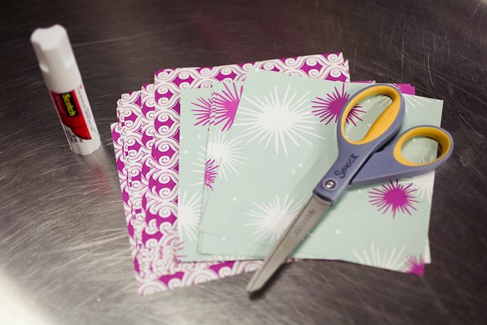
We were inspired by these amazing snowflakes on How About Orange and decided to create our own crafty garland with the pretty paper folds instead of snowflakes! It’s really simple and the end result is stunning, and you’ll only need a few items: paper, scissors, and a glue stick! We used our double-sided, eco-friendly Pageant gift wrap — it’s really cheerful & festive!
Cut 10-15 6 inch squares of your favorite Smock gift wrap. We used Pageant.

Fold each square in half diagonally, then fold it in half diagonally a second time.

Use the scissors to make straight cuts on the triangle, and make sure each cut is evenly spaced apart – we created 5 cuts. Be sure to cut into the folded side of the triangle.

Unfold the paper, then begin assembly by bending the tips of the inner-most sections toward each other. Curl with your fingers to give it shape, then glue the pieces together.

Bend the next set of sections around in the opposite direction until they meet. Overlap the ends and secure with a glue stick. Continue this process until each section is combined.


Begin assembling your garland by gluing the ends of the ornaments to one another. Let dry, hang, and enjoy!


We’re overjoyed to share these recently printed Lashar wedding invitations submitted to us by our friend, Linda at Pen & Paper in Bryn Mawr, Pennsylvania. What better color combination is there than mulberry and gold for a wedding celebration in December? When guests open up the pocketfold they will see the most incredible wash of mulberry and we think this is where the set is most romantic. Around here we LOVE December weddings and the colors that come with the holiday season.
inks: mulberry + gold | fonts: cooper + smock clermont | paper: 1-ply ivory | printing: letterpress |folio exterior: marav pattern in gold | folio interior: sinclair pattern in mulberry| invite size: 5.125 x 7.75


