If you’re looking for a traditional wedding invitation suite – then look no further! We’re head over heels for this simple and sweet letterpressed set submitted to us by our friends at The Dandelion Patch in Reston, Virginia. Letterpressed in black ink with gorgeous mulberry edge paint that acts as the perfect accent to this one color set – we can’t help but swoon! After looking at photos of the The Ritz Carlton in McLean Virginia, where the fabulous wedding was held – we see what a fanciful and lavish venue the couple chose for their special day. Of course we believe tossing our mulberry ink into the mix helps keep this set looking romantic, but this set also encourages the feeling of the winter months. The three letter monogram on both the invitation and letterpress belly band adds another touch of elegance to this striking set!
ink: black | font: smock spencerian | paper: 1-ply white | printing: letterpress | edge paint in mulberry | liner: the champlain pattern in mulberry | letterpress belly band | invite size: S6

Seeing an order become a design is great. Seeing a design become a letterpress printed invitation is better. But when we get to see photos of our invitations in the hands of the happy couple and shots of their important day…well that just reminds us how much the hard work can pay off. Thanks so much to Michele at the Wedding Company in Hong Kong and well done to Adam Sjöberg for Ira Lippke Studios for the amazing camera work! The reception looked gorgeous and we are very honored to have played some small role in making that day special. Read our previous post about the letterpress wedding invitations.
inks: taupe + pearl + whisper | fonts: cameron + carrington | paper: 1-ply ivory | printing: letterpress | size: s8 | 3-color, bilingual invitations |


We printed these lovely pieces for the ultimate take-two wedding. The couples first attempt was thwarted by a hurricane, but, these newlyweds weren’t going to let a little weather ruin their special day. We went back to the drawing board with our friends at Judy Paulen Designs and whipped up these awesome Part II pieces. They combine beautiful offset and letterpress printing in our Navy ink. We were thrilled to be able to help them with their special day, even if the weather wasn’t going to cooperate.
ink: navy | fonts: smock spencerian + graham | paper: 1-ply white + 2-ply white | printing: letterpress + offset

These letterpressed save the dates were submitted to us by our good friend, Aileen at Aileen Invitations in Miami Beach, Florida. Our Rhon design looks truly sensational printed in our lavender and pewter inks. There are certainly times when a softer color palette works best and this is definitely one of those times! We print save the dates for all sorts of occasions and these save the dates happen to be for an engagement celebration. We can’t help but feel that the lavender ink represents gracefulness and charm while the pewter ink helps keep this set looking refined. Purple hues have always been connected to royalty which makes these save the dates all the more classic. The couple chose our payette pattern in lavender for both the offset back patterning and envelope liner – which ties this whole set together nicely.
inks: lavender + pewter| fonts: etienne + auden | paper: 2-ply white | printing: letterpress | corner rounding |back patterning: payette in lavender |liner: the payette pattern in lavender | size: S6

Submitted to us by our good friend, Elle at Petite & Sweet in Toronto, Canada these letterpressed Hekla baptism invitations are downright swank! I mean talk about being up-to-the-minute! These invitations showcase our royale and inkless blind deboss inks – and the end result makes for some of the most chic invitations we’ve had the joy of printing in quite some time. The envelope liner adds another nice modernistic touch to this anything but simplistic set! We think these invitations are the perfect prelude to such a memorable occasion – and helped achieve the vision the proud parents were hoping for. We look forward to many more unique and current customizations from Petite & Sweet!
inks: royale + inkless blind deboss | fonts: shaw + social | paper: 2-ply white bamboo | printing: letterpress | edge painting in royale | liner: the ridley pattern in royale | invite size: S8

This vintage inspired customization of our Chasseral design was submitted to us by our great friends at LS Amster Company in Scarsdale, New York. We think our eggplant and saffron inks were the perfect pairing for an autumn wedding. The rich colors of the season are seen throughout- so much that it’s easy to see the leaves changing color! The iznik pattern envelope lining in saffron gives off the perfect amount of charm! Complete with direction cards printed on both front and back- these cards tell guests everything they need to know about getting to the celebration! The couple also chose letterpress thank you cards and we cannot think of a better way to show all of your guests your gratitude for being such an important part of your special day. Vintage inspired + autumn color palette = ABSOLUTELY BREATHTAKING!
inks: eggplant + saffron| fonts: graham + tally| paper: 2-ply ivory bamboo | printing: letterpress | edge painting in eggplant |back patterning: sinclair in eggplant |liner: the iznik pattern in saffron | invite size: S8SQ

With a pairing of our navy and azalea inks we have a real beauty on our hands! These lovely letterpress save the dates were submitted to us by our great friends at By Invitation Only in Little Rock, Arkansas. The couple chose our willoughby pattern for the top and bottom of their save the dates – which we think adds a real elegant factor. We can’t get enough of this stunning color combination because it’s not overly feminine and has just a touch of boyish charm – within the navy ink. And we’re all about couples sending their save the dates early – it’s customary to mail save the dates six months to a year before the big day. This allows your guests enough time to book their accommodations, save enough spending money and request time off work. Mailing your save the dates early also allows your guests to count down the days til the “I Do’s”.
inks: navy + azalea | fonts: cahun + shaw | paper: 2-ply white | printing: letterpress | size: S6

We love hand bordering! Bringing metallic gold to the front of this rehearsal card was a great way for Rugg Road in Boston, MA to accentuate the silver font and shell-colored liner. I think Cristina did a fantastic job this one. It’s simple and elegant and we were very impressed.
inks: silver + shell + gold metallic | fonts: cahun + lazlo | paper: 2-ply ivory | printing: letterpress | metallic gold hand bordering | rehearsal card |

It’s time to say thanks to the fantastic editors who have featured Smock’s letterpress wedding invitations, greeting cards, gift-wrap, and more in their magazines and on their blogs over the past few months. Our first feature is from Brides magazine, which showed our Palmer letterpress wedding invitations in their White Hot! section of their November edition — they were digging the die-cut shape and the fact that our invitations are eco-friendly!

Well Wed Hamptons Fall/Winter 2011 edition featured this set of stunning letterpress wedding invitation suite and one of our amazing retailers — Claudia Hanlin of The Wedding Library!


Eco Beautiful Weddings, an online magazine, recently featured Smock wedding invitations in their winter 2012 edition in “Green Is” — a section that helps brides track down eco-friendly goods for their weddings, and MODBlog also featured a variety of Smock wedding invitations this fall! (more…)
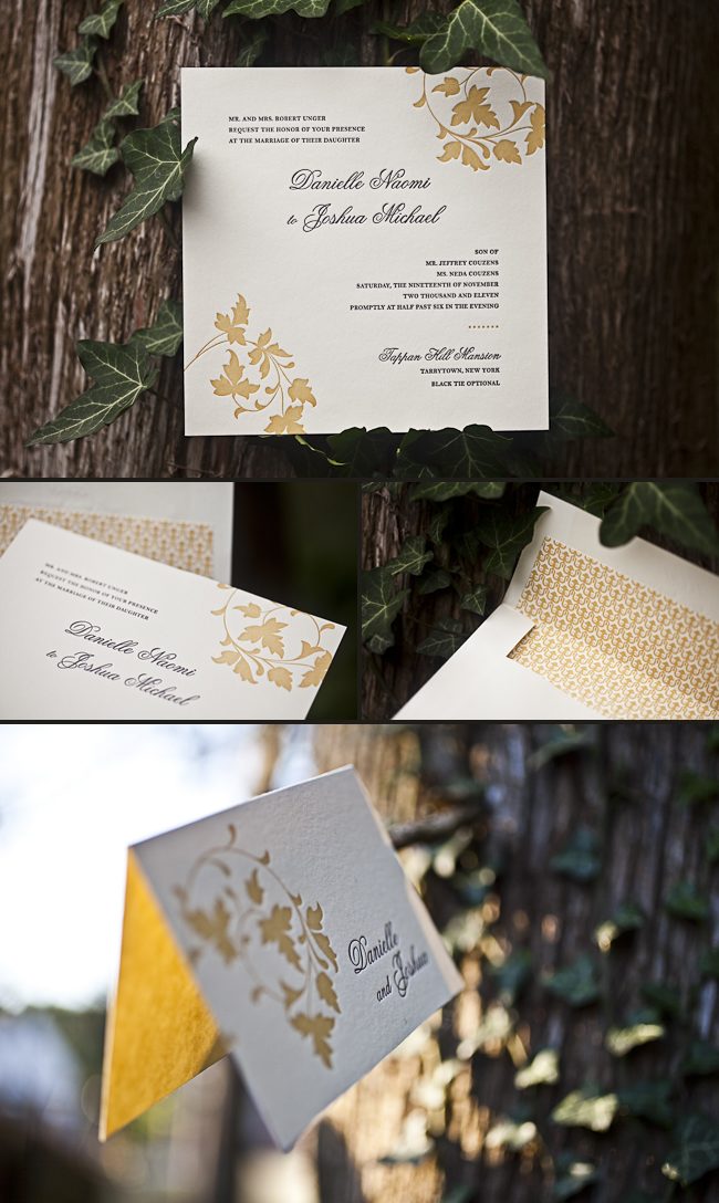
Our wonderful friend Cheryl at Paper Studio in Ontario, Canada submitted this remarkable custom invitation suite to us for printing. It’s easy to get lost in the splendor of this simplistic set because it has the coolest customizations! The couple chose our elegant rousseau pattern for offset backing on their invitation, reply cards-and coordinated this with an envelope liner to match! The gold and taupe inks are perfect for a wedding celebration in the middle of the any season! We also printed what we think are the most adorable and whimsical double sided information cards we’ve seen in quite some time. Choosing a text-based invitation is an excellent way to keep your set looking classy!
inks: gold + taupe | fonts : custom| paper: 2-ply ivory | custom artwork: submitted | printing: letterpress | edge painting in gold metallic |back patterning: rousseau in gold + taupe |corner rounding | liner: the rousseau pattern in gold + taupe| invite size: S8SQ


