It’s always fun to see the finishing touches that our clients make when it comes to their wedding invitations and save the dates. For Chelsea and JohnMichael’s May wedding at The Hempstead House, we worked with Jill from Jilly P Invitations & Gifts to create a set of custom, venue-inspired wedding invitations and save the dates. Jill shared some background with us on the inspiration for this suite – we’ll let her take it from here!
Whenever I work with a customer, my goal is to always make their dreams become a reality. For this invitation, the bride wanted a drawing of the castle where the event was being held. So as to hint at the incredible night ahead, we first used a hand drawn image of the castle on the save the date. As we continued the process, we then included the castle design on the direction card in the pocketfold invitation, and to tie it all together, we designed a beautiful stamp incorporating the castle. In finalizing the entire package, we added a wax seal on the back of the envelope with the bride and groom’s initials as a perfect finishing touch for what will be the most magical night of their lives.


letterpress ink: jute | foil: tawny matte | digital inks: jute + espresso | fonts: smock plaza + wallis | paper: 1-ply white bamboo | sizes: S-8 folio + S-6 + S-5 | folio interior + exterior: sinclair pattern in jute | envelope liners: metallic camel design: custom library featuring submitted artwork | customization #:35310 + 35404 | Jilly P Invitations & Gifts
Danna and Michael treated their guests to a casual 4th of July barbecue for their wedding last summer. We digitally printed a custom map complete with adorable illustrations that was adhered to a red, white and blue invitation folio. Their barn party wedding invitations were actually inserts for the folio, and included a phone number for RSVPs. We love the checkered look on the outside of the folio — perfectly fitting for a barn party celebration!


letterpress ink: cherry + royale | fonts: Ruby + Barnes | artwork: submitted | paper: 1-ply white | size: S-8 + S-6 | folio exterior: custom pattern in cherry; folio interior: fleming pattern in royale | customization #22078 | Arabesque
We created a completely custom letterpress invitation suite for Honor and Jay’s black tie celebration at Winvian Farm earlier this month. The entire suite – which included an invitation and folio, save the date, reply card, website card, rehearsal dinner invitation, brunch card, and a custom map – featured custom, hand-drawn illustrations inspired by Chinoiserie style porcelain. Little nods to the wedding venue were worked into the custom illustrations, which spanned the entire back of the invitation folio and were sprinkled throughout the additional pieces.


letterpress ink: azure | font: AT Sackers Antique Roman | artwork: custom illustrations by Brenda Fox, design by Mariel Mirra | paper: 1-ply white | size: S-8 + S-5 + custom sizes | envelope liners: Sinclair pattern in azure | customization #25755 | By Invitation Only
Our navy and hot pink inks have never looked so pretty together! Gus & Ruby Letterpress in Portsmouth, New Hampshire submitted this elegant letterpress wedding suite featuring our Engadine design, which looks amazing next to the bouts of color included on the folio. Hot pink envelope liners add a gorgeous pop of color that guests might not be expecting when opening their invitation.
inks: hot pink + navy | fonts: tennyson + auden + spence | paper: 1-ply ivory | printing: letterpress| folio exterior: reverse virelles pattern in navy | folio interior: champlain pattern in hot pink| liner: grand champlain in hot pink| |invite size: 5.125 x 7.75

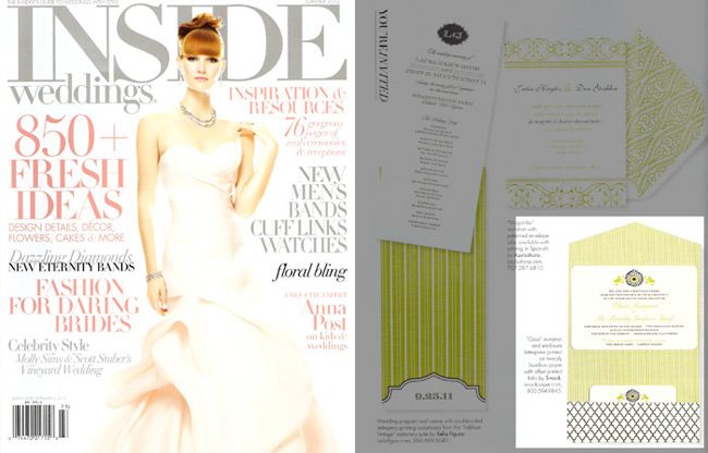
We love seeing the real weddings of brides and grooms who ordered their wedding invitations from Smock, but it’s an extra-special treat when the wedding photos come from one of our beloved Smock dealers! Today’s real wedding spotlight features Olivia, daughter of Edie Frere (Smock dealer extraordinaire and owner of Landis Gifts & Stationery in Los Angeles!) and her gorgeous wedding at The Holly Farm in Carmel, California. Olivia ordered a stunning invitation suite featuring our modern Ossa design in black and lime inks with a sophisticated folio that tied everything together. Inside Weddings loved her invitation set so much that they chose to feature it in their Summer 2012 issue! Olivia filled us in on what went into planning their fabulous wedding and even gave a few tips for couples who are currently planning their own celebrations.
How did you choose your invitation design & ink color?
I am very fortunate that my Mom and her team at Landis Gifts and Stationery are so good at what they do! We told Mom that we liked letterpress and wanted something fun and unusual. She took it from there!


Can you share with us a bit about your wedding and your inspiration for the event?
We focused on throwing a really fun, casual party for our family and friends. Our wedding would not have been possible without their support, so we wanted to make sure THEY had a really good time!
What advice do you have for couples currently planning a wedding?
Don’t stress. Planning a wedding can be so overwhelming. I’ll admit, I was a bit of a stress case myself, but in the end it all worked out the way we had envisioned. My husband’s advice: Eat meals together, family style. You can do a better job planning when you talk about it over meals.


What was your favorite moment?
The satisfaction of planning and enjoying the occasion so deeply. We feel we did something as a couple that was greater than what we could have done as individuals and that was incredibly meaningful to us both.
Favorite design element of your big day?
We loved the flags that Mom had made for our signature drink. They were a surprise and added a great touch to our reception! We also loved our wedding cake decorated with a tandem bike.
What’s next for the newlyweds?
We are planning a honeymoon to South America, hopefully this fall! We love traveling and adventure, and are planning to spend a few weeks exploring Chile and Argentina by bike and boat.


Congratulations and best wishes to Olivia and Tim from everyone here at Smock!
Vendors:
Church: Church in the Forest, Pebble Beach
Reception: The Holly Farm
Save the dates: Custom design by Landis Gifts and Stationery
Invitations: Smock via Landis Gifts and Stationery
Photography: Kristy Ahumada of Volatile Photography
Flowers: Kim England at Fleurs du Soleil
Hair and Makeup: Salon at Lincoln Lane
Catering: Grapes of Wrath
Desserts: Patisserie Bechler in Monterey
Band: Cam Perridge 415 948 4446
We had the fortune of printing these great Evans letterpress wedding invitations for our friends at Epitome Papers. It’s jobs like these that show us that our stores are the creative ones!!!
inks: midnight + inkless blind deboss | fonts: spence | paper: 1-ply white + 2-ply white | printing: letterpress + offset | folio: exterior pattern: willoughby in inkless blind deboss letterpress + interior pattern: willoughby in midnight letterpress | liner: willoughby in midnight offset | invite size: S-7SQ folio

For the last week, we’ve been posting the honorable mentions for the Smock Design Contest. Now we’re down to the final three! Our good friend Nole at Oh So Beautiful Paper chose our winners for this competition, and selected Alphagraphics Lyric Opera Invitation as the 3rd place winner. Here’s what Nole had to say about the design: “I don’t think I’ve ever seen a corporate invitation that was so pretty! I love the patterns, the font selections, and the fold out layout. Gorgeous.”

Nole, we couldn’t agree more! It’s not often we get to print letterpress invitations for galas, concerts, or charitable events, so when we do, we tend to get pretty excited. This espresso and gold invitation to the Lyric Opera’s Charitable Subscriber Concert and Dinner was extraordinary! It was, indeed, a ticketed concert (which explains the use of the pocketfold), and the invitation invited 100 of the Opera’s premier patrons to dinner and a concert.

To the untrained eye, this striped, monogrammed pocketfold invitation looks beautiful and classy. For those who spend a lot of time at Chicago’s Civic Opera House, they’ll notice graphic elements that remind them of the gilded gold walls and ceilings of that very building. When designing the invitation, Amy at Alphagraphics used the opera’s Art Deco elements and color scheme as her guide. She created an invitation that was reminiscent of the old stately edifice, glamorous in its timelessness.

Her work was well appreciated by all! Both the Lyric Opera and the event’s attendees thought the invitation was a fantastic bidding to a wonderful evening of music and feasting. Bravo Amy, Bravo!
Congratulations again to Alphagraphics for taking 3rd place in our design contest. This twice-a-year competition recognizes outstanding and inspired designs submitted by our beloved dealers.
We featured these stunning letterpress invitations back in October and are thrilled to show them off one more time as a design contest honoree! This sophisticated set was sent to us by Darcy at Pearl Beach Paperie in Orlando, Florida, and features charming vintage airplanes and a rich color combination of cherry and black inks. The swirls and flourished fonts set a whimsical tone which balances the chic gold stripes printed on the folios and envelope liners. Congratulations and thank you to Pearl Beach Paperie for sending us such a lovely invitation set!
ink: cherry + black | fonts: custom| paper: 2-ply ivory | printing: letterpress | folio exterior: custom pattern in cherry | folio interior: custom pattern in gold | liner: custom pattern in gold |invite size: 5.125 x 7.75 |

This design won an honorable mention in our Smock design competition for the first half of 2012. This twice-a-year competition recognizes outstanding and inspired designs submitted by our beloved dealers.
We printed these lovely wedding invitations for our friends at Dandelion Patch – Vienna. The letterpress eggplant and lavender inks make this an elegant suite that they will remember for the rest of their lives. This Chasseral design was letterpress printed on ivory bamboo 2-ply paper. Its wrapped up neatly in a Smock pocketfold to give that new age look to a classic design.
inks: eggplant + lavender | fonts: graham + tally | paper: 2-ply ivory | printing: letterpress | invite size: S-8 Folio

Sneak a peek at this beyond beautiful letterpress Rhon invitation suite submitted to us by our friend Casie at Francis~Orr Corona del Mar in Corona del Mar, California. The color combination of verbena and taupe transforms the look of this set into something almost vintage! And everyone knows yellow represents sunshine and joy! We can’t help but feel this yellow hue helps radiant happiness about the couple’s big day. Our rhon pattern in verbena on the pocketfold’s exterior adds the most elegant touch to this sensational suite! We always enjoy working with Francis~Orr because they submit some of the most creative invitation sets!
inks: verbena + taupe | fonts: smock spencerian + stockton | paper: 2-ply white | printing: letterpress | corner rounding | folio exterior: rhon pattern in verbena | folio interior: payette pattern in taupe | liner: the payette pattern in verbena | invite size: 5.125 x 7.75


