The votes are in: Odin is the Smock design of the month! From now through May 14, all custom orders that feature the bright and bubbly Odin design (wedding invitations, social stationery, save the dates, programs, menus, calling cards, hang tags, baby or graduation announcements, birthday party invites, and more!) will be 10% off (or 15% off for orders with 6 or more pieces!). Locate one of our amazing Smock custom dealers today to get started on your Odin stationery!
Thanks to everyone who voted, we’ll be donating almost $200 to the Earthworks No Dirty Gold campaign to help put an end to dirty mining practices that are devastating the planet. (Click here to read more about dirty gold and find out what you can do to help). To show you just how unique our Odin design can look with a few simple tweaks, our designers put together the stunning customizations below to get you inspired!


inks: ocean + saffron | fonts: parson + chaplin | paper: 2-ply white | printing: letterpress| back patterning: van in saffron | invite size: s8

inks: eggplant and gold | fonts: elsie + lazlo | paper: 2-ply ivory | printing: letterpress| envelope liner: filby in eggplant | corner rounding | invite size: s8

inks: sand + pewter + peacock | fonts: alice + percy | paper: 2-ply white | printing: letterpress + offset | back patterning: everett in pewter | edge painting: peacock | invite size: s8-sq

inks: whisper + pink | fonts: percy + fairchild + louise | paper: 2-ply white | printing: letterpress| envelope liner: fleming in pink | invite size: s8
Stop in to your local Smock retailer to get started on your custom Odin order today!
How to vote: Visit smockpaper.com/wedding and choose your favorite invitation design. Roll over the photo and click the “like” button that appears. That’s it!
Why vote: For every vote cast through April 12, 2012, we’ll donate $1 to Earthwork’s No Dirty Gold campaign (up to $500) to help put an end to dirty gold mining practices that are devastating the planet.
What happens with the winning design? The invitation design with the most votes will be the next Smock design of the month. From 4/14 – 5/14, all custom orders that feature the winning invitation design (wedding invitations, stationery, save the dates, you name it!) will be 10% off (or 15% off for orders with 6 or more pieces!). You can place your order with one of our amazing Smock custom dealers.

So why should you care about dirty gold mining practices? If you’re engaged, there’s a good chance you’ve already got a ring with some gold in it (and you may be looking to purchase wedding bands soon, too). There are certain dirty mining practices that have really terrible impacts on the communities and the environment surrounding the mines – did you know?
- The production of one gold ring generates 20 tons of mine waste.
- The drinking water in mining communities often becomes contaminated, and mine drainage can also raise acid levels in rivers and lakes that can be harmful to wildlife and people. Some mines even dispose of toxic waste in rivers, lakes, and oceans on a regular basis.
- Some of the refining processes that are used in mines release chemicals that cause smog and acid rain.
- Many gold mines create solid waste, too: by employing a process known as heap leaching, these mines drip a cyanide solution through high piles of ore. The solution strips away the gold, but a lot of waste is left over from the process (read: the waste from these sites can sometimes reach over 300 feet – which is nearly the height of a 30-story building!). Many of these heaps are often abandoned because they are too costly to dispose of properly.
- Indigenous people around the world typically lose out when mining leases are granted. In rural communities, locals often become vulnerable to eviction without notice, meaningful compensation or an offer of equivalent lands in a new region because legal land titles aren’t always on hand (even if a family has occupied the same lands for generations).
- Mining is a dangerous job: rock falls, tunnel collapses, fires, heat exhaustion, and other dangers claim the lives of over 15,000 miners every year, and while the profession only accounts for 1% of the world’s labor force, it accounts for 5% of on-the-job fatalities.
Wondering what you can do to help? It’s really easy to take action. Sign the Earthworks pledge today, and be sure to support retailers who are actively pursuing clean gold sources. If you choose to work with a retailer who’s not on that list (like Macy’s or Costco – the only two retailers in the top 10 list that haven’t committed to sourcing responsible gold) be sure to ask your jeweler about the source for the gold in your ring. Other ways you can help:
- Recycle old jewelry, and have old rings melted down to make new ones. Support jewelers that offer products made with recycled gold.
- Buy vintage or antique jewelry.
- Keep jewelry in your family and pass on to your children or grandchildren.
Letterpress cards, notepads, and stationery in pretty shades of blue have been extremely popular this year, and it’s easy to see why! This on-trend color works in many different shades: a vibrant, true blue paired with crisp red and nautical patterns appeals to just about everyone, while a deeper navy and rich royal blues work well for men (or for women who like deep, rich colors!). For a fresh, feminine look, lighten things up a bit and go with turquoise. Which shade of blue are you?

1. Breakers boxes: Small $6, Medium $12, Large $18 | 2. Rhino Letterpress Cards $14 for a 6 count box | 3. Lobster Letterpress Card $4 | 4. Breakers Jotter Notepads $6 for a 2-pack | 5. Pearl Notebook $9 | 6. Phillips Boxed Offset Cards $12 for an 8 count box | 7. Talt Notebook $9 | 8. Chatham Scratchpad $7
All Smock goods are made around Syracuse, New York with the planet in mind: our notebooks and notepads use 100% post-consumer waste recycled paper, and our greeting cards are printed on our exclusive (and sustainable) bamboo paper.
We are always amazed at the gorgeous letterpress invitations we get to print for Smock retailer The Wedding Company, but it’s not very often that we get to see an actual event that they put on. The Wedding Company is a full service wedding planning boutique based in Hong Kong, and recently they put on an incredible bridal showcase, complete with romantic décor, elaborate cakes, gorgeous tables and a sweet candy buffet. They even had time to put together an incredible Smock display, and created paper flowers and pinwheels with our double-sided, eco friendly gift wrap for the occasion! We were blown away by the end result — take a look!


Soft, subtle hues are what’s in right now! Take a look at these trendsetter custom letterpress wedding invitations. This whimsical set was submitted to us by our great friend, Kappy at Le Village Marche in Arlington, Virginia. We love that our lyon border is featured on the left side of the invitation – adding to the modern feel of this suite. Although this set is more on the contemporary side – choosing a softer color palette helps maintain a timeless and elegant feel for your wedding day. We think these stylish invitations will surely delight their guests!
inks: yolk + pewter | fonts: louise + peale | paper 2-ply white | invite size: S-8 | printing: letterpress | corner rounding | liner: the granby pattern in dove

Nole Garey, editor and publisher of Oh So Beautiful Paper, gave this fantastic invitation set first place in our design contest! Nole loved the texture and the playful yet elegant mix of patterns for this wedding invitation set, and we couldn’t agree more – it’s simply stunning!
Danielle from Creative Touch Party Design in Palm Beach Gardens, Florida always sends us gorgeous designs, and this set is no exception. Much of the inspiration for this design was pulled from Smock’s Dawson suite, sleeve and all. Layers of dynamically designed pieces in this suite really bring it to life, and the colors of pewter and merlot give the playful patterns a little sophistication.
Danielle gave us the scoop on the inspiration behind these invitations. “The wedding colors are shades of wine and berry with silver. The wine color comes from her Lulu Kate bridesmaid dresses, which are just beautiful. These were the inspiration for the border color. The gray picks up the silver throughout the wedding decor. And the men are wearing gray tuxedos, which is reflective in the pocket she chose. The linens are a modern lace pattern which is reminiscent of the quilting in the invitation itself.”
We loved this set — congratulations, Danielle! And a huge thanks to Nole for judging the contest!
Customization = letterpress inks: merlot + pewter | fonts: carrington + smock clermont | paper color: white | paper size: s-7 for sleeve | envelope liner: ashford reversed in pewter | sleeve: custom design in pewter letterpress

This design won first place in our Smock design competition for the first half of 2012. This twice-a-year competition recognizes outstanding and inspired designs submitted by our beloved dealers.
Our second place design contest winner comes to us from Shelley at /di’zain/ loft limited in the Republic of Trinidad and Tobago, a recent addition to the Smock family. The couple chose a dreamy color palette of dusty pinks and greys for their wedding, so invitations in pewter and shell inks on our white bamboo paper fit their theme perfectly and created a soft, sweet feel. The invitation design was modeled after a vintage, “fashionably chic” handwritten love letter, which seems perfectly fitting for Clare-Ann and Joshua as they have had to experience the challenges of an overseas relationship. Shell envelope liners and a pretty script font reminiscent of elegant cursive handwriting complete the look of the invitations.

The couple strove for a sense of romanticism with their invitations, and we definitely think they’ve achieved it! We fell in love – and so did our contest judge, Nole, at Oh So Beautiful Paper, who selected the design as the 2nd place winner. She writes, “The invitation has a clean and modern layout, and I love the use of script and serif fonts that keep the design from looking too fussy. Sweet and simple.”
Congratulations Shelley, and best wishes to the happy couple!
Congratulations again to Di’zain Loft Limited for taking 2nd place in our design contest. This twice-a-year competition recognizes outstanding and inspired designs submitted by our beloved dealers.
For the last week, we’ve been posting the honorable mentions for the Smock Design Contest. Now we’re down to the final three! Our good friend Nole at Oh So Beautiful Paper chose our winners for this competition, and selected Alphagraphics Lyric Opera Invitation as the 3rd place winner. Here’s what Nole had to say about the design: “I don’t think I’ve ever seen a corporate invitation that was so pretty! I love the patterns, the font selections, and the fold out layout. Gorgeous.”

Nole, we couldn’t agree more! It’s not often we get to print letterpress invitations for galas, concerts, or charitable events, so when we do, we tend to get pretty excited. This espresso and gold invitation to the Lyric Opera’s Charitable Subscriber Concert and Dinner was extraordinary! It was, indeed, a ticketed concert (which explains the use of the pocketfold), and the invitation invited 100 of the Opera’s premier patrons to dinner and a concert.

To the untrained eye, this striped, monogrammed pocketfold invitation looks beautiful and classy. For those who spend a lot of time at Chicago’s Civic Opera House, they’ll notice graphic elements that remind them of the gilded gold walls and ceilings of that very building. When designing the invitation, Amy at Alphagraphics used the opera’s Art Deco elements and color scheme as her guide. She created an invitation that was reminiscent of the old stately edifice, glamorous in its timelessness.

Her work was well appreciated by all! Both the Lyric Opera and the event’s attendees thought the invitation was a fantastic bidding to a wonderful evening of music and feasting. Bravo Amy, Bravo!
Congratulations again to Alphagraphics for taking 3rd place in our design contest. This twice-a-year competition recognizes outstanding and inspired designs submitted by our beloved dealers.
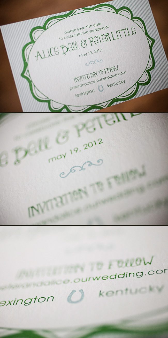
Cori at Social Graces in Nashville, Tennessee sent us this adorable Odin customization! These offset printed save the dates are both personalized and creative, and were printed in a very cool color palette of our sea mist + grass inks. When we asked Cori what inspired this design she told us that the bride was drawn to the fun font style and whimsical frame, and loved how these elements balanced the striped background. The wedding reception will be on her family’s horse farm, so the couple thought it would be appropriate to include a horseshoe. Here at Smock, we believe these save the dates are lucky! Common legend is that keeping the ends of a horseshoe point up keeps all of the good luck in. Congrats to the lucky bride and groom, and bravo to Social Graces for such an inspired design!
inks: sea mist + grass | fonts: mack + louise | paper: 1-ply white bamboo | printing: offset | size: s6

This design won an honorable mention in our Smock design competition for the first half of 2012. This twice-a-year competition recognizes outstanding and inspired designs submitted by our beloved dealers.
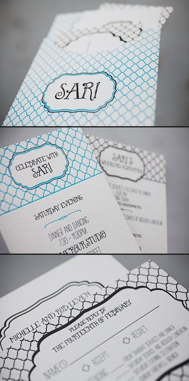
We have the lovely Jenny from Jenny’s Paper, Ink! to thank for these incredible letterpress Bat Mitzvah invitations that we recently had the pleasure of printing. The invitations have a sweet, youthful look and feature fun fonts and bold colors. Jenny said the inspiration for these Bat Mitzvah invitations began with a custom sleeve – Sari fell in love with the idea of keeping the entire invitation set together without using a typical folio or bellyband. From there, they created a logo that could be used throughout the event by pairing our Louise font with our Dawson cartouche. Next came the patterns and colors — Sari’s favorite color is blue, so robin’s egg was a perfect choice, and adding black as a second ink color gave the invitation a bold look. The Champlain pattern was used in different ways throughout the entire set, and complemented the playful fonts and bold ink combination beautifully. The finished product was amazing and set the tone for a fabulous weekend with family and friends. Congratulations and thank you to Jenny for sending us such a stunning invitation set!
inks: robin’s egg + black + inkless blind deboss | fonts: percy + louise | paper: 2-ply white | printing: letterpress | liner: custom liner pattern in robin’s egg + black | custom sleeve: champlain pattern with dawson cartouche | size: s7 for sleeve

This design won an honorable mention in our Smock design competition for the first half of 2012. This twice-a-year competition recognizes outstanding and inspired designs submitted by our beloved dealers.


