Danna and Michael treated their guests to a casual 4th of July barbecue for their wedding last summer. We digitally printed a custom map complete with adorable illustrations that was adhered to a red, white and blue invitation folio. Their barn party wedding invitations were actually inserts for the folio, and included a phone number for RSVPs. We love the checkered look on the outside of the folio — perfectly fitting for a barn party celebration!


letterpress ink: cherry + royale | fonts: Ruby + Barnes | artwork: submitted | paper: 1-ply white | size: S-8 + S-6 | folio exterior: custom pattern in cherry; folio interior: fleming pattern in royale | customization #22078 | Arabesque
We created matching save the dates and ombré wedding invitations using our Spence design for Kasey and Adam’s Stone Harbor wedding celebration. The entire set was printed with gold matte foil, and the main two pieces included a pretty peach ombré fade. We duplexed the invitations to make them ultra thick, then added corner rounding and gold matte foil edging for a polished finish.


foil color: gold matte | digital printing: ombre pattern in peach ink | fonts: Smock Plaza + Lazlo + Stockton | paper: 1-ply + 2-ply white | size: S-8 + S-6 + S-5 | corner rounding | foil edge: gold matte | envelope liners: champagne metallic | customization #27102 + 24836 | Nota Bene
Tracey and Nicholas worked with us to create one of the most beautiful invitation suites we’ve ever printed! For their May wedding in St. Barths, we digitally printed their tri-fold, passport style save the dates in pretty blues and pinks, then added gold shine foil stamping. An intricate custom crest complete with palm trees and their monogram was printed on both their save the dates and their gold wedding invitations, which also featured hand calligraphy. Their tropical invitation set included an events card and a reply card, which fit inside of a vibrant invitation sleeve complete with personal motifs – like the wedding chapel, a bottle of champagne, palm trees, and even the couple’s pup! Custom envelope liners for both the save the dates and the invitations were created to match each piece accordingly.


letterpress ink: peacock | digital inks: peacock + watermelon + CMYK process | foil color: gold shine | fonts + artwork: submitted | paper: 1-ply + 2-ply white | size: S-8 + S-6 + 5×7 + S6-TF | edge paint: watermelon sleeve: digitally printed custom artwork; juliette style | envelope liner: custom | customization #:25390 + 26997
We personalized our Brynn design to create Maggie’s jewel toned Bat Mitzvah invitations. Featuring a pretty palette of orchid, azure, royale, and violet inks, the invitations and party cards both included a modern, text-based design on the front, with a colorful pattern covering the back. Orchid edge painting and striped patterned envelope liners added additional bursts of color to this sweet set.


digital inks: azure + royale + violet + orchid | digital patterned backing: Rainier 2 pattern in azure + royale + violet + orchid | edge paint: orchid | fonts: Lawrence + Greenaway | paper: 1-ply + 2-ply white | size: S-8 + S6 | envelope liner: fleming pattern in azure + royale + violet + orchid | customization #27610 | Pen & Paper
A beautiful array of soft blues and greens were featured together on this sea glass inspired version of our Keira invitation. Sarah and Robert chose letterpress printing in azure ink for the main text on their invitations, which added texture to the colorful, digitally printed piece. We duplexed the invitation and added azure edge paint to make the piece more substantial. Reply cards and event cards were printed to match, and a custom watercolor envelope liner added an extra layer of color to this unique invitation set.


letterpress ink: azure | digital inks: azure + robin egg + sky + sea mist + emerald + ocean | fonts: Lawrence + Hutton | paper: 1-ply + 2-ply white | size: S-6 + S-5 | edge paint: azure | envelope liners: custom watercolor liner | customization #25319 | Paperista
Digitally printed in pink, yellow, and navy inks, these petite moving announcements bear the universal symbol for hospitality: the pineapple. The recorded history of the hospitality pineapple dates back to the late 1400’s. At the time, pineapples were an uncommon luxury, and were displayed and served to guests to provide a warm welcome. We can’t think of a better way to invite family and friends into a new home!

digital inks: yolk + whisper + navy | fonts: Flora + Mack | paper: 1-ply white | size: S-5 | rounded corners | pineapple motif from custom library | customization #27612 | Lovely Paperie and Gifts
Check out Apartment Therapy for their brief history of the hospitality pineapple!
We worked with Shayne at Ink Papery to create these darling invitations for Chelsea’s bridal shower. Letterpress printed in pink ink, the invitations feature our Plaza calligraphy font and a gorgeous patterned backing filled with romantic floral watercolors. We duplexed the letterpress invitation to the digitally printed patterned backing to make the invitation ultra thick, then edge painted the piece with pretty pink ink as a finishing touch. MaryKate Moon addressed the invitation envelopes in a pretty pink ink to match, and also calligraphed matching table cards and place cards for the celebration.


letterpress ink: pink | fonts: smock plaza + sans capitals | paper: 1-ply + 2-ply ivory, duplexed invitation | size: S-8 + 5.25 x 3.5 | back patterning + envelope liners: digitally printed, custom submitted artwork | edge painting: pink | customization #: 26269 | Ink Papery
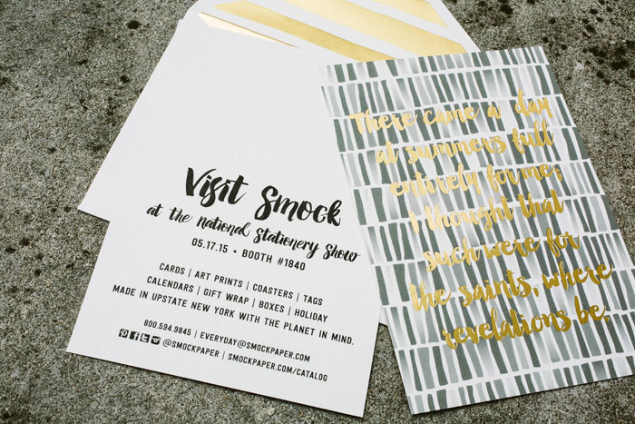
It’s almost time for the 2015 National Stationery Show! To kick things off, we recently sent out announcements to spread the word on our new offerings for this year’s show. We chose a sophisticated color palette of black, white, and gold matte foil, and created informative cards that doubled as art prints. Our new foil stamped envelope liners made their debut, and we purchased some gorgeous postage stamps from the USPS as a finishing touch. We hope you’ll come see us at the show — we’ll be in booth #1840!


PS: check us out on Instagram to catch a peek at the postage stamps we used on the envelopes!
We we worked with Heather at Posh Parties & Paper to create these modern bridal shower invitations. Digitally printed on our white bamboo paper, these petite invitations are reply card sized and included an email address for regrets. A cheery yellow monogram created with our Huxley cartouche and a kincaid patterned envelope liner added an extra splash of color to this sweet set!

digital inks: verbena + silver | fonts: brecht + lawrence | paper: 1-ply white | size: S-5 | envelope liners: kincaid pattern in verbena | customization #26391 | Posh Parties & Paper
We customized our Brynn design to create Logan’s modern typographic Bar Mitzvah invitations. Letterpress printed in navy ink, the invitations feature silver foil stamping to highlight Logan’s name, with a digitally printed Rainier patterned backing adding a fun design element to the back. In addition to the invitation, colorful patterns were included on both the reply cards and the envelope liners, adding a stylish touch to this otherwise minimalist invitation set.


letterpress ink: navy | foil color: silver matte | digitally printed back patterning: rainier 2 pattern in navy + pewter + dove + slate | font: Impression | paper: 1-ply white | size: S-8 + S-5 | envelope liners: fleming pattern in navy + pewter + dove + slate | customization #24210 | The Printed Page