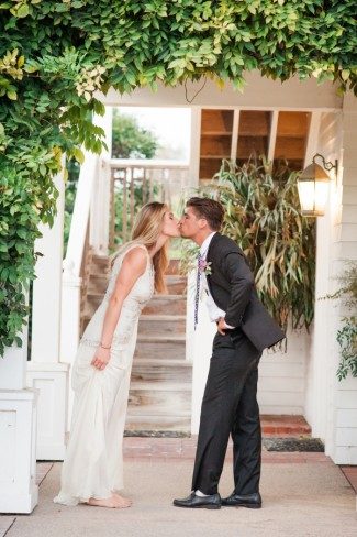
Last summer we collaborated with California based wedding planner Amy Nichols to create a gorgeous lavender inspiration shoot that’s been featured on both Martha Stewart Weddings and Elizabeth Anne Designs! Our Ingalls suite helped set the tone for the shoot, which took place at Amy’s parents’ avocado and lemon ranch in Santa Paula. Inspired Southern California’s lavender fields, the shoot featured a wide range of purple shades — from the candles to the flowers and even the napkins! Many thanks to Amy for including us in this beautiful shoot!


Photography – Gertrude & Mabel Photography | Event Design and Planning – Amy Nichols Special Events | Floral and Prop Styling – Kelly Oshiro with flowers from Florabundance | Stationery – Smock | Calligraphy –Anne Robin Calligraphy | Day-of Assistance – Smith + James Events | Furniture Rentals – My Lovely Events | China, Copper Trays, and Cake Stand – the Ark | Flatware and Gold Trays – Otis + Pearl Vintage Rentals | Linens – La Tavola Fine Linen | Candles – Creative Candles | Napkins and Gift Bag – The Loveliest Co. | Ribbon – Silk & Willow | Gowns – Alice Temperley | Ring Box – The Mrs. Box | Clutches – Cuyana | Desserts – Marie Shannon Bakery | Edible Flowers – Gourmet Sweet Botanicals | Signage – Be Curious Designs | Tote – Lands End | Hat Box – Trousseau & Co.
We worked with Shayne at Ink Papery to create these darling invitations for Chelsea’s bridal shower. Letterpress printed in pink ink, the invitations feature our Plaza calligraphy font and a gorgeous patterned backing filled with romantic floral watercolors. We duplexed the letterpress invitation to the digitally printed patterned backing to make the invitation ultra thick, then edge painted the piece with pretty pink ink as a finishing touch. MaryKate Moon addressed the invitation envelopes in a pretty pink ink to match, and also calligraphed matching table cards and place cards for the celebration.


letterpress ink: pink | fonts: smock plaza + sans capitals | paper: 1-ply + 2-ply ivory, duplexed invitation | size: S-8 + 5.25 x 3.5 | back patterning + envelope liners: digitally printed, custom submitted artwork | edge painting: pink | customization #: 26269 | Ink Papery
New for 2010 and recently unveiled at the National Stationery Show, we are excited to introduce you to the second of our two new calligraphy fonts exclusive to Smock! Calligrapher Patricia Mumau of Primele Studio created our new Harrison font, a bold, fresh calligraphy lettering style that we showcased on our 2010 NYIGF invitations. Patricia worked alongside our internationally recognized typography firm to create her amazing new font and we’re proud to show it off! All of our calligraphy fonts (now four in total) are available with no additional calligraphy fee when you order custom letterpress stationery from Smock. Visit one of our awesome Smock dealers to see samples!
Today it is our pleasure to welcome Patricia to the blog for a little Q + A session. Welcome, Patricia!

How did you become interested in calligraphy?
I was studying in Rome at the time, and I came across a street vendor selling antique mail to collectors – old letters and postcards, amazing postage, meaty papers – and all with the most fascinating handwriting. The penmanship was imperfect but graceful, for everyday and yet lucidly personal. I wanted to capture that candid natural hand in a contemporary calligraphy and began experimenting.
What tools does someone need to start learning calligraphy?
Patience, creative freedom, access to a library, a pen nib and holder, and a bottle of ink in a irresistible color.
What was the process like for designing a font for Smock?
For my part, I created gobs of handwriting samples. I took time to consider the nuances of my mark making – the way I dotted my “i”s, the curve of my question mark…

What do you think makes hand calligraphy so special?
Some projects really need that look of handwritten typography, and having access to handwriting styles on demand with calligraphy fonts makes a great addition to a graphic designer’s toolbox. But however useful, fonts can’t do everything. When it comes to spot phrases that require a bit of artistic flare and incorporated flourishes, hand calligraphy is the better fit.
What was the first lettering style you learned?
Classic American Cursive in 2nd grade. I am glad to have put those “Q”s masquerading as “2”s behind me.
Are you right or left handed?
I’m left handed, which made things interesting at first as I was learning. But with a bit of trial and error I figured out techniques that worked for me.

What’s a normal workday like for you?
#1) Coffee. Next I usually go over what’s on the docket with my sister Rachel who manages the studio’s projects. I do most of my addressing in the late morning and early afternoon, and work on design projects such as invitations in the later part of the day.
Other than invitations, envelopes and place cards, what other fun things do people have hand-lettered?
I’ve created logos, transcribed letters, and designed calling cards. Currently I’ve been creating a lot of hand-lettering for return address stamps.

What is your favorite letter in the alphabet to calligraph?
A capital “Z”, all the way.
What fictional character would you be and why?
Virginia Lee Burton’s Little House. I’d like to think that while the world is constantly changing all around me, that I’d remain true to the builder’s intentions…and maybe someday make a move to a fantastic landscape and get a new coat of paint.

Where do you look for inspiration?
Mid-century picture book illustration, piped birthday cakes, American folk needlework, Swiss graphic design, opening credits to films from the 40’s and 50’s, Swedish decor, happy thoughts.
What is your favorite book of all time?
A Hole is to Dig by Ruth Krauss
How long have you been doing calligraphy professionally?
I started marketing my services late summer of 2009, so a little over a year now.

Primele consists of you and your two sisters, does everyone have a say in the design process?
We all bring our own strengths to the table. For me it’s the hand-drawn typography and illustration. I also tend to work a lot with the initial concepts and designs. Rachel does most of the work once a design is brought into the computer. She’s our Adobe software guru who makes everything graphically perfect. At different times throughout a project we’ll run it through the-kimmy. Kim has an amazing eye and a sensitive design palate, and her perfected taste acts as a kind of editor to my sometimes too-funky ideas.
New for 2010 and recently unveiled at the National Stationery Show, we are excited to introduce two new calligraphy fonts exclusive to Smock! Calligrapher Kelle McCarter of designsgirl is the talent behind our new Bescal font, a playful modern lettering style that we feature on our 2010 National Stationery Show invitations. Kelle hand lettered each of the characters in our new font, which we developed with an internationally recognized typography firm. All of our calligraphy fonts (now four in total!) are available with no additional calligraphy fee when you order stationery from Smock. Visit one of our awesome Smock dealers to see samples!
Today we are thrilled to be welcoming Kelle to our blog for a little Q + A session. Thanks, Kelle!

{Our new Bescal calligraphy font featured on our 2010 NSS invitation.}
How did you become interested in calligraphy?
I have always been enamored with beautiful writing. I remember vividly the day I became excited about learning calligraphy. I saw a logo of “Bell ‘Occhio”, a San Francisco ship, in a book. It was designed with a pointed pen illustration and whimsical lettering and it was magically captivating to me. This is when I knew I wanted to be a calligrapher.
What tools does one need to start learning calligraphy?
You need to find a good teacher (through a local calligraphy guild) or good instructional books such as The Zanerian Manual of Alphabets and Engrossing for Copperplate style lettering or for a more modern instructional guide, I like Lisa Engelbrecht’s Modern Mark Making. Then you will know what nibs inks, and papers are best for the type of calligraphy you want to learn.

What was the process like for designing a font for Smock?
I love typography and to have my calligraphy made into a font for Smock was thrilling. The key to this work, which was done over several months, was to not worry about the results and to be free with my strokes so that the personality and the movement of the style would be preserved.
What do you think makes calligraphy so special?
Everyone loves the beauty of a hand lettered envelope or invitation. For those whose budget does not allow for calligraphy services, the calligraphy font is a fine alternative…True calligraphy is where pen and ink meet paper and there is no substitute for this artistic, textural and organic element. It is one of the most special details of a wedding; just ask any bride who has heard the oohs and aahs from those receiving a hand lettered wedding invitation in the mail.

What was the first calligraphy style you learned?
I spent months with my first teacher, Laurie Doctor, learning monoline lettering, the simplest form of lettering with no thick or thin lines, to gain a foundation for developing the basic strokes of each letter. At this time, I did not even know how to put ink on my nib.
Are you right or left handed?
I am a left handed calligrapher which presents some challenges in calligraphy because most oblique pen holders and broad edged nibs are made for right handers. But an artist and fellow calligrapher recently hand carved a left-handed oblique penholder out of African Blackwood for me that I am learning to use.

What is a normal workday like for you?
Since I work from my home studio, I must establish a regimented schedule. I handle client correspondence in the morning and then work in my studio until lunchtime. Our two Golden Retrievers, Garner and Gibson, are always by my side at my desk and can often be found with splatters of ink on their noses. They are very good assistants. I break for lunch, maybe hike with our “girls” and then resume projects in the afternoon. I usually end my work before dinner. If I did not set limits on my workday, I would be in my studio around the clock. I reserve time in the evening for practice and experimentation.

Other than invitations, envelopes and place cards, what other fun things do people have hand lettered?
Wedding vows are a popular anniversary gift that I am asked to do. I love doing calligraphy for custom rubber stamps and one of my favorite projects was creating forty “I Love You” note cards for a client to place in her husband’s suitcase when he traveled. My goal is to be the first to do custom calligraphy for golf balls. The idea comes from my father who was a PGA Tour professional and he was the first to have his signature imprinted on a Titleist golf ball.

What is your favorite letter in the alphabet to calligraphy?
It is the capital “D”. There is a rhythm to this stroke that is like a waltz- one and two and three and four. It is done with only one stroke and ends with a beautiful swirl that tucks into the vertical stem of the “D”.

If you could be any fictional character, who would you be and why?
It must be Super Woman for her ability to fly, have daily adventures, right wrongs and save the world.
What do you look to for inspiration?
This is the most exciting aspect of my work and my designsgirl business. I awake and fall asleep filled with ideas of what I want to create and calligraphy styles I want to develop and I love incorporating my calligraphy into embroidery and journaling projects. The inspiration is everywhere, particularly from fashion designer sketches and illustrations, textile patterns, flowers, architecture, typography, interior design, paintings, magazine and books.

What is your favorite book of all time?
This like asking to name my favorite child; impossible. For classic literature, The Age of Innocence by Edith Wharton. For artistic creativity and uniqueness, Century Girl: 100 Years in the Life of Doris Eaton Travis, Last Living Star of the Ziegfeld Follies by Lauren Redniss.

How long have you been doing calligraphy professionally?
I started designsgirl officially when I married and moved to Denver four years ago. It has been a dream of a lifetime.
You are very accomplished on the golf course. How many hours do you get to spend on a course a week now that you have designsgirl?
My husband began playing golf when we married, just for my sake, but now he is an avid golfer. We practice three to four hours each week and play about once a week at the Country Club at Castle Pines, where we live.

We can hardly believe it, but it’s true – the 2010 National Stationery Show kicks off later this morning! For those of you attending the show, we’d love to have you come visit us in booth 2241 where we’ll be spreading our love for stylish eco letterpress stationery and paper goods. We’re excited to announce that Smock’s calligrapher, Debi Zeinert of The Blooming Quill, will once again be joining us at the show offering complimentary calligraphy for visitors to our Smock booth. You can catch her from 9am to 6pm today and again from 11am – 2pm tomorrow and 10am to 1pm on Tuesday. Be sure to stop by and say hello!

And just to get you good and excited, here’s a little sneak peek at our booth (and all of our beautiful new products we absolutely adore) from setup yesterday –

It’s hard to believe, but the 2010 National Stationery Show officially opens in just twelve days! We’ve been hard at work preparing for the show – there are so many fun new things to come from Smock this year! Over the last couple of weeks we’ve been mailing out invitations to our favorite retailers and media contacts to visit us at booth 2241 to check out all of the exciting new releases. While we can’t share everything just yet, we did want to give you a little sneak peek at the pretty letterpress printed envelopes that have been arriving in mailboxes nationwide. They feature beautiful hand calligraphy addressing from our dear friend Debi Zeinert of The Blooming Quill. For those attending the show, we’re excited to announce that Debi will once again be in the Smock booth offering hand calligraphy for visitors from 9 to 6 on Sunday, May 16th, and again from 11 to 2 on Monday, and 10 to 1 on Tuesday. We look forward to seeing you there!


