How do you outdo an awesome save the date? Our good friend Niki at Papery & Cakery in Boca Raton, Florida has the recipe. We posted these lovely save the dates for Niki’s sister back in September!!!

Now that the wedding has passed, we are able to show you the amazing suite she designed, and we couldn’t be happier to share these with everyone! The suite was letterpress printed in our Pewter ink on our beautiful white bamboo 2-ply paper. All of the pieces were fitted with an offset border in pewter and die-cut in our new Chesapeake design. Each piece has a decorative offset backing and is finished with perfect edge painting in Pewter. The invitation, reply cards, and events card are tucked nicely into a custom offset sleeve.
inks: pewter + spring | fonts: submitted fonts | paper: 1-ply white + 2-ply white | printing: letterpress + offset | sleeve: custom pattern offset in pewter + spring | liner: seneca pattern offset in spring | invite size: S-8 sleeve | die-cut: chesapeake

Today we’re highlighting Urban Coast, one of our fabulous Smock retailers! Based in Belleair Bluffs, Florida, Urban Coast specializes in custom letterpress wedding invitations and event design. Owner Soosie Lazenby was kind enough to give us a behind the scenes scoop on this fabulous paperie.

Tell us about yourself & the shop. What was the inspiration behind Urban Coast?
I had a very blessed 20 year career in sports and entertainment marketing. I worked for companies such as IMG and Adidas, and served as the Sports Commissioner for the State of Massachusetts, an appointment by Governor Mitt Romney as the Chair of the Governor’s Committee on Physical Fitness and Sports, and then built my own company which I later sold. A geographical move made me ponder what was next. I decided to create a business that represented all the things I loved about my prior career and the challenges I faced in planning prestigious events. Thus, I founded URBANcoast: marrying the creative side of events and developing a model that provides a one stop shopping experience for clients. URBANcoast offers custom invitation designs, and represents the best in stationery, personalized gifts and accessories, and tabletop decor.
What do you love most about what you do?
Designing a one-of-a-kind look for clients that conveys the style and experience of their event. I also love getting to know our clients – it is such a personal process that takes place over an extended period of time. It creates a special opportunity to form a bond that goes beyond their wedding and carries over into other momentous occasions in their life.
Any predictions for 2012 weddings? What do you think will be popular this year? We are seeing a huge surge in letterpress. History always repeats itself. Additionally, fonts are taking center stage. This is why Smock and Bella Figura [Smock’s sister company] do so well for us. Having your design libraries allows our clients to create a unique look that represents their personality.
What’s the hottest color palette out there right now? Taupe — this color somehow makes its way into a majority of our designs.


What charities does your store support? We support a number of local charities, but the one we champion most is the Morton Plant Mease Foundation. Morton Plant is one of the top 50 hospitals in the country and we are fortunate to have the care they offer in our backyard. We have raised almost 100K and named a hospital suite on the new Women & Children’s floor after my father who has been on staff there for over 40 years, in addition to three other physicians who have made a profound impact on the lives of many in our community. (more…)
Check out these personalized Tallulah letterpress baby announcements. Our friends at Nest Paper Studio in Oxford, Mississippi submitted these precious baby announcements to us for printing. The silhouette at the very top makes these all the more elegant and truly adds a personal touch. We truly adore the bold color palette of our papaya and peacock inks on these. We can only imagine how excited the proud family is to announce the arrival of their new bundle of joy!
inks: papaya + peacock | fonts: cameron + worthington| custom artwork: submitted |paper: 2-ply white | printing: letterpress | card size: S5SQ

Nole Garey, editor and publisher of Oh So Beautiful Paper, gave this fantastic invitation set first place in our design contest! Nole loved the texture and the playful yet elegant mix of patterns for this wedding invitation set, and we couldn’t agree more – it’s simply stunning!
Danielle from Creative Touch Party Design in Palm Beach Gardens, Florida always sends us gorgeous designs, and this set is no exception. Much of the inspiration for this design was pulled from Smock’s Dawson suite, sleeve and all. Layers of dynamically designed pieces in this suite really bring it to life, and the colors of pewter and merlot give the playful patterns a little sophistication.
Danielle gave us the scoop on the inspiration behind these invitations. “The wedding colors are shades of wine and berry with silver. The wine color comes from her Lulu Kate bridesmaid dresses, which are just beautiful. These were the inspiration for the border color. The gray picks up the silver throughout the wedding decor. And the men are wearing gray tuxedos, which is reflective in the pocket she chose. The linens are a modern lace pattern which is reminiscent of the quilting in the invitation itself.”
We loved this set — congratulations, Danielle! And a huge thanks to Nole for judging the contest!
Customization = letterpress inks: merlot + pewter | fonts: carrington + smock clermont | paper color: white | paper size: s-7 for sleeve | envelope liner: ashford reversed in pewter | sleeve: custom design in pewter letterpress

This design won first place in our Smock design competition for the first half of 2012. This twice-a-year competition recognizes outstanding and inspired designs submitted by our beloved dealers.
Our second place design contest winner comes to us from Shelley at /di’zain/ loft limited in the Republic of Trinidad and Tobago, a recent addition to the Smock family. The couple chose a dreamy color palette of dusty pinks and greys for their wedding, so invitations in pewter and shell inks on our white bamboo paper fit their theme perfectly and created a soft, sweet feel. The invitation design was modeled after a vintage, “fashionably chic” handwritten love letter, which seems perfectly fitting for Clare-Ann and Joshua as they have had to experience the challenges of an overseas relationship. Shell envelope liners and a pretty script font reminiscent of elegant cursive handwriting complete the look of the invitations.

The couple strove for a sense of romanticism with their invitations, and we definitely think they’ve achieved it! We fell in love – and so did our contest judge, Nole, at Oh So Beautiful Paper, who selected the design as the 2nd place winner. She writes, “The invitation has a clean and modern layout, and I love the use of script and serif fonts that keep the design from looking too fussy. Sweet and simple.”
Congratulations Shelley, and best wishes to the happy couple!
Congratulations again to Di’zain Loft Limited for taking 2nd place in our design contest. This twice-a-year competition recognizes outstanding and inspired designs submitted by our beloved dealers.
For the last week, we’ve been posting the honorable mentions for the Smock Design Contest. Now we’re down to the final three! Our good friend Nole at Oh So Beautiful Paper chose our winners for this competition, and selected Alphagraphics Lyric Opera Invitation as the 3rd place winner. Here’s what Nole had to say about the design: “I don’t think I’ve ever seen a corporate invitation that was so pretty! I love the patterns, the font selections, and the fold out layout. Gorgeous.”

Nole, we couldn’t agree more! It’s not often we get to print letterpress invitations for galas, concerts, or charitable events, so when we do, we tend to get pretty excited. This espresso and gold invitation to the Lyric Opera’s Charitable Subscriber Concert and Dinner was extraordinary! It was, indeed, a ticketed concert (which explains the use of the pocketfold), and the invitation invited 100 of the Opera’s premier patrons to dinner and a concert.

To the untrained eye, this striped, monogrammed pocketfold invitation looks beautiful and classy. For those who spend a lot of time at Chicago’s Civic Opera House, they’ll notice graphic elements that remind them of the gilded gold walls and ceilings of that very building. When designing the invitation, Amy at Alphagraphics used the opera’s Art Deco elements and color scheme as her guide. She created an invitation that was reminiscent of the old stately edifice, glamorous in its timelessness.

Her work was well appreciated by all! Both the Lyric Opera and the event’s attendees thought the invitation was a fantastic bidding to a wonderful evening of music and feasting. Bravo Amy, Bravo!
Congratulations again to Alphagraphics for taking 3rd place in our design contest. This twice-a-year competition recognizes outstanding and inspired designs submitted by our beloved dealers.
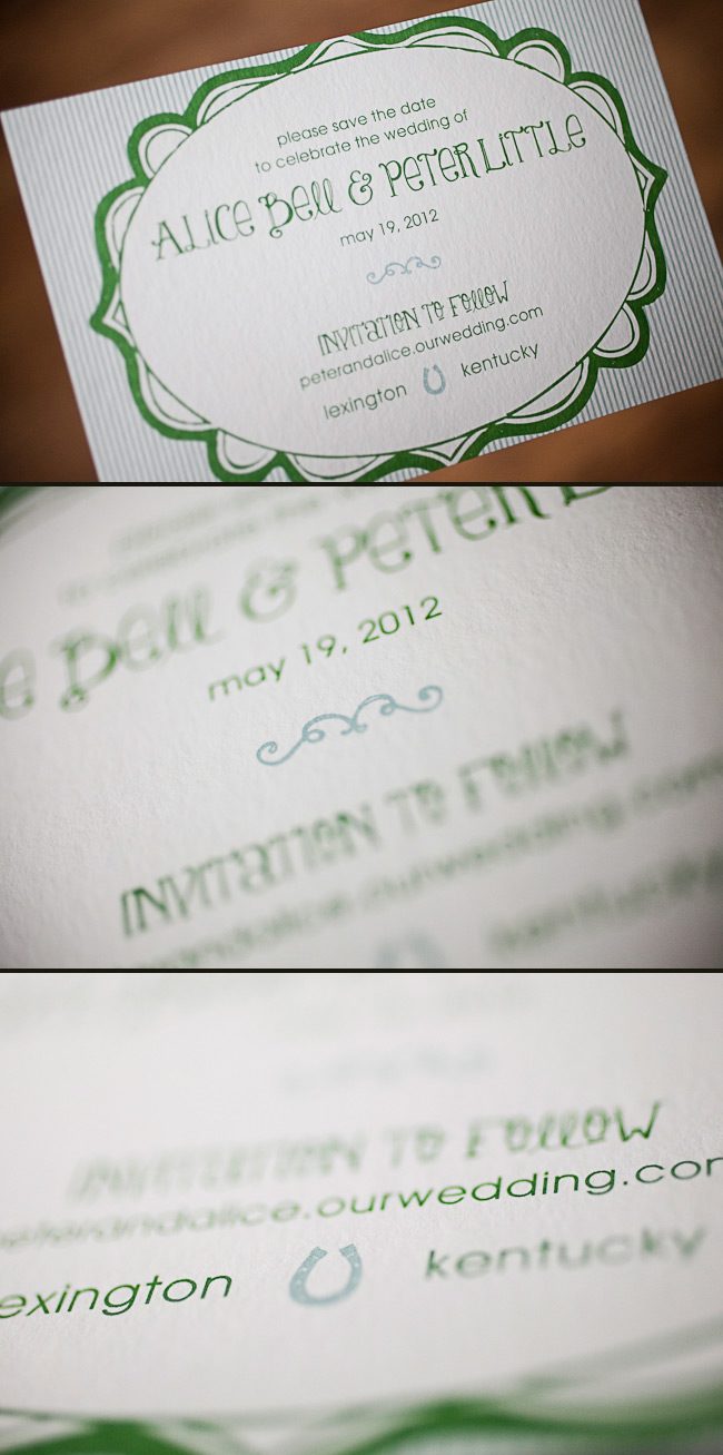
Cori at Social Graces in Nashville, Tennessee sent us this adorable Odin customization! These offset printed save the dates are both personalized and creative, and were printed in a very cool color palette of our sea mist + grass inks. When we asked Cori what inspired this design she told us that the bride was drawn to the fun font style and whimsical frame, and loved how these elements balanced the striped background. The wedding reception will be on her family’s horse farm, so the couple thought it would be appropriate to include a horseshoe. Here at Smock, we believe these save the dates are lucky! Common legend is that keeping the ends of a horseshoe point up keeps all of the good luck in. Congrats to the lucky bride and groom, and bravo to Social Graces for such an inspired design!
inks: sea mist + grass | fonts: mack + louise | paper: 1-ply white bamboo | printing: offset | size: s6

This design won an honorable mention in our Smock design competition for the first half of 2012. This twice-a-year competition recognizes outstanding and inspired designs submitted by our beloved dealers.
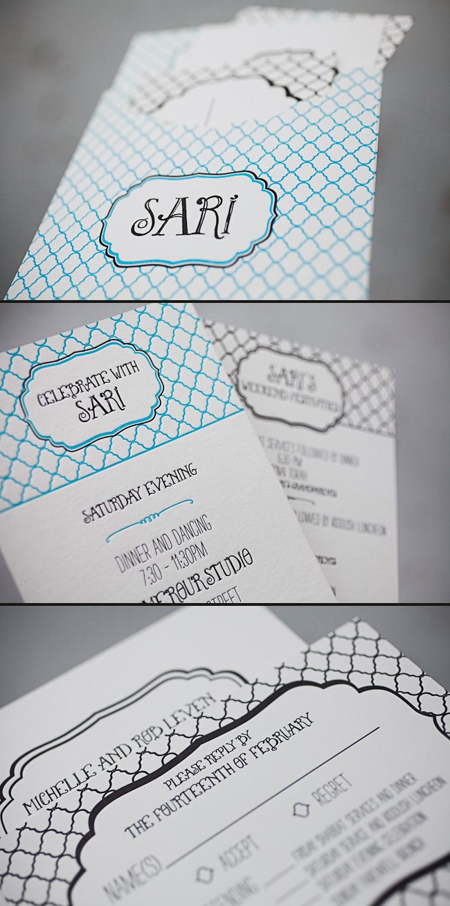
We have the lovely Jenny from Jenny’s Paper, Ink! to thank for these incredible letterpress Bat Mitzvah invitations that we recently had the pleasure of printing. The invitations have a sweet, youthful look and feature fun fonts and bold colors. Jenny said the inspiration for these Bat Mitzvah invitations began with a custom sleeve – Sari fell in love with the idea of keeping the entire invitation set together without using a typical folio or bellyband. From there, they created a logo that could be used throughout the event by pairing our Louise font with our Dawson cartouche. Next came the patterns and colors — Sari’s favorite color is blue, so robin’s egg was a perfect choice, and adding black as a second ink color gave the invitation a bold look. The Champlain pattern was used in different ways throughout the entire set, and complemented the playful fonts and bold ink combination beautifully. The finished product was amazing and set the tone for a fabulous weekend with family and friends. Congratulations and thank you to Jenny for sending us such a stunning invitation set!
inks: robin’s egg + black + inkless blind deboss | fonts: percy + louise | paper: 2-ply white | printing: letterpress | liner: custom liner pattern in robin’s egg + black | custom sleeve: champlain pattern with dawson cartouche | size: s7 for sleeve

This design won an honorable mention in our Smock design competition for the first half of 2012. This twice-a-year competition recognizes outstanding and inspired designs submitted by our beloved dealers.
We featured these stunning letterpress invitations back in October and are thrilled to show them off one more time as a design contest honoree! This sophisticated set was sent to us by Darcy at Pearl Beach Paperie in Orlando, Florida, and features charming vintage airplanes and a rich color combination of cherry and black inks. The swirls and flourished fonts set a whimsical tone which balances the chic gold stripes printed on the folios and envelope liners. Congratulations and thank you to Pearl Beach Paperie for sending us such a lovely invitation set!
ink: cherry + black | fonts: custom| paper: 2-ply ivory | printing: letterpress | folio exterior: custom pattern in cherry | folio interior: custom pattern in gold | liner: custom pattern in gold |invite size: 5.125 x 7.75 |

This design won an honorable mention in our Smock design competition for the first half of 2012. This twice-a-year competition recognizes outstanding and inspired designs submitted by our beloved dealers.
Our fabulous friends at By Invitation Only in Little Rock, Arkansas submitted these custom save the dates to us for printing! We were completely blown away when we saw the end result — we knew these had to be a part of our annual design contest. These save the dates were actually printed for Paige – one of the lovely ladies at By Invitation Only. It was our pleasure to work on save the dates that just overflow with sweetness.

Choosing our smaller card size (S5) is a wonderful way to help keep costs down and with this set, the smaller card really worked – since the back of the card reads small card, big party – and with letterpress on both the front and back these save the dates are so beautifully textured and without a doubt, one of a kind!
inks: papaya + pms 333 | fonts: smock clermont + mack | paper: 2-ply ivory | printing: letterpress – both sides | liner: custom pattern in papaya | size: S5
This design won an honorable mention in our Smock design competition for the first half of 2012. This twice-a-year competition recognizes outstanding and inspired designs submitted by our beloved dealers.


