Last summer we collaborated with California based wedding planner Amy Nichols to create a gorgeous lavender inspiration shoot that’s been featured on both Martha Stewart Weddings and Elizabeth Anne Designs! Our Ingalls suite helped set the tone for the shoot, which took place at Amy’s parents’ avocado and lemon ranch in Santa Paula. Inspired Southern California’s lavender fields, the shoot featured a wide range of purple shades — from the candles to the flowers and even the napkins! Many thanks to Amy for including us in this beautiful shoot!


Photography – Gertrude & Mabel Photography | Event Design and Planning – Amy Nichols Special Events | Floral and Prop Styling – Kelly Oshiro with flowers from Florabundance | Stationery – Smock | Calligraphy –Anne Robin Calligraphy | Day-of Assistance – Smith + James Events | Furniture Rentals – My Lovely Events | China, Copper Trays, and Cake Stand – the Ark | Flatware and Gold Trays – Otis + Pearl Vintage Rentals | Linens – La Tavola Fine Linen | Candles – Creative Candles | Napkins and Gift Bag – The Loveliest Co. | Ribbon – Silk & Willow | Gowns – Alice Temperley | Ring Box – The Mrs. Box | Clutches – Cuyana | Desserts – Marie Shannon Bakery | Edible Flowers – Gourmet Sweet Botanicals | Signage – Be Curious Designs | Tote – Lands End | Hat Box – Trousseau & Co.
We worked with Kara at Nest Paper Studio to create these custom wedding invitations for a November celebration at the Annesdale Mansion in Memphis, Tennessee. In order to create a thick, 2-ply piece, we digitally printed both pieces of the invitation in a flood of hazel ink, then duplexed the two pieces together. The invitations feature our popular tawny matte foil stamping for both the text and the edge treatment, adding a sophisticated metallic touch. A hazel watercolor envelope liner tied the entire set together, which set the tone for this elegant fall affair.


letterpress ink: hazel | digital ink: hazel | foil color: tawny matte | fonts + design: lilla + sans capitals + mason, custom library-based design | paper: 2-ply ivory (duplexed invitation) | size: S-8 + S-5 | envelope liner: water color 9 pattern in hazel | customization #28643 | Nest Paper Studio
Jade and Matthew combined two of our designs to create their elegant wedding invitations. Their invitations and combination reply + reception cards feature our Galena design, with design accents highlighted in subtle pearl shine foil. We created a Gosford stlye invitation sleeve featuring the names of the bride and groom inside of a simple cartouche and surrounded by the pattern from our Avella design. Metallic glass envelope liners added a final hint of shimmer to this timeless set.


letterpress ink: pewter | foil color: pearl shine | fonts: Smock Plaza + Cranbrook | paper: 1-ply + 2-ply white | size: S-8 + S-5 | sleeve: avella design in pewter letterpress + pearl shine foil; gosford style | envelope liner: metallic glass | customization #28037 | No Regrets
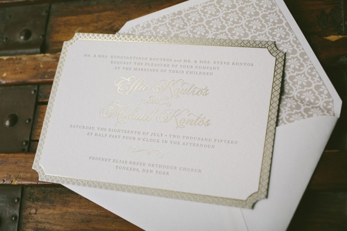
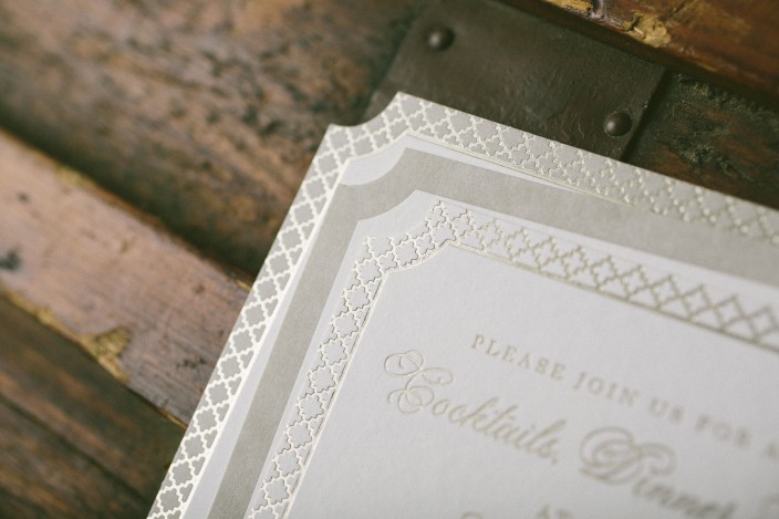
Our Halifax design took on a glamorous new look for Effie and Michael’s elegant summer wedding. We created a solid letterpress border around the invitation, then foil stamped a quatrefoil styled pattern on top. The reply card and reception card both mimicked the invitation, with the former picking up the letterpress border and the latter using the same foil border, making for a cohesive set across the board. We letterpress printed flat social notes featuring the names of the bride and groom in our Plaza calligraphy font by Sarah Hanna to round out the couple’s stationery suite.


letterpress ink: jute | foil color: tawny matte | fonts: Smock Plaza + Wallis | paper: 1-ply + 2-ply white | size: S-8 + S-5 | die-cut: belmont | envelope liner: grayling pattern in jute | customization #28262 | Yes I Do!
Samantha and Thomas selected a romantic blush color palette for their July wedding. The couple celebrated at the bride’s family home, and worked with Sweet Paper to customize our Chapman suite. We created chevron invitation sleeves to contain their set, which included invites, reply cards, brunch cards, direction cards, and welcome dinner invitations. Finishing touches included our pink vintage rose patterned envelope liners and corner rounding for a soft, polished look.


letterpress ink: shell | foil color: tawny matte | blind emboss | fonts: Smock Plaza + Barnes | paper: 1-ply + 2-ply ivory | size: S-8 + S-6 + S-5 + S-3 | sleeve: van pattern in dove letterpress; juliette style | corner rounding | envelope liner: pink vintage rose print | customization #27572 | Sweet Paper
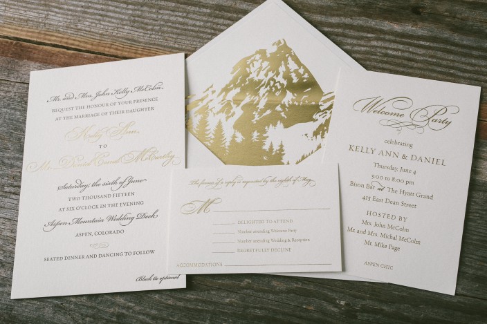
For their Aspen wedding, Kelly and Daniel worked with Byrd and Bleecker to create a timeless invitation suite with a dramatic envelope liner. We printed their suite in gold matte foil and espresso letterpress ink, and created an invitation, reply card, and welcome party invitation. The couple kept the invitations and additional pieces simple, opting for a chic, text-based design, and showcased the Rocky Mountains on their stunning gold foil envelope liners.


letterpress ink: espresso | foil color: gold matte | fonts: submitted | paper: 1-ply + 2-ply ivory | size: S-8 + S-6 + S-5 | foil envelope liner: custom artwork in gold matte | customization #26938 | Byrd + Bleecker
Leanne and Joseph worked with Appleberry Press to create their intricate letterpress wedding invitations depicting their wedding venue, Ballymagarvey Village. Printed in classic black ink, the invitations include incredibly fine detailing — right down to the idyllic ivy vines growing along the house! Lush gold florals added a romantic touch to the invitation envelopes, and continued on to the envelope liners.


letterpress ink: black + gold | custom artwork + fonts: submitted | paper: 2-ply ivory | size: S-8 | envelope liner: custom pattern in gold ink | customization #25057 | Appleberry Press
We’re still all about the ever-popular metallic trend, and can’t get enough of the gold, silver, and copper invitations we’ve been printing these days. One of our favorite shiny metallic looks though? Rose gold – which is why we love this take on our Spence design. Ariel and Joshua worked with Marissa Allie Designs to create their rose gold wedding invitations and reply cards. We printed subtle envelope liners with our vintage world map pattern in jute to match. We love the end result!


letterpress ink: jute | foil color: rose gold shine | fonts: Cooper + Smock Ruby | paper: 1-ply + 2-ply ivory | size: S-8 + S-5 | envelope liner: vintage world map pattern in jute | customization #25779 | Marissa Allie Designs
We customized our Fremont design for Ryan and Christopher’s autumn wedding at the Brant Point Lighthouse on Nantucket Island. Their letterpress suite was printed in olive ink, and we created striped envelope liners in olive and sage inks to complement the stripes used throughout the set. In addition to the invitations, we created folded social notes with a simple monogram, website cards, an events card, and reply postcards. Each piece featured varying stripe designs, and our oak leaf motif added a seasonal touch to these simple yet sophisticated wedding invitations.


letterpress ink: olive | fonts: Percy + Sargent | paper: 1-ply + 2-ply white | size: S-8 + S-6 + S-5F + S-3 | envelope liners: stripe 2 pattern in olive + sage | customization #24538 | Parchment Fine Papers
Danna and Michael treated their guests to a casual 4th of July barbecue for their wedding last summer. We digitally printed a custom map complete with adorable illustrations that was adhered to a red, white and blue invitation folio. Their barn party wedding invitations were actually inserts for the folio, and included a phone number for RSVPs. We love the checkered look on the outside of the folio — perfectly fitting for a barn party celebration!


letterpress ink: cherry + royale | fonts: Ruby + Barnes | artwork: submitted | paper: 1-ply white | size: S-8 + S-6 | folio exterior: custom pattern in cherry; folio interior: fleming pattern in royale | customization #22078 | Arabesque


