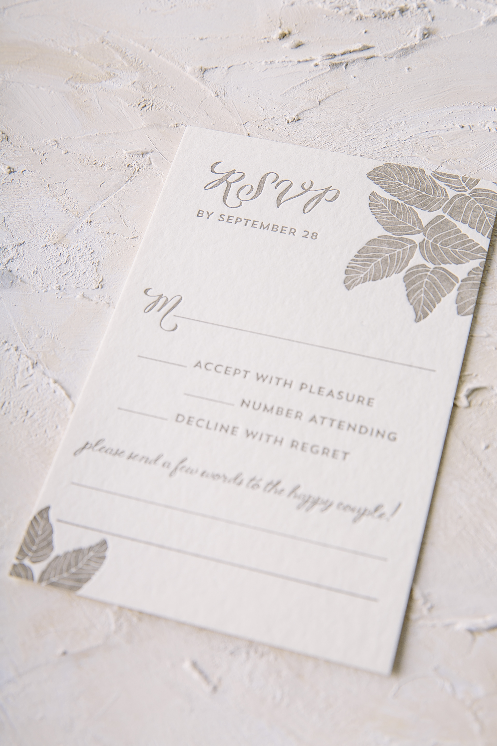
This past October Jori and Christopher were married at Architectural Artifacts in Chicago. Their venue is filled with a combination of formal yet vintage touches throughout and their refined letterpress wedding invitations reflected the space perfectly. Our Bristen design originally uses Sand letterpress only on the leaf motif, but this couple decided to change it up by throwing Taupe and Tawny Matte accents within the mix as well. To give the traditional invitation layout a little something extra, Tawny Matte was also added to the names of the bride and groom to make them shine among the rest. Guests will find the same leaf motif added throughout the rest of the set to keep everything cohesive and interesting to the eye. Thanks to the help of Quintessence Fine Papers and Gifts, we were able to create an incredibly sweet suite.


Letterpress ink colors: Sand + Taupe | Foil stamping color: Tawny Matte | Fonts: Smock Ruby + Woodland | Design: Bristen | Paper: 2 ply bamboo | Size: S-8 | Customization: 39441 | Quintessence Fine Papers and Gifts
We can never get enough of patterns that have something to say. Our Sheridan design is all about pushing that envelope even further with its modern geometric flair. Melissa and Yuki decided that this design would be the perfect fit to reflect their wedding held at the Four Seasons in Scottsdale, Arizona. A digitally printed marble sleeve with Bronze Shine accents gave everything a home in a chic way. While the same contemporary pattern printed on the sleeve was carried onto the reply envelope as well as the menu. The unique diamond structure was used as the actual shape of the menu for another wow factor within their wedding stationery. Thanks to the help of Mrs. Post Fine Stationery & Gifts, we were able to create a suite that will surely leave their guests talking.


foil stamping color: bronze shine | digital ink color: cmyk | letterpress ink color: taupe | fonts: Gotham, Mina, Avenir | paper: 1 ply white bamboo | size: S8-Q | customization: 36774 | Mrs. Post Fine Stationery & Gifts
These sophisticated gender neutral baby shower invitations from Georgia Ann’s Paperie pair pewter and taupe letterpress inks on our ivory bamboo paper. We worked with Georgia to create a custom design using fonts and elements from our design library (like our lamby motif and our pavee border), and created a playful patterned envelope liner using our fleming pattern to match the whimsical invitation design.


letterpress inks: pewter + taupe | fonts + design: flora + woodville, custom design | paper: 1-ply ivory bamboo | size: S-6 | envelope liner: fleming pattern in taupe | customization #33389 | Georgia Ann’s Paperie
A stately venue calls for a stately invitation! For Melissa and Geoffrey’s rehearsal dinner at The Colonnade Inn — an elegant estate that dates back to the 1870’s — we created a custom version of our Haynes rehearsal dinner invitations. A vintage world map pattern was used for the envelope liners, which accentuated the old-world charm, while hints of tawny matte foil and classic fonts combined for a modern yet timeless look.


letterpress ink: taupe | foil color: tawny matte | fonts + design: stockton + carrington, haynes design | paper: 2-ply ivory | size: S-6 | envelope liner: custom world vintage map pattern | customization #29974 | The Papery of Philadelphia
Kyle and Nicholas customized our Chapman design for their springtime wedding at Current at Chelsea Piers. We printed their taupe and navy letterpress wedding invitations on our white bamboo paper. Sleek fonts, a square shape, and a simple striped envelope liner completed the minimalist, modern look that the couple was going for.


letterpress inks: taupe + navy | font: greenaway | paper: 1-ply + 2-ply white | size: S-8SQ + S-5SQ + S-5 |envelope liners: stripe 2 pattern in taupe + navy | customization #26138 | Judy Paulen Designs
We worked with Michael and Jessica from JCG Events to create these darling letterpress baby shower invitations for their shower! The invitation features Ruby — one of our exclusive calligraphy fonts — in taupe letterpress ink, and was edge painted in neon pink ink. The return address was also printed in neon pink ink, and the couple had the envelopes addressed in neon pink ink to match. They even purchased vintage postage to match the look of the shower (including an Audrey Hepburn stamp – for baby Audrey!). For the celebration, Jessica and Michael hosted a beautiful, Italian-inspired event at Villa Woodbine in Miami, complete with vibrant centerpieces, a DIY headband station and a gelato cart. Head over to Style Me Pretty to see more photos and details from this beautiful baby shower! 
These small, squared letterpress save the dates were submitted to us by our friends at Union Street Papery. Both cards are foil edged in gold matte which enhances the gold grommets used to keep the weekend details and save the date information all in one place.
ink: taupe | font: cranbook + Plaza calligraphy font | paper: 2-ply white | size: S-SQ5 | offset liner: grand mondsee in apricot | foil edging: gold matte | gold grommets | customization #: 16285 |

What happens when you mix die cuts, letterpress, offset, edge painting, envelope liners and a signature calligraphy font? A stylish update to our Fitzroy wedding invitation! That’s exactly what The Inviting Place dreamed up and we were thrilled to create this customization.
inks: taupe + papaya | font: plaza calligraphy font | paper: 2-ply ivory | invite size: s-8 | back pattern: sherbrooke in sea mist offset | die cut: plymouth | offset liner: amble in papaya | edge painting: sea mist | customization #: 15328 |

No Regrets seems to show no bias toward any embellishments, managing successfully to incorporate so many into one design! Letterpress, Offset, Foil, Edge Paint, Back patterns, Custom liners….if there was ever a need to show how to combine all of these options without making a design seem too busy or cluttered, this would be it.
letterpress ink: taupe + papaya | foil: silver shine | fonts: cecilia + lawrence + carrington | paper: 2-ply ivory | printing: letterpress + foil | offset back pattern metallic silver | edge painting: metallic silver | offset liner: taihu in papaya | invite size: S8-Square | customization #: 15356 |

Poeme in Cincinnati, Ohio submitted this beyond beautiful letterpress Robson suite for printing. We adore the soft, subtle combination of our taupe and papaya inks on this set. This set is kept looking classic with traditional font choices. Toss in papaya edge paint on the invitation, another splash of color on the invitation back pattern and a colorful envelope liner – this set truly has everything to make it complete.
inks: taupe + papaya | fonts: cameron + lazlo | paper: 2-ply ivory bamboo | printing: letterpress | edge painting in papaya | corner rounding | back patterning: robson in pool |liner: the taihu pattern in pool | invite size: S8


