Photo save the dates are a great way to share engagement photos with family and friends while giving them a heads on your wedding date and location. They’re also an ideal way to share your wedding website, which can include directions, accommodations, photos, sweet stories, registry info, and more. Today we’re sharing a few of our favorite photo save the dates to give you some ideas on ways to customize your own!


Go big: Ashley and Klint chose our larger S-8 invitation size for their photo save the dates, and added tawny matte foil for an extra touch of glamour.
digital printing / CMYK process + tawny matte foil | white bamboo paper | 5.75 x 8.375 | #26222 | No Regrets

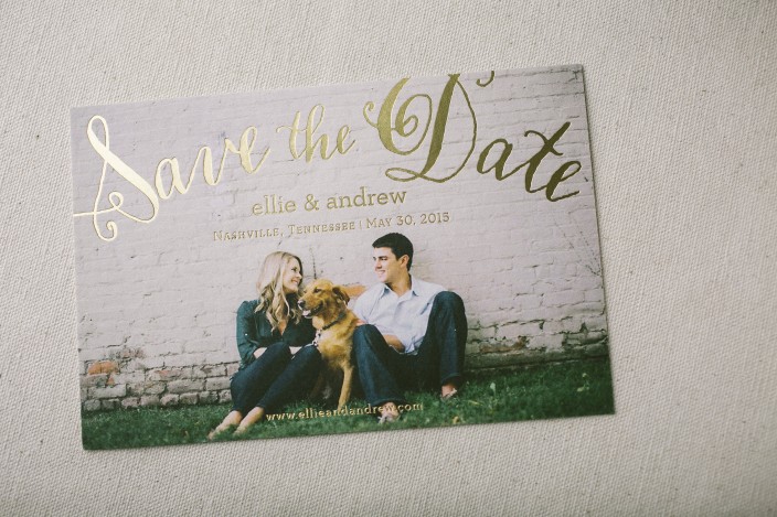
Make it personal: Ellie and Andrew included their adorable dog on their custom photo save the dates, and used our Stella calligraphy font to add a touch of whimsy.
digital printing / CMYK process + gold matte foil | white bamboo paper | 4.5 x 6.75 | #25667 | Hitched

Show the locale: These scenic photo save the dates gave guests a peek at the beautiful scenery to come for Nathalie and Neil’s Napa Valley celebration.
digital printing / CMYK process | white bamboo paper | 4.5 x 6.75 | #25170 | Rugg Road Paper Company

Share your story: Tory and Andy got married in the place they met as teenagers – and added their wedding website to their save the dates to help tell their love story!
navy digital printing / CMYK process | white bamboo paper | 4.5 x 6.75 | finn envelope liners in navy | #25467 | Gus & Ruby Letterpress

Keep it classic: Laura and Justin combined letterpress printing and digital printing for their Ashbourne save the dates, and went for a timeless look by using a black and white photo.
digital printing / CMYK process + pewter letterpress | white bamboo paper | 4.5 x 6.75 | #25756 | Write Selection

Tie it all together: Tanya and Matthew took advantage of our 6+ printed pieces discount (and saved 10%!) for their wedding stationery. They printed their save the dates and their Barnesly invitations at the same time, and tied it all together by matching the fonts and adding blue to their save the date envelope liners to match the blue watercolor wash on their invitations.
digital printing / CMYK process + gold matte foil | white bamboo paper | 4.5 x 6.75 | clairveaux envelope liners in pool | #25307 | The Dandelion Patch
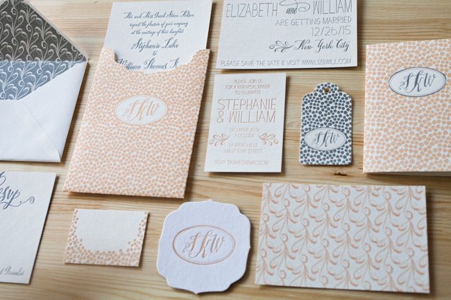
Abby and Greg worked with Gus & Ruby Letterpress to customize their petite silver foil wedding invitations. They chose our Chablais design for their New Year’s Eve wedding, opting for a smaller S-6 size invitation and coordinating reply cards. Chablais patterned envelope liners were printed in apricot ink to match the letterpress accents featured on the invitations.


letterpress ink: apricot | foil color: silver matte | fonts: Smock Stella + Harper | paper: 1-ply white | size: S-6 + S-5 | envelope liners: Chablais pattern in apricot | customization #24684 | Gus & Ruby Letterpress
We worked with The Social Page to create these sleek custom wedding invitations for Amanda and Christopher’s country club celebration. The couple customized our Chablais invitation with silver matte foil and black ink, and used our Stella calligraphy font to emphasize key text throughout the suite. A custom map was included on the directions card to help guests find their way, and a chevron patterned envelope liner added a chic finishing touch!

letterpress ink: black | foil: silver matte | fonts: smock plaza + harper | paper: 1-ply white | sizes: S-8sq folio + S-6sq + S-5sq | folio exterior: pearl pattern in blind deboss | folio interior: unprinted | envelope liners: van pattern in black ink | customization #:18384 | Social Page
Printed in striking indigo shine foil, these Chablais rehearsal dinner invitations from The Write Touch are both festive and fun. Chevron patterning on the back of each card and a playful envelope liner add decorative elements to this otherwise streamlined invitation set.

letterpress ink: dove | foil: indigo shine | fonts: stella + kipling | paper: 1-ply white bamboo | printing: letterpress + foil stamping | sizes: S-5 + S-6 | envelope liner: pearl in azure ink | customization #: 17332 | The Write Touch
Here at Smock, we’ve developed six exclusive calligraphy fonts based on the actual penmanship of master calligraphers. New for the 2013 wedding season are two brand new calligraphy fonts: the Smock Stella and the Smock Plaza. Last week, we gave a behind-the-scenes look at Sarah Hanna’s inspiration for the Smock Plaza, and today we’re sharing Kelle Ann McCarter’s inspiration for the Smock Stella font.
How did you develop the Stella Hand for Smock?
I spend much time developing new styles of calligraphy and experimenting with different types of calligraphy nibs. I normally think of a character or personality and then try to translate it to the lettering. In “Stella”, I envisioned the French American stage and movie actress Claudette Colbert. I wanted her to be strong, quirky, independent, playful- perhaps with a touch of mysterious contradiction; one who has self-possession and is comfortable in any setting; understated without excessive flourish.

The inspiration behind Stella:
I purchased some vintage straight pins and the packaging design in which they were enclosed showed a lovely lettering- dainty and spritely. I was smitten with the movement and simplicity of the strokes. I knew I wanted to create something in this vein which is different from my other calligraphy styles.

(sources from left to right: decor | Claudette Colbert | clutch and jewels | dress | cake )
What kind of weddings do you picture this font used for?
Since “Stella” was conceived to be a well-rounded lady, she can be used in any wedding – from modern to vintage to formal. For example, in the current issue of Brides Magazine, “Stella” in foil stamping is shown as a perfect pairing for a black-tie soiree.

Visit a Smock dealer today to see the Smock Stella font (and all of our other fonts) in person and get started on your next custom order!


