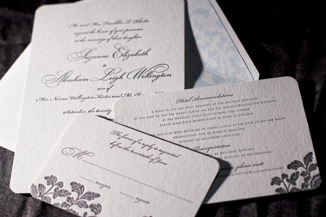
Merging the design elements of Haddington and Rhon, Alyssa from Judy Paulen Designs shows just how to balance a letterpress wedding invitation set.

Particularly stunning was the pale blue of our Lake ink used as an envelope liner which complimented the Pewter of the design and text, making an elegant wedding invitation.

inks: pewter + lake | fonts: bickham swash + bickham script | paper: 2-ply white | invite size: S-8 | liner: ganval in lake | printing: letterpress | edge painting: lake
This design won an honorable mention in our Smock design competition for the first half of 2011. This twice-a-year competition recognizes outstanding and inspired designs submitted by our beloved dealers.
Day three of our design contest brings us an incredibly elegant invitation set – a simple design that looks anything but simple! Hats off to Tasha at The Dandelion Patch for this one.


Coconut ink looks incredible letterpressed in our Champlain pattern, and is an impressive compliment to the Eggplant used throughout the set.

Everything from the square cards to the rounded corners to the elegant script make this quite the eye-catcher.

Thanks again to The Dandelion Patch for sending us this gorgeous customization!
inks: eggplant + coconut | fonts: spence + cooper | papers: 2-ply white | invite size: s-7 square | liner: reversed champlain in eggplant
This design won an honorable mention in our Smock design competition for the first half of 2011. This twice-a-year competition recognizes outstanding and inspired designs submitted by our beloved dealers.
The second honoree in our design contest was sent to us by Ilyssa at Brenda Himmel Stationery. Ilyssa worked with in-house graphic designer Lindsy Aragona to create the custom artwork, and we can’t get enough of these cheery letterpress social notes! The social notes were printed in 3-color letterpress, and combine our Verbena and Grass inks with a custom ink color that Ilyssa selected. The custom artwork printed beautifully, and pairs perfectly with a coordinating Payette liner, also printed in Verbena ink.


The font selection is a perfect complement to the design and looks incredible in letterpress.

Congrats to Brenda Himmel!
inks: espresso + grass + verbena | font: tally | paper: 2- ply white | liner: payette in verbena | edge painting: | printing: letterpress | social note size: S-6
This design won an honorable mention in our Smock design competition for the first half of 2011. This twice-a-year competition recognizes outstanding and inspired designs submitted by our beloved dealers.
We are so excited to kick off another round of the Smock Design Contest! Over the next 10 days, we’ll be honoring some really gorgeous designs that have been sent to us by our Smock retailers. So without further ado, let us begin by showcasing our first honoree!

Joellen and the team at Bennett Schneider, Inc. brought us what may be the perfect color selection for the letterpress wedding Aberdeen suite.


The tangerine ink helps this wedding announcement pop in such a way that it doesn’t overpower the design or distract from the details. Sometimes all it takes is a little tweak to make a letterpressed card look fantastic, and that is just what they did!

inks: tangerine + black | fonts: Spencerian + Cooper | 2-ply ivory | printing: letterpress | liner: payette in tangerine | invite size: S-6
This design won an honorable mention in our Smock design competition for the first half of 2011. This twice-a-year competition recognizes outstanding and inspired designs submitted by our beloved dealers.
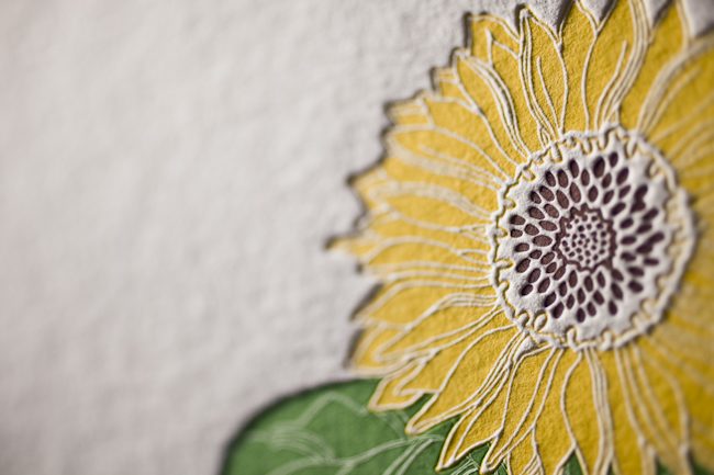
We recently had the pleasure of printing these gorgeous die-cut invitations for our friends at Urban Coast in Florida! These luxe invitations invited local industry experts to a special evening with esteemed wedding and event planner, Bryan Rafanelli. Inspired by our National Stationery Show invitations, we created a beautiful set of invitations and insert cards using one of our new die-cuts, which were neatly packaged in a stunning 2-color sleeve. Taupe and Papaya inks on our white bamboo paper made for a chic, summery look that we just adore.

ink: taupe and papaya | fonts: alice (new for 2011!) and century | paper: white 1-ply bamboo | printing: letterpress | die-cut: chesapeake | sleeve: letterpress, seneca pattern in taupe; marsden cartouche in papaya
We’re so happy to be able to share more photos and highlights of our West Coast travels! It was such a treat to be able to visit Sugar Paper when we were in LA – it’s the most adorable stationery boutique with so much style and charm. Chelsea from Sugar Paper gave us the scoop on what’s trending, what they love & how they’re making the world a better place.

Is there a cause or charity your store supports? Tell us all about it:
Sugar Paper donates to a myriad of charities throughout the year. Our clients are very philanthropic and we support their causes through donations. This year, however, we have chosen pediatric cancer as our personal cause. Jamie and I are both new mothers and a close friend recently lost her baby to a rare form of cancer. Her battle was a tough fight and loss of baby Quinn has left a mark on our hearts.

What about your store are you most proud of? What makes you unique?
We’re proud of the Sugar Paper team. The invitation business is driven by deadlines and our days can be very busy. We feel lucky to work with a group of creative people who work extremely hard and make us laugh every day. Laughter seems to make the load lighter.


What do you predict will be the biggest wedding or stationery trend for 2012?
Hand lettering is HUGE right now. Clients are requesting hand lettered stationery + invitations more and more and we predict this will continue through the 2012 wedding season.

Hottest color palette right now?
The seasons tend to dictate hot color palettes. Right now, Sugar Paper is loving crisp white, khaki and canary yellow.

If someone is visiting your store, what’s another essential stop in your neighborhood?
If you’re visiting our original location on Ensley Avenue, Clementine Bakery is a MUST. The chocolate chip cookies are gooey in the middle and crisp on the edge – our favorite kind. If you visit our Brentwood Country Mart location, the Mart is a destination in and of itself. Caffe Luxxe serves artisanal coffee and Sweet Rose Creamery makes homemade ice cream that will knock your socks off. The salted caramel is our personal favorite.
A huge thanks goes out to Chelsea for filling us in on everything Sugar Paper – if you’re in LA, be sure to stop in!!
**Be like Sugar Paper and support research for pediatric cancer by visiting any of the following foundations:
Pediatric Cancer Foundation
Alex’s Lemonade Stand
Pediatric Cancer Research Foundation
St. Jude’s Children’s Research Hospital
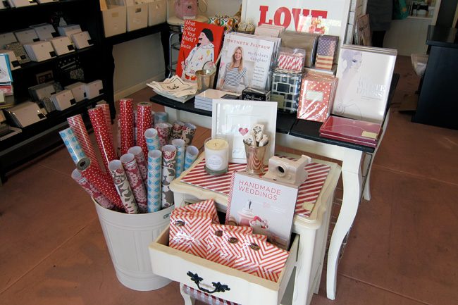
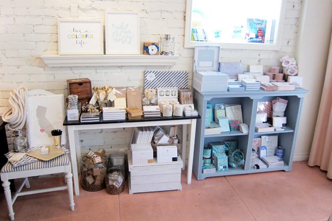
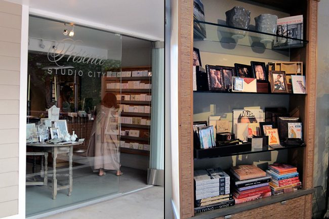
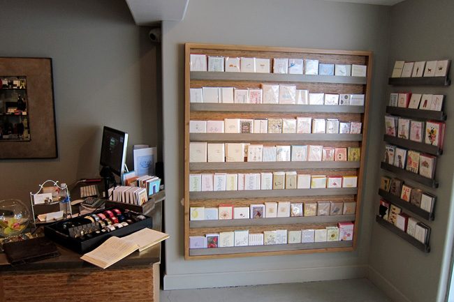
During our West Coast travels, Lindsy and I had the chance to stop in and visit lots of our LA dealers – we were thrilled to be able to stop in to the shops and meet our lovely retailers in person! Today we’re highlighting some images of two of the stores we visited during our trip – we’ll start with Presence Studio City, a stationery and gift shop in Studio City. Presence offers a carefully curated selection of unique gifts – including some gorgeous hardcover books, one-of-a-kind jewelry, home decor, fragrant candles, and more.


We chatted with Kaila from Presence – she was kind enough to tell us more about this sweet boutique!
What about the store are you most proud of?
We try to showcase unique yet affordable gifts that people won’t find anywhere else. We also pride ourselves on our customer service – many of our stationery and gift customers come back on return visits because they were so happy with their experience.
What’s the hottest color palette right now?
We’ve been seeing a lot of blues right now – cool tones of blue paired with silver, lots of navy, some turquoise here and there too. Blue is definitely a popular color right now.


One of our other stops in LA was to Landis Gifts & Stationery – a shop that truly has something special for everyone. Located on Larchmont Boulevard – an area that got its start in the early 1920’s – the shop is nestled into one of the most historic areas in LA and is surrounded by a wonderful mix of boutiques and restaurants.


Edie shared some thoughts about some of our latest products – check out her interview with Lindsy!
[iframe http://www.youtube.com/embed/0Noymj7rL8k 650 370]
We are crazy in love with this great customization of our Lashar design, submitted by our friend Libby from Byrd + Bleecker in Fort Worth, Texas (who we had the joy of seeing last week when she came up for a visit – see the fabulous letterpress coasters made for her while she was here on Boxcar’s blog!). We can’t get enough of the creative ways she uses our designs and motifs to create unique invitations for the lucky couples that walk into her store!
ink: midnight + peacock | fonts: engravers + engravers gothic | paper: 1-ply white | printing: offset | invite size: s-8 |


by Sarah Walroth, In-House Designer.
Although it seems we have just kicked off the summer season, it’s time to start looking ahead to fall weddings that are only around the corner! What about fall inspires you — maybe it’s the foliage or the the cool nights or the feeling of change? One of the things we have been seeing a lot of lately is lots of jewel tones paired with light vintage colors and classic themes, these are all great inspirations for a lovely autumn wedding! We love this pairing of our Eggplant and Antique Gold inks letterpress printed in the Lashar wedding invitation design, submitted by our friends at Inklinations in Manhasset, NY.
inks: eggplant + antique gold | fonts: clermont calligraphy font + cooper | paper: ivory 2-ply bamboo | printing: letterpress


by Racheal Decker, In-house Designer.
Couldn’t make it to the Summer Social at Urbanic? Dying to make your own bundle of fabulous Smock pinwheels? Here’s the how-to!

No great pinwheel is complete without our eco gift wrap – it’s double-sided, so you’ll get bold & beautiful patterns no matter which way you decide to create your masterpiece. Our gift wrap is sustainably printed on 100% post-consumer recycled, FSC-certified paper, so it’s not just pretty, but it’s eco-friendly, too! We’re diggin’ the Sorbet, Pollen and Anchor gift wraps – so perfect for summertime. Pick out your favorite patterns & get crafting today!

Photography – The Why We Love


