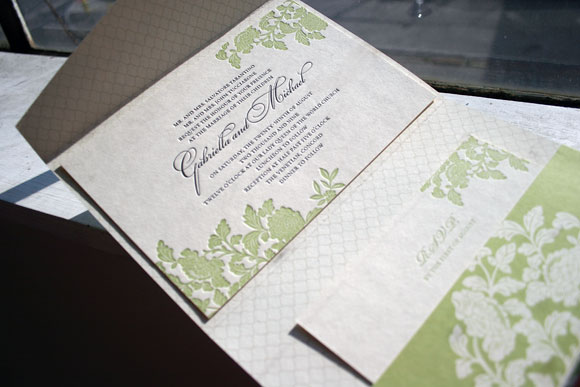
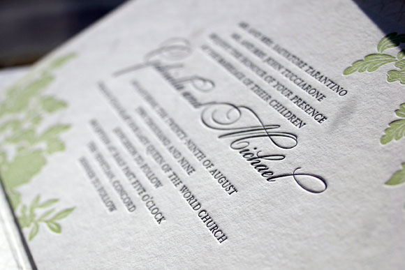
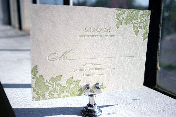
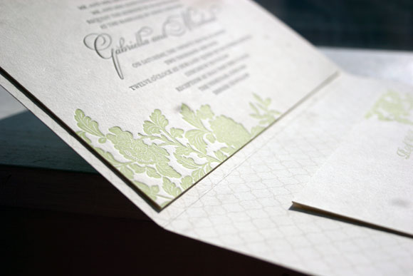
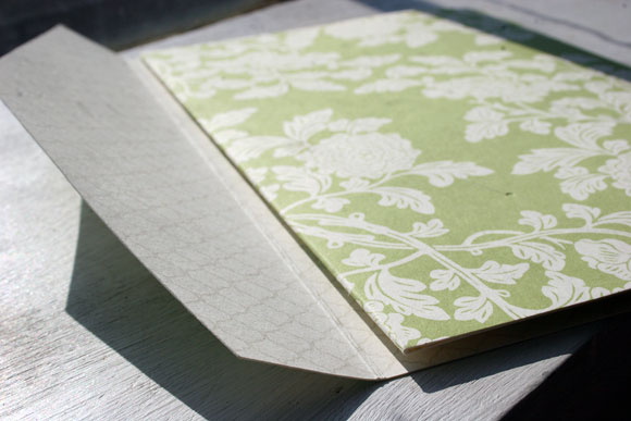
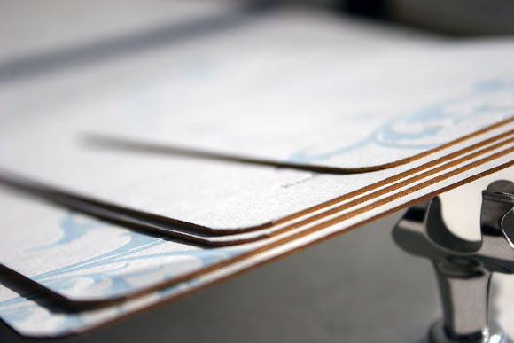
What a wonderful suite we received from our friends at Landis Gifts & Stationery. This Ossa design was customized beautifully on our white bamboo paper, and letterpressed in Lime and Black inks. The invitation and reply card were edge painted in Orchid. The invitation is adhered to an awesome folio, offset printed in our Ashwell pattern in Black on the outside and in our Sherbrooke pattern in Lime on the inside. The final touch of brilliance is the envelope liner, offset printed in our Sherbrooke pattern in Lime to match. This one was a very personal suite as it was printed for the store owner’s daughter. We are so happy to be able to be included in such a special day.
inks: black + lime | fonts: carrington stripes + alice + chaplin | paper: 2-ply white + 1-ply white | printing: letterpress + offset | liner: the sherbrooke pattern in lime | folio exterior: ashford pattern offset in black | folio interior: sherbrooke pattern offset in lime | invite size: S-8 folio

Lose your heart in San Francisco with these recently printed custom letterpress wedding invitations designed by Lindsy Aragona, who is just one of our many wonderful in-house designers. This ultramodern and whimsical set was submitted to us by our great friends at Union Street Papery in San Francisco, California (would you have even guessed?). The San Francisco Bay Bridge is letterpressed in our lovely coral ink and the bubbly persona is carried through onto all pieces. They say people go crazy for a great city like San Francisco-and we’re just as crazy for this imaginative set!
inks: coral + peacock | fonts: clementine and stockton | paper: 1-ply ivory bamboo | printing: letterpress | invite size: S8

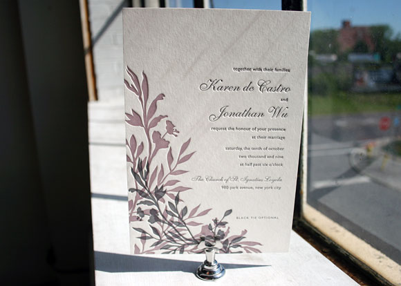
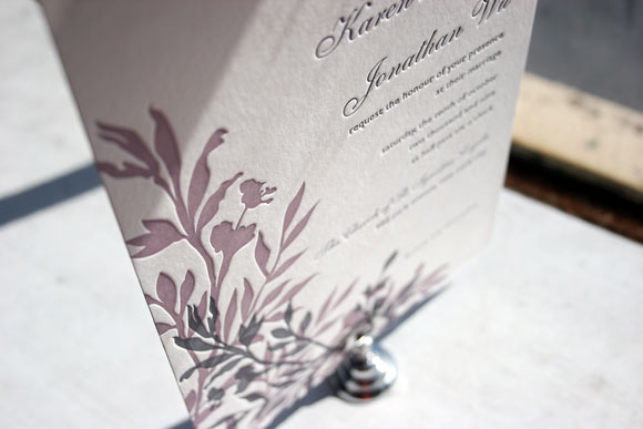
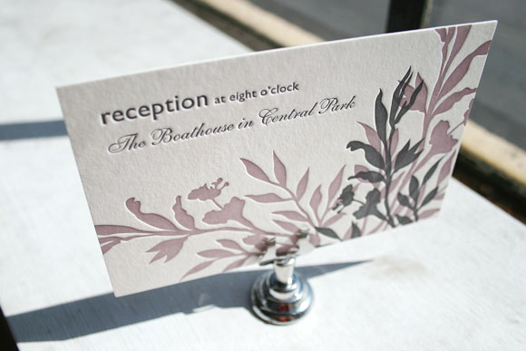
The first of two honorable mentions in our Smock Design Contest brought to us by Judy Paulen Designs at Bloomingdale’s in New York, we’re completely in love with this chic customization of our Engadine letterpress wedding invitation design. It’s printed in elegant wisteria and pewter inks and features our playful Etienne and Shaw fonts for a finished design that is the perfect blend of traditional elegance and modern sophistication. The set also includes a really lovely letterpress reception card that makes the most of a play between the script Etienne font and the clean look of the sans serif Shaw font. It’s minimal and simple, but still fresh and completely chic.


Thanks so much to our friends at Judy Paulen for sending us this beautiful customization!
Continuing with the amazing customizations that were honored as winners in our Smock Design Contest, this incredible Rhon letterpress invitation with custom folio was brought to us by our friends at RSVP Studio in Toronto. Using a horizontal orientation and spring and sand inks, it’s a design that is fresh and fun, but also amazingly elegant.


While the invitation itself features spring and black inks, we printed the letterpress reply card in 1-color, making it a more budget-friendly option without sacrificing a bit of style. We love how pretty crisp spring ink looks on our ivory bamboo paper!

The folio features our Rhon motif in spring on the exterior with a really sophisticated use of our champlain pattern in sand on the interior. This chic combination of patterns and ink colors really made this customization stand out from the crowd.


As always, thank you to the folks at RSVP Studio for this amazing customization! It’s always so very exciting for us to see what our amazing clients and Smock stores dream up!
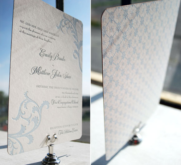
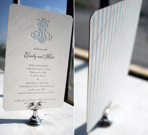
This next runner up in our Smock Design Contest is a true customization, blending all of the beauty of both our Nevis and Vettore letterpress invitation designs into one incredible invitation suite. Brought to us by our friends at Arabesque in Naples, Florida, this customization was a true pleasure for us to print. With an exciting mixing and matching of colors, patterns and designs, this set is truly unique and exudes an undeniable elegance.

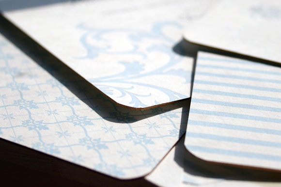
The letterpress invitation itself is our Vettore design, printed in soft lake and midnight inks. The design was shifted to have a vertical orientation and the couple opted for pattern backing in our willoughby pattern in lake. With corner rounding and gold edge painting, every detail was thoughtfully considered. The result? An absolute show-stopping letterpress invitation that we completely love.

Switching it up, the letterpress reception card is in our Nevis design in the same midnight and lake inks, with pattern backing in our seneca pattern. The same corner rounding and gold edge painting make this card just as classically chic as the invitation itself.

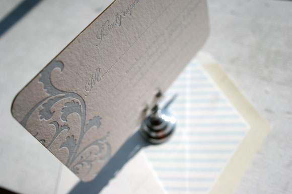
The letterpress reply card is once again in our Vettore design, paired with an envelope liner in our seneca pattern printed in lake to match the pattern backing of the letterpress reception card. The careful pairing of colors and patterns helps this invitation set shine, a truly beautiful and unique reflection of the couple and their wedding.


Thank you so very much to the folks at Arabesque for the privilege to print such an incredible customization. Congratulations on being one of our Smock Design Contest winners!


