Take a peek at these vibrant and high spirited save the dates! We have Melanie at Salutations in Charlotte, North Carolina to thank for these beauties! We were even able to get a bit of a back story to find out where the inspiration came to create a design so eye catching and brilliant. The bride loved the bold pattern of our Evans design and wanted to use our robin’s egg ink color to truly make a statement. We love to see couples choosing more modern and chic designs for their save the dates, even when they’re planning on sending a super formal invitation suite like these guys are planning. The happy couple said that their save the dates totally matched their fun and bubbly personalities — and we couldn’t agree more! Thanks so much to Salutations for sending us such a fun save the date set — we can’t wait to see the invitations!
inks: robin’s egg + black | fonts: chaplin + carrington + smock harrison | paper: 2-ply white | printing: letterpress | liner: the sinclair pattern in robin’s egg | size: S6

This design won an honorable mention in our Smock design competition for the first half of 2012. This twice-a-year competition recognizes outstanding and inspired designs submitted by our beloved dealers.
With a pairing of our navy and azalea inks we have a real beauty on our hands! These lovely letterpress save the dates were submitted to us by our great friends at By Invitation Only in Little Rock, Arkansas. The couple chose our willoughby pattern for the top and bottom of their save the dates – which we think adds a real elegant factor. We can’t get enough of this stunning color combination because it’s not overly feminine and has just a touch of boyish charm – within the navy ink. And we’re all about couples sending their save the dates early – it’s customary to mail save the dates six months to a year before the big day. This allows your guests enough time to book their accommodations, save enough spending money and request time off work. Mailing your save the dates early also allows your guests to count down the days til the “I Do’s”.
inks: navy + azalea | fonts: cahun + shaw | paper: 2-ply white | printing: letterpress | size: S6

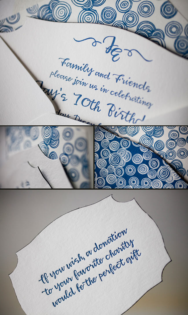
Get ready to blow out those birthday candles! Check out these recently printed birthday party invitations submitted to us by our friends at Judy Paulen Designs in New York, NY. Our plymouth die cut adds even more boyish charm to an already youthful looking birthday party invitation. We can’t get enough of the granby backing patterning in navy, and take a look at the envelope liner in reverse granby in navy-for another super cool customization. Alright now, let’s get the party started!
inks: navy | fonts: smock harrison | paper 2-ply white | invite size: S-6 | printing: letterpress | die cut: plymouth | back pattern: the granby pattern in navy | edge paint: black | liner: the reversed granby pattern in navy

Courtesy of Village Invites in New York, NY this custom letterpress wedding invitation order was fun to see come to life! The vibrant colors (raspberry and turquoise inks) and reverse-printed bellyband created a very unique invitation set for a destination wedding. Jaye and Nathalie are a joy to work with and we are happy to showcase their work when they ask for something that looks this good.
inks: raspberry + turquoise | fonts: stockton + smock harrison | paper: 2-ply white | printing: letterpress | letterpress belly band | square invitation: 7 x 7 |

Celia at Urbanic came to us for these “day of” pieces for a September wedding. Our Odin design was a perfect fit, especially when designed using the right cartouche and blend of our ocean and peacock inks. Carrying the design over to the table numbers and place cards was a great way to make the motifs stand out at the reception.
inks: peacock + ocean | fonts: cecilia + social | paper: 1-ply white | printing: offset | program with cartouche | program size: #10

We were so thrilled when Lily Kesselman (the amazing photographer behind this next real wedding) shared her images of Katie & Jack’s gorgeous New York wedding. Katie worked with our friends at Judy Paulen Designs for their elegant Haddington wedding invitations, which were printed in midnight ink on our white bamboo paper. This wedding is overflowing with preppy sophistication and we can’t get enough of it!


Katie and Jack were married at the Convent of The Sacred Heart on Manhattan’s Upper East Side. After the ceremony, the couple rode to their reception in style in an iconic vintage taxi, while the guests and bridal party headed to the reception on chartered Greyline double-decker buses – complete with champagne and a tour of the city!


Congratulations to Katie & Jack, and thanks again to Lily for sharing these beautiful photos! Be sure to visit her blog to see more photos from their big day:
part 1 |
part 2.
Vendors:
Lose your heart in San Francisco with these recently printed custom letterpress wedding invitations designed by Lindsy Aragona, who is just one of our many wonderful in-house designers. This ultramodern and whimsical set was submitted to us by our great friends at Union Street Papery in San Francisco, California (would you have even guessed?). The San Francisco Bay Bridge is letterpressed in our lovely coral ink and the bubbly persona is carried through onto all pieces. They say people go crazy for a great city like San Francisco-and we’re just as crazy for this imaginative set!
inks: coral + peacock | fonts: clementine and stockton | paper: 1-ply ivory bamboo | printing: letterpress | invite size: S8

This cool Hekla custom letterpress + offset invitation suite was submitted by our friends at Hitched in Washington DC. The invitation is letterpress printed on our bamboo 2-ply paper in black with a blind deboss ink that makes it pop. The edge painting in spring and an offset back pattern in black add to the uniqueness of this piece. To top it all off, they decided to go with one of our new chesapeake die-cuts. It is accompanied by an outer envelope lined with our ashford pattern in spring. The piece that makes this suite amazing is the custom sleeve – offset with our seneca pattern in black.
inks: black + spring + blind deboss | fonts: percy + louise | paper: 2-ply white | printing: letterpress + offset | liner: the ashford pattern in spring | back pattern: the van pattern in black | sleeve: the seneca pattern in black | invite size: S-8 (chesapeake die-cut)


Save the dates should help generate excitement for your special day and these contemporary custom offset save the dates are spot on! The custom artwork for these was submitted to us from our good friends at Papery & Cakery in Boca Raton, Florida these fun save the dates are perfectly personalized. We’re absolutely smitten with the ultramodern and trendy feel of this set. The dark pewter ink helps the spring ink stand out and this color pairing is absolutely enchanting! We love seeing save the dates that express style and these certainly do the trick.
inks: pewter + spring | fonts: custom | paper: 2-ply white bamboo | printing: offset | liner: the seneca pattern in spring | invite size: S-5SQ


We printed these cool save the dates in our Nass design for our friends at Gus & Ruby Letterpress. They are letterpress printed in pewter and a custom lime ink for a fresh, modern look. We love the mix of colors and great typography – big thanks to Gus & Ruby for working with us on this fabulous design!


