We can never get enough of patterns that have something to say. Our Sheridan design is all about pushing that envelope even further with its modern geometric flair. Melissa and Yuki decided that this design would be the perfect fit to reflect their wedding held at the Four Seasons in Scottsdale, Arizona. A digitally printed marble sleeve with Bronze Shine accents gave everything a home in a chic way. While the same contemporary pattern printed on the sleeve was carried onto the reply envelope as well as the menu. The unique diamond structure was used as the actual shape of the menu for another wow factor within their wedding stationery. Thanks to the help of Mrs. Post Fine Stationery & Gifts, we were able to create a suite that will surely leave their guests talking.


foil stamping color: bronze shine | digital ink color: cmyk | letterpress ink color: taupe | fonts: Gotham, Mina, Avenir | paper: 1 ply white bamboo | size: S8-Q | customization: 36774 | Mrs. Post Fine Stationery & Gifts
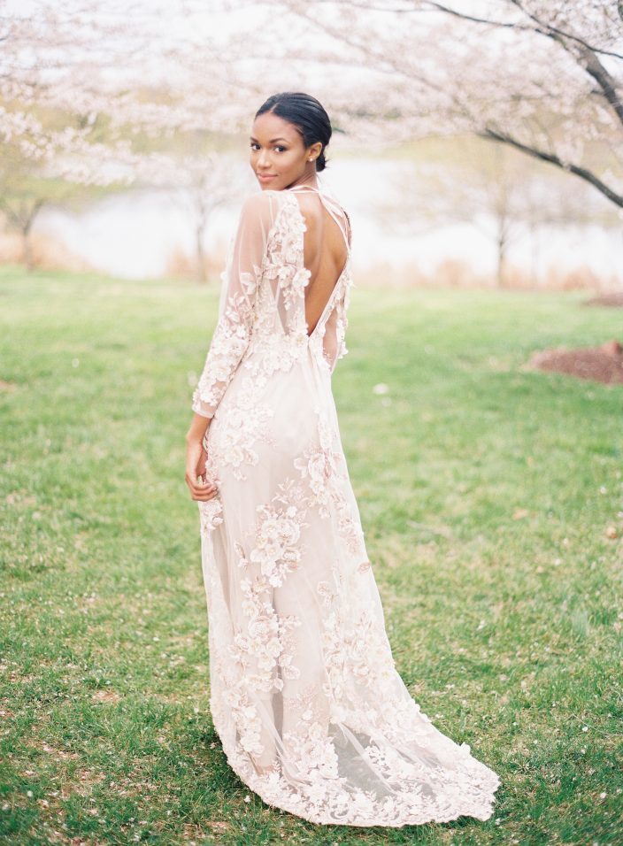
We were thrilled to see our Exeter letterpress wedding menus featured on Style Me Pretty this week! Veronica from Type A Society led the styling and creative direction for the shoot, which was all about springtime cherry blossoms. The floral applique details on the model’s dress gave a nice nod to the cherry blossom theme, while fresh florals made the shoot come to life. Angela Newton Roy captured the entire inspiration shoot beautifully – check out some of our favorite shots below, and be sure to visit Style Me Pretty to see the full gallery!


Photography: Angela Newton Roy Photography | Floral Design: Wild Green Yonder | Creative Direction & Styling: Type A Society | Wedding Dress: Marchesa | Wedding Dress: Gossamer | Veil & Crown: Twigs & Honey | Shoes: Bella Belle | Rentals: Something Vintage Rentals | Invitations + Calligraphy: Written Word Calligraphy | Hair & Make Up: Anna Breeding
We introduced our newest wedding album at the National Stationery Show earlier this month, and we can’t wait for you to see the new designs! The album features 12 wedding invitation suites with styles ranging from modern to vintage to traditional. New fonts, patterns, and colors can be found throughout the new suites, which will be available in stores this summer. Take a look at some of our new favorites!

Above: our new Linden suite features bronze shine foil stamping on our white bamboo paper and a leafy vintage print pattern. The foil stamped menus are printed on our 100% recycled gray paper and complement the suite beautifully!

The new Prospect suite features another new foil color: quartz! Darker than our rose gold foil, quartz has some seriously pink shine, and pairs perfectly with our jute ink.


The vintage prints used on our modern Exeter suite are stunning – we love the classic black letterpress printing combined with the dramatic Dutch painting look of the patterns.

Last but not least, show-stopper Lennon draws on some of our favorite trends: painterly patterns, modern script fonts, and the perfect amount of foil. The suite pairs tawny matte foil with black letterpress printing on the wedding invitation and throughout the suite, which also includes a chic photo save the date.
These new designs will be available on our website soon – be sure to check out our invitation gallery for even more inspiration!
Rocki and Doug personalized our Greely suite with copper shine foil for their November wedding in Texas Hill Country. We worked with our friends at Events to create their wedding invitation suite (complete with reply cards and website cards) along with #10 sized wedding programs, menus, and a cute folded itinerary that we assembled with neutral colored ribbons. They were after a rustic, shabby chic look, and chose a venue with both a whimsical and romantic feel for their big day. The couple chose to highlight the natural rustic beauty of the property by using a neutral color palette and infusing pops of burgundy and rust to tie into the fall season. These are just a few of our favorite photos from their big day, but head over to Style Me Pretty for even more inspiration!


Venue: Creek Haus | Photography: Jenna McElroy | Floral Design: Petal Pushers | Hair & makeup: Nina Fitzgerald with Urban Betty | Cake: Simon Lee Bakery | Band: Royal Dukes Band | Videography: Lizama Videography | Shoes: Jimmy Choo | Bridal Gown Boutique: Joan Pillow Bridal | Wedding Dress: Monique Lhuillier | Catering: Crave Catering | Film Scans: Photovision
We created a full suite for Michael and Craig’s October wedding at the New England Aquarium using different motifs from our custom library. Their custom invitations paired our pewter and ocean inks together on white bamboo paper, with our coral motif and Harrison calligraphy font adding special touches. The other cards in the suite included our sea turtle, fish, and penguin motifs, which gave subtle nods to the venue.


letterpress inks: pewter + ocean | fonts + design: Smock Harrison + Inigo, custom library design | paper: 1-ply + 2-ply white bamboo | sizes: S-8 + S-5 + S-5F + B-3 + #10 + S-3F | envelope liner: metallic platinum | customization #28530 + #29440 | Invitations & Company
Last summer we collaborated with California based wedding planner Amy Nichols to create a gorgeous lavender inspiration shoot that’s been featured on both Martha Stewart Weddings and Elizabeth Anne Designs! Our Ingalls suite helped set the tone for the shoot, which took place at Amy’s parents’ avocado and lemon ranch in Santa Paula. Inspired Southern California’s lavender fields, the shoot featured a wide range of purple shades — from the candles to the flowers and even the napkins! Many thanks to Amy for including us in this beautiful shoot!


Photography – Gertrude & Mabel Photography | Event Design and Planning – Amy Nichols Special Events | Floral and Prop Styling – Kelly Oshiro with flowers from Florabundance | Stationery – Smock | Calligraphy –Anne Robin Calligraphy | Day-of Assistance – Smith + James Events | Furniture Rentals – My Lovely Events | China, Copper Trays, and Cake Stand – the Ark | Flatware and Gold Trays – Otis + Pearl Vintage Rentals | Linens – La Tavola Fine Linen | Candles – Creative Candles | Napkins and Gift Bag – The Loveliest Co. | Ribbon – Silk & Willow | Gowns – Alice Temperley | Ring Box – The Mrs. Box | Clutches – Cuyana | Desserts – Marie Shannon Bakery | Edible Flowers – Gourmet Sweet Botanicals | Signage – Be Curious Designs | Tote – Lands End | Hat Box – Trousseau & Co.
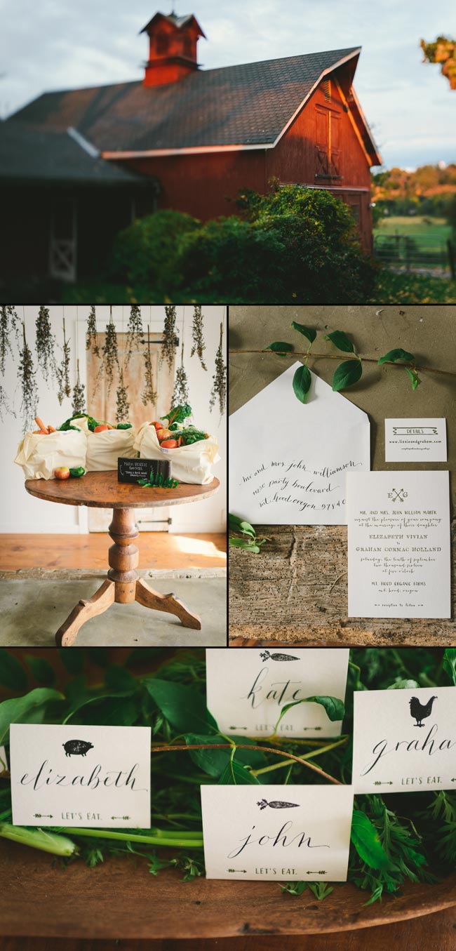
We’re thrilled to share photos from a recent collaboration with the talented Kate Ignatowski that was featured today on Green Wedding Shoes! Our Cimarron letterpress invitation suite help set the tone for this rustic, eco-friendly wedding inspiration shoot, which took place at Pioneer Farm. Kate was inspired by her experience of shifting her business to be more environmentally conscious, so she reached out to a team of earth-friendly vendors to prove that having a wedding with low-to-no impact on the environment is totally possible (and incredibly pretty!). We love the end results – take a look!


Many thanks to Kate for inviting us to be a part of this amazing team!
photographer: Kate Ignatowski // florals: Mimosa Floral // location + farm table: Pioneer Farm // invitations: Smock // assistant: Claire Teator // wedding dress: Kendal Leonard Designs // calligraphy: The Left Handed Calligrapher // gold bracelet + ring: Aquarian Thoughts // models: Brooklyn + Patrick Coats
A lovely double sided menu that features the couples names in navy ink on one side, and then the actual menu details in slate ink on the reverse. The whole shebang was offset printed on a text-weight version of our bamboo paper and submitted by our friends at Seaside Papery.
inks: slate + navy | paper: text-weight ivory | menu size: b-10 | printing method: offset | customization #: 15853 |

Celia at Urbanic came to us for these “day of” pieces for a September wedding. Our Odin design was a perfect fit, especially when designed using the right cartouche and blend of our ocean and peacock inks. Carrying the design over to the table numbers and place cards was a great way to make the motifs stand out at the reception.
inks: peacock + ocean | fonts: cecilia + social | paper: 1-ply white | printing: offset | program with cartouche | program size: #10

Recently featured in Martha Stewart Weddings and showcased on their blog (here and here), we loved working on this stunning summer-inspired custom designed wedding suite with our friends at The Wedding Library. We chose bright and cheerful shades of red and aqua, inspired by a vintage handkerchief with a fun cherry motif. The end creation is bright, elegant and perfect for a summer wedding celebration. We designed and printed letterpress invitations, signage, table numbers, favor tags, and place cards, all perfectly coordinated for the vision of the event and showcasing our Smock Clermont calligraphy font. Another huge thank you to Claudia Hanlin for proposing this fantastic project – it was so much fun and a true honor.


