We know we’ve shared many gorgeous Dawson customizations with you, but we especially couldn’t wait to share this one. With a pairing of our violet and persimmon inks – this invitation is a sure fire hit. We definitely feel the romance reflected from this invitation. This suite was submitted by our friends at Epitome Papers in Edina, Minnesota and each piece is letterpressed on our luxurious 2-ply bamboo paper. We adore that the vibrant and more feminine color palette is carried throughout on the reply cards and reception cards, too. We love seeing couples step outside the box and truly toss in a bit of their own creativity when choosing how to customize their own wedding invitations.
inks: violet + persimmon| fonts: engravers + frida| paper: 2-ply white | printing: letterpress | liner: the mondsee pattern in violet | invite size: S8

This three color letterpress suite featuring blossoming chinese hydrangeas looks delicate and downright romantic. Sent in by our good friend, Sue at Merci for Stationery and Fine Things in Denver, Colorado we were smitten with this suite the moment we saw it come off press. The soft, natural hues used on this set are what have us so in love. Textured blooms on the flowers transform the invitation into something positively nature inspired.
inks: lavender + pewter + spring| fonts: cooper + frida | paper: 2-ply white bamboo | printing: letterpress | corner rounding |liner: the sinclair pattern in lavender| invite size: S8

Here at Smock our Odin design is one of the invitations in particular that we get really excited about seeing customized and personalized. And we feel that our friend, Cheryl at Paper Studio in Ontario, Canada did a fabulous job dreaming up this Odin suite. Letterpressed in taupe and eggplant inks this bilingual set includes an English language invitation and a French language invitation. The back of each card is offset printed in our willoughby pattern in taupe, adding even more personality to this lively suite. The envelopes are lined in metallic camel providing a picture perfect contrast against their wedding colors.
inks: taupe + eggplant | font: claudel + percy | paper: 1-ply ivory bamboo | printing: letterpress |corner rounding |back patterning: willoughby in taupe |liner: metallic camel| invite size: S8

Sometimes it’s softness and subtlety that are key. Check out this overly modern Helani wedding invitation suite submitted by our friends at Stationer of New Orleans in Louisiana. We adore the choice of such a unique color palette – and pairing our mint + peacock inks together worked wonders for this design, making the invitation look almost vintage. Then the couple chose our always popular chalain pattern in mint for their envelope liner – tying this set together so nicely.
inks: mint + peacock | fonts: smock harrison + mack | paper 2-ply white | invite size: S-8 | printing: letterpress | liner: the chalain pattern in mint

The perfect pairing of our azalea and ocean inks really make this letterpressed Aneto invitation set stand out – in a good way! We have our friends at Arabesque in Naples, Florida to thank for sending along such a colorful suite – with a happy go lucky feeling that has us all smiling. We just love the contemporary fonts and a floral motif that provides the most beautiful accented border. And then there’s the reply postcards that help maintain the modern vibe.
inks: azalea + ocean| fonts: gertrude + coombs | paper: 1-ply white | printing: letterpress | invite size: S8

Check out this letterpressed Breton suite submitted by our good friend, Laura at Rugg Road Paper Company in Boston, Massachusetts. We’ve fallen for the warm color palette of saffron and merlot inks. The simplicity of this set is endearing and ever so sweet. The two color border around the invitation creates a perfect frame and we love that this set doesn’t go overboard on design elements. And adding a custom offset liner printed in the same ink colors as the rest of the set adds even more of a romantic feel.
inks: saffron + merlot |fonts: smock harrison + cooper | paper: 1-ply ivory| printing: letterpress | liner: custom pattern in saffron + merlot | invite size: S8

We’d like to thank our friends at The Dandelion Patch in Reston, Virginia for sending us this incredible, nature inspired letterpress suite. Pairing our luscious peacock and pewter inks looks stellar and oh so elegant! Our cameron font is used for all of the text keeping this set more on the formal side. Adding an offset belly band and envelope lining looks divine and maintains the classic feel. The attention to detail on the cascading flowers and flying dragonflies has us head over heels.
inks: pewter + peacock | font: cameron| paper: 2-ply ivory | printing: letterpress | back pattern: the sinclair pattern in raspberry | liner: custom pattern in raspberry | offset belly band |invite size: s7

We have Kerri at Anne Grace Designs in Dallas, Texas to thank for these fabulous letterpress + foil stamped wedding invitations. The pairing of our inkless blind deboss ink and silver shine foil will surely make a bold statement – and it’s breathtaking invitations like this one here that we’re overjoyed to be gushing about.
inks: inkless blind deboss + silver shine foil| fonts: worthington + cameron| paper: 1-ply white | printing: letterpress |invite size: S8

We couldn’t wait to share this downright adorable set sent to us by our lovely friends Samantha and Liz at Gus & Ruby Letterpress in Portsmouth, New Hampshire. Letterpressed in navy ink with playful type, these invitations are overflowing with sweetness. The lime polka dot pattern on the custom offset sleeve gives this set a fun personality. We just can’t get enough!
ink: navy | fonts: strangelove + emma script | paper 1-ply ivory | printing: letterpress | custom sleeve: page pattern in lime offset |invite size: 5.4375 x 8.0625

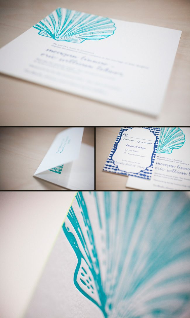
The lovely ladies at Gus & Ruby Letterpress in Portsmouth, New Hampshire submitted these eye-catching custom wedding invitations for printing. The oversized scallop shell gives this suite character and makes such an invitation fitting for the wedding celebration at Wentworth by the Sea Country Club. Talk about matching your invitations to your venue – we think these are a perfect fit! The sea inspired color palette of ocean and navy inks looks striking and sophisticated. We feel this pulls the whole look together.
inks: ocean + navy | fonts: smock harrison and gill sans | paper 2-ply white | edge paint in lime | invite size: S8SQ | printing: letterpress