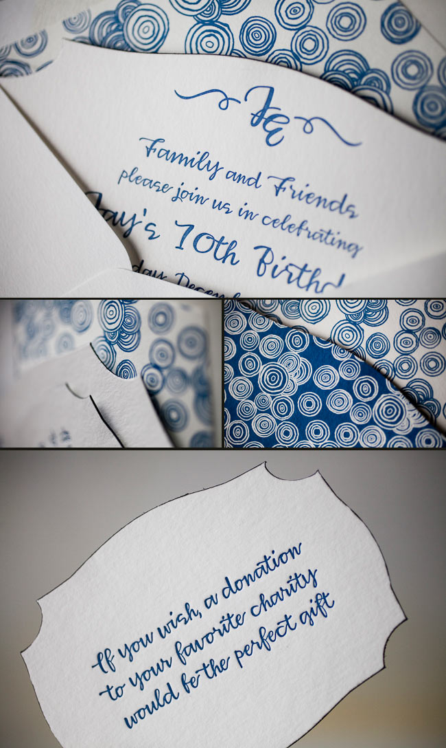
How do you outdo an awesome save the date? Our good friend Niki at Papery & Cakery in Boca Raton, Florida has the recipe. We posted these lovely save the dates for Niki’s sister back in September!!!

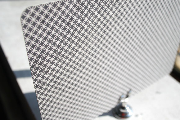
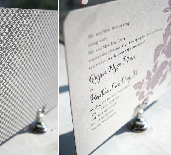
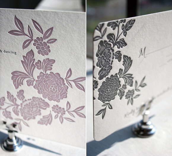
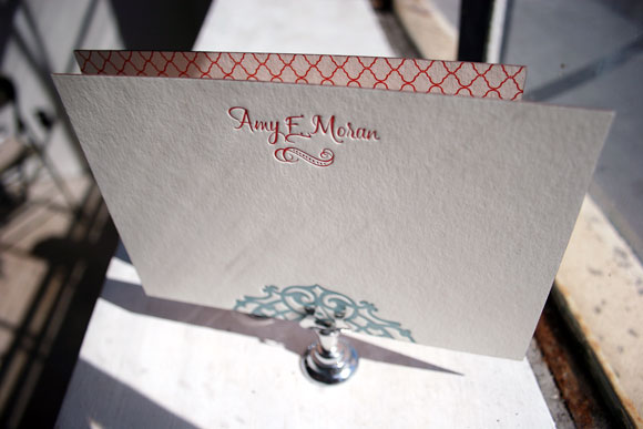
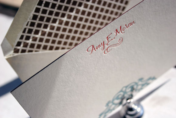
Now that the wedding has passed, we are able to show you the amazing suite she designed, and we couldn’t be happier to share these with everyone! The suite was letterpress printed in our Pewter ink on our beautiful white bamboo 2-ply paper. All of the pieces were fitted with an offset border in pewter and die-cut in our new Chesapeake design. Each piece has a decorative offset backing and is finished with perfect edge painting in Pewter. The invitation, reply cards, and events card are tucked nicely into a custom offset sleeve.
inks: pewter + spring | fonts: submitted fonts | paper: 1-ply white + 2-ply white | printing: letterpress + offset | sleeve: custom pattern offset in pewter + spring | liner: seneca pattern offset in spring | invite size: S-8 sleeve | die-cut: chesapeake

These letterpressed save the dates were submitted to us by our good friend, Aileen at Aileen Invitations in Miami Beach, Florida. Our Rhon design looks truly sensational printed in our lavender and pewter inks. There are certainly times when a softer color palette works best and this is definitely one of those times! We print save the dates for all sorts of occasions and these save the dates happen to be for an engagement celebration. We can’t help but feel that the lavender ink represents gracefulness and charm while the pewter ink helps keep this set looking refined. Purple hues have always been connected to royalty which makes these save the dates all the more classic. The couple chose our payette pattern in lavender for both the offset back patterning and envelope liner – which ties this whole set together nicely.
inks: lavender + pewter| fonts: etienne + auden | paper: 2-ply white | printing: letterpress | corner rounding |back patterning: payette in lavender |liner: the payette pattern in lavender | size: S6

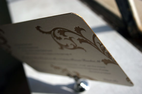
Our wonderful friend Cheryl at Paper Studio in Ontario, Canada submitted this remarkable custom invitation suite to us for printing. It’s easy to get lost in the splendor of this simplistic set because it has the coolest customizations! The couple chose our elegant rousseau pattern for offset backing on their invitation, reply cards-and coordinated this with an envelope liner to match! The gold and taupe inks are perfect for a wedding celebration in the middle of the any season! We also printed what we think are the most adorable and whimsical double sided information cards we’ve seen in quite some time. Choosing a text-based invitation is an excellent way to keep your set looking classy!
inks: gold + taupe | fonts : custom| paper: 2-ply ivory | custom artwork: submitted | printing: letterpress | edge painting in gold metallic |back patterning: rousseau in gold + taupe |corner rounding | liner: the rousseau pattern in gold + taupe| invite size: S8SQ

Get ready to blow out those birthday candles! Check out these recently printed birthday party invitations submitted to us by our friends at Judy Paulen Designs in New York, NY. Our plymouth die cut adds even more boyish charm to an already youthful looking birthday party invitation. We can’t get enough of the granby backing patterning in navy, and take a look at the envelope liner in reverse granby in navy-for another super cool customization. Alright now, let’s get the party started!
inks: navy | fonts: smock harrison | paper 2-ply white | invite size: S-6 | printing: letterpress | die cut: plymouth | back pattern: the granby pattern in navy | edge paint: black | liner: the reversed granby pattern in navy
We think these vibrant Delano Bat Mitzvah invitations are perfectly stylish and feminine. This ultramodern set was submitted to us by our good friends at Proper Notice in Roslyn Heights, New York. The striking color pairing of our orchid and hot pink inks is down right charming. We definitely love unique and clever Bat Mitzvah customizations-especially when they’re this pretty!
inks: orchid + hot pink| fonts: smock harrison + graham | paper: 2-ply white | printing: letterpress | back patterning: hoveton in orchid |liner: the hoveton pattern in orchid | invite size: S8

Brought to us by our lovely friends at Urbanic Paper Boutique, this next honoree in our Smock Design Contest is a customization of our Helani letterpress wedding invitation design. We love the gorgeous color palette, printed in azalea and pewter inks, and the fun mixing and matching of patterns. The letterpress invitation itself is printed in 2-color letterpress with patterned backing printed in azalea ink in our willoughby pattern. The reply post card was printed in 1-color letterpress in azalea ink with a sweet little accommodation card printed in pewter ink. For the perfect finishing touch, the envelope was lined in our champlain patterned printed in pewter.
Thank you so much to Urbanic for allowing us the great pleasure of printing this letterpress invitation suite. To learn more about this amazing Smock dealer, check out their recent Smock Store Spotlight feature.
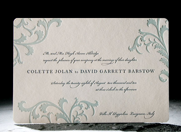
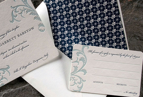
Finally, the moment you’ve been waiting for breathlessly for weeks – it’s time to wrap up our first ever Smock Design Contest by sharing our first place winner! This absolutely stunning customization, brought to us by our friends at Real Card Company in Seattle, was the clear favorite, taking our ever-popular Rhon letterpress wedding invitation design and completely reinventing it into something extraordinarily special. We loved it before we even printed it and seeing is believing – the end result is truly beautiful! It was a real favorite of Smock’s Creative Director, Amy Graham Stigler. From the soft romantic colors, pewter and wisteria, to the asymmetrical layout featuring a unique variation of the Rhon floral motif and horizontal orientation, Amy loved how this design was truly personalized to make a one of a kind creation.
Letterpress printed in soft wisteria and pewter inks, this invitation also features chic patterned backing in our rowe pattern in pewter.
While the letterpress invitation itself was printed in 2-color letterpress, the reply card was letterpress printed in 1-color in pewter ink. We love the play between colors and patterns in this incredible set – it’s both elegant and formal, but still fun and just a touch modern. A huge thank you to Real Card Company for collaborating with us on this incredible customization and congratulations on winning the first Smock Design Contest!
For more fabulous customizations of Smock’s letterpress wedding invitations, check out the rest of the honorees in our Smock Design Contest for incredible inspiration!
Brought to us by our friends at Alphagraphics in Chicago, the first runner-up in our Smock Design Contest is this truly customized letterpress social note in our Lashar design. It features fabulous edge painting, pattern backing and a gorgeous lined envelope for a look that is totally luxe and completely personalized. Letterpress printed in red and pool inks, the card itself showcases gorgeous red patterned backing in our champlain pattern. It’s edge painted in espresso and then paired with an envelope lined in our payette pattern in espresso ink. This is truly a piece where every detail was considered – the front of the card even features beautiful hand calligraphy in red ink. Smock’s Creative Director, Amy Graham Stigler, fell in love with this customization for it’s unique play between pattern and color. We’d love to be the recipients of one of these amazingly beautiful letterpress correspondence cards!

Thank you to Alphagraphics for sending us such a truly unique creation!
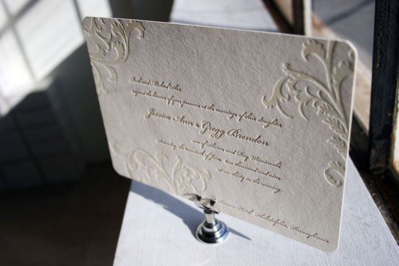
Vettore has long been one of our favorite letterpress wedding invitation designs and judging by its popularity, Smock customers agree! And as lovely as it is, it’s easy to see why so many people love Vettore!
The original Vettore design is printed in sea mist and midnight inks for a look that is romantic and a little bit vintage. The excitement of seeing how couples make the design their own never fades and we love some of the latest adaptations so much so that we just had to share them with you. How gorgeous are these?
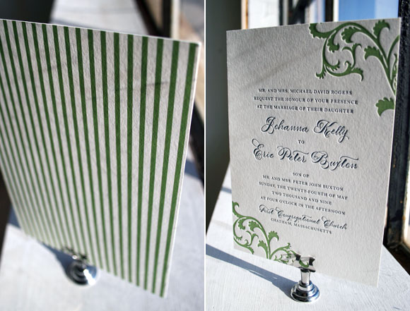
Vettore printed in clover and midnight with a vertical orientation and pattern backing in our seneca pattern, brought to us by the folks at Peabody Papers in Columbus, Ohio. We love how this puts a fresh and modern spin on the design, especially with the extra special touch that comes from using our Smock Spencerian calligraphy font.
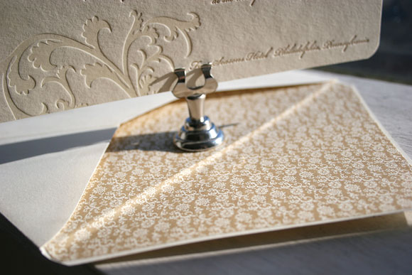
This incredible customization uses gold ink paired with blind deboss and it’s utterly sophisticated matched with the lined envelope in our clairveaux pattern printed in gold ink. A big thank you to Paper Chase in Margate, New Jersey for this classy take on Vettore!
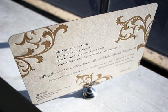
We absolutely love edge painting and this lovely customization from Pearl Beach Paperie in Orlando, Florida is a perfect example of why. We love the eggplant and gold inks paired with the gold edge painting as it is so incredibly chic and luxurious.
Seeing what our awesome Smock stores dream up with their clients is thrilling for us and truly inspiring. We love seeing how creative and playful they can be with ink colors, embellishments and patterns and we can’t wait to share more great Smock customizations!