Alexis and David chose to customize our Barnesly wedding invitations for their July celebration at the Ritz-Carlton in Aruba. Petite save the date cards were printed in gold matte foil and slipped inside luggage tags to help set the tone for their destination wedding. For the main invitation, we switched things up by changing the watercolor artwork to a pale shade of lavender, and swapped the script font from the original design with a more formal script. Metallic glass envelope liners added a subtle touch of shimmer to these elegant wedding invitations.


foil color: gold matte | digital ink color: CMYK process | fonts: Social + submitted script font | paper: 1-ply white bamboo | size: S-8 + S-3 + S-5 + 3.5 x 2.325 | envelope liner: metallic glass | customization #29124 | The Dandelion Patch
We worked with Toni at The Write Image to create these magical Bat Mitzvah invitations for Sophia. The set featured a range of rich. watercolor jewel tones in rich shades of deep purple, emerald, and royal blue. Gold matte and indigo shine foil stamping added a luxurious shine to the invitation suite, which included flat social notes, transportation cards, reply cards and party cards. Embellishments like coordinating custom envelope liners and indigo shine foil edging were added to complete the look.


foil color: gold matte + indigo shine | letterpress ink colors: royale + orchid | digital ink color: CMYK process | fonts: Hutton + Percy | paper: 1-ply white bamboo + duplexed 2-ply white bamboo | size: S-8SQ + S-6SQ + S-5SQ + 5.25 x 5.25 + S-6 | foil edge: indigo shine | envelope liner: custom watercolor 3 | customization #30852 | The Write Image
These elegant custom wedding invitations feature a unique combination of both blind embossed and blind debossed florals, making for a beautifully textured design. Inside the invitation envelopes, colorful florals and greenery were bursting right off the envelope liners, which featured lovely pastels in shades of blues, greens, and purples. Letterpress printing in wisteria ink was used for the text throughout the suite, accented by a sweet script font to highlight names and key details.


letterpress inks: wisteria + blind deboss | blind embossing | fonts + design: Nublia & Graham, custom | paper: 1-ply + 2-ply ivory bamboo | size: S-8 + S-6 + S-5 | envelope liner: custom submitted artwork | customization #34393 | Lion in the Sun
We worked with our friends at Fat Cat Paperie to create Clio’s painterly rose gold birth announcements and coordinating envelope liners. Her parents drew inspiration from our Ellory invitation suite to create the cards, which paired a digitally printed watercolor wash with our rose gold foil. What a sweet way to welcome a new baby!


foil color: rose gold shine | digital ink color: papaya | fonts + design: greenway + hutton, Ellory design | paper: 1-ply white | size: S-6 | envelope liner: miette pattern | customization #34589 | Fat Cat Paperie – Center Moriches
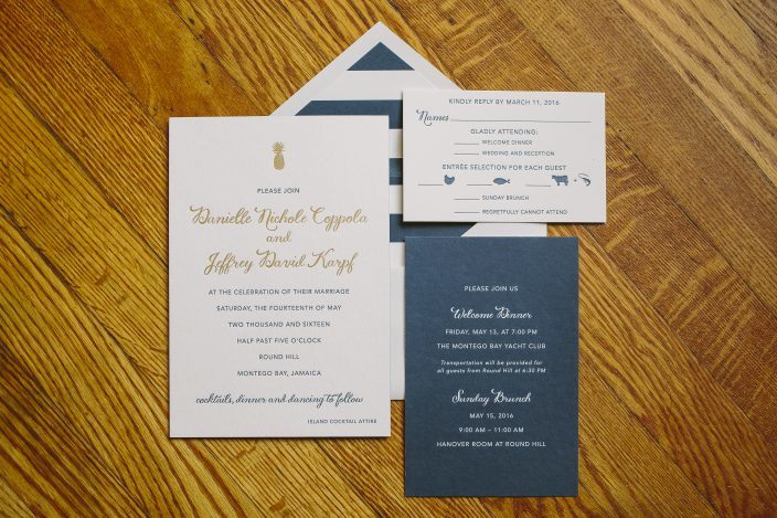
Danielle and Jeffrey worked with our friends at Lion in the Sun to create chic navy and gold pineapple wedding invitations for their Montego Bay celebration in May. We letterpress printed their invitations in navy ink, and highlighted their names with gold matte foil. Bold navy striped envelope liners reflected the seaside locale, while the gold pineapple motif gave a nod to the Round Hill Resort logo. We created a navy combination card that invited guests to both the welcome dinner and the farewell brunch, which resulted in a beautiful layered effect when the invitations were assembled and wrapped with their bellybands.


letterpress ink: navy | foil color: gold matte | fonts: Smock Ruby + Gill | paper: 1-ply + 2-ply white | sizes: S-8 + S-6 + S-5 | envelope liners: bar pattern in navy ink | belly band: digitally printed navy ink + gold matte foil | customization #:31082 | Lion in the Sun
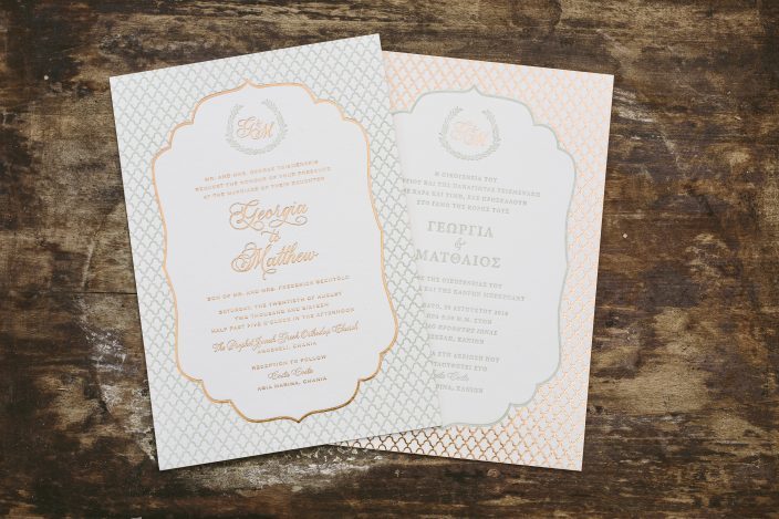
We worked with Debbie at RSVP Today to create Georgia and Matthew’s double-sided bilingual wedding invitations for their summer wedding in Crete. The couple chose our ultra-thick 3-ply paper for their double-sided invitations, which featured an elegant monogram flanked by our balsam wreath cartouche. Our exclusive Plaza calligraphy font was used on the English side of the invitations, as well as the monogram and the welcome, reply, and rehearsal dinner cards. Both sides of the invitations featured copper shine foil and sage green letterpress ink; the English side showcased the text in foil while the Greek side featured letterpress, and the design elements were printed in the opposite color for a mirrored effect.


letterpress ink: sage | foil color: copper shine | fonts + design: plaza, cooper + minion pro; Dawson design | paper: 1-ply + 3-ply ivory bamboo | size: S-8 + S-5 + S-5SQ | customization #32893 | RSVP Today
We completely transformed our Vista design to create Rachel’s pastel Bat Mitzvah invitations. An ever-so-subtle wash of digitally printed sea mist ink gave a soft, ocean-like look to the main invitations, while gold matte foil highlighted Rachel’s name and gave a glowing effect to the tiny stars sprinkled throughout the design. A striped watercolor envelope liner featured a gradient effect starting with varying shades of blue at the bottom and transitioning to the palest shade of purple at the top.


digital inks: sea mist + pool | foil color: gold matte | fonts + design: festus; Vista | paper: 1-ply white | size: S-8 + S-5 | envelope liner: watercolor 1 pattern digitally printed in lilac + gossamer + sea mist + sky + pool inks | customization #32687 | LS Amster Company
When a stationery shop owner moves, you know they’re going to have stylish moving announcements! Recently we worked with Carolyn, owner of The Write Touch in Jacksonville, Florida, for her letterpress moving cards. The double-sided cards featured our Plaza calligraphy font on the front, with our lemons vintage print pattern adding a hint of flair to the back. Lined envelopes and corner rounding were chosen as finishing touches on these sophisticated cards, but our favorite detail has to be the petite paw print for Nicholas, Carolyn’s beloved golden retriever – so sweet!


letterpress ink: olive | fonts + design: barnes + plaza, Donegal | paper: 1-ply white bamboo | size: S-5SQ | envelope liner: olive tree vintage print pattern | patterned backing: lemons vintage print pattern | customization #33389 | The Write Touch
Gold and navy is one of our favorite classic color pairings – and this Keira suite showcased it beautifully. Ryann and and Andrew opted to flip the orientation on the original design to create a vertical invitation, allowing for a more traditional layout for their text. Ruby, one of our exclusive calligraphy fonts (created just us by Molly Jacques) was used throughout the design, giving it a hand-calligraphed feel. A letterpress and foil stamped invitation sleeve contained each piece, which surely made an impression on every guest who received this stunning set!


letterpress ink: navy| foil color: gold matte | fonts + design: Smock Ruby + Greenaway, Keira | paper: 2-ply white | size: S-8 for sleeve + S-5 | sleeve: letterpress printed gosford sleeve | customization #28686 |The Write Touch
Amanda and Eric chose our Ellory design for their April wedding in Texas, opting for a gold color palette with pastel blue and green watercolor accents. We worked with our friends at Needle in a Haystack to create the set, which included a cute weekend festivities card and a response card in addition to the gold foil stamped invitations. An ocean-inspired watercolor envelope liner introduced a third color and complemented the mint green watercolor accents on each insert card beautifully.


letterpress ink: gold | foil color: gold matte | digital ink color: mint | fonts + design: lavish, timber + greenway, Ellory design | paper: 1-ply white | size: S-8 + S-5 + S-6 | envelope liner: watercolor 3 in mint, seamist and pool | customization #31973 | Needle in a Haystack


