Soft, subtle hues are what’s in right now! Take a look at these trendsetter custom letterpress wedding invitations. This whimsical set was submitted to us by our great friend, Kappy at Le Village Marche in Arlington, Virginia. We love that our lyon border is featured on the left side of the invitation – adding to the modern feel of this suite. Although this set is more on the contemporary side – choosing a softer color palette helps maintain a timeless and elegant feel for your wedding day. We think these stylish invitations will surely delight their guests!
inks: yolk + pewter | fonts: louise + peale | paper 2-ply white | invite size: S-8 | printing: letterpress | corner rounding | liner: the granby pattern in dove

How do you outdo an awesome save the date? Our good friend Niki at Papery & Cakery in Boca Raton, Florida has the recipe. We posted these lovely save the dates for Niki’s sister back in September!!!

Now that the wedding has passed, we are able to show you the amazing suite she designed, and we couldn’t be happier to share these with everyone! The suite was letterpress printed in our Pewter ink on our beautiful white bamboo 2-ply paper. All of the pieces were fitted with an offset border in pewter and die-cut in our new Chesapeake design. Each piece has a decorative offset backing and is finished with perfect edge painting in Pewter. The invitation, reply cards, and events card are tucked nicely into a custom offset sleeve.
inks: pewter + spring | fonts: submitted fonts | paper: 1-ply white + 2-ply white | printing: letterpress + offset | sleeve: custom pattern offset in pewter + spring | liner: seneca pattern offset in spring | invite size: S-8 sleeve | die-cut: chesapeake

We printed these lovely wedding invitations for our friends at Dandelion Patch – Vienna. The letterpress eggplant and lavender inks make this an elegant suite that they will remember for the rest of their lives. This Chasseral design was letterpress printed on ivory bamboo 2-ply paper. Its wrapped up neatly in a Smock pocketfold to give that new age look to a classic design.
inks: eggplant + lavender | fonts: graham + tally | paper: 2-ply ivory | printing: letterpress | invite size: S-8 Folio

Get ready to lose yourself in these charming Mecan letterpress wedding invitations submitted to us by Raegan at Papel New York in Brooklyn, NY. This set has the perfect balance of design and whimsical fonts -which make this an excellent choice for a destination wedding! Check out the downright adorable reply postcards requesting flight information. With flair to match to their idyllic wedding venue in the Caribbean these invites are making us wish for warmer days. The turquoise ink used throughout adds to the island feel. Finished off with a stellar envelope liner that reminds us of champagne bubbles.
inks: pewter + turquoise |fonts: coombs + gertrude | paper 2-ply white | invite size: S-6 | printing: letterpress |back pattern: the granby pattern in pewter | corner rounding | liner: the babine pattern in turquoise

If you’re looking for a traditional wedding invitation suite – then look no further! We’re head over heels for this simple and sweet letterpressed set submitted to us by our friends at The Dandelion Patch in Reston, Virginia. Letterpressed in black ink with gorgeous mulberry edge paint that acts as the perfect accent to this one color set – we can’t help but swoon! After looking at photos of the The Ritz Carlton in McLean Virginia, where the fabulous wedding was held – we see what a fanciful and lavish venue the couple chose for their special day. Of course we believe tossing our mulberry ink into the mix helps keep this set looking romantic, but this set also encourages the feeling of the winter months. The three letter monogram on both the invitation and letterpress belly band adds another touch of elegance to this striking set!
ink: black | font: smock spencerian | paper: 1-ply white | printing: letterpress | edge paint in mulberry | liner: the champlain pattern in mulberry | letterpress belly band | invite size: S6

Seeing an order become a design is great. Seeing a design become a letterpress printed invitation is better. But when we get to see photos of our invitations in the hands of the happy couple and shots of their important day…well that just reminds us how much the hard work can pay off. Thanks so much to Michele at the Wedding Company in Hong Kong and well done to Adam Sjöberg for Ira Lippke Studios for the amazing camera work! The reception looked gorgeous and we are very honored to have played some small role in making that day special. Read our previous post about the letterpress wedding invitations.
inks: taupe + pearl + whisper | fonts: cameron + carrington | paper: 1-ply ivory | printing: letterpress | size: s8 | 3-color, bilingual invitations |


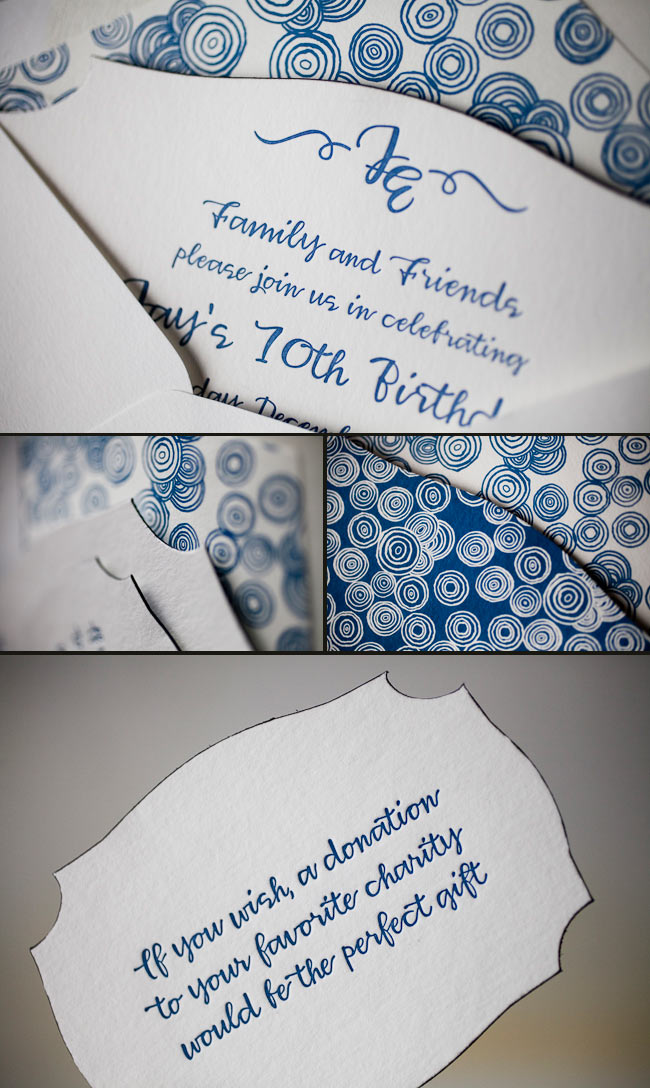
We printed these lovely pieces for the ultimate take-two wedding. The couples first attempt was thwarted by a hurricane, but, these newlyweds weren’t going to let a little weather ruin their special day. We went back to the drawing board with our friends at Judy Paulen Designs and whipped up these awesome Part II pieces. They combine beautiful offset and letterpress printing in our Navy ink. We were thrilled to be able to help them with their special day, even if the weather wasn’t going to cooperate.
ink: navy | fonts: smock spencerian + graham | paper: 1-ply white + 2-ply white | printing: letterpress + offset

Our wonderful friend Cheryl at Paper Studio in Ontario, Canada submitted this remarkable custom invitation suite to us for printing. It’s easy to get lost in the splendor of this simplistic set because it has the coolest customizations! The couple chose our elegant rousseau pattern for offset backing on their invitation, reply cards-and coordinated this with an envelope liner to match! The gold and taupe inks are perfect for a wedding celebration in the middle of the any season! We also printed what we think are the most adorable and whimsical double sided information cards we’ve seen in quite some time. Choosing a text-based invitation is an excellent way to keep your set looking classy!
inks: gold + taupe | fonts : custom| paper: 2-ply ivory | custom artwork: submitted | printing: letterpress | edge painting in gold metallic |back patterning: rousseau in gold + taupe |corner rounding | liner: the rousseau pattern in gold + taupe| invite size: S8SQ

Sneak a peek at this beyond beautiful letterpress Rhon invitation suite submitted to us by our friend Casie at Francis~Orr Corona del Mar in Corona del Mar, California. The color combination of verbena and taupe transforms the look of this set into something almost vintage! And everyone knows yellow represents sunshine and joy! We can’t help but feel this yellow hue helps radiant happiness about the couple’s big day. Our rhon pattern in verbena on the pocketfold’s exterior adds the most elegant touch to this sensational suite! We always enjoy working with Francis~Orr because they submit some of the most creative invitation sets!
inks: verbena + taupe | fonts: smock spencerian + stockton | paper: 2-ply white | printing: letterpress | corner rounding | folio exterior: rhon pattern in verbena | folio interior: payette pattern in taupe | liner: the payette pattern in verbena | invite size: 5.125 x 7.75

Get ready to blow out those birthday candles! Check out these recently printed birthday party invitations submitted to us by our friends at Judy Paulen Designs in New York, NY. Our plymouth die cut adds even more boyish charm to an already youthful looking birthday party invitation. We can’t get enough of the granby backing patterning in navy, and take a look at the envelope liner in reverse granby in navy-for another super cool customization. Alright now, let’s get the party started!
inks: navy | fonts: smock harrison | paper 2-ply white | invite size: S-6 | printing: letterpress | die cut: plymouth | back pattern: the granby pattern in navy | edge paint: black | liner: the reversed granby pattern in navy