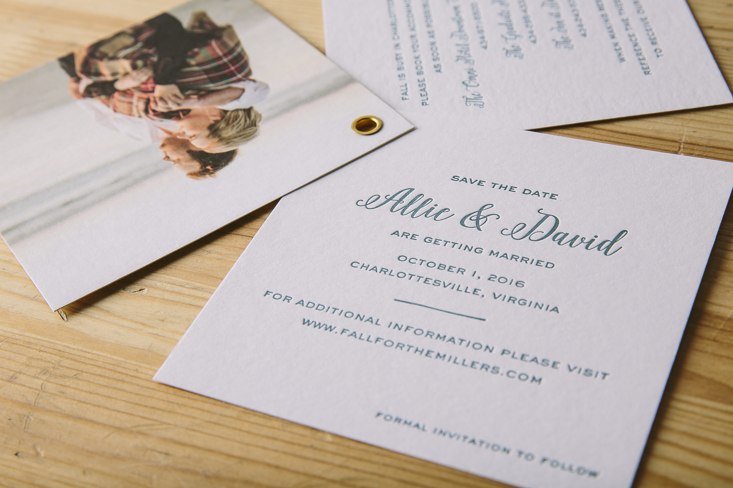
We worked with Sweet Paper to create these letterpress save the date booklets for Allie and David based on our Prescott design. They decided to use our Pool letterpress ink color for their wording which mimicked the serene ocean color in the photo chosen for the front page of their grommeted piece. The third page of the booklet even contains a list of accommodations to ensure that their guests book ahead of time to avoid booking during busy season in Charlottesville. We have no doubt Allie and David’s wedding will come together just as sweetly as their save the date!


Letterpress ink colors: Pool | Digital colors: CMYK | Fonts: Gothic + Eden | Design: Prescott | Paper: 1 ply white bamboo | Size: S-5SQ | Customization: 31771 | Sweet Paper
We always love seeing what kind of Rainier customizations our clients will dream up next. These pretty purple and blue letterpress Bat Mitzvah invitations are a perfect example of a harmonious color combination. Pansy, Gossamer, and Azure all came together in different ways throughout this suite, yet still tied back to the original invitation color palette. The Rainier pattern was another consistent element used in different ways that created visual interest and gave each card a sense of individuality. To give the set an extra dose of playfulness, an envelope liner was added to tie all the colors and pattern together effortlessly.


Letterpress ink colors: Pansy from Bella Figura + Gossamer + Azure | Fonts: Jules + Scala | Design: Brynn | Paper: 2 ply white bamboo, 1 ply white bamboo | Size: S-8SQ | Liner: Rainier pattern in Gossamer + Azure + Pansy from Bella Figura | Customization: 38906 | LS Amster Company
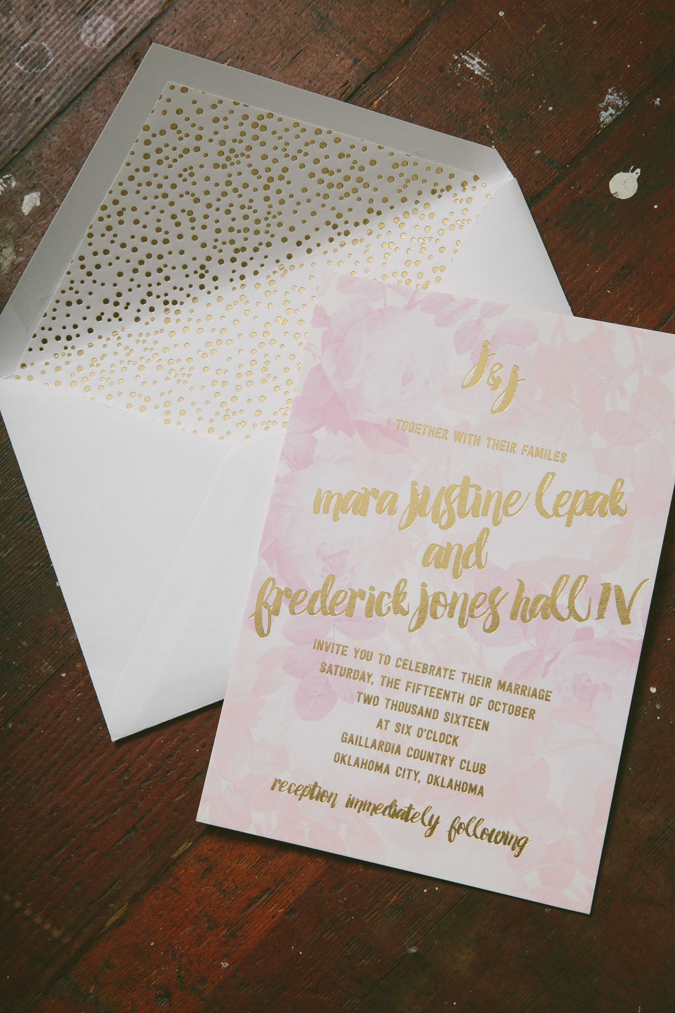
Justine and Jones took our Bloomsbury design and made it into something completely their own for their October affair. These playful watercolor wedding invitations were printed in our Gold Matte foil with dreamy florals added in a palette of pinks as the backdrop. To include a little bit of whimsy, foil stamped polka dots were incorporated throughout the suite. The rehearsal dinner set was kept safe and sound in a corresponding sleeve to give the set a little extra dose of individuality. Guests will be pleasantly surprised to find this same theme carried onto the welcome tags and thank you set as well. This spirited set wouldn’t have been possible without the help of No Regrets- OK and we have no doubt the wedding of Justine and Jones came together just as beautifully as their suite.


Foil stamping color: Gold Matte | Digital: CMYK | Fonts: Ada + Festus | Design: Bloomsbury | Paper: 2 ply white bamboo, 1 ply white bamboo | Size: S-8 | Liner: Pearl pattern in Gold Matte | Customization: 35227 | No Regrets – OK
You may have noticed that the beautiful boxes, gift wraps, notebooks, and pre-printed cards are missing from our website. Sadly, we made the decision to discontinue the Everyday line as of December 31, 2017. The main reason was declining sales due to a tough retail market, but we are also changing to better support Smock Custom printing and Bella Figura printing. Our custom printing is growing and we want to give it more focus.
Thankfully, there are many other talented stationers making awesome paper goods. You might want to check out:
Thanks again for your support over the years and let us know if you have any questions. Also, please think of Smock Custom for your wedding invitations, bar and bat mitzvah announcements, and holiday card printing.
Our friends at Uptowne Papers helped Jen and Phil create these elegant foil-stamped brunch invitations printed in Silver Shine foil along with Vine letterpress. They used the same font combination from our Exeter design, but with their own tasteful twist. The sweet floral motif at the top of the invitation added a hint of romantic interest to a more simple overall design.

Letterpress ink color: Vine | Foil stamping color: Silver Shine | Fonts: Copperlove + Capital + Didot | Design: Custom Library | Paper: 1 ply white bamboo | Size: S-6 | Liner: Sullivan stripes pattern in Silver Shine | Customization: 38722 | Uptowne Papers
Kate and David decided to customize our Wessox design for their North Carolina wedding this past fall. There’s something to be said for classic silver letterpress wedding invitations with an aesthetic that will never go out of style. The suite also contained matching pieces like a reply card, welcome card and website card. Each card was designed with a little extra something different to add more interest to the overall design, whether that be a border or a solid background color in a corresponding color. The envelope liner printed in Cloud tied everything together with the addition of a more traditional pattern as the finishing touch.


Letterpress ink colors: Silver, Cloud, Sea Mist | Digital colors: Cloud | Fonts: Smock Plaza + Greenaway | Design: Wessox | Paper: 2 ply white bamboo, 1 ply white bamboo | Size: S-8 | Liner: Wessox pattern in Cloud | Customization: 38705 | Union Street Papery
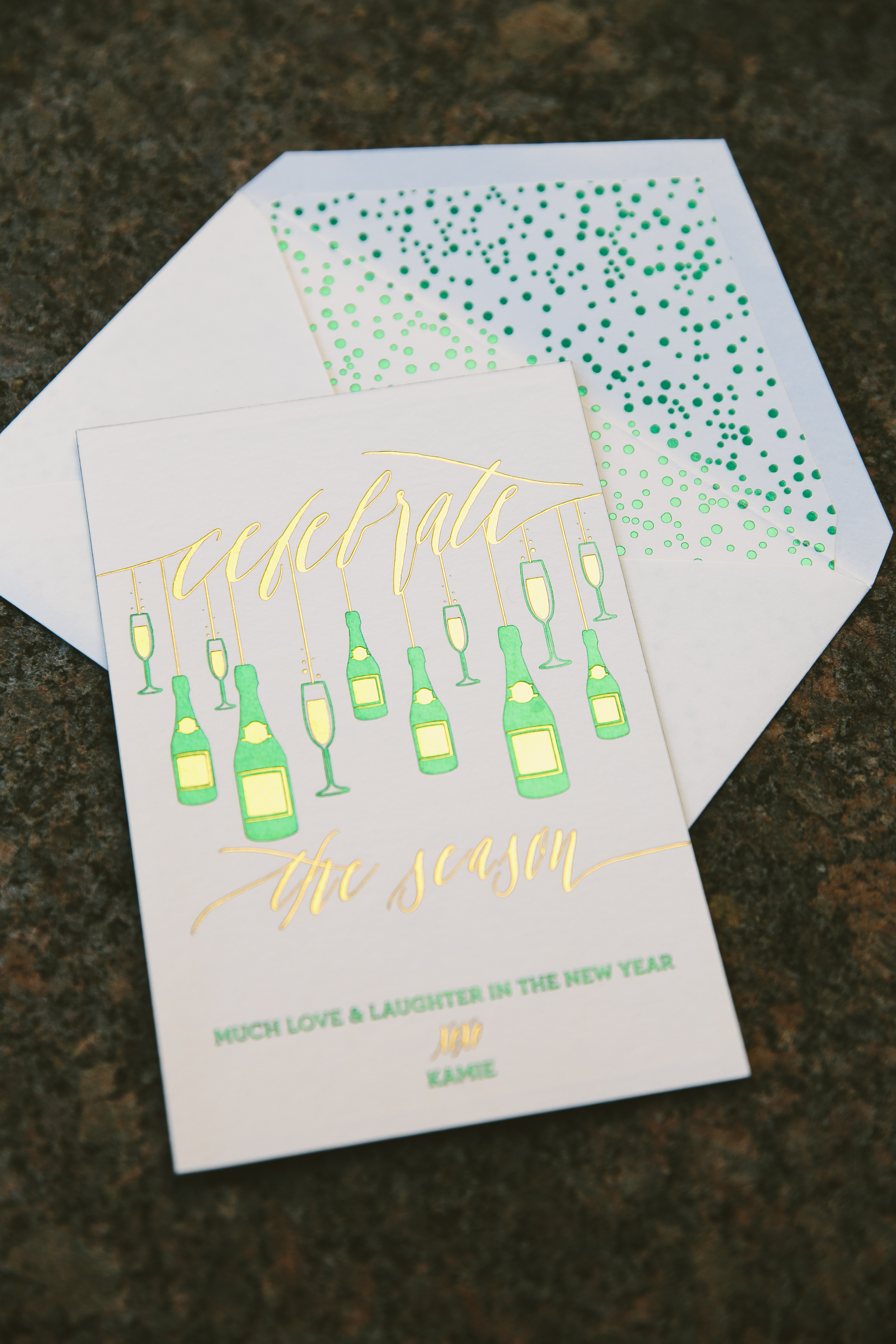
We can’t wipe the grin off our faces while reading the clever greeting on these foil stamped New Year’s cards made with the help of Sweet Paper. With such a glamorous, celebratory front printed in Green Shine and Gold Shine foil, the back printed in simple, clean Black letterpress added an unexpectedly charming twist to the card. The pearl pattern envelope liner printed in Green Shine was a perfect addition in the way it mimics the bubbles of freshly poured champagne when the clock turns to midnight on New Year’s Eve!


Letterpress ink colors: Black | Foil colors: Green Shine and Gold Shine | Fonts: Revival, Lavish, Greenaway | Design: Custom Library | Paper: 2 ply white bamboo | Size: S-6 | Liner: Pearl pattern in Green Shine Customization: 31447 | Sweet Paper
Nothing says it’s the holidays again quite like seeing a big evergreen sitting atop of cars zooming down the road. These festive letterpress holiday cards are a perfect fit for a more traditional greeting. The Lucas family chose to print our seasonal Wagon design in Coral and Olive letterpress colors, inks that compliment each other beautifully, especially during this time of year. To top it off, a photo featuring nothing but big smiles beaming back at their friends and family made for a cheerful finishing touch.

Letterpress ink colors: Coral and Olive | Digital printing: CMYK | Design: Wagon | paper: 1 ply white bamboo | size: S-6 | customization: 30474 | Paper Twist
We customized our Ellory design to fit Brianna and Patrick’s wedding at The Walton House in Homestead, Florida. Thanks to the help of our friends at Stationer on Sunrise, these botanical foil stamped wedding invitations reflected their venue perfectly with images of greenery incorporated that can be similarly found on the property of The Walton House. The suite contained corresponding reply, reception and website cards to complete the package, all with rounded corners for a softer overall aesthetic. On the flip side of these cards, guests will be pleasantly surprised to find more traces of greenery, tying everything together perfectly.


Foil stamping color: Copper Shine | Fonts: Lavish + Greenaway | Design: Ellory | paper: 2 ply ivory bamboo, 1 ply ivory bamboo | size: S-8 | liner: Olive Tree pattern | customization: 35195 | Stationer on Sunrise
Lauri Lawrence worked with P.S. The Letter to create her sophisticated foil stamped holiday cards last year. They opted for our Red Shine foil which made for a bolder and festive statement, while at the same time remaining classic due to their more traditional font choices. To give this holiday set a little something extra, they decided to add a scarlet metallic envelope liner with our Windsor pattern foil stamped in Gold Shine. It’s clear that our Cooper design has never looked better!


Foil stamping color: Red Shine | Fonts: Spence + Mason | Design: Cooper | Paper: 2 ply white bamboo | Size: S-8 | liner: Metallic Scarlet with Windsor Pattern in Gold Shine | Design: Cooper | Customization: 36732 | P.S. The Letter
