One of our greatest reviewed Rhon designs, brought to us by Margaret at Scriptura. Having struggled to find just the right color combination, Margaret eventually struck gold…or should we say, “struck papaya?”
The papaya ink worked very well with the offset shell and lettepressed pewter. The addition of the program fan was a great way to tie everything together — the full set looks amazing.

inks: pewter + papaya | fonts: graham + smock bescal | paper: 2- ply white | liner: caspian in shell| folio exterior -rhon in papaya, interior – caspian in shell | printing: letterpress + offset
This design won an honorable mention in our Smock design competition for the first half of 2011. This twice-a-year competition recognizes outstanding and inspired designs submitted by our beloved dealers.

Merging the design elements of Haddington and Rhon, Alyssa from Judy Paulen Designs shows just how to balance a letterpress wedding invitation set.

Particularly stunning was the pale blue of our Lake ink used as an envelope liner which complimented the Pewter of the design and text, making an elegant wedding invitation.
inks: pewter + lake | fonts: bickham swash + bickham script | paper: 2-ply white | invite size: S-8 | liner: ganval in lake | printing: letterpress | edge painting: lake
This design won an honorable mention in our Smock design competition for the first half of 2011. This twice-a-year competition recognizes outstanding and inspired designs submitted by our beloved dealers.
Day three of our design contest brings us an incredibly elegant invitation set – a simple design that looks anything but simple! Hats off to Tasha at The Dandelion Patch for this one.


Coconut ink looks incredible letterpressed in our Champlain pattern, and is an impressive compliment to the Eggplant used throughout the set.

Everything from the square cards to the rounded corners to the elegant script make this quite the eye-catcher.

Thanks again to The Dandelion Patch for sending us this gorgeous customization!
inks: eggplant + coconut | fonts: spence + cooper | papers: 2-ply white | invite size: s-7 square | liner: reversed champlain in eggplant
This design won an honorable mention in our Smock design competition for the first half of 2011. This twice-a-year competition recognizes outstanding and inspired designs submitted by our beloved dealers.
The second honoree in our design contest was sent to us by Ilyssa at Brenda Himmel Stationery. Ilyssa worked with in-house graphic designer Lindsy Aragona to create the custom artwork, and we can’t get enough of these cheery letterpress social notes! The social notes were printed in 3-color letterpress, and combine our Verbena and Grass inks with a custom ink color that Ilyssa selected. The custom artwork printed beautifully, and pairs perfectly with a coordinating Payette liner, also printed in Verbena ink.


The font selection is a perfect complement to the design and looks incredible in letterpress.

Congrats to Brenda Himmel!
inks: espresso + grass + verbena | font: tally | paper: 2- ply white | liner: payette in verbena | edge painting: | printing: letterpress | social note size: S-6
This design won an honorable mention in our Smock design competition for the first half of 2011. This twice-a-year competition recognizes outstanding and inspired designs submitted by our beloved dealers.
We are so excited to kick off another round of the Smock Design Contest! Over the next 10 days, we’ll be honoring some really gorgeous designs that have been sent to us by our Smock retailers. So without further ado, let us begin by showcasing our first honoree!

Joellen and the team at Bennett Schneider, Inc. brought us what may be the perfect color selection for the letterpress wedding Aberdeen suite.


The tangerine ink helps this wedding announcement pop in such a way that it doesn’t overpower the design or distract from the details. Sometimes all it takes is a little tweak to make a letterpressed card look fantastic, and that is just what they did!

inks: tangerine + black | fonts: Spencerian + Cooper | 2-ply ivory | printing: letterpress | liner: payette in tangerine | invite size: S-6
This design won an honorable mention in our Smock design competition for the first half of 2011. This twice-a-year competition recognizes outstanding and inspired designs submitted by our beloved dealers.
We are crazy in love with this great customization of our Lashar design, submitted by our friend Libby from Byrd + Bleecker in Fort Worth, Texas (who we had the joy of seeing last week when she came up for a visit – see the fabulous letterpress coasters made for her while she was here on Boxcar’s blog!). We can’t get enough of the creative ways she uses our designs and motifs to create unique invitations for the lucky couples that walk into her store!
ink: midnight + peacock | fonts: engravers + engravers gothic | paper: 1-ply white | printing: offset | invite size: s-8 |


by Sarah Walroth, In-House Designer.
We’re excited today to introduce you to the latest letterpress wedding invitation inspiration from Smock! Now available at a Smock dealer near you, we’re happy to unveil our latest design – Piedmont. A sophisticated and fun new take on modern wedding invitations, the Piedmont suite features a whimsical graphic pattern printed in blind deboss letterpress and boasts Smock’s exclusive (and new!) Bescal calligraphy font, a vibrant hot pink patterned backing and a striped envelope liner in our sherbrooke pattern. Piedmont also introduces our new square invitation shape, also available as inserts and reply cards.


On trend with the latest styles for upcoming 2010 and 2011 weddings, we’re also thrilled to introduce six gorgeous new ink colors; violet, peach, hot pink, aquamarine, pumpkin and royale. These colors are bright, vibrant and perfect for celebrations of all shapes and sizes.

We’ve already hinted about our two new exclusive calligraphy fonts, Harrison and Bescal, created by world-renowned type designer Richard Kegler featuring the hand lettering of calligraphers Patricia Mumau and Kelle McCarter. (Read more about the calligraphers here and here.) They join our existing calligraphy fonts by calligrapher Debi Zeinert, Spencerian and Clermont, as part of our exclusive font collection available only through Smock.

For all of the latest inspiration from Smock, visit your local Smock dealer!
New for 2010 and recently unveiled at the National Stationery Show, we are excited to introduce you to the second of our two new calligraphy fonts exclusive to Smock! Calligrapher Patricia Mumau of Primele Studio created our new Harrison font, a bold, fresh calligraphy lettering style that we showcased on our 2010 NYIGF invitations. Patricia worked alongside our internationally recognized typography firm to create her amazing new font and we’re proud to show it off! All of our calligraphy fonts (now four in total) are available with no additional calligraphy fee when you order custom letterpress stationery from Smock. Visit one of our awesome Smock dealers to see samples!
Today it is our pleasure to welcome Patricia to the blog for a little Q + A session. Welcome, Patricia!

How did you become interested in calligraphy?
I was studying in Rome at the time, and I came across a street vendor selling antique mail to collectors – old letters and postcards, amazing postage, meaty papers – and all with the most fascinating handwriting. The penmanship was imperfect but graceful, for everyday and yet lucidly personal. I wanted to capture that candid natural hand in a contemporary calligraphy and began experimenting.
What tools does someone need to start learning calligraphy?
Patience, creative freedom, access to a library, a pen nib and holder, and a bottle of ink in a irresistible color.
What was the process like for designing a font for Smock?
For my part, I created gobs of handwriting samples. I took time to consider the nuances of my mark making – the way I dotted my “i”s, the curve of my question mark…

What do you think makes hand calligraphy so special?
Some projects really need that look of handwritten typography, and having access to handwriting styles on demand with calligraphy fonts makes a great addition to a graphic designer’s toolbox. But however useful, fonts can’t do everything. When it comes to spot phrases that require a bit of artistic flare and incorporated flourishes, hand calligraphy is the better fit.
What was the first lettering style you learned?
Classic American Cursive in 2nd grade. I am glad to have put those “Q”s masquerading as “2”s behind me.
Are you right or left handed?
I’m left handed, which made things interesting at first as I was learning. But with a bit of trial and error I figured out techniques that worked for me.

What’s a normal workday like for you?
#1) Coffee. Next I usually go over what’s on the docket with my sister Rachel who manages the studio’s projects. I do most of my addressing in the late morning and early afternoon, and work on design projects such as invitations in the later part of the day.
Other than invitations, envelopes and place cards, what other fun things do people have hand-lettered?
I’ve created logos, transcribed letters, and designed calling cards. Currently I’ve been creating a lot of hand-lettering for return address stamps.

What is your favorite letter in the alphabet to calligraph?
A capital “Z”, all the way.
What fictional character would you be and why?
Virginia Lee Burton’s Little House. I’d like to think that while the world is constantly changing all around me, that I’d remain true to the builder’s intentions…and maybe someday make a move to a fantastic landscape and get a new coat of paint.

Where do you look for inspiration?
Mid-century picture book illustration, piped birthday cakes, American folk needlework, Swiss graphic design, opening credits to films from the 40’s and 50’s, Swedish decor, happy thoughts.
What is your favorite book of all time?
A Hole is to Dig by Ruth Krauss
How long have you been doing calligraphy professionally?
I started marketing my services late summer of 2009, so a little over a year now.

Primele consists of you and your two sisters, does everyone have a say in the design process?
We all bring our own strengths to the table. For me it’s the hand-drawn typography and illustration. I also tend to work a lot with the initial concepts and designs. Rachel does most of the work once a design is brought into the computer. She’s our Adobe software guru who makes everything graphically perfect. At different times throughout a project we’ll run it through the-kimmy. Kim has an amazing eye and a sensitive design palate, and her perfected taste acts as a kind of editor to my sometimes too-funky ideas.
We loved seeing our Rhon letterpress wedding invitation design in pewter and verbena inks pop up in this beautiful inspiration board featured here on The Inspired Bride yesterday. We think this kind of sunshine-filled inspiration is perfect for a vibrant summer affair and we extend a big thank you to Maddy of The Inspired Bride for including Smock! Also, The Inspired Bride is celebrating the launch of their beautiful new site, so be sure to pop over and visit for lots of fabulous ideas sure to inspire.
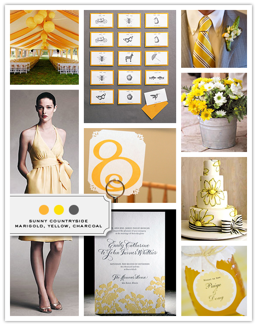
{Inspiration Board via The Inspired Bride}
Inspiration Board Credits:
Decorated Tent, The Knot
Placecards, Martha Stewart Weddings
Groom’s Tie and Boutonniere, The Knot
Bridesmaid’s Dress, Jenny Yoo
Table Card, The Knot
Planter Decor, The Knot
Cake, Cake Girls
Invitation, Smock
Honey Jar Favor, The Knot
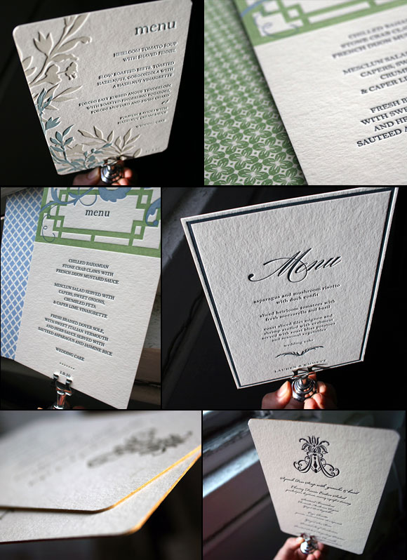
Designing and letterpress printing menus is one of our favorite things to do here – the weddings become so real at this point, and our clients have really, really good taste in food. Letterpress menus generally evoke your wedding invitation design and bring things full circle. On occasion, menus double as place cards and have the name of the guest calligraphied at the top of the menu. We think these letterpress menus would be fabulous for other occasions – milestone birthday parties, for instance, or even a really unforgettable dinner party of the year. We often do cool customizations like edge painting (go gold!), corner rounding, or even back printing of patterns. Here are a few of our favorite letterpress menus of late!
(designs from upper left: Engadine, Helani, Burstell, Nevis, Nevis, Helani)