Thanks to Melanie at Salutations in Charlotte, North Carolina for the opportunity to print a beautiful letterpress + offset wedding invitations. Using submitted artwork to combine offset printing for their folio and letterpress printing for their cards, the patterns and designs used in this set were very striking. Seamist compliments taupe very well to begin with, but we were very pleased to see how elegant everything looked when put together. Great work, Melanie!
inks: seamist + taupe| fonts: custom + therese | paper: 1-ply ivory bamboo | printing: letterpress | folio interior: windemere in taupe| folio exterior: custom in seamist | invite size: s-7 folio |


It’s easy to get swept away with this charming letterpress invitation customization made to our Burstell design submitted to us by our friend Ailbhe from Pretty as a Picture in Ireland! This modern text based invitation has clean lines and the right amount of flourishes to add a touch of elegance to this set. We love the luscious raspberry on the interior of the folio even more because it is probably not something guests will be expecting! The exterior of the folio is printed in our virelles pattern which looks positively nature inspired! Pretty as a Picture always sends us the coolest customizations-and it’s safe to say this will be another crowd pleaser!
ink: espresso | fonts: spence + graham| paper: 1-ply ivory | printing: letterpress |folio exterior: virelles pattern in espresso | folio interior: sinclair pattern in raspberry | invite size: 5.125 x 7.75


We were so happy when we were able to offer to letterpress print submitted artwork for no charge, it opened up the door for beautiful new designs to come our way! Michelle at Paperkiss sent us this wonderful invitation set and it came out beautifully. Michelle is a great friend of ours in Australia and we are always happy to see what she sends. Thanks again to Paperkiss!
ink: navy + silver | fonts: inigo + custom font | paper: 1-ply white | printing: letterpress | submitted art |


We thank our friends at Paper Studio, in Ontario Canada, for this beautiful customized 3 color letterpress wedding invitation suite. The invitations and reply cards were letterpress printed in Sky and Espresso inks on our Bamboo 2-ply paper. They were given a touch of brilliance with the blind debossed flowers. The understated elegance is absolutely captivating!
inks: espresso + sky + blind deboss | fonts: cameron + shaw | paper: 2-ply white bamboo | printing: letterpress | wedding invitation suite with custom art |


You’ve sent save the dates. Ordered invitations. Received invitations. Jumped for joy. Then stopped to realize you haven’t got a clue how to put these things together. Not sure how to stack your cards? Invitation assembly got you stumped? Don’t worry – we can help! Check out this how to and allow us to walk you through the entire process – we made it easy for you!
[iframe http://www.youtube.com/embed/_y2Elt2ym4g?hl=en&fs=1]
We have our great friends at Magnificent Milestones in Chicago, Illinois to thank for this custom letterpress Alzette vow booklet! Letterpressed in sky & lake inks on our 2-ply white bamboo paper the cover is perfectly designed with a 3-letter monogram. We think this is a great way to include guests in the joy of exchanging vows.
inks: sky + lake | fonts: nelly + inigo | paper: 2-ply white bamboo | printing: letterpress |


Our good friend Mayra from Always a Bridesmaid in New York, NY did a wonderful job with this Cavall letterpress wedding invitation customization. Orchid seems to be one of the best inks to use with the Pippen liner and brought just the right amount of energy to the simple, text-based design of this invitation. We look forward to seeing what comes next from Always a Bridesmaid!
ink: orchid + red | fonts: smock spencerian + stockton | paper: 2-ply white bamboo | printing: letterpress | corner rounding | liner: the pippen pattern in orchid | invite size: s-8 |


Amy Graham Stigler, Smock’s design extraordinaire and honored design contest judge, chose Urban Coast’s custom letterpress design as the FIRST PLACE WINNER!!! We couldn’t agree more.

Urban Coast in Belleair Bluffs, Florida proudly hosted an event honoring Bryan Rafanelli – a renowned event planner and founder of Rafanelli Events.

As you may know, Bryan Rafanelli’s exquisite sense of style, attention to detail and ability to transform clients’ visions into unforgettable celebrations have made him a go-to planner for the most exclusive and high-profile events. From Chelsea Clinton’s “wedding of the decade” to fairytale-themed galas for Massachusetts General Hospital for Children to celebrations for the inauguration of President Barack Obama –he has produced it all!

And Urban Coast chose Smock to create the beautiful letterpress invitations to this extraordinary event. WE WERE ECSTATIC!!!

The design itself is incredible. Layers of bamboo paper, die-cut into Smock’s new Chesapeake shape, fill a custom letterpress sleeve. The warm summer colors of papaya and taupe feel perfect for a June event. The Everett and Seneca patterns, all letterpress printed, create sophisticated textures as well. This set screams touch me, feel me, love me!
Mr. Rafanelli, I hope we made you smile!
inks: taupe + papaya | fonts: alice + century gothic | paper 1-ply white | invite size: S-7 | printing: letterpress | die cut: chesapeake | custom sleeve: seneca pattern in taupe and the marsda cartouche in papaya
This design won first place in our Smock design competition for the first half of 2011. This twice-a-year competition recognizes outstanding and inspired designs submitted by our beloved dealers.

At Smock our goal is to ensure that our brides have one of kind invitations for their big day. With that in mind, we often accept custom artwork to pair with our wide variety of fonts and letterpress (or offset) print in our luscious ink on our luxurious bamboo paper. The artwork submitted to us by Peabody Papers in Grandview Heights, OH once compared with all of the above, blew us away!

The 3-color offset invitation was printed on both the front and the back in pewter, slate and gold inks. The juxtaposition of the flat yet colorful imagery with the black letterpress text created such a dignified look. The subtle hint of masculinity is impeccable. Well done Peabody Papers. Well done!
Meg, from Peabody Papers had the pleasure of working with the happy couple and says, “Working with Shawna has been so much fun! She wanted to convey a sense of elegance while evoking thoughts of champagne bubbles. I drew the “bubbles” and decided that I would use the block for their names vs. a more traditional treatment. The last piece to come together was the kalogram – 5 sheets of proofs! It payed off though as she loves it and is using it & the dot design throughout the reception at the Statehouse. I have a degree in printmaking and enthusiastically convinced her that Smock letterpress would be the most beautiful printing option!!! She really loves the invitations – thanks for everything!”
Excellent thinking Meg!!! Champagne kisses and Caviar Dreams to you!
inks: black + pewter + gold + slate | fonts: cameron + indigo | paper 2-ply white | invite size: S-8 | printing: letterpress + offset | edge painting: pewter | corner rounding
This design won third place in our Smock design competition for the first half of 2011. This twice-a-year competition recognizes outstanding and inspired designs submitted by our beloved dealers.
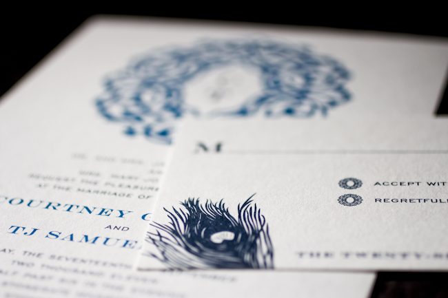
You’d never know this invitation was offset printed unless you felt it! Libby of Byrd & Bleecker definitely knows how to work within and around our albums, combining a converted version of the Lashar design that looks completely unique, with the peacock plume from our Everyday line.

Because the full order was offset in midnight and peacock inks, she was able to help the client save a bit of money and still get them an eye-catching design.

inks: midnight + peacock | fonts: engravers + gothic engravers | paper: 1-ply white | invite size: Tier 3 | liner: repeating lashar cartouche design in white + peacock | printing: offset
This design won an honorable mention in our Smock design competition for the first half of 2011. This twice-a-year competition recognizes outstanding and inspired designs submitted by our beloved dealers.