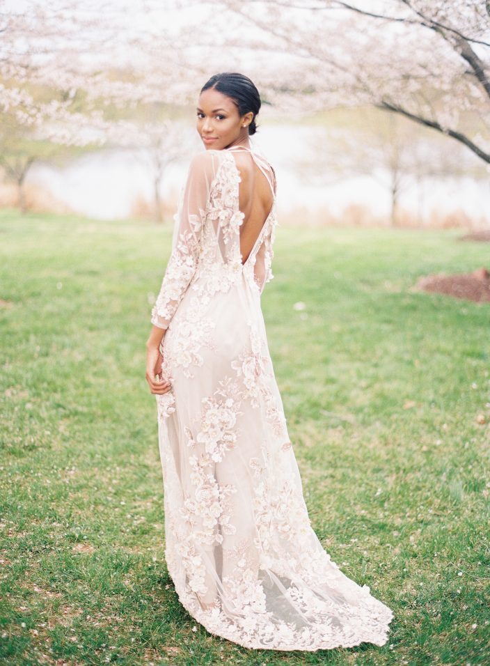
We were thrilled to see our Exeter letterpress wedding menus featured on Style Me Pretty this week! Veronica from Type A Society led the styling and creative direction for the shoot, which was all about springtime cherry blossoms. The floral applique details on the model’s dress gave a nice nod to the cherry blossom theme, while fresh florals made the shoot come to life. Angela Newton Roy captured the entire inspiration shoot beautifully – check out some of our favorite shots below, and be sure to visit Style Me Pretty to see the full gallery!


Photography: Angela Newton Roy Photography | Floral Design: Wild Green Yonder | Creative Direction & Styling: Type A Society | Wedding Dress: Marchesa | Wedding Dress: Gossamer | Veil & Crown: Twigs & Honey | Shoes: Bella Belle | Rentals: Something Vintage Rentals | Invitations + Calligraphy: Written Word Calligraphy | Hair & Make Up: Anna Breeding
We were thrilled to spot our Camden and Tensley wedding invitations in the February 2017 issue of Weddings in Houston magazine! The tawny matte Camden suite – complete with a peacock adorned envelope liner – was featured alongside other modern wedding invitations with floral envelope liners and design elements. Our sweet Tensley invitations feature letterpress printing in deep blue ink on our ivory bamboo paper, and were paired alongside other pretty blue invitations (including the Garden Sun invitation from our BFF Bella Figura). Many thanks to Weddings in Houston for including our invitations on these beautiful pages!


Inscriptions on the Boulevard in Fort Worth, Texas submitted these cheery rehearsal dinner invitations. Our pearl pattern was used on the invitation and the exterior of the folio, and gives off a fun, confetti-like look. The bubbly feel continued onto each insert card in the suite, and we love the way this stellar set came together!
inks: azure + pewter| font: beaumont| paper: 1-ply white | printing: letterpress | folio exterior: pearl pattern in pewter| folio interior: reverse fleming pattern in dove| edge paint: yolk |invite size: 5.125 x 7.75

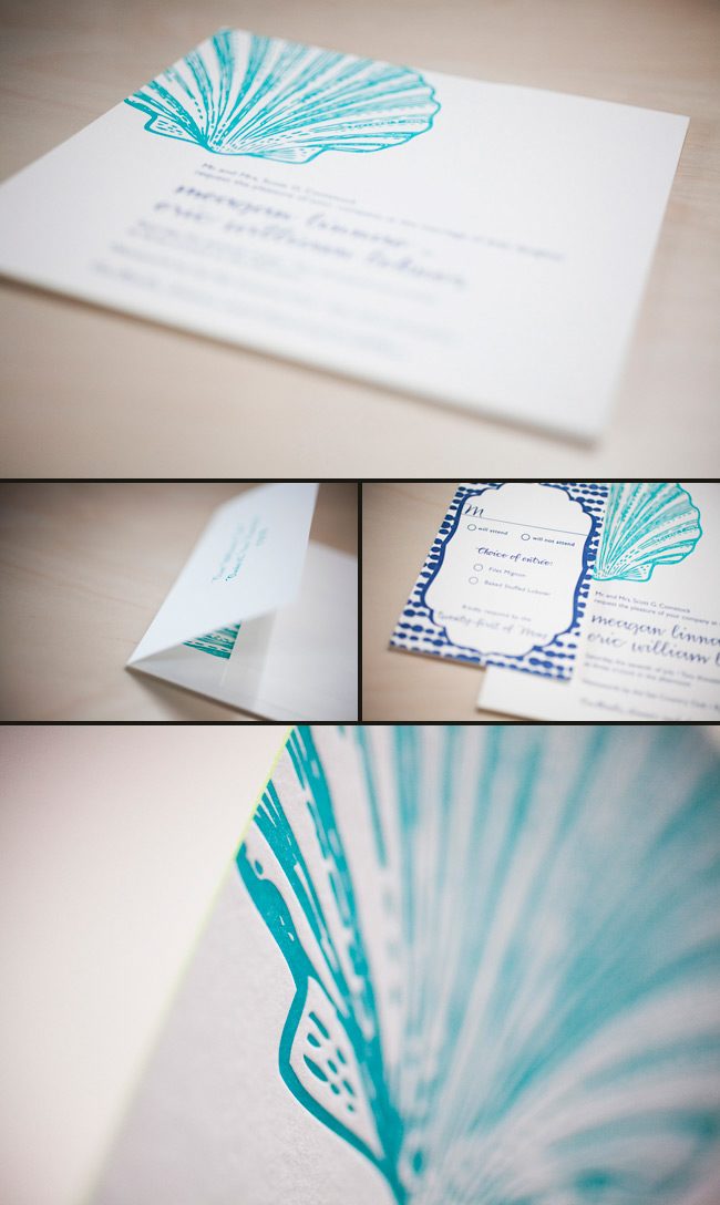
The lovely ladies at Gus & Ruby Letterpress in Portsmouth, New Hampshire submitted these eye-catching custom wedding invitations for printing. The oversized scallop shell gives this suite character and makes such an invitation fitting for the wedding celebration at Wentworth by the Sea Country Club. Talk about matching your invitations to your venue – we think these are a perfect fit! The sea inspired color palette of ocean and navy inks looks striking and sophisticated. We feel this pulls the whole look together.
inks: ocean + navy | fonts: smock harrison and gill sans | paper 2-ply white | edge paint in lime | invite size: S8SQ | printing: letterpress

This beautiful, and hardly “simple” custom design paired with a custom neon pink ink made one of the more dynamic letterpress sleeves we’ve seen yet. This was one of those letterpress invitation sets that got passed around from hand to hand, met by a series of “oohs” and “aahs.” Thanks so much to Simply Put by Ashley Woodman for all their hard work!
ink: navy + custom neon | fonts: custom submitted | paper: 2-ply white | printing: letterpress | letterpress sleeve, custom artwork | invitation size: s-7 seeve |

If you’re looking for a traditional wedding invitation suite – then look no further! We’re head over heels for this simple and sweet letterpressed set submitted to us by our friends at The Dandelion Patch in Reston, Virginia. Letterpressed in black ink with gorgeous mulberry edge paint that acts as the perfect accent to this one color set – we can’t help but swoon! After looking at photos of the The Ritz Carlton in McLean Virginia, where the fabulous wedding was held – we see what a fanciful and lavish venue the couple chose for their special day. Of course we believe tossing our mulberry ink into the mix helps keep this set looking romantic, but this set also encourages the feeling of the winter months. The three letter monogram on both the invitation and letterpress belly band adds another touch of elegance to this striking set!
ink: black | font: smock spencerian | paper: 1-ply white | printing: letterpress | edge paint in mulberry | liner: the champlain pattern in mulberry | letterpress belly band | invite size: S6

Seeing an order become a design is great. Seeing a design become a letterpress printed invitation is better. But when we get to see photos of our invitations in the hands of the happy couple and shots of their important day…well that just reminds us how much the hard work can pay off. Thanks so much to Michele at the Wedding Company in Hong Kong and well done to Adam Sjöberg for Ira Lippke Studios for the amazing camera work! The reception looked gorgeous and we are very honored to have played some small role in making that day special. Read our previous post about the letterpress wedding invitations.
inks: taupe + pearl + whisper | fonts: cameron + carrington | paper: 1-ply ivory | printing: letterpress | size: s8 | 3-color, bilingual invitations |


We printed these lovely pieces for the ultimate take-two wedding. The couples first attempt was thwarted by a hurricane, but, these newlyweds weren’t going to let a little weather ruin their special day. We went back to the drawing board with our friends at Judy Paulen Designs and whipped up these awesome Part II pieces. They combine beautiful offset and letterpress printing in our Navy ink. We were thrilled to be able to help them with their special day, even if the weather wasn’t going to cooperate.
ink: navy | fonts: smock spencerian + graham | paper: 1-ply white + 2-ply white | printing: letterpress + offset

These letterpressed save the dates were submitted to us by our good friend, Aileen at Aileen Invitations in Miami Beach, Florida. Our Rhon design looks truly sensational printed in our lavender and pewter inks. There are certainly times when a softer color palette works best and this is definitely one of those times! We print save the dates for all sorts of occasions and these save the dates happen to be for an engagement celebration. We can’t help but feel that the lavender ink represents gracefulness and charm while the pewter ink helps keep this set looking refined. Purple hues have always been connected to royalty which makes these save the dates all the more classic. The couple chose our payette pattern in lavender for both the offset back patterning and envelope liner – which ties this whole set together nicely.
inks: lavender + pewter| fonts: etienne + auden | paper: 2-ply white | printing: letterpress | corner rounding |back patterning: payette in lavender |liner: the payette pattern in lavender | size: S6

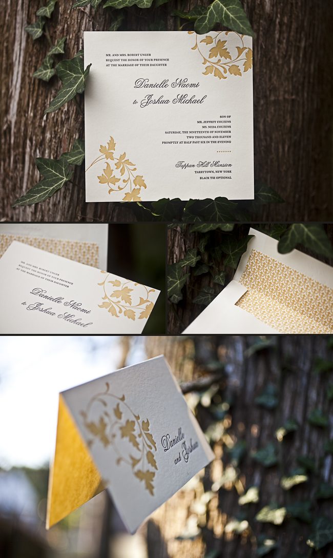
This vintage inspired customization of our Chasseral design was submitted to us by our great friends at LS Amster Company in Scarsdale, New York. We think our eggplant and saffron inks were the perfect pairing for an autumn wedding. The rich colors of the season are seen throughout- so much that it’s easy to see the leaves changing color! The iznik pattern envelope lining in saffron gives off the perfect amount of charm! Complete with direction cards printed on both front and back- these cards tell guests everything they need to know about getting to the celebration! The couple also chose letterpress thank you cards and we cannot think of a better way to show all of your guests your gratitude for being such an important part of your special day. Vintage inspired + autumn color palette = ABSOLUTELY BREATHTAKING!
inks: eggplant + saffron| fonts: graham + tally| paper: 2-ply ivory bamboo | printing: letterpress | edge painting in eggplant |back patterning: sinclair in eggplant |liner: the iznik pattern in saffron | invite size: S8SQ
