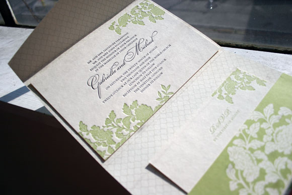
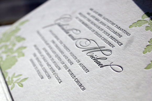
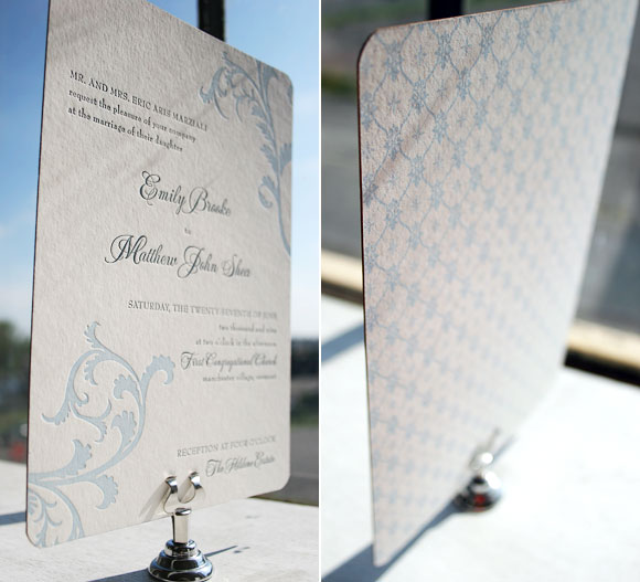
It’s not every day that we get to print an insanely beautiful 3-color letterpress wedding invitation and this one, a customization of our Engadine design and honoree in our Smock Design Contest from Kate’s Paperie, is just that – insanely beautiful. Printed in soft cream, verbena and periwinkle inks, this lovely letterpress wedding invitation is truly one of a kind. Using our Smock Spencerian calligraphy font in verbena and our Stockton serif font in periwinkle, this customization feels both bold and modern yet soft and pretty. Opting to use the Engadine leaf motif at the top of the invitation as opposed to in the lower corner as in the original design further personalizes the invitation, making it a true reflection of the couple and their wedding.
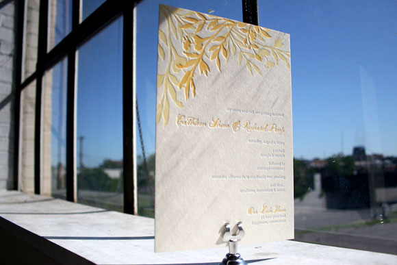
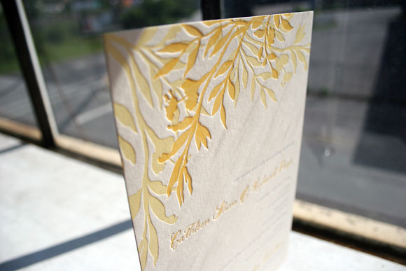
Thanks so much to our friends at Kate’s Paperie for sending along this customization – we always love the opportunity to print a really fabulous 3-color letterpress wedding invitation!
Featuring beautiful letterpress details by Smock in our Rhon design, calligraphy from our master calligrapher Debi Zeinert, and the beautiful styling of Lemiga Events, this tablescape is undeniably beautiful. Once again sent to us by the lovely Debra Saba of Luxe Expressions, Debra and the other talented professionals of StudioWed in Atlanta pulled together this tablescape design that has us totally inspired. (And the photos, taken by Blue World Studios, are just as beautiful!)
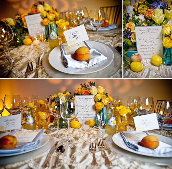
From the amazing linens from I Do Linens, to the adorable place cards poking out of pretty peaches, to the breathtaking flowers from Tulip, the details are so fresh and so pretty. It would make for a beautiful wedding, but would be equally as brilliant for a great anniversary or engagement party. The possibilities are endless!
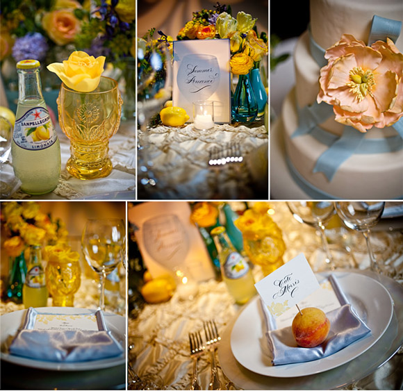
We are completely charmed by how lovely our Smock letterpress menus and place cards look nestled in among such fabulous details. And how amazing is that cake from Sweet Sensations? Even the fresh lemons and adorable bottles of lemonade are incredibly sweet – we’re so thrilled to have our Smock letterpress included in such an inspiring design!
A big thank you to Debra for all of the incredible inspiration this week – it’s such a pleasure to share it with everyone!
Residing at StudioWed in Atlanta, an exclusive gathering of Atlanta’s finest wedding professionals, Luxe Expressions is the inspired stationery boutique of Debra Saba. (The same Debra Saba who sent us this fabulous birthday party we shared earlier this week!) Having grown up in the small Illinois town of Joliet, with fond memories of the local dime store and visiting Orange Julius with her grandmother, Debra was inspired early on to take great care in customer service. While attending college and majoring in journalism and communications with a focus in graphic design, Debra always envisioned herself moving to Chicago and working for an advertising agency or a magazine. However, after several summers spent working at a golf course and having met a number of professionals, she found herself working for the next decade as a computer consultant in the corporate world. Though not in keeping with her education or her love for design, her career afforded her the opportunity to grow tremendously as a professional and do quite a bit of traveling, leading to her meeting her husband. Soon, all of the travel began to feel like too much, and with her husband’s support Debra decided to make the leap and go into business for herself, hoping to spread her love for design through her own stationery boutique and design studio. And with that, Luxe Expressions was born.
Debra figured that with her experience in building out technology centers for large corporations in her life as a computer consultant, it wouldn’t be hard to build her own business. She quickly found out just how wrong she was, but with the constant support of her husband she was able to make it work. She was inspired by her passion for stationery and her desire to work with happy people for a living, people who were celebrating life and the most meaningful of occasions. After so many years spent fixing problems, she longed for a career where she could work with people who were excited and optimistic. As she says today, “I love being around sunny happy people now.”
A typical day in the life of Luxe Expressions involves Debra or one of the other in-house designers working with clients on their projects and keeping in close contact with design studios such as Smock to track progress on client orders. As Luxe Expressions is not a traditional stationery store, consultations are scheduled by appointment only either at StudioWed or wherever else a design client may like to meet up over coffee to discuss their vision and ideas. StudioWed offers fabulous industry experts in everything from stationery and photography to floral design, event planning and catering. Couples are able to visit the studio, which is exquisitely designed, and have the vendors cater to them while providing endless inspiration for their event.
Debra and her team take great care in dealing with their clients, bringing a true consultative approach when dealing with brides and corporate clients alike. From the initial consultation to the final packaging, everything that involves Luxe Expressions is thoughtful and rich in personal detail. The running joke around StudioWed is that even Debra’s invoices come neatly packaged in cute envelopes topped with pretty ribbons. The great pride of Luxe Expressions is making clients friends for life – hopefully if they work with Luxe Expressions for wedding invitations, they’ll be back to design at-home cards, holiday cards and, of course, baby announcements.
If you could describe your personality in letterpress, which Smock invitation would you be and why?
I love them all but there are two that match my personality for completely different reasons. I love pattern and just a hint of the unexpected so I would say Lashar in blind deboss and eggplant. It has a bit of an ethnic flair to it and the pattern reminds me a bit of Damascus, Syria – my husband’s hometown. I also would have to have an inner envelope lined as I like to be very neat and the thought of ripping open an outer envelope and tearing the gorgeous liner makes me sad. I also love Haddington with the Smock Clermont calligraphy font and the names done by hand by Smock’s master calligrapher, Debi Zeinert.
What’s your favorite part about your job?
One of my favorite things is to collaborate with Lindsy and Beth Ann and everyone at Smock. You truly make my day enjoyable when we are working on a project together. I also love love love my clients, listening to their needs, and translating that into a design for them. I had a client that Smock did for us and when she saw her printed invitations, she cried. Those are the best part of my days for sure. I also love to “make it happen” so whatever the client needs, we’ll figure it out. I have a great team both internally and in the team of my extended vendor and partnership family.
What’s your favorite city to visit?
There are two. Internationally would be Damascus, Syria where my husband is from. I love everything from the people, to the smells of falafel cooking on the streets, to the sounds throughout the day. It’s amazing there and if I could talk my husband into moving back, I’d be there! Domestically I would have to say Ponte Vedra Beach, Florida where I lived right out of college. It was perfectly manicured and not fussy at all. It’s gorgeous and a few minutes from St. Augustine which is another favorite.
What do you think will be the next big thing in weddings?
I get a lot of requests to incorporate my client’s custom linen selections for their event into their stationery. I think bringing in a textile feel to things will take off. I would love to layer the invitations that are perfectly letterpress printed with some fabulous organic fabric.
Where are your favorite places to shop?
I am a huge Zappos fan for shoes! They by far have the best customer service for an online company. I also do quite a bit of shopping for fun things on Etsy. Locally I go to Lenox Sqaure Mall in Buckhead or The Avenue at West Cobb where I live out in Acworth, GA.
What’s your top pick destinations for first time travelers to Atlanta?
You must go to The World of Coca-Cola, the Georgia Aquarium, and the Atlanta Botanical Gardens as they all appeal to kids and adults. Piedmont Park is also quite lovely. Outside of Atlanta, if you take a drive up 75 north heading towards Tennessee…the view are gorgeous!
Thank you, Debra, for indulging us with the inside scoop on Luxe Expressions – you can plan on a visit from Smock the next time we make it to Atlanta! Also, a big thank you to Ross Oscar Knight, the photographer at StudioWed for the amazing photos – including some great shots of Smock’s letterpress wedding invitations!
Stay tuned because we have some more fabulous inspiration from the professionals at StudioWed later today!
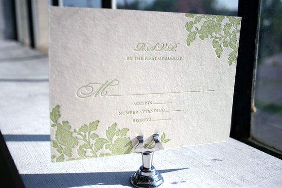
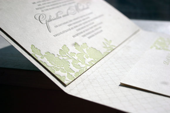
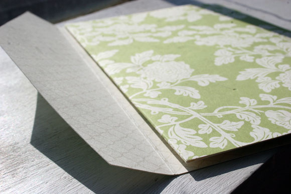
Continuing with the amazing customizations that were honored as winners in our Smock Design Contest, this incredible Rhon letterpress invitation with custom folio was brought to us by our friends at RSVP Studio in Toronto. Using a horizontal orientation and spring and sand inks, it’s a design that is fresh and fun, but also amazingly elegant.
While the invitation itself features spring and black inks, we printed the letterpress reply card in 1-color, making it a more budget-friendly option without sacrificing a bit of style. We love how pretty crisp spring ink looks on our ivory bamboo paper!
The folio features our Rhon motif in spring on the exterior with a really sophisticated use of our champlain pattern in sand on the interior. This chic combination of patterns and ink colors really made this customization stand out from the crowd.
As always, thank you to the folks at RSVP Studio for this amazing customization! It’s always so very exciting for us to see what our amazing clients and Smock stores dream up!
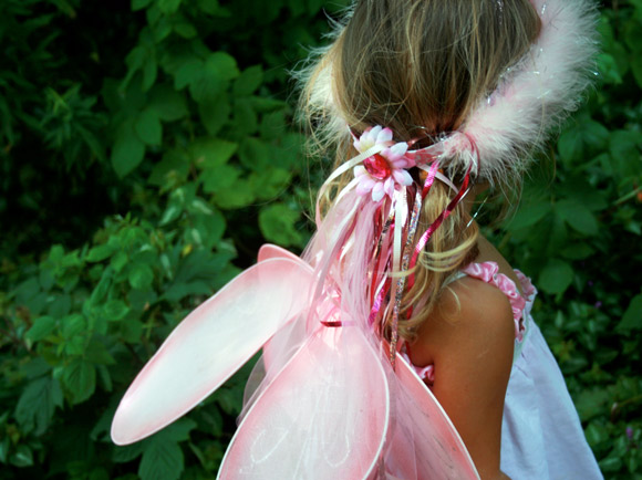
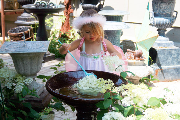
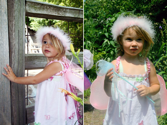
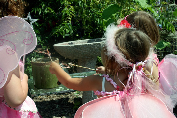
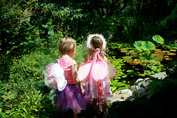
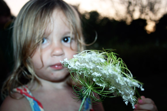
Miette and I recently attended a fairy festival at a local perennial farm. It was our first, so we weren’t quite sure what to expect (aside from lots of little be-glittered girls). On arrival, Miette was slightly awe-struck. Once she got her bearings, in true fairy fashion, she became quite industrious — sprinkling water on ALL the flowers with her wand. For nearly an hour. Other fairy-day moments: watching a puppet show, chasing butterflies and kissing a frog (ok, more princess than fairy, but still). I daresay, by the end, we were both fairied out.
This next runner up in our Smock Design Contest is a true customization, blending all of the beauty of both our Nevis and Vettore letterpress invitation designs into one incredible invitation suite. Brought to us by our friends at Arabesque in Naples, Florida, this customization was a true pleasure for us to print. With an exciting mixing and matching of colors, patterns and designs, this set is truly unique and exudes an undeniable elegance.
The letterpress invitation itself is our Vettore design, printed in soft lake and midnight inks. The design was shifted to have a vertical orientation and the couple opted for pattern backing in our willoughby pattern in lake. With corner rounding and gold edge painting, every detail was thoughtfully considered. The result? An absolute show-stopping letterpress invitation that we completely love.
Switching it up, the letterpress reception card is in our Nevis design in the same midnight and lake inks, with pattern backing in our seneca pattern. The same corner rounding and gold edge painting make this card just as classically chic as the invitation itself.
The letterpress reply card is once again in our Vettore design, paired with an envelope liner in our seneca pattern printed in lake to match the pattern backing of the letterpress reception card. The careful pairing of colors and patterns helps this invitation set shine, a truly beautiful and unique reflection of the couple and their wedding.
Thank you so very much to the folks at Arabesque for the privilege to print such an incredible customization. Congratulations on being one of our Smock Design Contest winners!
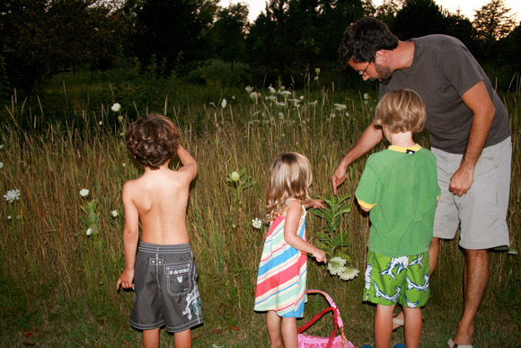
While my last post focused on a ‘big’ summer event, this week I thought I would reflect on a small and frequent tradition of our family – the evening walk. The best thing about this tradition (besides its ease) is that it is completely mutable. There is no start and stop time. No map. No itinerary. Very few rules. The kids run and look and shout and wrestle. They point out little things they find interesting – bugs and balls and old coins. They ask questions. They chase the dog. They get tired out. And my husband and I just try to soak it all in. Because this time together seems like it may go by just as fast as their little legs…


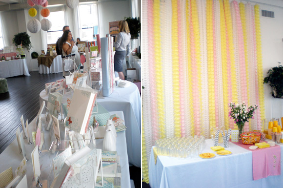
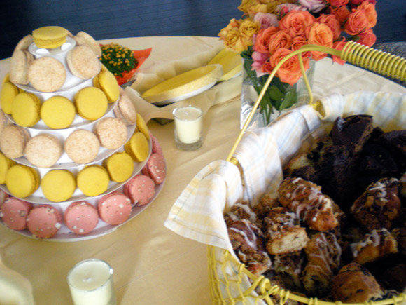
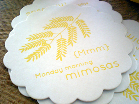
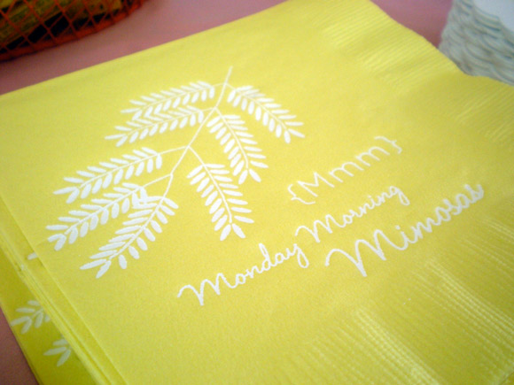
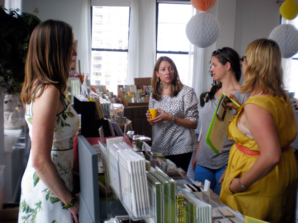
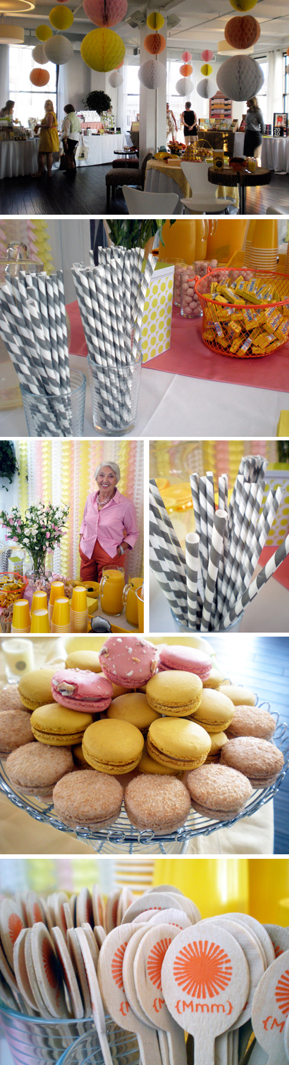
Have we mentioned already how much fun was had at Monday Morning Mimosas? Not only did we get to hang out with good friends, but we also got to spend the day in the incredible loft space of Hatch Creative Studio, with amazing event details pulled together by Erika of Delphine. Pretty paper streamers, and fun MMM-themed coasters and cocktail napkins, even color-coordinated Paulette macarons kept all of our visitors (and us!) oohing and aahing as they walked in all day.
Bobbi and Erika of Delphine chatting with friends Jennifer from Orange and Pear and Chloe from Toots & Magoo.
Joan and Vanessa of Green Paper Company
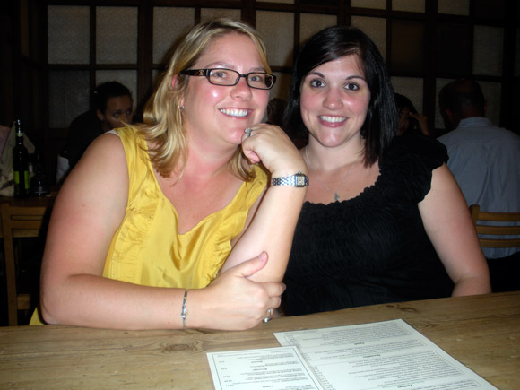
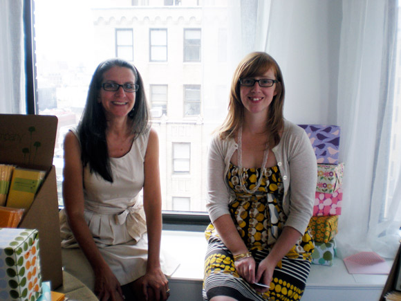
Erika of Delphine [left] and me, hanging out at lunch after Monday Morning Mimosas.
Stay tuned for more from Monday Morning Mimosas!
[Previously…Smock at Monday Morning Mimosas]
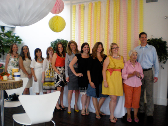
Thank you to everyone who came out for Monday Morning Mimosas this week and to all of the excited Smock fans who showed up for our sample sale that evening! It was wonderful to meet so many new people who share our love for great letterpress, stationery, lovely candles and chic office supplies. We had a fabulous time with our friends from Delphine, Linnea’s Lights, russell+hazel and Green Paper Company. For those who couldn’t make it, here’s a sneak peek at the event….there are many more photos to come!
And, of course, an obligatory group photo…
Good is an eco magazine, one of my favorite eco reads. Subscribe to this magazine and 100% of your subscription is donated to nonprofits doing good. And if that isn’t convincing enough, this magazine has amazing photography and really cool graphs (“the most used subways in the United States and the world, showed in graphic form”), as well as inspiring profiles of people who are helping change the world for the better. Though I wish they trusted their readers to have a longer attention span (lots of short 1/2 page or 1 page articles), it’s a thought provoking read that nudges you to live your life better – not in the self-development sense (10 ways to look better, etc.), but living your life in a way that helps others and the world. One of the most recent issues was devoted to transportation, and by the end of it, it was hard not to say “okay, okay, I’ll ride my bike more, I’ll look at bus routes differently, okay, I’ll do it!” This issue included drawings from grade school students on transportation of the future (including “traveling legs’), a neat article on “casual carpooling” in the Bay Area, and the cool buses of Bogota. Good is just that, good, and one you should definitely check out.
[Good]