We worked with No Regrets to create the Margo family’s Christmas card, which was a sweet and simple take on our Lincoln design. The family chose a nontraditional color combination of gold, gray and pink for their cards, with modern fonts completing the look.


foil color: gold matte | fonts: natura + natie | paper: 1-ply 100% recycled gray paper | size: S-6 | envelope liner: taihu pattern in shell | customization #30034 | No Regrets
We’re excited to introduce a brand new paper to the Smock line. Our new gray paper is 100% recycled (50% post consumer) and looks beautiful with gold foil stamping. This new paper debuts with our latest release, and is featured on three cards: Happy New Home, Cheers, and Congratulations. Paired with classic white envelopes, these congratulatory cards are festive, fun, and chic.


Soft, subtle hues are what’s in right now! Take a look at these trendsetter custom letterpress wedding invitations. This whimsical set was submitted to us by our great friend, Kappy at Le Village Marche in Arlington, Virginia. We love that our lyon border is featured on the left side of the invitation – adding to the modern feel of this suite. Although this set is more on the contemporary side – choosing a softer color palette helps maintain a timeless and elegant feel for your wedding day. We think these stylish invitations will surely delight their guests!
inks: yolk + pewter | fonts: louise + peale | paper 2-ply white | invite size: S-8 | printing: letterpress | corner rounding | liner: the granby pattern in dove

These letterpressed save the dates were submitted to us by our good friend, Aileen at Aileen Invitations in Miami Beach, Florida. Our Rhon design looks truly sensational printed in our lavender and pewter inks. There are certainly times when a softer color palette works best and this is definitely one of those times! We print save the dates for all sorts of occasions and these save the dates happen to be for an engagement celebration. We can’t help but feel that the lavender ink represents gracefulness and charm while the pewter ink helps keep this set looking refined. Purple hues have always been connected to royalty which makes these save the dates all the more classic. The couple chose our payette pattern in lavender for both the offset back patterning and envelope liner – which ties this whole set together nicely.
inks: lavender + pewter| fonts: etienne + auden | paper: 2-ply white | printing: letterpress | corner rounding |back patterning: payette in lavender |liner: the payette pattern in lavender | size: S6

This stellar custom invitation suite was submitted to us by our good friend Jessica at Judy Paulen Designs in New York, NY. With the perfect design elements on the invitation, this only quietly calls for attention-and we just love that! We absolutely adore the soft, subtle ink palette which is the perfect match to the couple’s fabulous venue in Chicago, Illinois. The neutral and conservative pairing of our dove and pewter inks look positively remarkable! And then there’s the metallic platinum envelope liner providing the perfect color contrast.
inks: dove + pewter | fonts: smock harrison + carrington stripes | paper: 2-ply white | printing: letterpress | liner: metallic platinum| invite size: S7

Sent to us by our friends at Bridals by Lori in Atlanta, Georgia these precious Dorset letterpress baby announcements will surely tug at your heart strings! These adorable baby announcements are printed in pearl and pewter inks with corner rounding to make for the most gracious curves and a completely finished look. We love to see the unique customizations proud parents dream up to celebrate their new bundle of joy! Paired with our champlain envelope liner in pearl we love this added feminine touch! We think you’ll agree that these baby announcements are absolutely precious.
inks: pearl + pewter| fonts: smock bescal + stockton| paper: 2-ply ivory | printing: letterpress | edge painting in pearl |back patterning: sinclair in pearl |corner rounding |liner: the champlain pattern in pearl | size: S6

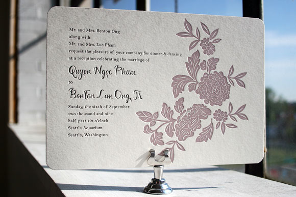
Finally, the moment you’ve been waiting for breathlessly for weeks – it’s time to wrap up our first ever Smock Design Contest by sharing our first place winner! This absolutely stunning customization, brought to us by our friends at Real Card Company in Seattle, was the clear favorite, taking our ever-popular Rhon letterpress wedding invitation design and completely reinventing it into something extraordinarily special. We loved it before we even printed it and seeing is believing – the end result is truly beautiful! It was a real favorite of Smock’s Creative Director, Amy Graham Stigler. From the soft romantic colors, pewter and wisteria, to the asymmetrical layout featuring a unique variation of the Rhon floral motif and horizontal orientation, Amy loved how this design was truly personalized to make a one of a kind creation.


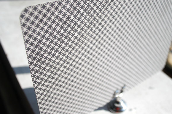
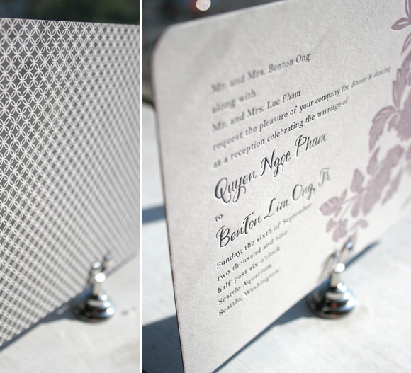
Letterpress printed in soft wisteria and pewter inks, this invitation also features chic patterned backing in our rowe pattern in pewter.


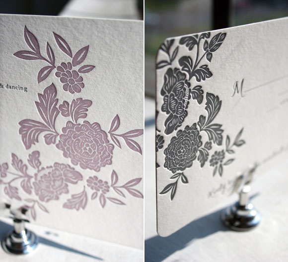
While the letterpress invitation itself was printed in 2-color letterpress, the reply card was letterpress printed in 1-color in pewter ink. We love the play between colors and patterns in this incredible set – it’s both elegant and formal, but still fun and just a touch modern. A huge thank you to Real Card Company for collaborating with us on this incredible customization and congratulations on winning the first Smock Design Contest!
For more fabulous customizations of Smock’s letterpress wedding invitations, check out the rest of the honorees in our Smock Design Contest for incredible inspiration!
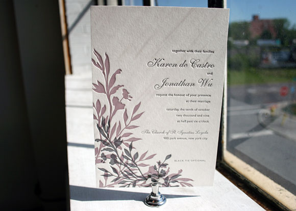
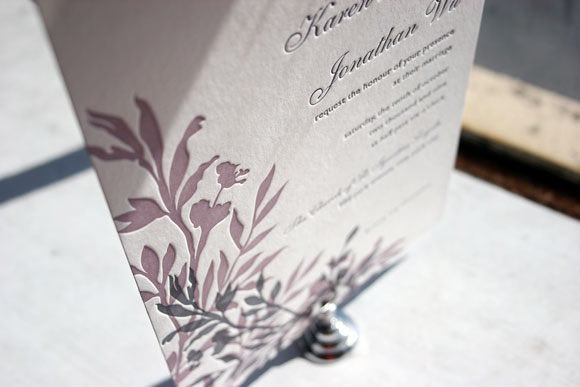
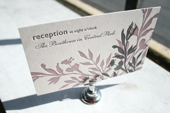
The first of two honorable mentions in our Smock Design Contest brought to us by Judy Paulen Designs at Bloomingdale’s in New York, we’re completely in love with this chic customization of our Engadine letterpress wedding invitation design. It’s printed in elegant wisteria and pewter inks and features our playful Etienne and Shaw fonts for a finished design that is the perfect blend of traditional elegance and modern sophistication. The set also includes a really lovely letterpress reception card that makes the most of a play between the script Etienne font and the clean look of the sans serif Shaw font. It’s minimal and simple, but still fresh and completely chic.


Thanks so much to our friends at Judy Paulen for sending us this beautiful customization!


