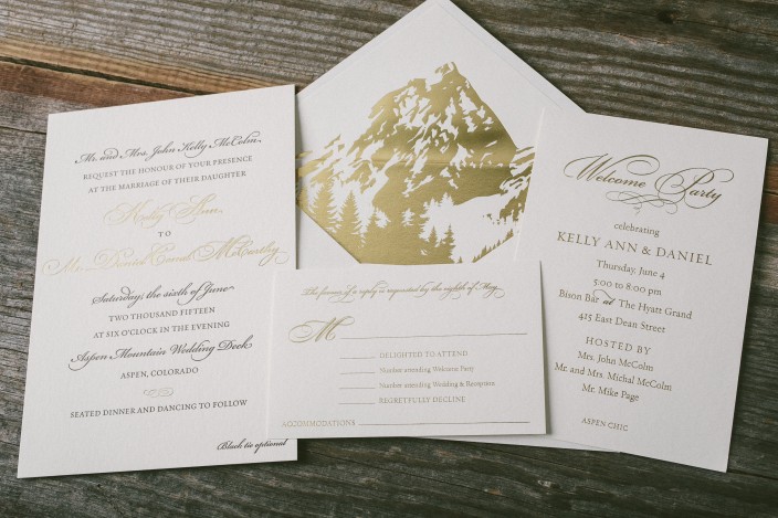
For their Aspen wedding, Kelly and Daniel worked with Byrd and Bleecker to create a timeless invitation suite with a dramatic envelope liner. We printed their suite in gold matte foil and espresso letterpress ink, and created an invitation, reply card, and welcome party invitation. The couple kept the invitations and additional pieces simple, opting for a chic, text-based design, and showcased the Rocky Mountains on their stunning gold foil envelope liners.


letterpress ink: espresso | foil color: gold matte | fonts: submitted | paper: 1-ply + 2-ply ivory | size: S-8 + S-6 + S-5 | foil envelope liner: custom artwork in gold matte | customization #26938 | Byrd + Bleecker
Paperista submitted this tri-fold letterpress save the date and we love the color combination. From accommodation information to upcoming weekend events, a tri-fold save the date can provide all the thoughtful details for your guests.
ink: espresso + sand + coconut blind deboss | font: inigo + spencerian font | paper: 1-ply ivory | size: S-5TF | customization #: 16524 |

Gold and Espresso are one of the most elegant pairings of inks in our library. The submitted artwork sent to us by Paperkiss for this order was not only beautiful, but looked even better in print.
ink: gold + espresso | fonts: submitted artwork | paper: 2-ply white | printing: letterpress | submitted artwork | invite size: S8 | customization #: 16107 |

A huge thanks goes out to Invite for sending us these very elegant invitations for the Berkshire International Film Festival. Using our Chasseral design, they have made this a must attend event.
inks: tangerine + espresso | fonts: minn + stockton | paper: 2-ply ivory | invitation size: S8 | printing: letterpress + offset | customization #: 15712 |

We were floored when we got this stunning Dawson rehearsal dinner invite from Paper & Chocolate. The set looks complete with a simple patterned offset envelope liner.
inks: espresso + robin egg | fonts: millicent + lazlo | paper: 1-ply white | printing: letterpress + offset | envelope liner: offset champlain in espresso | invite size: S8 | customization #: 15457 |

Sometimes, all an invitation needs is the right letterpress ink in the right fonts. Pen & Paper created a great balance between script fonts and block fonts in this customization of our Fitzroy design, and finished the set off with a little bit of gold foil edging.
ink: espresso | fonts: cranbrook + engravers + smock plaza calligraphy font | paper: 2-ply white bamboo | printing: letterpress | gold matte foil edging | offset liner: sherbrooke in espresso | invite size: S8 | customization #: 15276 |

There is no greater testament to the strong relationships we have with our stores than when they choose Smock for their own orders. Byrd + Bleecker put together a wonderful set of holiday cards, incorporating a little bit of everything and we are honored that they thought of us for their printing.
letterpress ink: hot pink + espresso | foil: silver shine | fonts: smock stella + auden | paper: 2-ply white bamboo | printing: letterpress + foil | offset back pattern: everett in espresso | offset liner: pearl in hot pink | invite size: S7 | customization #: 15378 |

Sleeves are fun, especially this sleeve. This letterpress invitation set has a great combination of inks, fonts, and motifs. Hitched is great at working with the Smock Library to create fun, unique designs, and this customization is no exception!
inks: espresso + yolk | fonts: graham + smock stella cf | paper: 1-ply ivory bamboo | printing: letterpress | chesapeake die cut | offset liner: mondsee in yolk | invite size: S7 | offset sleeve: custom in espresso | customization #: 14533 |

For the last week, we’ve been posting the honorable mentions for the Smock Design Contest. Now we’re down to the final three! Our good friend Nole at Oh So Beautiful Paper chose our winners for this competition, and selected Alphagraphics Lyric Opera Invitation as the 3rd place winner. Here’s what Nole had to say about the design: “I don’t think I’ve ever seen a corporate invitation that was so pretty! I love the patterns, the font selections, and the fold out layout. Gorgeous.”

Nole, we couldn’t agree more! It’s not often we get to print letterpress invitations for galas, concerts, or charitable events, so when we do, we tend to get pretty excited. This espresso and gold invitation to the Lyric Opera’s Charitable Subscriber Concert and Dinner was extraordinary! It was, indeed, a ticketed concert (which explains the use of the pocketfold), and the invitation invited 100 of the Opera’s premier patrons to dinner and a concert.

To the untrained eye, this striped, monogrammed pocketfold invitation looks beautiful and classy. For those who spend a lot of time at Chicago’s Civic Opera House, they’ll notice graphic elements that remind them of the gilded gold walls and ceilings of that very building. When designing the invitation, Amy at Alphagraphics used the opera’s Art Deco elements and color scheme as her guide. She created an invitation that was reminiscent of the old stately edifice, glamorous in its timelessness.

Her work was well appreciated by all! Both the Lyric Opera and the event’s attendees thought the invitation was a fantastic bidding to a wonderful evening of music and feasting. Bravo Amy, Bravo!
Congratulations again to Alphagraphics for taking 3rd place in our design contest. This twice-a-year competition recognizes outstanding and inspired designs submitted by our beloved dealers.
We printed these simple, yet elegant, birthday announcements for our friend Linda Chamlin at LS Amster Company. They were offset printed in our Espresso and Heliotrope inks. They are a beautiful way to welcome an 18th birthday.
inks: espresso + heliotrope | fonts: estrella + cooper | paper: 1-ply white | printing: offset | invite size: S-5SQ


