Take a peek at these vibrant and high spirited save the dates! We have Melanie at Salutations in Charlotte, North Carolina to thank for these beauties! We were even able to get a bit of a back story to find out where the inspiration came to create a design so eye catching and brilliant. The bride loved the bold pattern of our Evans design and wanted to use our robin’s egg ink color to truly make a statement. We love to see couples choosing more modern and chic designs for their save the dates, even when they’re planning on sending a super formal invitation suite like these guys are planning. The happy couple said that their save the dates totally matched their fun and bubbly personalities — and we couldn’t agree more! Thanks so much to Salutations for sending us such a fun save the date set — we can’t wait to see the invitations!
inks: robin’s egg + black | fonts: chaplin + carrington + smock harrison | paper: 2-ply white | printing: letterpress | liner: the sinclair pattern in robin’s egg | size: S6

This design won an honorable mention in our Smock design competition for the first half of 2012. This twice-a-year competition recognizes outstanding and inspired designs submitted by our beloved dealers.
If you’re looking for a traditional wedding invitation suite – then look no further! We’re head over heels for this simple and sweet letterpressed set submitted to us by our friends at The Dandelion Patch in Reston, Virginia. Letterpressed in black ink with gorgeous mulberry edge paint that acts as the perfect accent to this one color set – we can’t help but swoon! After looking at photos of the The Ritz Carlton in McLean Virginia, where the fabulous wedding was held – we see what a fanciful and lavish venue the couple chose for their special day. Of course we believe tossing our mulberry ink into the mix helps keep this set looking romantic, but this set also encourages the feeling of the winter months. The three letter monogram on both the invitation and letterpress belly band adds another touch of elegance to this striking set!
ink: black | font: smock spencerian | paper: 1-ply white | printing: letterpress | edge paint in mulberry | liner: the champlain pattern in mulberry | letterpress belly band | invite size: S6

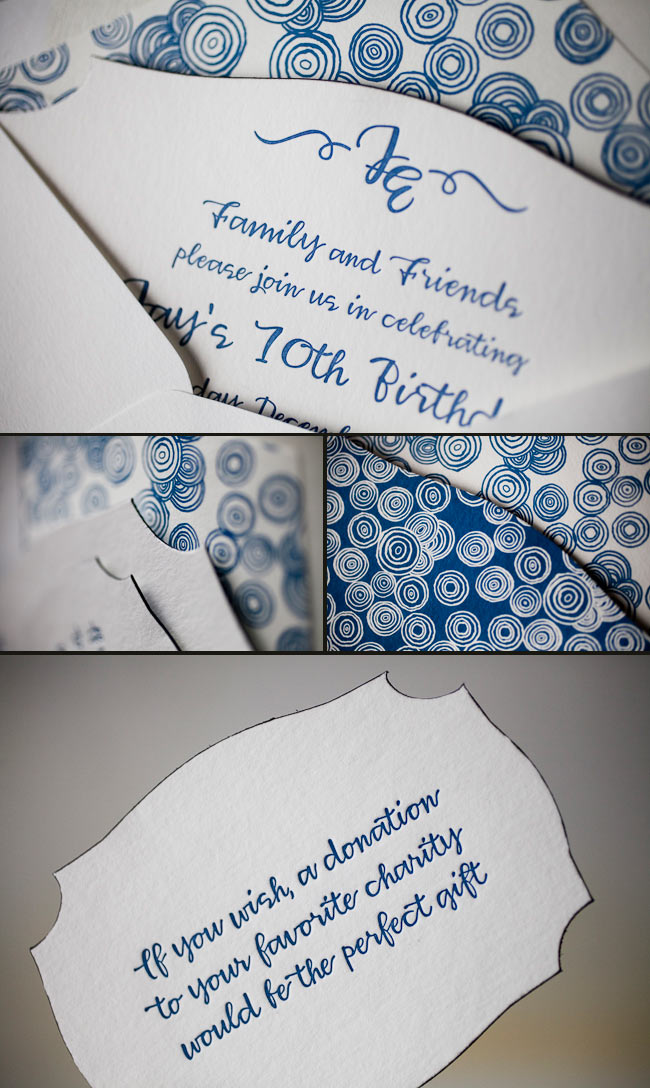
These letterpressed save the dates were submitted to us by our good friend, Aileen at Aileen Invitations in Miami Beach, Florida. Our Rhon design looks truly sensational printed in our lavender and pewter inks. There are certainly times when a softer color palette works best and this is definitely one of those times! We print save the dates for all sorts of occasions and these save the dates happen to be for an engagement celebration. We can’t help but feel that the lavender ink represents gracefulness and charm while the pewter ink helps keep this set looking refined. Purple hues have always been connected to royalty which makes these save the dates all the more classic. The couple chose our payette pattern in lavender for both the offset back patterning and envelope liner – which ties this whole set together nicely.
inks: lavender + pewter| fonts: etienne + auden | paper: 2-ply white | printing: letterpress | corner rounding |back patterning: payette in lavender |liner: the payette pattern in lavender | size: S6

Submitted to us by our good friend, Elle at Petite & Sweet in Toronto, Canada these letterpressed Hekla baptism invitations are downright swank! I mean talk about being up-to-the-minute! These invitations showcase our royale and inkless blind deboss inks – and the end result makes for some of the most chic invitations we’ve had the joy of printing in quite some time. The envelope liner adds another nice modernistic touch to this anything but simplistic set! We think these invitations are the perfect prelude to such a memorable occasion – and helped achieve the vision the proud parents were hoping for. We look forward to many more unique and current customizations from Petite & Sweet!
inks: royale + inkless blind deboss | fonts: shaw + social | paper: 2-ply white bamboo | printing: letterpress | edge painting in royale | liner: the ridley pattern in royale | invite size: S8

Sneak a peek at this beyond beautiful letterpress Rhon invitation suite submitted to us by our friend Casie at Francis~Orr Corona del Mar in Corona del Mar, California. The color combination of verbena and taupe transforms the look of this set into something almost vintage! And everyone knows yellow represents sunshine and joy! We can’t help but feel this yellow hue helps radiant happiness about the couple’s big day. Our rhon pattern in verbena on the pocketfold’s exterior adds the most elegant touch to this sensational suite! We always enjoy working with Francis~Orr because they submit some of the most creative invitation sets!
inks: verbena + taupe | fonts: smock spencerian + stockton | paper: 2-ply white | printing: letterpress | corner rounding | folio exterior: rhon pattern in verbena | folio interior: payette pattern in taupe | liner: the payette pattern in verbena | invite size: 5.125 x 7.75

This stellar custom invitation suite was submitted to us by our good friend Jessica at Judy Paulen Designs in New York, NY. With the perfect design elements on the invitation, this only quietly calls for attention-and we just love that! We absolutely adore the soft, subtle ink palette which is the perfect match to the couple’s fabulous venue in Chicago, Illinois. The neutral and conservative pairing of our dove and pewter inks look positively remarkable! And then there’s the metallic platinum envelope liner providing the perfect color contrast.
inks: dove + pewter | fonts: smock harrison + carrington stripes | paper: 2-ply white | printing: letterpress | liner: metallic platinum| invite size: S7

Get ready to blow out those birthday candles! Check out these recently printed birthday party invitations submitted to us by our friends at Judy Paulen Designs in New York, NY. Our plymouth die cut adds even more boyish charm to an already youthful looking birthday party invitation. We can’t get enough of the granby backing patterning in navy, and take a look at the envelope liner in reverse granby in navy-for another super cool customization. Alright now, let’s get the party started!
inks: navy | fonts: smock harrison | paper 2-ply white | invite size: S-6 | printing: letterpress | die cut: plymouth | back pattern: the granby pattern in navy | edge paint: black | liner: the reversed granby pattern in navy
If we were not already in the holiday spirit- these colorful and cheery Christmas cards would surely turn that right around! This custom and lovable set was submitted to us by our good friend, Sara at Salutations in Chapel Hill, North Carolina. Check out the reindeer envelope liner that is actually made from our Smock gift wrap! Looking at these cards we can’t help but feel good inside, as the holiday season is just around the corner! What a perfect way to send warm wishes to your friends and family!
inks: grass + cherry | fonts: smock clermont | paper: 2-ply white bamboo | printing: letterpress | signature liner: C9G1-1 | card size: S6

Traditional wedding meets modern design in this wedding suite from our friends at Union Street Papery. They put together this beautiful suite using our Talmossen design, which uses a traditional feel font and pairs it with modern design accents. This suite was done on our white Bamboo paper in Taupe ink. This was a wedding that brought together two cultures with invitations done in both English and Spanish version. All the pieces were finished off with metallic silver edge painting and the inner envelope was paired with a custom offset liner (our Fleming Design in Espresso) to give it that modern look.
inks: taupe + espresso (offset) | fonts: harrison calligraphy font | paper: 2-ply white + 1-ply white | printing: letterpress + offset | envelope liner: fleming in espresso (offset) | edge paint: metallic silver

This cool Hekla custom letterpress + offset invitation suite was submitted by our friends at Hitched in Washington DC. The invitation is letterpress printed on our bamboo 2-ply paper in black with a blind deboss ink that makes it pop. The edge painting in spring and an offset back pattern in black add to the uniqueness of this piece. To top it all off, they decided to go with one of our new chesapeake die-cuts. It is accompanied by an outer envelope lined with our ashford pattern in spring. The piece that makes this suite amazing is the custom sleeve – offset with our seneca pattern in black.
inks: black + spring + blind deboss | fonts: percy + louise | paper: 2-ply white | printing: letterpress + offset | liner: the ashford pattern in spring | back pattern: the van pattern in black | sleeve: the seneca pattern in black | invite size: S-8 (chesapeake die-cut)


