We were thrilled to be asked again this year to print the 2014 Paper Party invitations. This year’s invitation for the amazing event put on by Nole Garey at Oh So Beautiful Paper was designed by Mr. Boddington’s Studio, and we printed the invitations on Mohawk Superfine paper. Take a look at some of the photos – didn’t the invitations turn out beautifully? We love the calligraphy from Michele at Meant to Be Calligraphy and the stamps & envelope liners add a fun finishing touch!


Design: Mr. Boddington’s Studio | Printing: Smock | Paper: Mohawk, Superfine Ultrawhite Eggshell 130 lb | Envelopes: Mohawk, Loop Antique Vellum Kraft 80 text in A7 size | Envelope Address Calligraphy: Meant to Be Calligraphy
Fresh Ink in Jackson, Mississippi sent along these custom letterpress invitations for us to print. The couple submitted their own artwork for us to letterpress on their suite – and the end result was simplistic, yet sweet. Opting for our #10 tea length invitation size makes for a contemporary twist, while the silver ink still maintains the traditional look that we all adore.
ink: silver | fonts: submitted | paper: 2-ply white | printing: letterpress | offset liner: custom in silver | size: #10 | customization #: 16084 |

We can thank our friends at Dandelion Patch – Georgetown for this wonderful custom wedding suite. The modern feel of these invitations is helped with our custom Plymouth die cut and offset envelope liner.
inks: papaya + azure | fonts: smock clermont calligraphy font + harper | paper: 2-ply white | invitation size: S8 plymouth die-cut | printing: letterpress + offset | customization #: 14739 |

Our friends at Salutations in Charlotte, North Carolina sent along these adorable letterpress invitations for printing. The couple submitted their own custom artwork to be printed on each piece in their suite. The pairing of our cherry and azure inks also makes a bold statement – and we definitely think their creativity shines through.
inks: cherry + azure | fonts: worthington block font + alice script | paper 2-ply white | printing: letterpress |edge painting in cherry | liner: the sinclair pattern in cherry | offset sleeve: custom pattern; in cherry + azure |invite size: 5.4375 x 8.0625

Letterpress wedding invitations and greeting cards from Smock have been spotted in some amazing places lately, and today we’re excited to share the features that Smock has been a part of this fall! For their Fall 2012 issue, Inside Weddings magazine included a custom wedding invitation set from Smock that featured a letterpress sleeve and combined two of our most popular designs: our floral Rhon design paired with elements from our more modern Dawson design.

Brides magazine featured one of our new, foil stamped wedding invitation designs and matching invitation sleeve — our whimsical Tatra customization — as part of their November issue.

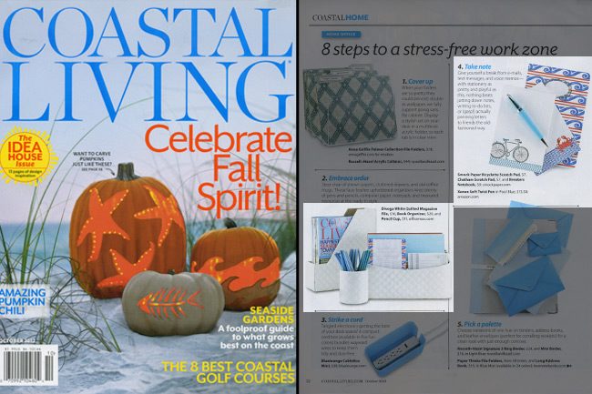
Coastal Living included several of our products in their October 2012 issue as part of their “8 Steps to a Stress-Free Work Zone” feature. Our Bicyclette and Chatham scratchpads ($7 each) and our Breakers notebook ($9 each) are perfect reasons to take a break from technology to write down notes the old-fashioned way.

Stationery Trends magazine featured one of our new holiday cards as part of their Fall 2012 issue — our Joyeux Noel card (which features letterpress and gold foil stamping) was included in a piece all about gold.

And of course, we can’t forget about the amazing bloggers who have been featuring Smock online these days — Oh So Beautiful Paper, Discover Paper, Going Home to Roost, Young House Love, Bustle Blog, and Creative Wish — we appreciate your recognition!
This three color letterpress suite featuring blossoming chinese hydrangeas looks delicate and downright romantic. Sent in by our good friend, Sue at Merci for Stationery and Fine Things in Denver, Colorado we were smitten with this suite the moment we saw it come off press. The soft, natural hues used on this set are what have us so in love. Textured blooms on the flowers transform the invitation into something positively nature inspired.
inks: lavender + pewter + spring| fonts: cooper + frida | paper: 2-ply white bamboo | printing: letterpress | corner rounding |liner: the sinclair pattern in lavender| invite size: S8

We couldn’t wait to share this downright adorable set sent to us by our lovely friends Samantha and Liz at Gus & Ruby Letterpress in Portsmouth, New Hampshire. Letterpressed in navy ink with playful type, these invitations are overflowing with sweetness. The lime polka dot pattern on the custom offset sleeve gives this set a fun personality. We just can’t get enough!
ink: navy | fonts: strangelove + emma script | paper 1-ply ivory | printing: letterpress | custom sleeve: page pattern in lime offset |invite size: 5.4375 x 8.0625

How to vote: Visit smockpaper.com/wedding and choose your favorite invitation design. Roll over the photo and click the “like” button that appears. That’s it!
Why vote: For every vote cast through April 12, 2012, we’ll donate $1 to Earthwork’s No Dirty Gold campaign (up to $500) to help put an end to dirty gold mining practices that are devastating the planet.
What happens with the winning design? The invitation design with the most votes will be the next Smock design of the month. From 4/14 – 5/14, all custom orders that feature the winning invitation design (wedding invitations, stationery, save the dates, you name it!) will be 10% off (or 15% off for orders with 6 or more pieces!). You can place your order with one of our amazing Smock custom dealers.

So why should you care about dirty gold mining practices? If you’re engaged, there’s a good chance you’ve already got a ring with some gold in it (and you may be looking to purchase wedding bands soon, too). There are certain dirty mining practices that have really terrible impacts on the communities and the environment surrounding the mines – did you know?
- The production of one gold ring generates 20 tons of mine waste.
- The drinking water in mining communities often becomes contaminated, and mine drainage can also raise acid levels in rivers and lakes that can be harmful to wildlife and people. Some mines even dispose of toxic waste in rivers, lakes, and oceans on a regular basis.
- Some of the refining processes that are used in mines release chemicals that cause smog and acid rain.
- Many gold mines create solid waste, too: by employing a process known as heap leaching, these mines drip a cyanide solution through high piles of ore. The solution strips away the gold, but a lot of waste is left over from the process (read: the waste from these sites can sometimes reach over 300 feet – which is nearly the height of a 30-story building!). Many of these heaps are often abandoned because they are too costly to dispose of properly.
- Indigenous people around the world typically lose out when mining leases are granted. In rural communities, locals often become vulnerable to eviction without notice, meaningful compensation or an offer of equivalent lands in a new region because legal land titles aren’t always on hand (even if a family has occupied the same lands for generations).
- Mining is a dangerous job: rock falls, tunnel collapses, fires, heat exhaustion, and other dangers claim the lives of over 15,000 miners every year, and while the profession only accounts for 1% of the world’s labor force, it accounts for 5% of on-the-job fatalities.
Wondering what you can do to help? It’s really easy to take action. Sign the Earthworks pledge today, and be sure to support retailers who are actively pursuing clean gold sources. If you choose to work with a retailer who’s not on that list (like Macy’s or Costco – the only two retailers in the top 10 list that haven’t committed to sourcing responsible gold) be sure to ask your jeweler about the source for the gold in your ring. Other ways you can help:
- Recycle old jewelry, and have old rings melted down to make new ones. Support jewelers that offer products made with recycled gold.
- Buy vintage or antique jewelry.
- Keep jewelry in your family and pass on to your children or grandchildren.
Our second place design contest winner comes to us from Shelley at /di’zain/ loft limited in the Republic of Trinidad and Tobago, a recent addition to the Smock family. The couple chose a dreamy color palette of dusty pinks and greys for their wedding, so invitations in pewter and shell inks on our white bamboo paper fit their theme perfectly and created a soft, sweet feel. The invitation design was modeled after a vintage, “fashionably chic” handwritten love letter, which seems perfectly fitting for Clare-Ann and Joshua as they have had to experience the challenges of an overseas relationship. Shell envelope liners and a pretty script font reminiscent of elegant cursive handwriting complete the look of the invitations.

The couple strove for a sense of romanticism with their invitations, and we definitely think they’ve achieved it! We fell in love – and so did our contest judge, Nole, at Oh So Beautiful Paper, who selected the design as the 2nd place winner. She writes, “The invitation has a clean and modern layout, and I love the use of script and serif fonts that keep the design from looking too fussy. Sweet and simple.”
Congratulations Shelley, and best wishes to the happy couple!
Congratulations again to Di’zain Loft Limited for taking 2nd place in our design contest. This twice-a-year competition recognizes outstanding and inspired designs submitted by our beloved dealers.
Courtesy of Village Invites in New York, NY this custom letterpress wedding invitation order was fun to see come to life! The vibrant colors (raspberry and turquoise inks) and reverse-printed bellyband created a very unique invitation set for a destination wedding. Jaye and Nathalie are a joy to work with and we are happy to showcase their work when they ask for something that looks this good.
inks: raspberry + turquoise | fonts: stockton + smock harrison | paper: 2-ply white | printing: letterpress | letterpress belly band | square invitation: 7 x 7 |


