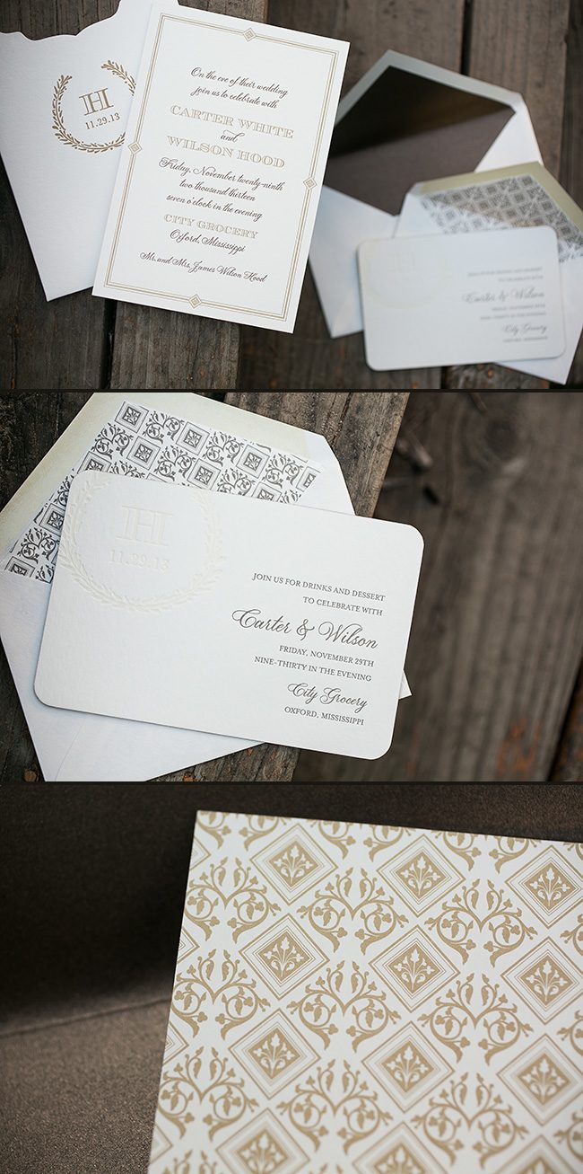
We worked with Elizabeth at Fresh Ink to create these custom letterpress rehearsal dinner invitations. Printed in gold and mocha letterpress inks, the invitations featured our plaza calligraphy font and a custom patterned backing. The invitations tucked neatly into a Juliette style sleeve, which included a gold letterpress printed monogram and our Balsam Wreath cartouche. A separate invitation for evening cocktails was also created to coordinate with the set, and the custom pattern that was printed on the back of the rehearsal dinner invitations was repeated for the envelope liners. All of the pieces combined to make an incredibly elegant invitation set!

letterpress inks: gold + mocha + taupe + coconut blind deboss | offset back patterning: croft pattern in gold ink | fonts: smock plaza + carrington stripes + worthington | paper: 2-ply ivory | sizes: S-8 for sleeve + S-6 | corner rounding | envelope liners: metallic antique liner + custom pattern in taupe ink | sleeve: customization #:20377 | Fresh Ink
There’s something magical about combining three different printing methods into one holiday card. The result? A festive holiday photo card sent to us by our friends at Paperista.
ink: custom 186U | foil: silver matte | fonts: stella + inigo block | paper: 2-ply white | printing: letterpress + foil + offset | size: S8 | customization #: 16157 |

Preppy Pink Pony sent us these wonderful custom Costa Rican inspired wedding invitations. The set is highlighted by an offset map of the country itself on the folio. A perfect first impression for a wedding that was obviously a great time!
inks: pool + blind deboss | fonts: clementine + graham | paper: 2-ply ivory + 1-ply ivory | printing: letterpress + offset | invite size: S7 folio | folio: offset in pool | customization #: 16312

We worked with Carolyn from The Papery in Philadelphia last summer to create the whimsical letterpress wedding invitation suite for this amazing real wedding. This unique invitation set featured a custom sleeve with an intricate tree motif that was created by The Papery, and the sleeve was used to hold the wedding invitation and all of the suite pieces. The eye-catching blend of pewter, lime and dove inks really made this invitation set stand out! We thought the invitation was really special, but wait until you see the wedding photos! The Merion Cricket Club provided the perfect location for this elegant wedding, which was complete with gorgeous bouquets, an incredibly romantic gown and lots of friends and family. Take a look at Alison Conklin’s blog for more photos from this wedding!


vendors: Photography: Alison Conklin | Reception Venue: Merion Cricket Club | Planner: Uncommon Events | Lighting: Eventions Productions | Florist: Uncommon Events | Hair Stylist: Salon Royal Court | Makeup Artist: Beke Beau | Entertainment: Starlight Orchestras | Video: cinemacake
No Regrets seems to show no bias toward any embellishments, managing successfully to incorporate so many into one design! Letterpress, Offset, Foil, Edge Paint, Back patterns, Custom liners….if there was ever a need to show how to combine all of these options without making a design seem too busy or cluttered, this would be it.
letterpress ink: taupe + papaya | foil: silver shine | fonts: cecilia + lawrence + carrington | paper: 2-ply ivory | printing: letterpress + foil | offset back pattern metallic silver | edge painting: metallic silver | offset liner: taihu in papaya | invite size: S8-Square | customization #: 15356 |

Baby announcements are just plain fun! We love the adorable little dragon artwork that was submitted by Union Street Papery. He looks like he’s excited about the new arrival too, as he playfully bounds over the granby pattern. The use of the same pattern for the liner was a great addition when chosen to be printed in reverse.
inks: wisteria + sage | font: worthington | paper: 2-ply ivory | printing: letterpress | offset liner: granby in wisteria | card size: S5-SQ | customization #: 16022 |

These day of pieces were sent to us by our friends at Rugg Road Paper. These beautiful customized pieces are the perfect accent for a day that won’t soon be forgotten. The corner rounding is the perfect, subtle touch to put these day of pieces over the edge.
ink: navy | fonts: frida + engravers | paper: 1-ply white | printing: letterpress | corner rounding | customization #: 15306 |

Sleeves are fun, especially this sleeve. This letterpress invitation set has a great combination of inks, fonts, and motifs. Hitched is great at working with the Smock Library to create fun, unique designs, and this customization is no exception!
inks: espresso + yolk | fonts: graham + smock stella cf | paper: 1-ply ivory bamboo | printing: letterpress | chesapeake die cut | offset liner: mondsee in yolk | invite size: S7 | offset sleeve: custom in espresso | customization #: 14533 |

Penelope at The Dandelion Patch in Vienna, Virginia submitted this ultramodern custom Bat Mitzvah invitation suite for printing. On the invitation, the custom submitted artwork spells out their daughter’s initials, ZLK – and we think this is done in the most adorable fashion. This colorful and edgy set features our ocean, peacock and robin’s egg inks – and maintains the contemporary vibe throughout each piece. With an enclosed travel card, guests can get the lowdown on everything they need to know about the local area. Personality and creativity shine through this unique suite – and we couldn’t be any more excited to be sharing this with you.
inks: ocean + peacock + robin’s egg | font: smock bescal + lawrence| paper: 2-ply white bamboo | printing: letterpress | invite size: S8

For the last week, we’ve been posting the honorable mentions for the Smock Design Contest. Now we’re down to the final three! Our good friend Nole at Oh So Beautiful Paper chose our winners for this competition, and selected Alphagraphics Lyric Opera Invitation as the 3rd place winner. Here’s what Nole had to say about the design: “I don’t think I’ve ever seen a corporate invitation that was so pretty! I love the patterns, the font selections, and the fold out layout. Gorgeous.”

Nole, we couldn’t agree more! It’s not often we get to print letterpress invitations for galas, concerts, or charitable events, so when we do, we tend to get pretty excited. This espresso and gold invitation to the Lyric Opera’s Charitable Subscriber Concert and Dinner was extraordinary! It was, indeed, a ticketed concert (which explains the use of the pocketfold), and the invitation invited 100 of the Opera’s premier patrons to dinner and a concert.

To the untrained eye, this striped, monogrammed pocketfold invitation looks beautiful and classy. For those who spend a lot of time at Chicago’s Civic Opera House, they’ll notice graphic elements that remind them of the gilded gold walls and ceilings of that very building. When designing the invitation, Amy at Alphagraphics used the opera’s Art Deco elements and color scheme as her guide. She created an invitation that was reminiscent of the old stately edifice, glamorous in its timelessness.

Her work was well appreciated by all! Both the Lyric Opera and the event’s attendees thought the invitation was a fantastic bidding to a wonderful evening of music and feasting. Bravo Amy, Bravo!
Congratulations again to Alphagraphics for taking 3rd place in our design contest. This twice-a-year competition recognizes outstanding and inspired designs submitted by our beloved dealers.


