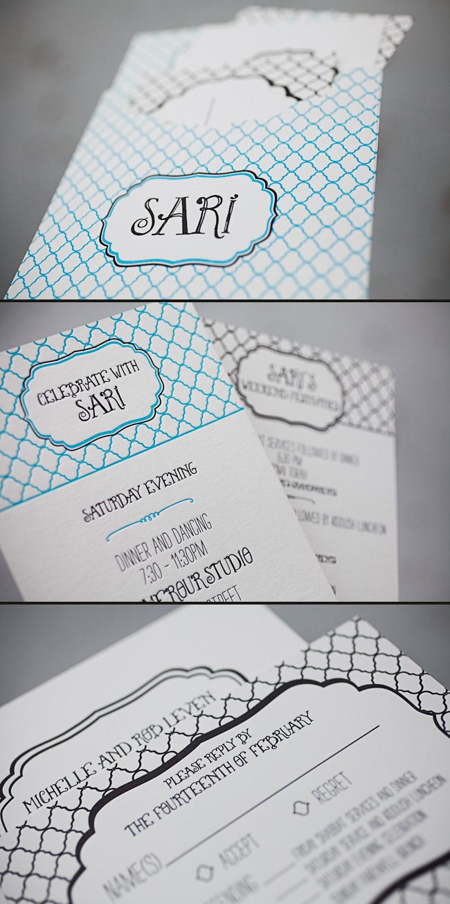
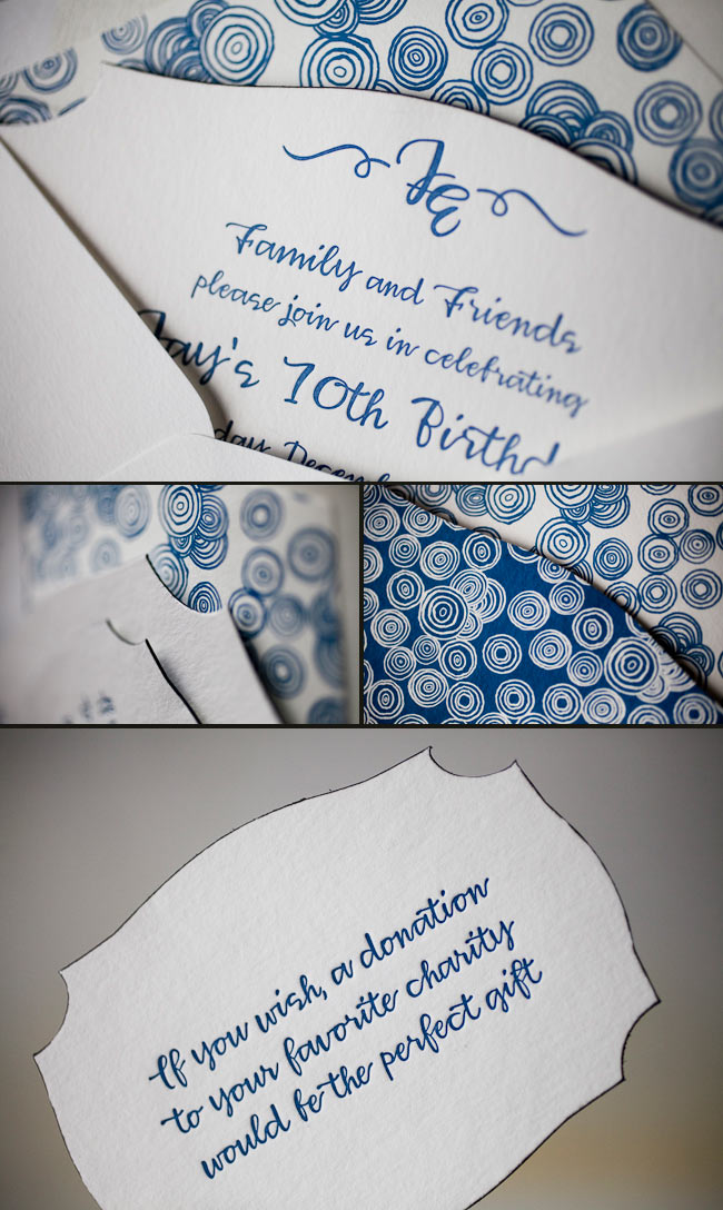
We have the lovely Jenny from Jenny’s Paper, Ink! to thank for these incredible letterpress Bat Mitzvah invitations that we recently had the pleasure of printing. The invitations have a sweet, youthful look and feature fun fonts and bold colors. Jenny said the inspiration for these Bat Mitzvah invitations began with a custom sleeve – Sari fell in love with the idea of keeping the entire invitation set together without using a typical folio or bellyband. From there, they created a logo that could be used throughout the event by pairing our Louise font with our Dawson cartouche. Next came the patterns and colors — Sari’s favorite color is blue, so robin’s egg was a perfect choice, and adding black as a second ink color gave the invitation a bold look. The Champlain pattern was used in different ways throughout the entire set, and complemented the playful fonts and bold ink combination beautifully. The finished product was amazing and set the tone for a fabulous weekend with family and friends. Congratulations and thank you to Jenny for sending us such a stunning invitation set!
inks: robin’s egg + black + inkless blind deboss | fonts: percy + louise | paper: 2-ply white | printing: letterpress | liner: custom liner pattern in robin’s egg + black | custom sleeve: champlain pattern with dawson cartouche | size: s7 for sleeve

This design won an honorable mention in our Smock design competition for the first half of 2012. This twice-a-year competition recognizes outstanding and inspired designs submitted by our beloved dealers.
We featured these stunning letterpress invitations back in October and are thrilled to show them off one more time as a design contest honoree! This sophisticated set was sent to us by Darcy at Pearl Beach Paperie in Orlando, Florida, and features charming vintage airplanes and a rich color combination of cherry and black inks. The swirls and flourished fonts set a whimsical tone which balances the chic gold stripes printed on the folios and envelope liners. Congratulations and thank you to Pearl Beach Paperie for sending us such a lovely invitation set!
ink: cherry + black | fonts: custom| paper: 2-ply ivory | printing: letterpress | folio exterior: custom pattern in cherry | folio interior: custom pattern in gold | liner: custom pattern in gold |invite size: 5.125 x 7.75 |

This design won an honorable mention in our Smock design competition for the first half of 2012. This twice-a-year competition recognizes outstanding and inspired designs submitted by our beloved dealers.
Take a peek at these vibrant and high spirited save the dates! We have Melanie at Salutations in Charlotte, North Carolina to thank for these beauties! We were even able to get a bit of a back story to find out where the inspiration came to create a design so eye catching and brilliant. The bride loved the bold pattern of our Evans design and wanted to use our robin’s egg ink color to truly make a statement. We love to see couples choosing more modern and chic designs for their save the dates, even when they’re planning on sending a super formal invitation suite like these guys are planning. The happy couple said that their save the dates totally matched their fun and bubbly personalities — and we couldn’t agree more! Thanks so much to Salutations for sending us such a fun save the date set — we can’t wait to see the invitations!
inks: robin’s egg + black | fonts: chaplin + carrington + smock harrison | paper: 2-ply white | printing: letterpress | liner: the sinclair pattern in robin’s egg | size: S6

This design won an honorable mention in our Smock design competition for the first half of 2012. This twice-a-year competition recognizes outstanding and inspired designs submitted by our beloved dealers.
If you’re looking for a traditional wedding invitation suite – then look no further! We’re head over heels for this simple and sweet letterpressed set submitted to us by our friends at The Dandelion Patch in Reston, Virginia. Letterpressed in black ink with gorgeous mulberry edge paint that acts as the perfect accent to this one color set – we can’t help but swoon! After looking at photos of the The Ritz Carlton in McLean Virginia, where the fabulous wedding was held – we see what a fanciful and lavish venue the couple chose for their special day. Of course we believe tossing our mulberry ink into the mix helps keep this set looking romantic, but this set also encourages the feeling of the winter months. The three letter monogram on both the invitation and letterpress belly band adds another touch of elegance to this striking set!
ink: black | font: smock spencerian | paper: 1-ply white | printing: letterpress | edge paint in mulberry | liner: the champlain pattern in mulberry | letterpress belly band | invite size: S6

Get ready to blow out those birthday candles! Check out these recently printed birthday party invitations submitted to us by our friends at Judy Paulen Designs in New York, NY. Our plymouth die cut adds even more boyish charm to an already youthful looking birthday party invitation. We can’t get enough of the granby backing patterning in navy, and take a look at the envelope liner in reverse granby in navy-for another super cool customization. Alright now, let’s get the party started!
inks: navy | fonts: smock harrison | paper 2-ply white | invite size: S-6 | printing: letterpress | die cut: plymouth | back pattern: the granby pattern in navy | edge paint: black | liner: the reversed granby pattern in navy

What a wonderful suite we received from our friends at Landis Gifts & Stationery. This Ossa design was customized beautifully on our white bamboo paper, and letterpressed in Lime and Black inks. The invitation and reply card were edge painted in Orchid. The invitation is adhered to an awesome folio, offset printed in our Ashwell pattern in Black on the outside and in our Sherbrooke pattern in Lime on the inside. The final touch of brilliance is the envelope liner, offset printed in our Sherbrooke pattern in Lime to match. This one was a very personal suite as it was printed for the store owner’s daughter. We are so happy to be able to be included in such a special day.
inks: black + lime | fonts: carrington stripes + alice + chaplin | paper: 2-ply white + 1-ply white | printing: letterpress + offset | liner: the sherbrooke pattern in lime | folio exterior: ashford pattern offset in black | folio interior: sherbrooke pattern offset in lime | invite size: S-8 folio

Are you ready for take off? We bet these custom letterpress wedding invitations will make you swoon! This whimsical set was submitted to us by our good friend, Darcy at Pearl Beach Paperie in Orlando, Florida. The invitation is printed in an AMAZING combination of cherry and black inks. The exterior of the folio is offset printed in cherry which adds to the romantic vibe! You can see the couple’s passion for airplanes and even a bit of the couple’s personality in every piece. This set features just about the cutest reply postcards we’ve ever seen! The reply postcards ask guests if they’re ready for take off or grounded due to inclement weather -as the choices are to accept or decline. These creative invitations let guests know that the wedding celebration will be filled with fun!
ink: cherry + black | fonts: submitted| custom artwork: submitted | paper: 2-ply ivory | printing: letterpress | folio exterior:custom pattern in cherry | folio interior: custom pattern in gold | liner: custom pattern in gold |invite size: 5.125 x 7.75 |

This cool Hekla custom letterpress + offset invitation suite was submitted by our friends at Hitched in Washington DC. The invitation is letterpress printed on our bamboo 2-ply paper in black with a blind deboss ink that makes it pop. The edge painting in spring and an offset back pattern in black add to the uniqueness of this piece. To top it all off, they decided to go with one of our new chesapeake die-cuts. It is accompanied by an outer envelope lined with our ashford pattern in spring. The piece that makes this suite amazing is the custom sleeve – offset with our seneca pattern in black.
inks: black + spring + blind deboss | fonts: percy + louise | paper: 2-ply white | printing: letterpress + offset | liner: the ashford pattern in spring | back pattern: the van pattern in black | sleeve: the seneca pattern in black | invite size: S-8 (chesapeake die-cut)


At Smock our goal is to ensure that our brides have one of kind invitations for their big day. With that in mind, we often accept custom artwork to pair with our wide variety of fonts and letterpress (or offset) print in our luscious ink on our luxurious bamboo paper. The artwork submitted to us by Peabody Papers in Grandview Heights, OH once compared with all of the above, blew us away!

The 3-color offset invitation was printed on both the front and the back in pewter, slate and gold inks. The juxtaposition of the flat yet colorful imagery with the black letterpress text created such a dignified look. The subtle hint of masculinity is impeccable. Well done Peabody Papers. Well done!
Meg, from Peabody Papers had the pleasure of working with the happy couple and says, “Working with Shawna has been so much fun! She wanted to convey a sense of elegance while evoking thoughts of champagne bubbles. I drew the “bubbles” and decided that I would use the block for their names vs. a more traditional treatment. The last piece to come together was the kalogram – 5 sheets of proofs! It payed off though as she loves it and is using it & the dot design throughout the reception at the Statehouse. I have a degree in printmaking and enthusiastically convinced her that Smock letterpress would be the most beautiful printing option!!! She really loves the invitations – thanks for everything!”
Excellent thinking Meg!!! Champagne kisses and Caviar Dreams to you!
inks: black + pewter + gold + slate | fonts: cameron + indigo | paper 2-ply white | invite size: S-8 | printing: letterpress + offset | edge painting: pewter | corner rounding
This design won third place in our Smock design competition for the first half of 2011. This twice-a-year competition recognizes outstanding and inspired designs submitted by our beloved dealers.
We are so excited to kick off another round of the Smock Design Contest! Over the next 10 days, we’ll be honoring some really gorgeous designs that have been sent to us by our Smock retailers. So without further ado, let us begin by showcasing our first honoree!

Joellen and the team at Bennett Schneider, Inc. brought us what may be the perfect color selection for the letterpress wedding Aberdeen suite.


The tangerine ink helps this wedding announcement pop in such a way that it doesn’t overpower the design or distract from the details. Sometimes all it takes is a little tweak to make a letterpressed card look fantastic, and that is just what they did!

inks: tangerine + black | fonts: Spencerian + Cooper | 2-ply ivory | printing: letterpress | liner: payette in tangerine | invite size: S-6
This design won an honorable mention in our Smock design competition for the first half of 2011. This twice-a-year competition recognizes outstanding and inspired designs submitted by our beloved dealers.


