Rugg Road Paper Company in Boston, Massachusetts submitted this three color letterpress Kurai invitation suite to us in dove, silver and moss inks for a rich, yet delicate look. The subtly printed letterpress pocketfolds used on this invitation set were wrapped in three color letterpress belly bands that incorporated the flowers from the invitation and used the wedding date as a focal point. The end result looks polished and perfect for a summer wedding.
inks: dove + silver + moss | fonts: graham block + cameron script | paper: 1-ply white | printing: letterpress | folio exterior: blank | folio interior: letterpressed champlain pattern in dove | liner: the champlain pattern in dove | letterpress belly band | invite size: 6.5 x 6.5

This delicate and effervescent Dawson letterpress suite is one of the most beautiful customizations we’ve seen done to this design. Wedding invitations should truly set the tone for the big day and should convey the formality and feel of the upcoming nupitals. With that said we feel that this set is spot on – the inkless blind deboss creates the most perfect and refined backdrop. Silver and lavender, two more soft ink colors keep this suite traditional. Offset belly bands that include the couple’s initials inside a cartouche is a fabulous finishing touch! We’d like to give our thanks to our friends at Westwood Paper Company in Carmel, Indiana for sending us this charming set.
inks: inkless blind deboss + silver + lavender | fonts: smock spencerian + graham | paper: 2-ply white| printing: letterpress | front patterning on reception card: limited sinclair in lavender | offset belly band | invite size: S8

This three color letterpress suite featuring blossoming chinese hydrangeas looks delicate and downright romantic. Sent in by our good friend, Sue at Merci for Stationery and Fine Things in Denver, Colorado we were smitten with this suite the moment we saw it come off press. The soft, natural hues used on this set are what have us so in love. Textured blooms on the flowers transform the invitation into something positively nature inspired.
inks: lavender + pewter + spring| fonts: cooper + frida | paper: 2-ply white bamboo | printing: letterpress | corner rounding |liner: the sinclair pattern in lavender| invite size: S8

Seeing an order become a design is great. Seeing a design become a letterpress printed invitation is better. But when we get to see photos of our invitations in the hands of the happy couple and shots of their important day…well that just reminds us how much the hard work can pay off. Thanks so much to Michele at the Wedding Company in Hong Kong and well done to Adam Sjöberg for Ira Lippke Studios for the amazing camera work! The reception looked gorgeous and we are very honored to have played some small role in making that day special. Read our previous post about the letterpress wedding invitations.
inks: taupe + pearl + whisper | fonts: cameron + carrington | paper: 1-ply ivory | printing: letterpress | size: s8 | 3-color, bilingual invitations |


This is the first order sent to us from The Wedding Company in Hong Kong and we already can’t wait to see what’s coming next! Michele uses a combination of whisper and pearl inks to give a wonderful 2-color accent to the invitation text of this Dawson-inspired design. The border chosen frames the English invitation as well as the Mandarin one in such a beautiful way. We are very happy to showcase our newest friends, particularly when this is the quality of the invitations they come up with. Well done Wedding Company!
inks: taupe + pearl + whisper | fonts: cameron + carrington | paper: 1-ply ivory | printing: letterpress | size: s8 | 3-color, bilingual invitations |

We thank our friends at Paper Studio, in Ontario Canada, for this beautiful customized 3 color letterpress wedding invitation suite. The invitations and reply cards were letterpress printed in Sky and Espresso inks on our Bamboo 2-ply paper. They were given a touch of brilliance with the blind debossed flowers. The understated elegance is absolutely captivating!
inks: espresso + sky + blind deboss | fonts: cameron + shaw | paper: 2-ply white bamboo | printing: letterpress | wedding invitation suite with custom art |


At Smock our goal is to ensure that our brides have one of kind invitations for their big day. With that in mind, we often accept custom artwork to pair with our wide variety of fonts and letterpress (or offset) print in our luscious ink on our luxurious bamboo paper. The artwork submitted to us by Peabody Papers in Grandview Heights, OH once compared with all of the above, blew us away!

The 3-color offset invitation was printed on both the front and the back in pewter, slate and gold inks. The juxtaposition of the flat yet colorful imagery with the black letterpress text created such a dignified look. The subtle hint of masculinity is impeccable. Well done Peabody Papers. Well done!
Meg, from Peabody Papers had the pleasure of working with the happy couple and says, “Working with Shawna has been so much fun! She wanted to convey a sense of elegance while evoking thoughts of champagne bubbles. I drew the “bubbles” and decided that I would use the block for their names vs. a more traditional treatment. The last piece to come together was the kalogram – 5 sheets of proofs! It payed off though as she loves it and is using it & the dot design throughout the reception at the Statehouse. I have a degree in printmaking and enthusiastically convinced her that Smock letterpress would be the most beautiful printing option!!! She really loves the invitations – thanks for everything!”
Excellent thinking Meg!!! Champagne kisses and Caviar Dreams to you!
inks: black + pewter + gold + slate | fonts: cameron + indigo | paper 2-ply white | invite size: S-8 | printing: letterpress + offset | edge painting: pewter | corner rounding
This design won third place in our Smock design competition for the first half of 2011. This twice-a-year competition recognizes outstanding and inspired designs submitted by our beloved dealers.
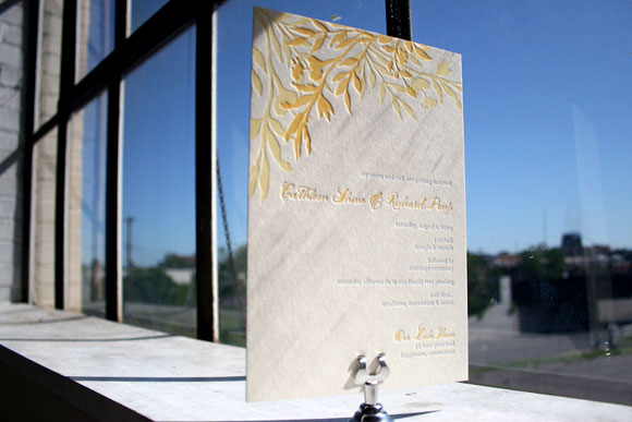
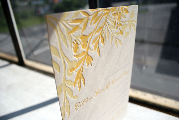
It’s not every day that we get to print an insanely beautiful 3-color letterpress wedding invitation and this one, a customization of our Engadine design and honoree in our Smock Design Contest from Kate’s Paperie, is just that – insanely beautiful. Printed in soft cream, verbena and periwinkle inks, this lovely letterpress wedding invitation is truly one of a kind. Using our Smock Spencerian calligraphy font in verbena and our Stockton serif font in periwinkle, this customization feels both bold and modern yet soft and pretty. Opting to use the Engadine leaf motif at the top of the invitation as opposed to in the lower corner as in the original design further personalizes the invitation, making it a true reflection of the couple and their wedding.


Thanks so much to our friends at Kate’s Paperie for sending along this customization – we always love the opportunity to print a really fabulous 3-color letterpress wedding invitation!


