Letterpress wedding invitations and greeting cards from Smock have been spotted in some amazing places lately, and today we’re excited to share the features that Smock has been a part of this fall! For their Fall 2012 issue, Inside Weddings magazine included a custom wedding invitation set from Smock that featured a letterpress sleeve and combined two of our most popular designs: our floral Rhon design paired with elements from our more modern Dawson design.

Brides magazine featured one of our new, foil stamped wedding invitation designs and matching invitation sleeve — our whimsical Tatra customization — as part of their November issue.

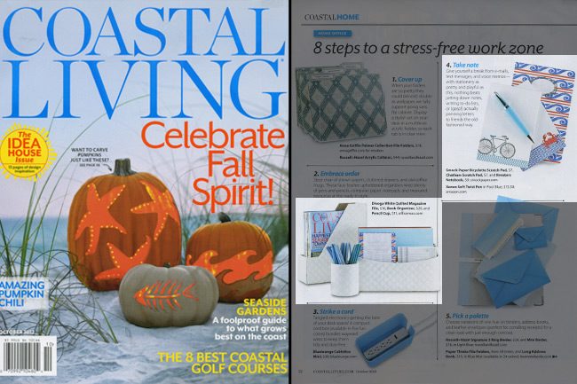
Coastal Living included several of our products in their October 2012 issue as part of their “8 Steps to a Stress-Free Work Zone” feature. Our Bicyclette and Chatham scratchpads ($7 each) and our Breakers notebook ($9 each) are perfect reasons to take a break from technology to write down notes the old-fashioned way.

Stationery Trends magazine featured one of our new holiday cards as part of their Fall 2012 issue — our Joyeux Noel card (which features letterpress and gold foil stamping) was included in a piece all about gold.

And of course, we can’t forget about the amazing bloggers who have been featuring Smock online these days — Oh So Beautiful Paper, Discover Paper, Going Home to Roost, Young House Love, Bustle Blog, and Creative Wish — we appreciate your recognition!
This wonderful letterpress wedding suite comes to us from our friends at Byrd & Bleecker. We absolutely loved their customization of our Dawson design and wanted to share it with everybody.
inks: eggplant + taupe | fonts: smock spencerian + graham | paper: white 1-ply | printing: letterpress + offset | envelope liner: reverse tesse in taupe offset | sleeve: custom design in eggplant offset | invite size: S7 for sleeve

We were overjoyed to print this unique and flashy one color Dawson suite. Submitted by our friends at RSVP in Plymouth, Michigan – this playful and chic set features just a few of the cool embellishments Smock has to offer. Our orchid ink helps make this set look royal, while still maintaining the modern feel. We’ve offset the back of the invitations and reception cards in our polka pattern in lime ink, which cleverly matches back to the dots on the invitation.
ink: orchid | fonts: coombs clock + louise accent | paper: 1-ply ivory bamboo | printing: letterpress | back patterning: polka in lime | signature liner: C9071-1 | invite size: S8

We’re excited to share these letterpress Dawson save the dates with you. Printed in gold and cherry inks, these save the dates set the perfect tone for an autumn wedding. Our Bescal calligraphy font was used for the couple’s names, which added even more character to this set. Many thanks to our friends at The Dandelion Patch – Georgetown for sending us these beauties!
inks: gold + cherry | fonts: beautmont block and smock bescal | paper: 1-ply white | printing: letterpress | size: S6

This delicate and effervescent Dawson letterpress suite is one of the most beautiful customizations we’ve seen done to this design. Wedding invitations should truly set the tone for the big day and should convey the formality and feel of the upcoming nupitals. With that said we feel that this set is spot on – the inkless blind deboss creates the most perfect and refined backdrop. Silver and lavender, two more soft ink colors keep this suite traditional. Offset belly bands that include the couple’s initials inside a cartouche is a fabulous finishing touch! We’d like to give our thanks to our friends at Westwood Paper Company in Carmel, Indiana for sending us this charming set.
inks: inkless blind deboss + silver + lavender | fonts: smock spencerian + graham | paper: 2-ply white| printing: letterpress | front patterning on reception card: limited sinclair in lavender | offset belly band | invite size: S8

We know we’ve shared many gorgeous Dawson customizations with you, but we especially couldn’t wait to share this one. With a pairing of our violet and persimmon inks – this invitation is a sure fire hit. We definitely feel the romance reflected from this invitation. This suite was submitted by our friends at Epitome Papers in Edina, Minnesota and each piece is letterpressed on our luxurious 2-ply bamboo paper. We adore that the vibrant and more feminine color palette is carried throughout on the reply cards and reception cards, too. We love seeing couples step outside the box and truly toss in a bit of their own creativity when choosing how to customize their own wedding invitations.
inks: violet + persimmon| fonts: engravers + frida| paper: 2-ply white | printing: letterpress | liner: the mondsee pattern in violet | invite size: S8

Dawson has proven to be one of our most popular letterpress wedding suites and with just the right nudge from Paper on the Avenue, the inks and patterns selected made this invitation set really sharp! Standing out is a beautiful lime folio with a custom monogram incorporated on the cover. Great work by Megan; we look forward to seeing what comes next!
inks: lime + taupe | fonts: carrington + cecilia | paper: 1-ply white | printing: letterpress + offset | | offset folio with monogram custom pattern folio |

We have Liz at Paper Place in Austin, Texas to thank for submitting this bright and beautiful Dawson invitation to us for printing. Lively and cheery are definitely adjectives that come to mind when taking a look these beauties! We feel that pairing our ocean and yolk inks together is the perfect choice for a wedding in early spring. When this is the time of year we’re used to seeing softer color palettes – pastels, too – it’s refreshing to see such a bubbly and bold invitation. The couple also chose a custom letterpress sleeve which adds even more pizazz!
inks: ocean + yolk| fonts: smock clermont + carrington| paper: 1-ply white | printing: letterpress| letterpress sleeve: custom pattern in yolk | invite size: S-8 for sleeve

Paper Place was also sweet enough to send along the accessory pieces they printed in house to coordinate with the letterpress wedding invitations we printed. The reply card, information card and rehearsal dinner card were sent along with the invitations. The larger reception invitation and registry card were sent separately by the groom’s parents. We love that the vibrant color palette is maintained throughout this set. We always adore working with the lovely ladies at Paper Place – and we’d like to give a huge THANK YOU to them!

Our Dawson design is one of our most popular here at Smock – and we always get really psyched to see the ways couples customize this suite to truly make it all their own! Take a look at this rustic Dawson suite submitted to us by our friend, Jahna at The Pleasure of your Company in Lutherville, Maryland. Not only does a fresh color palette make a set all the more trendy, but richer tones also have a way of bringing warmth to a wedding invitation. There’s almost a comforting feeling in such an earthy and bold color palette. Then toss in our sherbrooke envelope liner for even more sophistication!
inks: sage + midnight | fonts: smock spencerian + carrington| paper: 2-ply white | printing: letterpress | liner: the sherbrooke pattern in sage | invite size: S8

Nole Garey, editor and publisher of Oh So Beautiful Paper, gave this fantastic invitation set first place in our design contest! Nole loved the texture and the playful yet elegant mix of patterns for this wedding invitation set, and we couldn’t agree more – it’s simply stunning!
Danielle from Creative Touch Party Design in Palm Beach Gardens, Florida always sends us gorgeous designs, and this set is no exception. Much of the inspiration for this design was pulled from Smock’s Dawson suite, sleeve and all. Layers of dynamically designed pieces in this suite really bring it to life, and the colors of pewter and merlot give the playful patterns a little sophistication.
Danielle gave us the scoop on the inspiration behind these invitations. “The wedding colors are shades of wine and berry with silver. The wine color comes from her Lulu Kate bridesmaid dresses, which are just beautiful. These were the inspiration for the border color. The gray picks up the silver throughout the wedding decor. And the men are wearing gray tuxedos, which is reflective in the pocket she chose. The linens are a modern lace pattern which is reminiscent of the quilting in the invitation itself.”
We loved this set — congratulations, Danielle! And a huge thanks to Nole for judging the contest!
Customization = letterpress inks: merlot + pewter | fonts: carrington + smock clermont | paper color: white | paper size: s-7 for sleeve | envelope liner: ashford reversed in pewter | sleeve: custom design in pewter letterpress

This design won first place in our Smock design competition for the first half of 2012. This twice-a-year competition recognizes outstanding and inspired designs submitted by our beloved dealers.


