Thanks to Melanie at Salutations in Charlotte, North Carolina for the opportunity to print a beautiful letterpress + offset wedding invitations. Using submitted artwork to combine offset printing for their folio and letterpress printing for their cards, the patterns and designs used in this set were very striking. Seamist compliments taupe very well to begin with, but we were very pleased to see how elegant everything looked when put together. Great work, Melanie!
inks: seamist + taupe| fonts: custom + therese | paper: 1-ply ivory bamboo | printing: letterpress | folio interior: windemere in taupe| folio exterior: custom in seamist | invite size: s-7 folio |


It’s easy to get swept away with this charming letterpress invitation customization made to our Burstell design submitted to us by our friend Ailbhe from Pretty as a Picture in Ireland! This modern text based invitation has clean lines and the right amount of flourishes to add a touch of elegance to this set. We love the luscious raspberry on the interior of the folio even more because it is probably not something guests will be expecting! The exterior of the folio is printed in our virelles pattern which looks positively nature inspired! Pretty as a Picture always sends us the coolest customizations-and it’s safe to say this will be another crowd pleaser!
ink: espresso | fonts: spence + graham| paper: 1-ply ivory | printing: letterpress |folio exterior: virelles pattern in espresso | folio interior: sinclair pattern in raspberry | invite size: 5.125 x 7.75


We were so happy when we were able to offer to letterpress print submitted artwork for no charge, it opened up the door for beautiful new designs to come our way! Michelle at Paperkiss sent us this wonderful invitation set and it came out beautifully. Michelle is a great friend of ours in Australia and we are always happy to see what she sends. Thanks again to Paperkiss!
ink: navy + silver | fonts: inigo + custom font | paper: 1-ply white | printing: letterpress | submitted art |


We thank our friends at Paper Studio, in Ontario Canada, for this beautiful customized 3 color letterpress wedding invitation suite. The invitations and reply cards were letterpress printed in Sky and Espresso inks on our Bamboo 2-ply paper. They were given a touch of brilliance with the blind debossed flowers. The understated elegance is absolutely captivating!
inks: espresso + sky + blind deboss | fonts: cameron + shaw | paper: 2-ply white bamboo | printing: letterpress | wedding invitation suite with custom art |


We have our great friends at Magnificent Milestones in Chicago, Illinois to thank for this custom letterpress Alzette vow booklet! Letterpressed in sky & lake inks on our 2-ply white bamboo paper the cover is perfectly designed with a 3-letter monogram. We think this is a great way to include guests in the joy of exchanging vows.
inks: sky + lake | fonts: nelly + inigo | paper: 2-ply white bamboo | printing: letterpress |


Our good friend Mayra from Always a Bridesmaid in New York, NY did a wonderful job with this Cavall letterpress wedding invitation customization. Orchid seems to be one of the best inks to use with the Pippen liner and brought just the right amount of energy to the simple, text-based design of this invitation. We look forward to seeing what comes next from Always a Bridesmaid!
ink: orchid + red | fonts: smock spencerian + stockton | paper: 2-ply white bamboo | printing: letterpress | corner rounding | liner: the pippen pattern in orchid | invite size: s-8 |


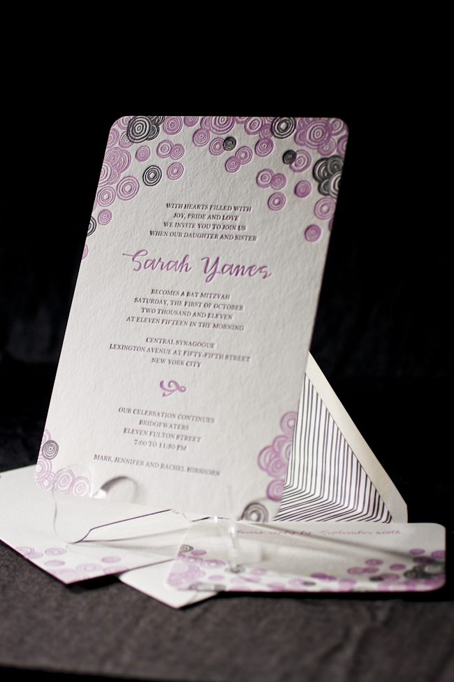
We are proud to announce that RSVP Today in New York won second place in the Smock Design Contest for their custom letterpress Bat Mitzvah Invitation! Playful, hand-drawn circles of the Piedmont design, in feminine colors of violet and pewter, really made this set come to life. Youthful, yet sophisticated – not a bad combination!

Deborah Hassan, owner of RSVP Today, shared with us a quote from her client illustrating the inspiration behind this design:
“For Sarah’s Bat Mitzvah, we wanted an invitation that would reflect the many levels of the day as well as the multi-generational nature of the event. We worked with Debbie from RSVP Today in Manhattan to find something that was youthful and celebratory but which did not compromise the more serious elements of the ceremony. The bubbly circles on both the invitation and the envelope and the lilac color are so well-suited to Sarah’s joyous personality, but the heft and texture of the paper give it weight and depth. We are also thrilled to support Smock’s environmental efforts and opted for a reply postcard to minimize paper. We just love our invitation!”– Jennifer and Sarah Hirshorn


Sarah, we wish you the best in all your future endeavors! Mazel Tov!
inks: violet + pewter + grass | fonts: smock clermont + graham | paper 2-ply white | invite size: S-8 | printing: letterpress | corner rounding | liner: custom in pewter
This design won second place in our Smock design competition for the first half of 2011. This twice-a-year competition recognizes outstanding and inspired designs submitted by our beloved dealers.

At Smock our goal is to ensure that our brides have one of kind invitations for their big day. With that in mind, we often accept custom artwork to pair with our wide variety of fonts and letterpress (or offset) print in our luscious ink on our luxurious bamboo paper. The artwork submitted to us by Peabody Papers in Grandview Heights, OH once compared with all of the above, blew us away!

The 3-color offset invitation was printed on both the front and the back in pewter, slate and gold inks. The juxtaposition of the flat yet colorful imagery with the black letterpress text created such a dignified look. The subtle hint of masculinity is impeccable. Well done Peabody Papers. Well done!
Meg, from Peabody Papers had the pleasure of working with the happy couple and says, “Working with Shawna has been so much fun! She wanted to convey a sense of elegance while evoking thoughts of champagne bubbles. I drew the “bubbles” and decided that I would use the block for their names vs. a more traditional treatment. The last piece to come together was the kalogram – 5 sheets of proofs! It payed off though as she loves it and is using it & the dot design throughout the reception at the Statehouse. I have a degree in printmaking and enthusiastically convinced her that Smock letterpress would be the most beautiful printing option!!! She really loves the invitations – thanks for everything!”
Excellent thinking Meg!!! Champagne kisses and Caviar Dreams to you!
inks: black + pewter + gold + slate | fonts: cameron + indigo | paper 2-ply white | invite size: S-8 | printing: letterpress + offset | edge painting: pewter | corner rounding
This design won third place in our Smock design competition for the first half of 2011. This twice-a-year competition recognizes outstanding and inspired designs submitted by our beloved dealers.
You need these letterpress invitations now. We’re serious. Our 14 brand new letterpress wedding invitation designs just launched on our web site and they’re available in stores right now, too. Some of our favorites include the chevron-crazy Hekla, the preppy formal Breton, and the romantic flutter of Aneto. We didn’t feel like stopping after 14 designs, though — the new album features a customization of each design, so we’ve doubled the amount of pretty you can choose from. We only spent, oh, about 9 months on this release. But it was worth it.
Planning a Bar or Bat Mitzvah? Wedding? Birthday Party? Rehearsal Dinner? Baby shower?? These new designs are perfect for special occasions, and they’re all completely customizable, so go crazy & make one your own. We think you’ll love the die-cuts (or perhaps some hand bordering?), and the new gift wrap liners are pretty cool, too. We even have coordinating postage stamps to go with each new design.
Dying to get your hands on some of that gorgeous bamboo?? Visit a Smock dealer & see the new collection today.


In San Fransisco, we had the chance to stop by a few more Smock retailers – first up: Paperwhirl. We spoke with Kitty, one of the owners of the trendy Union Square stationery shop.

What cause do your store support?
Paperwhirl tries to support local artists whenever possible – a lot of the cards and merchandise that we keep in the store comes from local artists in the Bay area.
What about your store are you most proud of?
We’re probably one of the only independent businesses on Union Square – it’s mostly chains, and we’re one of the few small, privately owned shops in this area. We’re also proud of the fact that we’ve been in business for almost 30 years.
If someone is visiting your store, what’s another essential stop in your neighborhood?
I love this shop called Downtown – it’s got some really edgy, organic clothing.
What’s the hottest color palette out there right now?
We’ve been seeing lots of bright, happy colors lately – oranges, corals, and pinks have been really popular for summer.

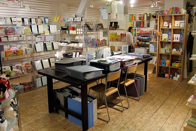
Our next stop was to Cherish – a sweet shop with lots of paper love. They had a great studio set up that’s perfect for parties – we got to see one getting started during our visit! This particular party was a birthday and scrap-booking event, and looked like so much fun! There were tons of beautiful papers to be found throughout the shop – we couldn’t get enough.

Ryan from Cherish filled us in on the shop – check out our interview with him!
What cause does your store believe in? How does this impact the store?
We give lots of donations to auctions that benefit local schools throughout the city – we tend to do a lot of gift certificates for parties and studio space usage, so we donate a lot of our services.
What about your store are you most proud of? What makes you unique?
We’ve narrowed down our store image to be more about local artists – we have a lot of items in the shop that are made locally, and some we make ourselves. It’s a win-win – we love offering a selection of local goods, and it provides an opportunity for the artists to get exposure, too.
What do you predict will be the biggest wedding or stationery trend for 2012?
I’ve noticed lately that a lot of brides are more mindful about the environment when it comes to their wedding stationery, and I think that trend is going to grow even more in 2012. They’re scaling back, trying to waste less paper, and making their selections extra special – choosing quality over quantity.


Thanks so much to Paperwhirl and Cherish for welcoming us with open arms! Be sure to stop in to these fabulous shops if you’re in the San Francisco Bay area!


