
At Smock our goal is to ensure that our brides have one of kind invitations for their big day. With that in mind, we often accept custom artwork to pair with our wide variety of fonts and letterpress (or offset) print in our luscious ink on our luxurious bamboo paper. The artwork submitted to us by Peabody Papers in Grandview Heights, OH once compared with all of the above, blew us away!

The 3-color offset invitation was printed on both the front and the back in pewter, slate and gold inks. The juxtaposition of the flat yet colorful imagery with the black letterpress text created such a dignified look. The subtle hint of masculinity is impeccable. Well done Peabody Papers. Well done!
Meg, from Peabody Papers had the pleasure of working with the happy couple and says, “Working with Shawna has been so much fun! She wanted to convey a sense of elegance while evoking thoughts of champagne bubbles. I drew the “bubbles” and decided that I would use the block for their names vs. a more traditional treatment. The last piece to come together was the kalogram – 5 sheets of proofs! It payed off though as she loves it and is using it & the dot design throughout the reception at the Statehouse. I have a degree in printmaking and enthusiastically convinced her that Smock letterpress would be the most beautiful printing option!!! She really loves the invitations – thanks for everything!”
Excellent thinking Meg!!! Champagne kisses and Caviar Dreams to you!
inks: black + pewter + gold + slate | fonts: cameron + indigo | paper 2-ply white | invite size: S-8 | printing: letterpress + offset | edge painting: pewter | corner rounding
This design won third place in our Smock design competition for the first half of 2011. This twice-a-year competition recognizes outstanding and inspired designs submitted by our beloved dealers.
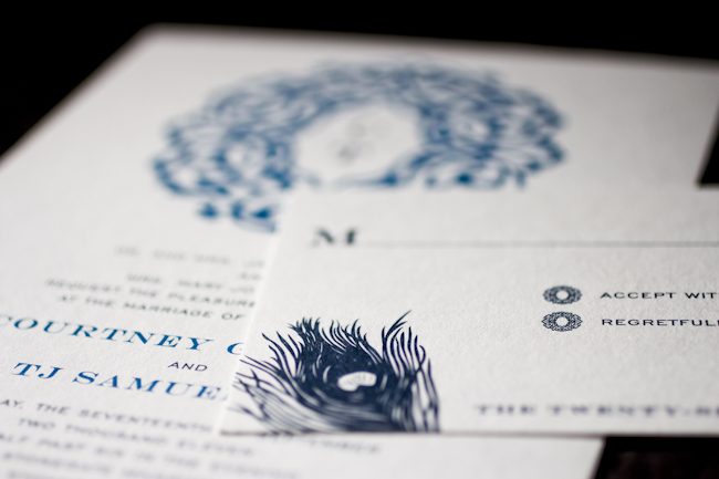
You’d never know this invitation was offset printed unless you felt it! Libby of Byrd & Bleecker definitely knows how to work within and around our albums, combining a converted version of the Lashar design that looks completely unique, with the peacock plume from our Everyday line.

Because the full order was offset in midnight and peacock inks, she was able to help the client save a bit of money and still get them an eye-catching design.

inks: midnight + peacock | fonts: engravers + gothic engravers | paper: 1-ply white | invite size: Tier 3 | liner: repeating lashar cartouche design in white + peacock | printing: offset
This design won an honorable mention in our Smock design competition for the first half of 2011. This twice-a-year competition recognizes outstanding and inspired designs submitted by our beloved dealers.

One of our greatest reviewed Rhon designs, brought to us by Margaret at Scriptura. Having struggled to find just the right color combination, Margaret eventually struck gold…or should we say, “struck papaya?”
The papaya ink worked very well with the offset shell and lettepressed pewter. The addition of the program fan was a great way to tie everything together — the full set looks amazing.

inks: pewter + papaya | fonts: graham + smock bescal | paper: 2- ply white | liner: caspian in shell| folio exterior -rhon in papaya, interior – caspian in shell | printing: letterpress + offset
This design won an honorable mention in our Smock design competition for the first half of 2011. This twice-a-year competition recognizes outstanding and inspired designs submitted by our beloved dealers.

Merging the design elements of Haddington and Rhon, Alyssa from Judy Paulen Designs shows just how to balance a letterpress wedding invitation set.

Particularly stunning was the pale blue of our Lake ink used as an envelope liner which complimented the Pewter of the design and text, making an elegant wedding invitation.
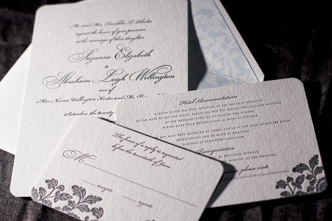
inks: pewter + lake | fonts: bickham swash + bickham script | paper: 2-ply white | invite size: S-8 | liner: ganval in lake | printing: letterpress | edge painting: lake
This design won an honorable mention in our Smock design competition for the first half of 2011. This twice-a-year competition recognizes outstanding and inspired designs submitted by our beloved dealers.
Day three of our design contest brings us an incredibly elegant invitation set – a simple design that looks anything but simple! Hats off to Tasha at The Dandelion Patch for this one.


Coconut ink looks incredible letterpressed in our Champlain pattern, and is an impressive compliment to the Eggplant used throughout the set.

Everything from the square cards to the rounded corners to the elegant script make this quite the eye-catcher.

Thanks again to The Dandelion Patch for sending us this gorgeous customization!
inks: eggplant + coconut | fonts: spence + cooper | papers: 2-ply white | invite size: s-7 square | liner: reversed champlain in eggplant
This design won an honorable mention in our Smock design competition for the first half of 2011. This twice-a-year competition recognizes outstanding and inspired designs submitted by our beloved dealers.
The second honoree in our design contest was sent to us by Ilyssa at Brenda Himmel Stationery. Ilyssa worked with in-house graphic designer Lindsy Aragona to create the custom artwork, and we can’t get enough of these cheery letterpress social notes! The social notes were printed in 3-color letterpress, and combine our Verbena and Grass inks with a custom ink color that Ilyssa selected. The custom artwork printed beautifully, and pairs perfectly with a coordinating Payette liner, also printed in Verbena ink.


The font selection is a perfect complement to the design and looks incredible in letterpress.

Congrats to Brenda Himmel!
inks: espresso + grass + verbena | font: tally | paper: 2- ply white | liner: payette in verbena | edge painting: | printing: letterpress | social note size: S-6
This design won an honorable mention in our Smock design competition for the first half of 2011. This twice-a-year competition recognizes outstanding and inspired designs submitted by our beloved dealers.
We are so excited to kick off another round of the Smock Design Contest! Over the next 10 days, we’ll be honoring some really gorgeous designs that have been sent to us by our Smock retailers. So without further ado, let us begin by showcasing our first honoree!

Joellen and the team at Bennett Schneider, Inc. brought us what may be the perfect color selection for the letterpress wedding Aberdeen suite.


The tangerine ink helps this wedding announcement pop in such a way that it doesn’t overpower the design or distract from the details. Sometimes all it takes is a little tweak to make a letterpressed card look fantastic, and that is just what they did!

inks: tangerine + black | fonts: Spencerian + Cooper | 2-ply ivory | printing: letterpress | liner: payette in tangerine | invite size: S-6
This design won an honorable mention in our Smock design competition for the first half of 2011. This twice-a-year competition recognizes outstanding and inspired designs submitted by our beloved dealers.
Today we’re excited to share the first of our ten honorees in our recent Smock Design Contest! These letterpress baby announcements were a very special project for us, one we got to work on directly with the new mom herself – Kelley Beirne Stephens, owner of Houston Invitation Service. (Talk about exciting!)


Kelley shares, ” Being the owner of a stationery boutique, I knew I wanted to do a truly special announcement for our first baby. That meant using Smock for sure! We didn’t find out the sex of the baby ahead of time so I sketched out both boy and girl designs. As soon as our little girl made her debut, I took out my draft and made a few revisions…the main one was to ‘girl it up’ and change the paper color to the soft pink so that her name would take on a softer, more tone-on-tone quality. I had our calligrapher pen her name, monogram, and a few items to punctuate the text. I then set up a draft and sent it on to the pros at Smock. The monogram liner was a last minute decision and I think it really completed the look. We are so pleased with the result and have had such great feedback from recipients, too!”


These pretty letterpress baby announcements were printed in dove and blush inks on our pearl paper with silver edge painting and corner rounding to ensure no detail was left forgotten. They feature pattern backing in our sherbrooke pattern in blush and the envelope liner features a custom monogram in blush. They are feminine, girly and perfect for welcoming a new baby girl. Congratulations to Kelley and Steve on welcoming the new addition to their family and on being a winner in our Smock Design Contest!
Today we’re excited to announce the winners of our most recent Smock Design Contest! Our friend and paper blogger extraordinaire Kristen from Paper Crave did the honor of selecting our first place winner and runner-ups from among our favorite recent customizations, sent to us by our beloved Smock dealers. Over the next few weeks we will be sharing full details and photos of all our honorees here on our blog so don’t miss it. In the meantime, a big thank you to all of our awesome Smock dealers!

FIRST PLACE WINNER – Salutations in Charlotte, North Carolina
Brought to us by Salutations in Charlotte, guest judge Kristen says, “I love that it’s feminine without being too feminine,” about our winning design, a stunning customization of our Kurai wedding invitation.

FIRST RUNNER UP – Luxe Expressions in Atlanta
Saying that “…the vibrant colors and bold pattern make this such a fun invitation” we loved Kristens’s pick for first runner up, a custom 40th birthday party invitation design for our friends at Luxe Expressions in Atlanta.

SECOND RUNNER UP – Judy Paulen Designs in Manhattan
Kristen’s choice for second runner up is a custom letterpress wedding invitation brough to us by Judy Paulen Designs at Bloomingdale’s in Manhattan. She loved it because “the fantastic color choices and patterns give it a very modern feel.”
HONORABLE MENTIONS
In addition to our three winners, we’re recognizing seven additional designs that inspired us to no end. We extend a heartfelt thank you to our friends at the following stores – we are continually awed by all you do!
Details in Philadelphia
Finally, the moment you’ve been waiting for breathlessly for weeks – it’s time to wrap up our first ever Smock Design Contest by sharing our first place winner! This absolutely stunning customization, brought to us by our friends at Real Card Company in Seattle, was the clear favorite, taking our ever-popular Rhon letterpress wedding invitation design and completely reinventing it into something extraordinarily special. We loved it before we even printed it and seeing is believing – the end result is truly beautiful! It was a real favorite of Smock’s Creative Director, Amy Graham Stigler. From the soft romantic colors, pewter and wisteria, to the asymmetrical layout featuring a unique variation of the Rhon floral motif and horizontal orientation, Amy loved how this design was truly personalized to make a one of a kind creation.
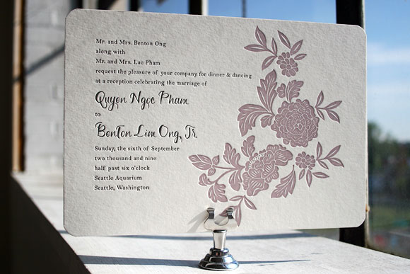
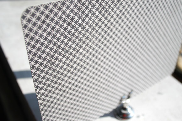
Letterpress printed in soft wisteria and pewter inks, this invitation also features chic patterned backing in our rowe pattern in pewter.
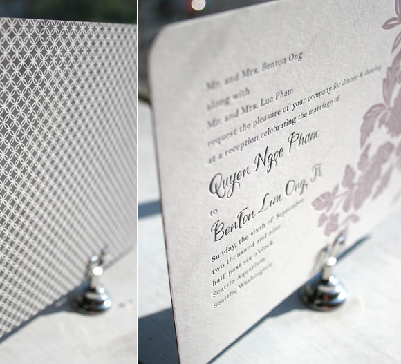
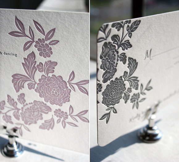
While the letterpress invitation itself was printed in 2-color letterpress, the reply card was letterpress printed in 1-color in pewter ink. We love the play between colors and patterns in this incredible set – it’s both elegant and formal, but still fun and just a touch modern. A huge thank you to Real Card Company for collaborating with us on this incredible customization and congratulations on winning the first Smock Design Contest!
For more fabulous customizations of Smock’s letterpress wedding invitations, check out the rest of the honorees in our Smock Design Contest for incredible inspiration!