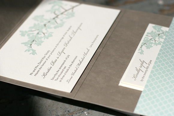
The first runner up in our latest Smock Design Contest, as selected by guest judge Audrey from Urbanic Paper Boutique, is a gorgeous custom letterpress invitation from our friends at Paperkiss in Australia. It features lovely script printed in taupe with corner rounding and taupe edge painting for a look that is simple and sophisticated. Many thanks to Paperkiss for working with us on these stunning letterpress invitations!


Last year we had the pleasure of printing custom letterpress wedding invitations for our friends Ailbhe and Jane at Pretty as a Picture in Ireland for Jane’s own wedding. We’re so excited to share the inspiration and design process behind the gorgeous final design. First up, Jane’s inspiration board…

- Edinburgh – where they had their first few dates
- Thistle, a representation of Scotland
- The bridesmaids dresses – purple colour scheme for wedding
- The wedding car
- Summerhill House Hotel – where they were getting married
- Their house
- The church in Wicklow Town where they were getting married
- Their baby
- An engagement photo
- Golf – John Joe’s favorite hobby
- A clock to represent the time of the church
All of that inspiration, came together in this first sketch by Ailbhe, which incorporated whimsical imagery and representations of Jane and John Joe’s zodiac signs…

Later the design was finalized and streamlined…

And then we letterpress printed the design on our 2-ply bamboo paper in a custom shade of purple and taupe inks.


We loved seeing how Jane’s inspiration came to life and how Ailbhe’s amazing sketches turned into really fabulous letterpress invitations. Read more about the design process and Jane’s inspiration on Pretty as a Picture’s blog. Thank you for sharing, ladies!
{Photos by Pretty as a Picture.}
Sent to us by Pearl Beach Paperie, the first place winner in our latest Smock Design Contest is a lovely customization of our Lashar letterpress wedding invitations. Perfectly elegant in sea mist and taupe inks, the letterpress invitations were accompanied by a separation invitation card printed on our seamist paper in taupe ink using our Plym letterpress design. This card invited guests to a low country boil the next day. The reverse of both cards features the Plym motif as a pattern for a complete set that is unabashedly elegant.


Pearl Beach Paperie proprietress Darcy shared the inspiration for this stunning customization…
“Working with the bride, Becky, on this set was such a pleasure. She had a clear vision of the invitation design, pattern selection and ink colors. I simply made a few suggestions to finish off the suite. I LOVED changing up the paper color and fusing the designs for the separate event within the overall celebration.”


A huge thank you to Pearl Beach Paperie for bringing us this lovely design and thanks again to guest judge Audrey from Urbanic Paper Boutique for selecting our winners! More winning designs to come!
It is with great pleasure that we announce the winners of our latest Smock Design Contest for the second half of 2010! As always, our beloved Smock retailers have continued to amaze us with their design inspiration and their passion for stunning stationery. Our good friend and paper connoisseur Audrey from Urbanic Paper Boutique in Venice Beach, California stepped in and did the honors of guest judging our contest this time around. Audrey has impeccable style and a fabulous eye for stationery – we love her picks and you will, too! Over the next few weeks we will be sharing full details and of photos of all our honorees right here on the blog so don’t miss it!
FIRST PLACE WINNER – Pearl Beach Paperie in Orlando
Brought to us by Pearl Beach Paperie in Orlando, guest judge Audrey loves the timeless colors and fonts of this design, a perfect balance of masculine and feminine.

FIRST RUNNER UP – Paperkiss in Australia
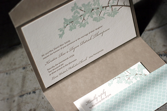
Saying that this pretty wedding invitation “…makes a sharp, sophisticated statement without getting too busy” we loved Audrey’s pick for first runner up, a custom letterpress wedding invitation design from our friends at Paperkiss in Australia.

SECOND RUNNER UP – Rock Paper Scissors in Franklin, Tennessee
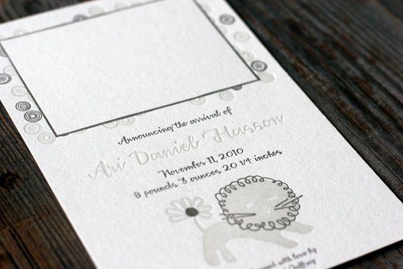
Audrey’s choice for second runner up is a sweet letterpress baby announcement from our friends at Rock Paper Scissors in Franklin, Tennessee. She loved it because it is “soft and whimsical and a keepsake any recipient would save and adore.”

HONORABLE MENTIONS
In addition to our three winners, we’re recognizing seven additional designs that inspired us to no end. We extend a heartfelt thank you to our friends at the following stores – we are continually awed by all you do!
Arabesque in Naples, Florida
Kate’s Paperie Soho in Manhattan
Inscriptions on the Boulevard in Fort Worth, Texas
Byrd & Bleecker in Fort Worth, Texas
By Invitation Only in Little Rock, Arkansas
LS Amster Company in Scarsdale, New York (two honorable mentions!)

New York City friends take note! Next week we’ll be hosting two incredible trunk show events with our friends at Judy Paulen Designs. In addition to other fabulous promotions, we’ll be offering 25 free letterpress invitations when you buy 75+ and our resident design experts will be on site to help you dream up something one of a kind for your wedding stationery. Come out and say hello! We’d love to meet you.
Monday, February 7th
5pm to 8pm
1282 Third Avenue
212.737.0037
Tuesday, February 8th
4pm to 8:30pm
Bloomingdale’s 59th Street, 6th Floor
212.705.2833
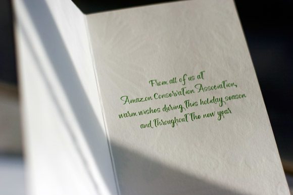
We couldn’t let the holidays completely slip away without sharing the letterpress holiday cards we printed for the Amazon Conservation Association this year. ACA is one of the eco organizations we regularly partner with on special projects and pro bono printing throughout the year and these letterpress holiday cards were an especially fun project. Letterpress printed in rich green and blue inks to match their branding, we designed them greeting card style playing on one of the pretty floral motifs from our Everyday stationery collection. For more information about our eco commitment, read more about our environmental efforts and the organizations we support through donations via 1% For the Planet, pro bono printing and special projects.


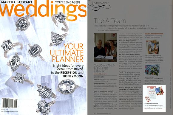
We are thrilled to be featured in the Winter 2011 issue of Martha Stewart Weddings! They showcased a custom design project we worked on with our friends at The Wedding Library, drawing inspiration from a vintage handkerchief to create bright and cheerful letterpress wedding invitations, menus, favor tags, table numbers and assorted paper goods. You can also see more of this project on the Martha Stewart blog The Bride’s Guide here and here. Thank you so much to Claudia at The Wedding Library for paying us the honor of working together on such an exciting collaboration!

Check out the latest issue of 30West where Smock’s Creative Director Amy Graham Stigler is featured. (She’s also the cover girl, too!) Learn about Amy’s design inspiration, her love for letterpress and the unique art history background she brings to designing for Smock. Check it out online now!

At long last it’s time to share the winner of our latest Smock Design Contest! This stunning customization of our Kurai letterpress wedding invitation suite came to us from Salutations in Charlotte, North Carolina. The design is printed in sea mist and taupe inks, enclosed in a custom folio featuring our sinclair pattern in taupe on the interior with our signature champlain pattern in sea mist on the exterior. Our special guest judge, Kristen Magee of Paper Crave, shares, “This invitation is ultra elegant, and I love that it’s feminine without being too feminine. The soft florals and script font are delicate, romantic and balance wonderfully with the more straightforward sans serif font and pattern on the pocket fold. The understated color choices are also nicely balanced, making this a design that would appeal to both women and men.”
We can’t thank our friends at Saluations enough for working with us on this incredible design and a huge thank you to Kristen for taking on the difficult task of judging the contest. Stay tuned for our next batch of design contest winners in early 2011!


Once upon a time we shared with you a whole bunch of gorgeous letterpress designs that we recently honored in our Smock Design Contest. Today we’re back with our first runner up! This design is a custom letterpress birthday party invitation based on our Graham design brought to us by Luxe Expressions in Atlanta. They are printed in bright hues of custom deep pink and green and feature our roxen pattern on the back. Created for an 80s theme 40th birthday party, our guest judge Kristen Magee of Paper Crave says, “The vibrant colors and bold pattern make this such a fun invitation, and the “40” emblem graphic gives the invite a bit of a funky edge. The design is versatile and could be used for so many different types of occasions, but I love it as a 40th birthday party invite. The message it sends is, ‘I’m turning 40, I am completely fabulous, and you are going to have an absolute blast at my party!'” We couldn’t agree more.


