Trissa Garvis is one of our Smock Everyday Reps who sent us her first custom letterpress order. This was so amazing, and we hope she sends some more! Bar and Bat Mitzvah cards are known for their bright colors and elaborate designs, and this letterpress invitation set certainly delivers on that reputation. With the multiple fonts and custom artwork, these invitations look very busy, but in exactly the right way. Sometimes it’s hard to fit a lot of design in without overwhelming the invitation, but this set just looks exciting! Excellent work, Trissa!
inks: custom | fonts: lawrence + carrington stripes + billhead + century gothic + rockwell | paper: 1-ply white bamboo | printing: letterpress | | bat mitzvah invitation with custom inks and art |


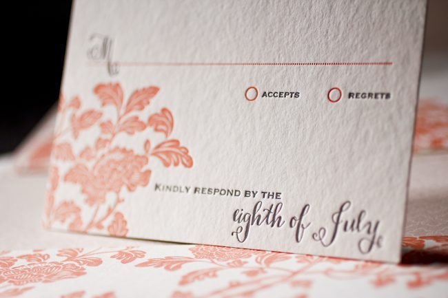
Our good friend Mayra from Always a Bridesmaid in New York, NY did a wonderful job with this Cavall letterpress wedding invitation customization. Orchid seems to be one of the best inks to use with the Pippen liner and brought just the right amount of energy to the simple, text-based design of this invitation. We look forward to seeing what comes next from Always a Bridesmaid!
ink: orchid + red | fonts: smock spencerian + stockton | paper: 2-ply white bamboo | printing: letterpress | corner rounding | liner: the pippen pattern in orchid | invite size: s-8 |


Amy Graham Stigler, Smock’s design extraordinaire and honored design contest judge, chose Urban Coast’s custom letterpress design as the FIRST PLACE WINNER!!! We couldn’t agree more.

Urban Coast in Belleair Bluffs, Florida proudly hosted an event honoring Bryan Rafanelli – a renowned event planner and founder of Rafanelli Events.

As you may know, Bryan Rafanelli’s exquisite sense of style, attention to detail and ability to transform clients’ visions into unforgettable celebrations have made him a go-to planner for the most exclusive and high-profile events. From Chelsea Clinton’s “wedding of the decade” to fairytale-themed galas for Massachusetts General Hospital for Children to celebrations for the inauguration of President Barack Obama –he has produced it all!

And Urban Coast chose Smock to create the beautiful letterpress invitations to this extraordinary event. WE WERE ECSTATIC!!!

The design itself is incredible. Layers of bamboo paper, die-cut into Smock’s new Chesapeake shape, fill a custom letterpress sleeve. The warm summer colors of papaya and taupe feel perfect for a June event. The Everett and Seneca patterns, all letterpress printed, create sophisticated textures as well. This set screams touch me, feel me, love me!
Mr. Rafanelli, I hope we made you smile!
inks: taupe + papaya | fonts: alice + century gothic | paper 1-ply white | invite size: S-7 | printing: letterpress | die cut: chesapeake | custom sleeve: seneca pattern in taupe and the marsda cartouche in papaya
This design won first place in our Smock design competition for the first half of 2011. This twice-a-year competition recognizes outstanding and inspired designs submitted by our beloved dealers.

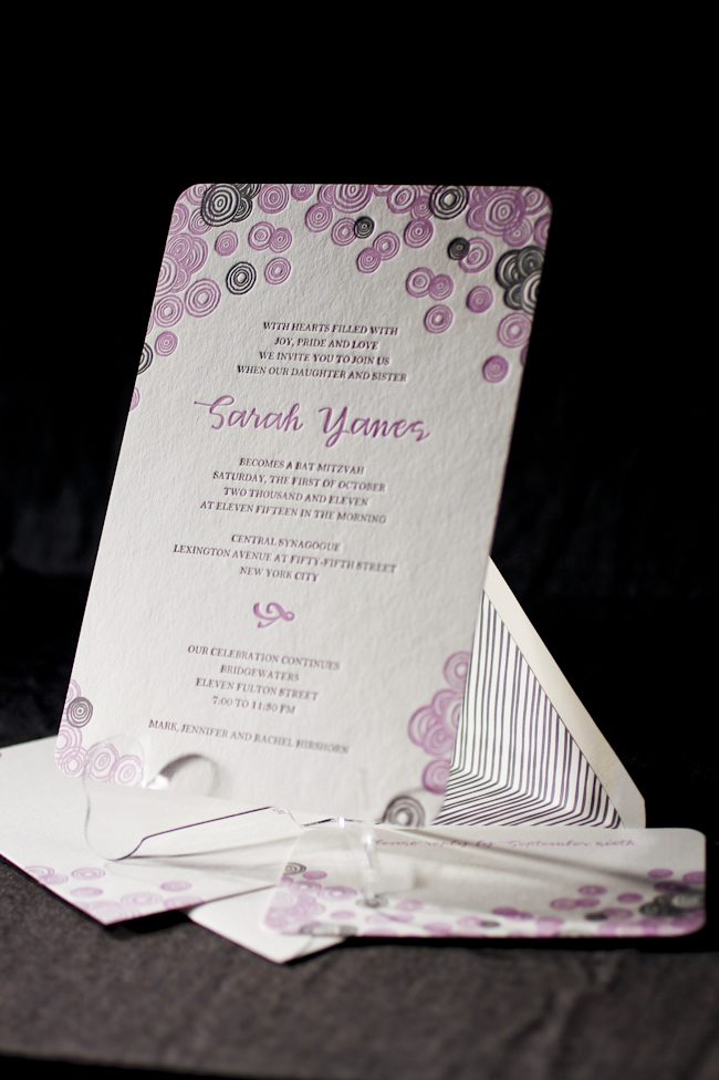
We are proud to announce that RSVP Today in New York won second place in the Smock Design Contest for their custom letterpress Bat Mitzvah Invitation! Playful, hand-drawn circles of the Piedmont design, in feminine colors of violet and pewter, really made this set come to life. Youthful, yet sophisticated – not a bad combination!

Deborah Hassan, owner of RSVP Today, shared with us a quote from her client illustrating the inspiration behind this design:
“For Sarah’s Bat Mitzvah, we wanted an invitation that would reflect the many levels of the day as well as the multi-generational nature of the event. We worked with Debbie from RSVP Today in Manhattan to find something that was youthful and celebratory but which did not compromise the more serious elements of the ceremony. The bubbly circles on both the invitation and the envelope and the lilac color are so well-suited to Sarah’s joyous personality, but the heft and texture of the paper give it weight and depth. We are also thrilled to support Smock’s environmental efforts and opted for a reply postcard to minimize paper. We just love our invitation!”– Jennifer and Sarah Hirshorn


Sarah, we wish you the best in all your future endeavors! Mazel Tov!
inks: violet + pewter + grass | fonts: smock clermont + graham | paper 2-ply white | invite size: S-8 | printing: letterpress | corner rounding | liner: custom in pewter
This design won second place in our Smock design competition for the first half of 2011. This twice-a-year competition recognizes outstanding and inspired designs submitted by our beloved dealers.

At Smock our goal is to ensure that our brides have one of kind invitations for their big day. With that in mind, we often accept custom artwork to pair with our wide variety of fonts and letterpress (or offset) print in our luscious ink on our luxurious bamboo paper. The artwork submitted to us by Peabody Papers in Grandview Heights, OH once compared with all of the above, blew us away!

The 3-color offset invitation was printed on both the front and the back in pewter, slate and gold inks. The juxtaposition of the flat yet colorful imagery with the black letterpress text created such a dignified look. The subtle hint of masculinity is impeccable. Well done Peabody Papers. Well done!
Meg, from Peabody Papers had the pleasure of working with the happy couple and says, “Working with Shawna has been so much fun! She wanted to convey a sense of elegance while evoking thoughts of champagne bubbles. I drew the “bubbles” and decided that I would use the block for their names vs. a more traditional treatment. The last piece to come together was the kalogram – 5 sheets of proofs! It payed off though as she loves it and is using it & the dot design throughout the reception at the Statehouse. I have a degree in printmaking and enthusiastically convinced her that Smock letterpress would be the most beautiful printing option!!! She really loves the invitations – thanks for everything!”
Excellent thinking Meg!!! Champagne kisses and Caviar Dreams to you!
inks: black + pewter + gold + slate | fonts: cameron + indigo | paper 2-ply white | invite size: S-8 | printing: letterpress + offset | edge painting: pewter | corner rounding
This design won third place in our Smock design competition for the first half of 2011. This twice-a-year competition recognizes outstanding and inspired designs submitted by our beloved dealers.

If you’re looking for an autumnal feel in a wedding set and still want an elaborate design, then look no further! Shelby at Seaside Papery delivered a one-of-a-kind invitation set that pieced together tangerine, espresso, and grass inks in a way that just speaks to us.


Based on the Helani design, this one had a little bit of everything and has been used as a great example of how to celebrate in the fall.
inks: tangerine + espresso + grass | fonts: bescal + carlton | paper 2-ply white | invite size: 7 x 7 | printing: letterpress
This design won an honorable mention in our Smock design competition for the first half of 2011. This twice-a-year competition recognizes outstanding and inspired designs submitted by our beloved dealers.

One of our greatest reviewed Rhon designs, brought to us by Margaret at Scriptura. Having struggled to find just the right color combination, Margaret eventually struck gold…or should we say, “struck papaya?”

The papaya ink worked very well with the offset shell and lettepressed pewter. The addition of the program fan was a great way to tie everything together — the full set looks amazing.

inks: pewter + papaya | fonts: graham + smock bescal | paper: 2- ply white | liner: caspian in shell| folio exterior -rhon in papaya, interior – caspian in shell | printing: letterpress + offset
This design won an honorable mention in our Smock design competition for the first half of 2011. This twice-a-year competition recognizes outstanding and inspired designs submitted by our beloved dealers.

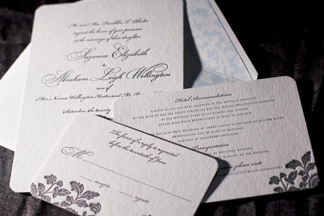
Merging the design elements of Haddington and Rhon, Alyssa from Judy Paulen Designs shows just how to balance a letterpress wedding invitation set.

Particularly stunning was the pale blue of our Lake ink used as an envelope liner which complimented the Pewter of the design and text, making an elegant wedding invitation.

inks: pewter + lake | fonts: bickham swash + bickham script | paper: 2-ply white | invite size: S-8 | liner: ganval in lake | printing: letterpress | edge painting: lake
This design won an honorable mention in our Smock design competition for the first half of 2011. This twice-a-year competition recognizes outstanding and inspired designs submitted by our beloved dealers.
Day three of our design contest brings us an incredibly elegant invitation set – a simple design that looks anything but simple! Hats off to Tasha at The Dandelion Patch for this one.


Coconut ink looks incredible letterpressed in our Champlain pattern, and is an impressive compliment to the Eggplant used throughout the set.

Everything from the square cards to the rounded corners to the elegant script make this quite the eye-catcher.

Thanks again to The Dandelion Patch for sending us this gorgeous customization!
inks: eggplant + coconut | fonts: spence + cooper | papers: 2-ply white | invite size: s-7 square | liner: reversed champlain in eggplant
This design won an honorable mention in our Smock design competition for the first half of 2011. This twice-a-year competition recognizes outstanding and inspired designs submitted by our beloved dealers.
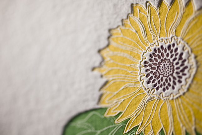
The second honoree in our design contest was sent to us by Ilyssa at Brenda Himmel Stationery. Ilyssa worked with in-house graphic designer Lindsy Aragona to create the custom artwork, and we can’t get enough of these cheery letterpress social notes! The social notes were printed in 3-color letterpress, and combine our Verbena and Grass inks with a custom ink color that Ilyssa selected. The custom artwork printed beautifully, and pairs perfectly with a coordinating Payette liner, also printed in Verbena ink.


The font selection is a perfect complement to the design and looks incredible in letterpress.

Congrats to Brenda Himmel!
inks: espresso + grass + verbena | font: tally | paper: 2- ply white | liner: payette in verbena | edge painting: | printing: letterpress | social note size: S-6
This design won an honorable mention in our Smock design competition for the first half of 2011. This twice-a-year competition recognizes outstanding and inspired designs submitted by our beloved dealers.


