Thanks to Melanie at Salutations in Charlotte, North Carolina for the opportunity to print a beautiful letterpress + offset wedding invitations. Using submitted artwork to combine offset printing for their folio and letterpress printing for their cards, the patterns and designs used in this set were very striking. Seamist compliments taupe very well to begin with, but we were very pleased to see how elegant everything looked when put together. Great work, Melanie!
inks: seamist + taupe| fonts: custom + therese | paper: 1-ply ivory bamboo | printing: letterpress | folio interior: windemere in taupe| folio exterior: custom in seamist | invite size: s-7 folio |


It’s easy to get swept away with this charming letterpress invitation customization made to our Burstell design submitted to us by our friend Ailbhe from Pretty as a Picture in Ireland! This modern text based invitation has clean lines and the right amount of flourishes to add a touch of elegance to this set. We love the luscious raspberry on the interior of the folio even more because it is probably not something guests will be expecting! The exterior of the folio is printed in our virelles pattern which looks positively nature inspired! Pretty as a Picture always sends us the coolest customizations-and it’s safe to say this will be another crowd pleaser!
ink: espresso | fonts: spence + graham| paper: 1-ply ivory | printing: letterpress |folio exterior: virelles pattern in espresso | folio interior: sinclair pattern in raspberry | invite size: 5.125 x 7.75


We were so happy when we were able to offer to letterpress print submitted artwork for no charge, it opened up the door for beautiful new designs to come our way! Michelle at Paperkiss sent us this wonderful invitation set and it came out beautifully. Michelle is a great friend of ours in Australia and we are always happy to see what she sends. Thanks again to Paperkiss!
ink: navy + silver | fonts: inigo + custom font | paper: 1-ply white | printing: letterpress | submitted art |


We thank our friends at Paper Studio, in Ontario Canada, for this beautiful customized 3 color letterpress wedding invitation suite. The invitations and reply cards were letterpress printed in Sky and Espresso inks on our Bamboo 2-ply paper. They were given a touch of brilliance with the blind debossed flowers. The understated elegance is absolutely captivating!
inks: espresso + sky + blind deboss | fonts: cameron + shaw | paper: 2-ply white bamboo | printing: letterpress | wedding invitation suite with custom art |


Amy Graham Stigler, Smock’s design extraordinaire and honored design contest judge, chose Urban Coast’s custom letterpress design as the FIRST PLACE WINNER!!! We couldn’t agree more.

Urban Coast in Belleair Bluffs, Florida proudly hosted an event honoring Bryan Rafanelli – a renowned event planner and founder of Rafanelli Events.

As you may know, Bryan Rafanelli’s exquisite sense of style, attention to detail and ability to transform clients’ visions into unforgettable celebrations have made him a go-to planner for the most exclusive and high-profile events. From Chelsea Clinton’s “wedding of the decade” to fairytale-themed galas for Massachusetts General Hospital for Children to celebrations for the inauguration of President Barack Obama –he has produced it all!

And Urban Coast chose Smock to create the beautiful letterpress invitations to this extraordinary event. WE WERE ECSTATIC!!!

The design itself is incredible. Layers of bamboo paper, die-cut into Smock’s new Chesapeake shape, fill a custom letterpress sleeve. The warm summer colors of papaya and taupe feel perfect for a June event. The Everett and Seneca patterns, all letterpress printed, create sophisticated textures as well. This set screams touch me, feel me, love me!
Mr. Rafanelli, I hope we made you smile!
inks: taupe + papaya | fonts: alice + century gothic | paper 1-ply white | invite size: S-7 | printing: letterpress | die cut: chesapeake | custom sleeve: seneca pattern in taupe and the marsda cartouche in papaya
This design won first place in our Smock design competition for the first half of 2011. This twice-a-year competition recognizes outstanding and inspired designs submitted by our beloved dealers.

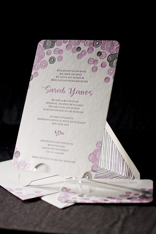
We are proud to announce that RSVP Today in New York won second place in the Smock Design Contest for their custom letterpress Bat Mitzvah Invitation! Playful, hand-drawn circles of the Piedmont design, in feminine colors of violet and pewter, really made this set come to life. Youthful, yet sophisticated – not a bad combination!

Deborah Hassan, owner of RSVP Today, shared with us a quote from her client illustrating the inspiration behind this design:
“For Sarah’s Bat Mitzvah, we wanted an invitation that would reflect the many levels of the day as well as the multi-generational nature of the event. We worked with Debbie from RSVP Today in Manhattan to find something that was youthful and celebratory but which did not compromise the more serious elements of the ceremony. The bubbly circles on both the invitation and the envelope and the lilac color are so well-suited to Sarah’s joyous personality, but the heft and texture of the paper give it weight and depth. We are also thrilled to support Smock’s environmental efforts and opted for a reply postcard to minimize paper. We just love our invitation!”– Jennifer and Sarah Hirshorn


Sarah, we wish you the best in all your future endeavors! Mazel Tov!
inks: violet + pewter + grass | fonts: smock clermont + graham | paper 2-ply white | invite size: S-8 | printing: letterpress | corner rounding | liner: custom in pewter
This design won second place in our Smock design competition for the first half of 2011. This twice-a-year competition recognizes outstanding and inspired designs submitted by our beloved dealers.
We recently had the pleasure of printing these gorgeous die-cut invitations for our friends at Urban Coast in Florida! These luxe invitations invited local industry experts to a special evening with esteemed wedding and event planner, Bryan Rafanelli. Inspired by our National Stationery Show invitations, we created a beautiful set of invitations and insert cards using one of our new die-cuts, which were neatly packaged in a stunning 2-color sleeve. Taupe and Papaya inks on our white bamboo paper made for a chic, summery look that we just adore.

ink: taupe and papaya | fonts: alice (new for 2011!) and century | paper: white 1-ply bamboo | printing: letterpress | die-cut: chesapeake | sleeve: letterpress, seneca pattern in taupe; marsden cartouche in papaya
While we were in Los Angeles for the Urbanic Summer Social, Lindsy and I made time to stop in and visit some of our lovely West Coast Smock retailers. One of our first stops was to Christie, located in beautiful Manhattan Beach. The shop carries a gorgeous range of unique gifts and cards, and there’s a great area set up to view albums and order custom stationery.


Here, Lindsy shows Kim and Mara the new album from our sister company and BFF, Bella Figura.

The ladies at Christie were also kind enough to share with us what they love most about the shop.
What about your store are you most proud of? What makes Christie unique?
We’re most proud of the fact that we’ve been in business for 26 years – we started out as a small card and gift shop in a smaller space down the street, and about 4 years later we moved into a larger space, where we were able to start offering custom printing to our clients. Our shop is located in a really cute little beach community, and our clients think we work in the happiest place on earth (and we agree!). People come a long way to see us here, and many of our clients say it’s like coming to Cheers – where everybody knows your name. We’ve printed birth announcements, Bar and Bat Mitzvah invitations and wedding invitations all for the same kids – we’ve seen a lot of our clients grow up.
What are some of the hottest trends you’re seeing lately?
We’ve seen a lot of navy and pink together these days, and monograms are still really big – we’re seeing monograms everywhere! We’ve also noticed that a lot of our brides are loving hand calligraphy for their envelopes – it adds such a nice touch to any invitation set.
If you’re ever in Manhattan Beach, we highly recommend stopping in to see everything that Christie has to offer!
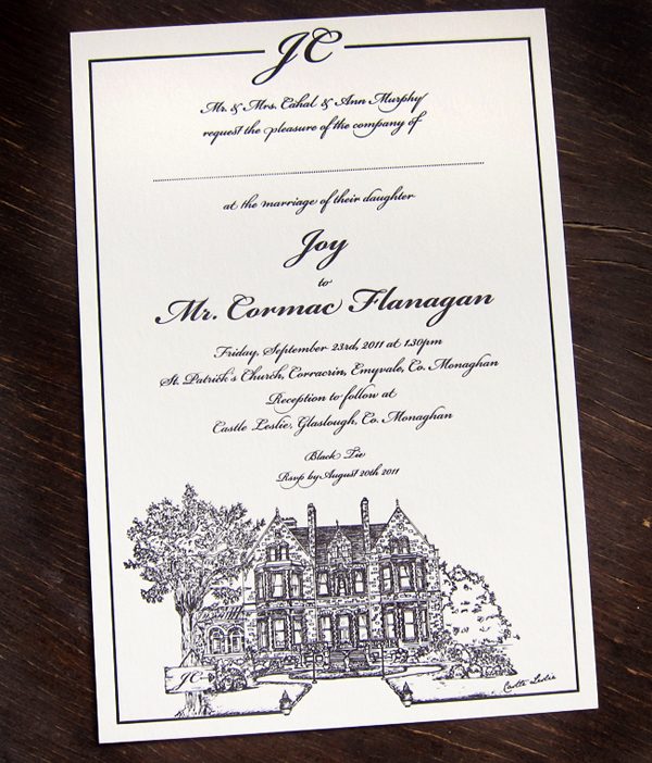
This stunning letterpress wedding invitation was submitted to us by our friends at Pretty as a Picture in Co. Wicklow, Ireland. Jane and Ailbhe love to create custom designs that are intricate but still work very well on letterpress. The simple Black ink on 2-ply bamboo ivory paper helps the focus remain on the detailed artwork which is what we think makes this invitation beautiful. We’re also very excited for our Irish friends to come visit Smock in a couple weeks!
ink: black | fonts: cameron| paper: 2-ply ivory | printing: letterpress | invite size: s-8 |


by Nathan Fleming, Client Coordinator.
We are so happy to see that our friends at Haute Papier were featured in Southern Living magazine! The post also included a gorgeous customization of our letterpress Helani wedding invitation design that Haute Papier submitted! Thanks Haute Papier and Southern Living!


