We have our great friends at Magnificent Milestones in Chicago, Illinois to thank for this custom letterpress Alzette vow booklet! Letterpressed in sky & lake inks on our 2-ply white bamboo paper the cover is perfectly designed with a 3-letter monogram. We think this is a great way to include guests in the joy of exchanging vows.
inks: sky + lake | fonts: nelly + inigo | paper: 2-ply white bamboo | printing: letterpress |


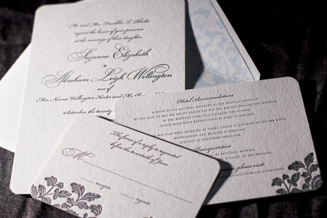
Merging the design elements of Haddington and Rhon, Alyssa from Judy Paulen Designs shows just how to balance a letterpress wedding invitation set.

Particularly stunning was the pale blue of our Lake ink used as an envelope liner which complimented the Pewter of the design and text, making an elegant wedding invitation.

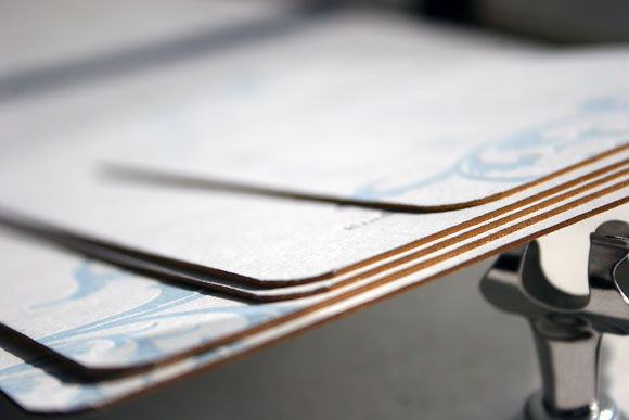
inks: pewter + lake | fonts: bickham swash + bickham script | paper: 2-ply white | invite size: S-8 | liner: ganval in lake | printing: letterpress | edge painting: lake
This design won an honorable mention in our Smock design competition for the first half of 2011. This twice-a-year competition recognizes outstanding and inspired designs submitted by our beloved dealers.
Printed in beautiful silver and lake inks, we can’t get enough of these gorgeous letterpress calling cards and matching correspondence cards. Honored in our most recent Smock Design Contest, we created these pieces for the fine folks at By Invitation Only in Little Rock, Arkansas. From the color combination to the simple, statement-making monogram, this is one of our favorite social stationery sets to date.


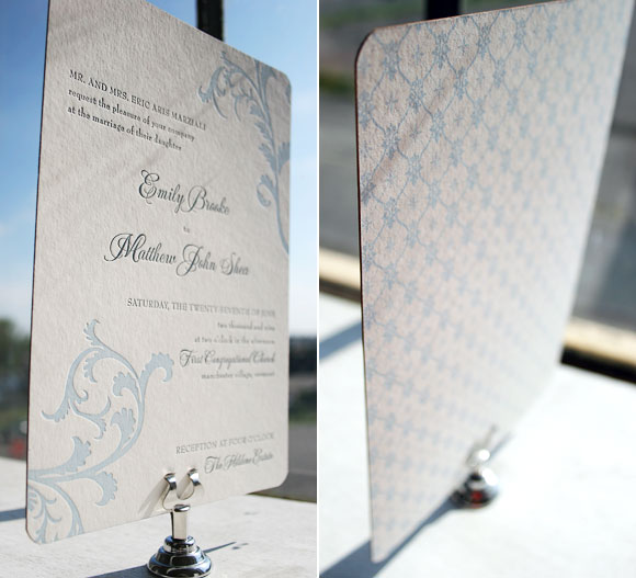
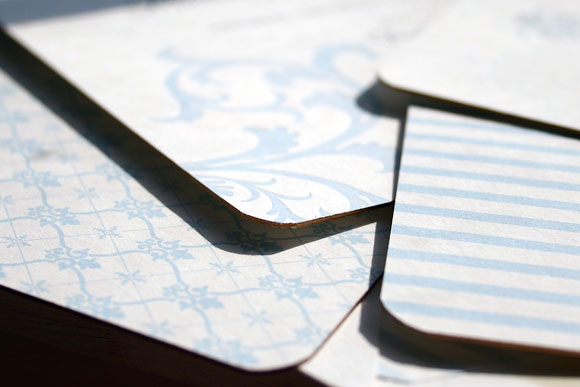
This next runner up in our Smock Design Contest is a true customization, blending all of the beauty of both our Nevis and Vettore letterpress invitation designs into one incredible invitation suite. Brought to us by our friends at Arabesque in Naples, Florida, this customization was a true pleasure for us to print. With an exciting mixing and matching of colors, patterns and designs, this set is truly unique and exudes an undeniable elegance.

The letterpress invitation itself is our Vettore design, printed in soft lake and midnight inks. The design was shifted to have a vertical orientation and the couple opted for pattern backing in our willoughby pattern in lake. With corner rounding and gold edge painting, every detail was thoughtfully considered. The result? An absolute show-stopping letterpress invitation that we completely love.

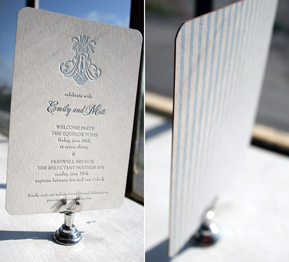
Switching it up, the letterpress reception card is in our Nevis design in the same midnight and lake inks, with pattern backing in our seneca pattern. The same corner rounding and gold edge painting make this card just as classically chic as the invitation itself.

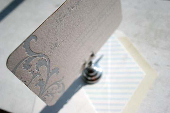
The letterpress reply card is once again in our Vettore design, paired with an envelope liner in our seneca pattern printed in lake to match the pattern backing of the letterpress reception card. The careful pairing of colors and patterns helps this invitation set shine, a truly beautiful and unique reflection of the couple and their wedding.


Thank you so very much to the folks at Arabesque for the privilege to print such an incredible customization. Congratulations on being one of our Smock Design Contest winners!
Every summer there is an event that reminds me just why we moved to Wisconsin. It’s called the Fishoree and, as the name implies, its a fishing ‘competition’ for kids. (Competition in the sense that there are awards given for such categories as ‘cutest fish’.) It’s a favorite of ALL my boys as it involves worms, tangled line and consequent fish-tales. Oh yes, and a locally brewed beer for my husband (who needs it after dealing with the tangled lines.) Miette loves it as well. This year she spent the entire evening squealing “I wanna catch a beauty!” (As in….“what a beauty!”) And therein lies my focus of the evening – soaking up the sheer beauty of it all.


