Last year we had the pleasure of printing custom letterpress wedding invitations for our friends Ailbhe and Jane at Pretty as a Picture in Ireland for Jane’s own wedding. We’re so excited to share the inspiration and design process behind the gorgeous final design. First up, Jane’s inspiration board…

- Edinburgh – where they had their first few dates
- Thistle, a representation of Scotland
- The bridesmaids dresses – purple colour scheme for wedding
- The wedding car
- Summerhill House Hotel – where they were getting married
- Their house
- The church in Wicklow Town where they were getting married
- Their baby
- An engagement photo
- Golf – John Joe’s favorite hobby
- A clock to represent the time of the church
All of that inspiration, came together in this first sketch by Ailbhe, which incorporated whimsical imagery and representations of Jane and John Joe’s zodiac signs…

Later the design was finalized and streamlined…

And then we letterpress printed the design on our 2-ply bamboo paper in a custom shade of purple and taupe inks.


We loved seeing how Jane’s inspiration came to life and how Ailbhe’s amazing sketches turned into really fabulous letterpress invitations. Read more about the design process and Jane’s inspiration on Pretty as a Picture’s blog. Thank you for sharing, ladies!
{Photos by Pretty as a Picture.}
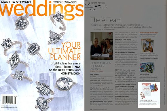
We are thrilled to be featured in the Winter 2011 issue of Martha Stewart Weddings! They showcased a custom design project we worked on with our friends at The Wedding Library, drawing inspiration from a vintage handkerchief to create bright and cheerful letterpress wedding invitations, menus, favor tags, table numbers and assorted paper goods. You can also see more of this project on the Martha Stewart blog The Bride’s Guide here and here. Thank you so much to Claudia at The Wedding Library for paying us the honor of working together on such an exciting collaboration!

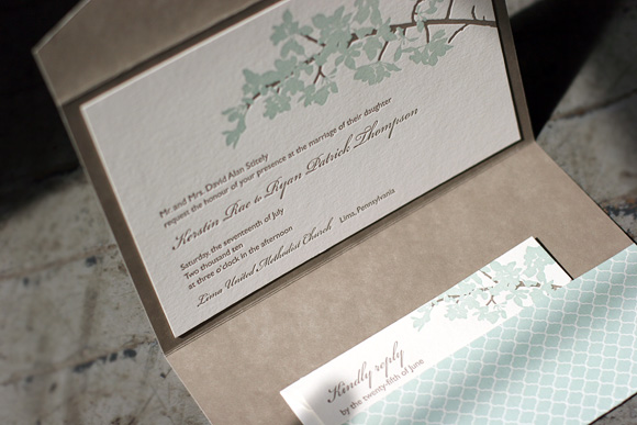
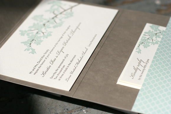
At long last it’s time to share the winner of our latest Smock Design Contest! This stunning customization of our Kurai letterpress wedding invitation suite came to us from Salutations in Charlotte, North Carolina. The design is printed in sea mist and taupe inks, enclosed in a custom folio featuring our sinclair pattern in taupe on the interior with our signature champlain pattern in sea mist on the exterior. Our special guest judge, Kristen Magee of Paper Crave, shares, “This invitation is ultra elegant, and I love that it’s feminine without being too feminine. The soft florals and script font are delicate, romantic and balance wonderfully with the more straightforward sans serif font and pattern on the pocket fold. The understated color choices are also nicely balanced, making this a design that would appeal to both women and men.”
We can’t thank our friends at Saluations enough for working with us on this incredible design and a huge thank you to Kristen for taking on the difficult task of judging the contest. Stay tuned for our next batch of design contest winners in early 2011!


We’re excited today to share another honoree in our recent Smock Design Contest! It’s a custom wedding invitation design brought to us by Details in Philadelphia, letterpress printed in gold ink on our ivory bamboo paper. The motif was inspired by our Pippen pattern, which makes an appearance as a gorgeous liner printed in gold. A big thank you to our friends at Details for sending us this great design!


Today’s incredible Smock Design Contest honoree came to us from Epitome Papers in Edina, Minnesota. It’s a custom letterpress wedding invitation design with an elegant botanical motif printed in blind deboss and grass ink with sky edge painting. It also boasts our Clermont hand calligraphy by Debi Zeinert for a total package that is amazingly sophisticated and pretty. Thank you to the folks at Epitome Papers for bringing us this fabulous design! 


Our next Smock Design Contest honoree is a fabulous custom letterpress wedding invitation design from Salutations in Charlotte, North Carolina. The set features a cool #10 business-sized letterpress wedding invitation printed in navy on our 1-ply white bamboo paper with coordinating letterpress reply post cards, reception cards and petite-sized website cards. We love when a couple thinks outside the box! In this case the design is fresh and modern while still feeling traditional. Thanks to our lovely friends at Salutations for sending us such a great design!


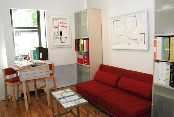
A unique stationery boutique on the Upper East Side of Manhattan, RSVP Today is a quaint by-appointment-only studio specializing in fine stationery and a beloved Smock dealer. Proprietress Deborah Hassan holds a business degree from New York University and spent many years in the corporate world working for a Fortune 500 company before becoming an entrepreneur. She shares, “When it came time to open my own store I wanted to sell a product I was passionate about. My love for paper began when I was a child; collecting samples of invitations and stationery that I purchased and received throughout the years.”

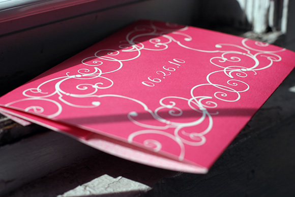
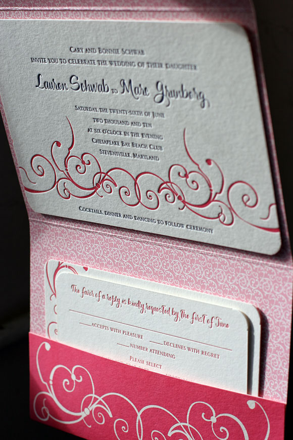
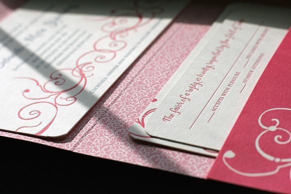
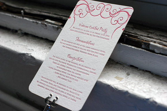
Debbie’s studio space is filled with gorgeous letterpress creations and is a haven for stationery lovers. She works attentively with each client to dream up the invitations, card and announcements of their dreams, filled with unique details and personal touches. We love this recent customization of our Cindrel letterpress wedding invitation design that she created with a client for their upcoming June wedding. It features a custom folio printed in azalea ink that showcases a unique customization of the Cindrel motif creating a frame around the couple’s wedding date. The interior of the folio is printed in our pippin pattern in blush ink and features several inserts detailing event information, lists of local accommodations and more. The letterpress invitation itself is a horizontal version of our Cindrel design printed in azalea ink paired with navy to match the other event details the couple is planning for their wedding.


In our typical fashion, we had to ask Deborah a few questions to get a feel for what makes her tick…
If you were invited to the White House for dinner, what would you wear?
I would want to wear something elegant and special. As with any invitation, it is important to have a memorable and unique presentation that reflects the event.
If you could describe your personality in letterpress, which Smock design would you be and why?
It would be Vettore, which I used when I did my letterpress holiday cards through Smock. I used Spence and Engravers printed in red ink.
What would you suggest as must-visit places for first time visitors to New York?
My studio is right across the street from the Guggenheim Museum and Central Park, both must sees on your visit. It is also right off Madison Avenue, an area boasting some of the most renowned stores in the world.
What is your favorite part about what you do?
I love helping people find the right invitation and making the experience fun instead of stressful. My store has a warm, unique and cozy atmosphere that makes people feel comfortable and excited to take part in planning their event. I love stationery and enjoy looking through my books with my customers.


