Today we’re excited to share a first look at AvaFlora’s brand new business cards, which feature our new white foil! Lori and Michael worked with Adrienne at Ipanema Press to create their new logo along with a new look for their cards, opting for white foil on our 100% recycled gray paper. A simple honeysuckle vine gives a nice nod to their craft (together they run a full service floral and event design boutique), while the rest of the card features sophisticated typography for a chic, modern look.


foil color: white matte | design: custom / supplied artwork | paper: 1-ply gray | size: B-1 | customization #34382 | Ipanema Press
Photographs courtesy of AvaFlora
Remember these gorgeous chinoiserie inspired invitations that we featured last year? They were featured in the latest issue of Martha Stewart Weddings! This job was a team effort by our in-house designers Brenda Fox, who created all of the custom illustrations for the invitation suite, and Mariel Mirra, who did the layout and design work. The suite was inspired by a blue-and-white chinoiserie fruit bowl that sat on the bride’s family kitchen counter while she was growing up. Honor and Jay worked with Phyllis at By Invitation Only to create their custom invitations, which were featured alongside photos from their wedding day in an 8-page spread in the latest issue. Visit Martha Stewart Weddings to see even more photos from their celebration!


Photos by Roey Yohai Photography, featured originally by Martha Stewart Weddings.
For Violet’s tennis inspired Bat Mitzvah invitations, we created a custom design influenced by preppy vintage tennis apparel – think 80’s country club, with brands like Lilly Pulitzer and Lacoste inspiring the look. Complete with argyle and alligators, the design layout mirrored the lines on a tennis court and was printed in a bright pink and green color palette.To bring the design to life, guests were encouraged to dress in their favorite tennis ensembles. We love the way this custom design reflected Violet’s passion for tennis — and really, who can resist such a fun reason to dress up?


letterpress inks: emerald + azalea | fonts: college black + cyclone layers + neutra display + fenway park | paper: 1-ply white | size: S-8 + S-5F + 4.7 x 8.375 | customization #25618
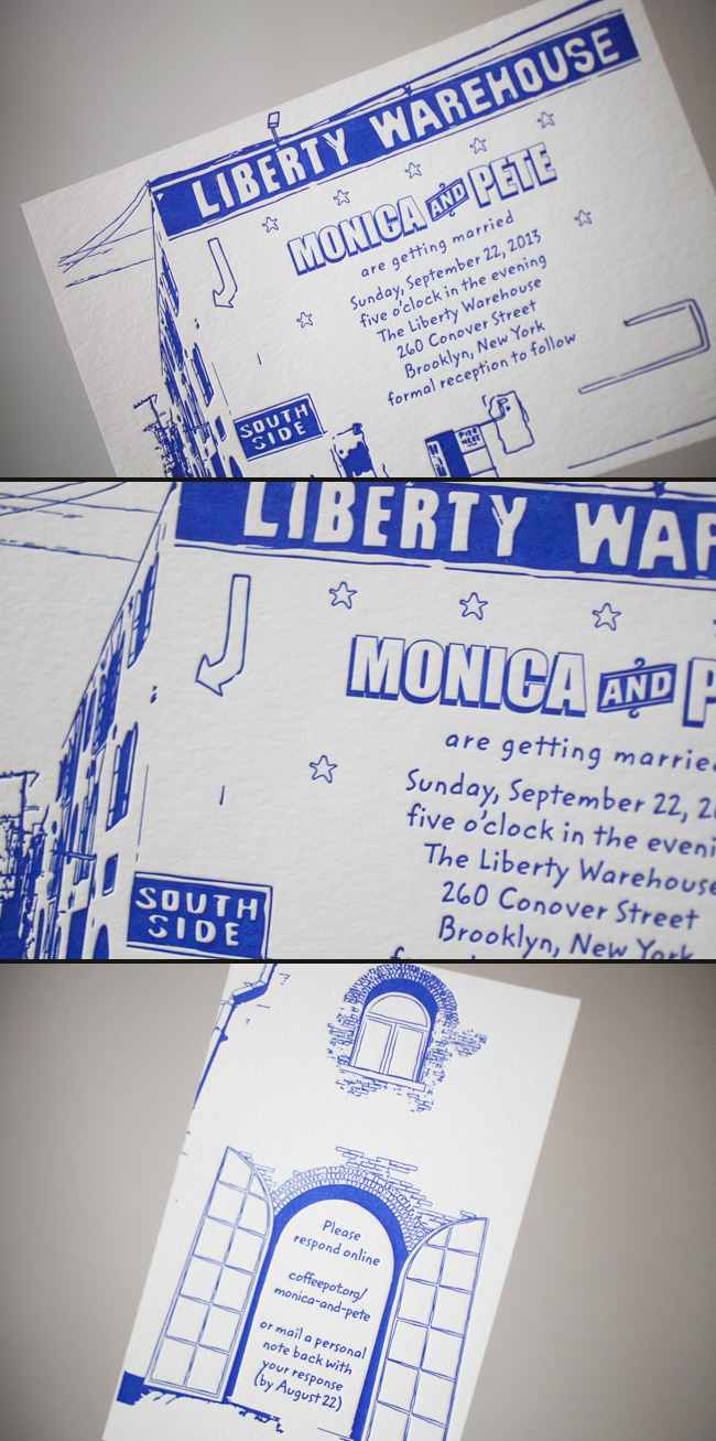
Lion in the Sun blew us away with this Brooklyn-inspired custom artwork. We love the way the design captured this iconic building and how creative the reply card is. Our azure blue letterpress ink makes the whole urban suite pop.
ink: azure | fonts: submitted | paper: 2-ply white | invite size: s-8 | foil edging: gold shine | customization #: 18909
How do you outdo an awesome save the date? Our good friend Niki at Papery & Cakery in Boca Raton, Florida has the recipe. We posted these lovely save the dates for Niki’s sister back in September!!!

Now that the wedding has passed, we are able to show you the amazing suite she designed, and we couldn’t be happier to share these with everyone! The suite was letterpress printed in our Pewter ink on our beautiful white bamboo 2-ply paper. All of the pieces were fitted with an offset border in pewter and die-cut in our new Chesapeake design. Each piece has a decorative offset backing and is finished with perfect edge painting in Pewter. The invitation, reply cards, and events card are tucked nicely into a custom offset sleeve.
inks: pewter + spring | fonts: submitted fonts | paper: 1-ply white + 2-ply white | printing: letterpress + offset | sleeve: custom pattern offset in pewter + spring | liner: seneca pattern offset in spring | invite size: S-8 sleeve | die-cut: chesapeake

Libby from Byrd + Bleecker in Fort Worth, Texas strikes again! Birth announcements are such a joy to print, particularly when they are original and beautiful in design. Peach and Ocean inks are a great blend for baby announcements and the use of design elements and photo space make this card a one-of-a-kind.
ink: peach + ocean | fonts: clementine + forester | paper: 1-ply white bamboo | printing: offset | birth announcement | size: 4.5 x 6.25 | corner rounding

Thanks to Melanie at Salutations in Charlotte, North Carolina for the opportunity to print a beautiful letterpress + offset wedding invitations. Using submitted artwork to combine offset printing for their folio and letterpress printing for their cards, the patterns and designs used in this set were very striking. Seamist compliments taupe very well to begin with, but we were very pleased to see how elegant everything looked when put together. Great work, Melanie!
inks: seamist + taupe| fonts: custom + therese | paper: 1-ply ivory bamboo | printing: letterpress | folio interior: windemere in taupe| folio exterior: custom in seamist | invite size: s-7 folio |


At Smock our goal is to ensure that our brides have one of kind invitations for their big day. With that in mind, we often accept custom artwork to pair with our wide variety of fonts and letterpress (or offset) print in our luscious ink on our luxurious bamboo paper. The artwork submitted to us by Peabody Papers in Grandview Heights, OH once compared with all of the above, blew us away!

The 3-color offset invitation was printed on both the front and the back in pewter, slate and gold inks. The juxtaposition of the flat yet colorful imagery with the black letterpress text created such a dignified look. The subtle hint of masculinity is impeccable. Well done Peabody Papers. Well done!
Meg, from Peabody Papers had the pleasure of working with the happy couple and says, “Working with Shawna has been so much fun! She wanted to convey a sense of elegance while evoking thoughts of champagne bubbles. I drew the “bubbles” and decided that I would use the block for their names vs. a more traditional treatment. The last piece to come together was the kalogram – 5 sheets of proofs! It payed off though as she loves it and is using it & the dot design throughout the reception at the Statehouse. I have a degree in printmaking and enthusiastically convinced her that Smock letterpress would be the most beautiful printing option!!! She really loves the invitations – thanks for everything!”
Excellent thinking Meg!!! Champagne kisses and Caviar Dreams to you!
inks: black + pewter + gold + slate | fonts: cameron + indigo | paper 2-ply white | invite size: S-8 | printing: letterpress + offset | edge painting: pewter | corner rounding
This design won third place in our Smock design competition for the first half of 2011. This twice-a-year competition recognizes outstanding and inspired designs submitted by our beloved dealers.
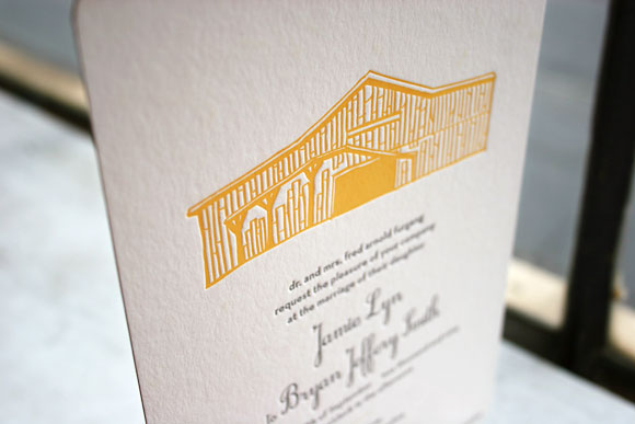
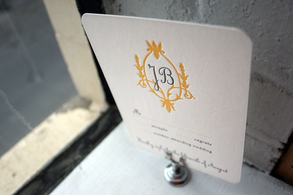
Our next runner up in our recent Smock Design Contest features a unique combination of custom artwork and signature Smock design, a truly unique customization that came to us from Paper Love in Brooklyn. Showcasing a custom hand-drawn illustration depicting the couple’s wedding venue, this letterpress wedding invitation is undeniably personal and thoughtful. Bright verbena and soft pewter inks make for a combination that is bold yet incredible sophisticated while the pattern backing in our marav pattern provides an unexpected touch. The letterpress reply card is in our Aberdeen design and all of the pieces feature corner rounding for that perfect finishing touch.


Thank you to our friends at Paper Love for sending us this fun and festive customization! It was such a treat for us to print something so unique.


