
Merging the design elements of Haddington and Rhon, Alyssa from Judy Paulen Designs shows just how to balance a letterpress wedding invitation set.

Particularly stunning was the pale blue of our Lake ink used as an envelope liner which complimented the Pewter of the design and text, making an elegant wedding invitation.
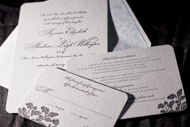
inks: pewter + lake | fonts: bickham swash + bickham script | paper: 2-ply white | invite size: S-8 | liner: ganval in lake | printing: letterpress | edge painting: lake
This design won an honorable mention in our Smock design competition for the first half of 2011. This twice-a-year competition recognizes outstanding and inspired designs submitted by our beloved dealers.
You need these letterpress invitations now. We’re serious. Our 14 brand new letterpress wedding invitation designs just launched on our web site and they’re available in stores right now, too. Some of our favorites include the chevron-crazy Hekla, the preppy formal Breton, and the romantic flutter of Aneto. We didn’t feel like stopping after 14 designs, though — the new album features a customization of each design, so we’ve doubled the amount of pretty you can choose from. We only spent, oh, about 9 months on this release. But it was worth it.
Planning a Bar or Bat Mitzvah? Wedding? Birthday Party? Rehearsal Dinner? Baby shower?? These new designs are perfect for special occasions, and they’re all completely customizable, so go crazy & make one your own. We think you’ll love the die-cuts (or perhaps some hand bordering?), and the new gift wrap liners are pretty cool, too. We even have coordinating postage stamps to go with each new design.
Dying to get your hands on some of that gorgeous bamboo?? Visit a Smock dealer & see the new collection today.


The second honoree in our design contest was sent to us by Ilyssa at Brenda Himmel Stationery. Ilyssa worked with in-house graphic designer Lindsy Aragona to create the custom artwork, and we can’t get enough of these cheery letterpress social notes! The social notes were printed in 3-color letterpress, and combine our Verbena and Grass inks with a custom ink color that Ilyssa selected. The custom artwork printed beautifully, and pairs perfectly with a coordinating Payette liner, also printed in Verbena ink.


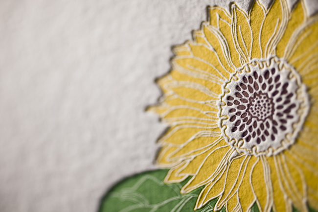
The font selection is a perfect complement to the design and looks incredible in letterpress.

Congrats to Brenda Himmel!
inks: espresso + grass + verbena | font: tally | paper: 2- ply white | liner: payette in verbena | edge painting: | printing: letterpress | social note size: S-6
This design won an honorable mention in our Smock design competition for the first half of 2011. This twice-a-year competition recognizes outstanding and inspired designs submitted by our beloved dealers.
We’re so happy to be able to share more photos and highlights of our West Coast travels! It was such a treat to be able to visit Sugar Paper when we were in LA – it’s the most adorable stationery boutique with so much style and charm. Chelsea from Sugar Paper gave us the scoop on what’s trending, what they love & how they’re making the world a better place.

Is there a cause or charity your store supports? Tell us all about it:
Sugar Paper donates to a myriad of charities throughout the year. Our clients are very philanthropic and we support their causes through donations. This year, however, we have chosen pediatric cancer as our personal cause. Jamie and I are both new mothers and a close friend recently lost her baby to a rare form of cancer. Her battle was a tough fight and loss of baby Quinn has left a mark on our hearts.

What about your store are you most proud of? What makes you unique?
We’re proud of the Sugar Paper team. The invitation business is driven by deadlines and our days can be very busy. We feel lucky to work with a group of creative people who work extremely hard and make us laugh every day. Laughter seems to make the load lighter.

What do you predict will be the biggest wedding or stationery trend for 2012?
Hand lettering is HUGE right now. Clients are requesting hand lettered stationery + invitations more and more and we predict this will continue through the 2012 wedding season.

Hottest color palette right now?
The seasons tend to dictate hot color palettes. Right now, Sugar Paper is loving crisp white, khaki and canary yellow.
If someone is visiting your store, what’s another essential stop in your neighborhood?
If you’re visiting our original location on Ensley Avenue, Clementine Bakery is a MUST. The chocolate chip cookies are gooey in the middle and crisp on the edge – our favorite kind. If you visit our Brentwood Country Mart location, the Mart is a destination in and of itself. Caffe Luxxe serves artisanal coffee and Sweet Rose Creamery makes homemade ice cream that will knock your socks off. The salted caramel is our personal favorite.
A huge thanks goes out to Chelsea for filling us in on everything Sugar Paper – if you’re in LA, be sure to stop in!!
**Be like Sugar Paper and support research for pediatric cancer by visiting any of the following foundations:
Pediatric Cancer Foundation
Alex’s Lemonade Stand
Pediatric Cancer Research Foundation
St. Jude’s Children’s Research Hospital
As owners of The Enchanted Florist, a whimsical, flower lover’s dream come true, Lance and Kim Williams opened the most charming stationery boutique in Burbank, California – An Open Invitation. This inviting space is nestled right next store to their flower shop, so visiting is certainly a treat!

About two years ago, I met the cutest couple ever at the National Stationery Show – guess who!? They both had the warmest personalities and a great love story! I was hooked! Lance and Kim had actually met and fell in love while working in the flower business together – adorable, right? And they just so happened to be overly intrigued by Smock – even better! They wanted to be Smock dealers right away and the rest is history.


Our adventurous trip out west in June lead us right to this enchanted world of flowers and stationery created by the Williams’. Surrounded by the scent of orchids, the textures of fine papers and sweet-as-pie gifts – I didn’t want to leave! You won’t want to either!


Be sure to stop by – the invitation is always open!
by Lindsy Aragona
While we’re off at the National Stationery Show this week, you can take advantage of incredible savings on Smock stationery and paper goods! Starting today, visit One Kings Lane to enjoy a fabulous discount on our letterpress cards, keepsake boxes, gift tags and more. Happy shopping!

This gorgeous letterpress invitation design was honored in our recent Smock Design Contest and was sent to us by Arabesque in Naples, Florida. The bold color combination features verbena and pewter inks and showcases a custom design styled after our Graham suite from our Social Occasions collection. The set, which includes fun letterpress insert cards detailing weekend events, is enclosed in a pretty folio printed with our champlain pattern on the interior and our botanical-inspired virelles pattern on the exterior. Many thanks to the folks at Arabesque for bringing us this showstopping design!


We’re excited to be kicking off a new round of Smock Store Spotlight features with Wordshop in Denver. A unique paperie with a beautiful storefront, Wordshop is Denver’s premiere indie stationery shop, offering a wide range of eco-friendly and artisan brand stationery, letterpress and paper goods. Proprietress Jill Alyn has an English degree and an unsurpassed passion for stationery and the written word. Wordshop is, for her, a longtime dream come true.


Please share a bit about yourself and your background. What makes you tick?
I am a wordgirl. I have an English degree. I never would have gotten into business school. I’m one of you who has also collected greeting cards for years. Good, thoughtful text makes me tick. From a. favorite design to me’shell ndegeocello.
What was the inspiration behind Wordshop?
There wasn’t a proper paperie in Northwest Denver (1) and (2) I had been dreaming of doing this for a really, really long time.

What’s your favorite part about what you do?
Hands down, connecting with people. Brides, mamas of brides, hopeless romantic card buyers, people who still see the value of the written word.
What stationery trends are you currently loving?
Great pattern on pattern invites, regional assembly of text is taking the crafty look to upscale design, and the return of the reply envelope – funk the postcard reply.


For first time visitors to Denver, what are your recommendations for must-do sights and scenes?
Table 6 for seasonal and local deliciousness, H|Burger for their roasted marshmallow and Nutella shake, Highlands Square shopping district, oh and the mountains are pretty, pretty.
What are you top prized possessions?
1. my little wordshop
2. an old dresser full of cards I have received, and cards I have purchased and will never send
3. a metal sculpture of peace doves from the seventies, snagged up from my parents house
4. a black, vintage ’79 Nicole Miller dress – a total show stopper.
If you could only have three fonts on your computer, what would they be?
Smock Clermont, Lawrence and Stockton

If you were a PMS number, what would you be?
7499 – daytime I am Victorian ivory + 5753 – nighttime I am pewter.
If you could describe your personality in letterpress, what Smock design would you be?
I would be Cavall. I think I already am. (Understated, some flair, a dotted line for annunciation. ) As for color, nothing is classier to me than black and ivory.
Thanks so much, Jill! If in Denver, be sure to stop by and pay Wordshop a visit.
We’re so excited to share this fabulous birthday party this morning! Our Creative Director, Amy Graham Stigler, recently planned an incredible party to celebrate her husband Zach’s 40th birthday. (Which just so happens to be today!) Back in the day Amy and Zach used to host an annual Valentines Day party – it’s such a great time of year to celebrate and get festive after the chaos of December and downtime of January. Then kids came and the party went by wayside, but this year they decided it would be fun to resurrect the celebration. However, little did Zach know that Amy decided to make the party a surprise birthday party as well, including a card with the invitation asking guests to plan to toast Zach’s 40th birthday at the party. His brother even flew in from Seattle to surprise him and gave the honorary toast.


Zach loves old school rap so a recurring theme throughout the party was 40 oz of Funk complete with 40 oz beers! A mix cd of Zach’s favorite old school rap songs were set out as favors and cocktail napkins were printed with a favorite LL Cool J quote. In true form, Zach donned one of Amy’s oversized chunky gold necklaces. Amy mixed up an assortment of festive punches and set up the fixings for a “guys” bar with an assortment of whiskey, scotch and beer. Tasty hor-d’oevres and a dessert table were set out for munching and decorations were mainly silver, white and sparkly with the number 40 incorporated here and there.


Many thanks to Jaclyn Tyler for sharing these incredible photos from the party and a big happy birthday to our friend Zach! Here’s to 40 more!
{Photos by Jaclyn Tyler.}
You couldn’t tell by the snow storm that slammed Central New York last night and early this morning, but spring is on the way! We’re getting so excited to start up our annual Community Supported Agriculture program with Grindstone Farm and it got us thinking about our friends at the Northeast Organic Farming Association of New York. We recently contributed pro bono letterpress printing to their fundraiser event at Candle 79 in New York City honoring chef Leslie McEachern of Angelica Kitchen for her 30 year career as a chef supporting local organic agriculture in New York State. It was an honor to be a part of this event!


All of the letterpress pieces feature our Rhon design printed in peach and taupe inks. We love this color combination! It felt appropriately earthy for this autumn event while still being super sophisticated.


NOFA-NY sent over a few photos from the event. The food looks so good! This is our kind of party.


Many thanks to our friends at NOFA-NY for extending us the honor of being a part of this important event and for your ongoing efforts! Read more about NOFA’s work on the NOFA-NY website.