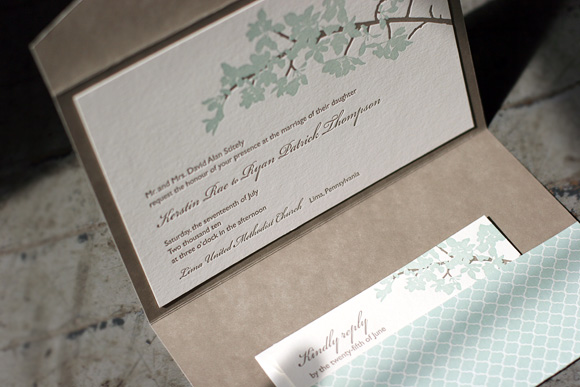
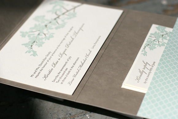
This gorgeous customization of our Sutton letterpress invitations was sent to us by our friends at Kate’s Paperie and is among the honorees in our most recent Smock Design Contest. It was printed in a custom bright turquoise ink paired with pewter and calligraphy accents for a look that is elegant and formal. We love this fresh and chic color combination for a traditional summer wedding. Many thanks to Kate’s Paperie for working with us on this stunning invitation set!


One of our favorite letterpress holiday cards this year, this custom design was an honoree in our latest Smock Design Contest. Brought to us by our fabulous friends at Byrd & Bleecker in Fort Worth, it was printed in olive and azalea inks, a festive nontraditional color combination for the holidays. An envelope lined in azalea Seneca stripes is the perfect finishing touch. We love how these turned out! Many thanks to Libby for working with us on this truly inspired design.


We’re excited to be kicking off a new round of Smock Store Spotlight features with Wordshop in Denver. A unique paperie with a beautiful storefront, Wordshop is Denver’s premiere indie stationery shop, offering a wide range of eco-friendly and artisan brand stationery, letterpress and paper goods. Proprietress Jill Alyn has an English degree and an unsurpassed passion for stationery and the written word. Wordshop is, for her, a longtime dream come true.


Please share a bit about yourself and your background. What makes you tick?
I am a wordgirl. I have an English degree. I never would have gotten into business school. I’m one of you who has also collected greeting cards for years. Good, thoughtful text makes me tick. From a. favorite design to me’shell ndegeocello.
What was the inspiration behind Wordshop?
There wasn’t a proper paperie in Northwest Denver (1) and (2) I had been dreaming of doing this for a really, really long time.

What’s your favorite part about what you do?
Hands down, connecting with people. Brides, mamas of brides, hopeless romantic card buyers, people who still see the value of the written word.
What stationery trends are you currently loving?
Great pattern on pattern invites, regional assembly of text is taking the crafty look to upscale design, and the return of the reply envelope – funk the postcard reply.


For first time visitors to Denver, what are your recommendations for must-do sights and scenes?
Table 6 for seasonal and local deliciousness, H|Burger for their roasted marshmallow and Nutella shake, Highlands Square shopping district, oh and the mountains are pretty, pretty.
What are you top prized possessions?
1. my little wordshop
2. an old dresser full of cards I have received, and cards I have purchased and will never send
3. a metal sculpture of peace doves from the seventies, snagged up from my parents house
4. a black, vintage ’79 Nicole Miller dress – a total show stopper.
If you could only have three fonts on your computer, what would they be?
Smock Clermont, Lawrence and Stockton

If you were a PMS number, what would you be?
7499 – daytime I am Victorian ivory + 5753 – nighttime I am pewter.
If you could describe your personality in letterpress, what Smock design would you be?
I would be Cavall. I think I already am. (Understated, some flair, a dotted line for annunciation. ) As for color, nothing is classier to me than black and ivory.
Thanks so much, Jill! If in Denver, be sure to stop by and pay Wordshop a visit.
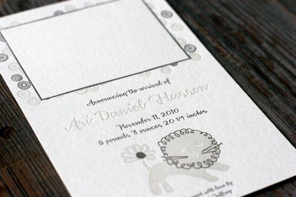
The second runner up in our latest Smock Design Contest, as selected by guest judge Audrey from Urbanic Paper Boutique, is a truly one of a kind letterpress baby announcement from Rock Paper Scissors in Franklin, Tennessee. Using our popular Liony motif paired with our Piedmont design, it was printed in a sophisticated pairing of taupe and sand inks. A space was left for a photo and our Harrison calligraphy font was put to fine use on this cute custom creation. Thanks so much to Rock Paper Scissors for bringing us this great design!


The first runner up in our latest Smock Design Contest, as selected by guest judge Audrey from Urbanic Paper Boutique, is a gorgeous custom letterpress invitation from our friends at Paperkiss in Australia. It features lovely script printed in taupe with corner rounding and taupe edge painting for a look that is simple and sophisticated. Many thanks to Paperkiss for working with us on these stunning letterpress invitations!


Sent to us by Pearl Beach Paperie, the first place winner in our latest Smock Design Contest is a lovely customization of our Lashar letterpress wedding invitations. Perfectly elegant in sea mist and taupe inks, the letterpress invitations were accompanied by a separation invitation card printed on our seamist paper in taupe ink using our Plym letterpress design. This card invited guests to a low country boil the next day. The reverse of both cards features the Plym motif as a pattern for a complete set that is unabashedly elegant.


Pearl Beach Paperie proprietress Darcy shared the inspiration for this stunning customization…
“Working with the bride, Becky, on this set was such a pleasure. She had a clear vision of the invitation design, pattern selection and ink colors. I simply made a few suggestions to finish off the suite. I LOVED changing up the paper color and fusing the designs for the separate event within the overall celebration.”


A huge thank you to Pearl Beach Paperie for bringing us this lovely design and thanks again to guest judge Audrey from Urbanic Paper Boutique for selecting our winners! More winning designs to come!
It is with great pleasure that we announce the winners of our latest Smock Design Contest for the second half of 2010! As always, our beloved Smock retailers have continued to amaze us with their design inspiration and their passion for stunning stationery. Our good friend and paper connoisseur Audrey from Urbanic Paper Boutique in Venice Beach, California stepped in and did the honors of guest judging our contest this time around. Audrey has impeccable style and a fabulous eye for stationery – we love her picks and you will, too! Over the next few weeks we will be sharing full details and of photos of all our honorees right here on the blog so don’t miss it!
FIRST PLACE WINNER – Pearl Beach Paperie in Orlando
Brought to us by Pearl Beach Paperie in Orlando, guest judge Audrey loves the timeless colors and fonts of this design, a perfect balance of masculine and feminine.

FIRST RUNNER UP – Paperkiss in Australia
Saying that this pretty wedding invitation “…makes a sharp, sophisticated statement without getting too busy” we loved Audrey’s pick for first runner up, a custom letterpress wedding invitation design from our friends at Paperkiss in Australia.

SECOND RUNNER UP – Rock Paper Scissors in Franklin, Tennessee
Audrey’s choice for second runner up is a sweet letterpress baby announcement from our friends at Rock Paper Scissors in Franklin, Tennessee. She loved it because it is “soft and whimsical and a keepsake any recipient would save and adore.”

HONORABLE MENTIONS
In addition to our three winners, we’re recognizing seven additional designs that inspired us to no end. We extend a heartfelt thank you to our friends at the following stores – we are continually awed by all you do!
Arabesque in Naples, Florida
Kate’s Paperie Soho in Manhattan
Inscriptions on the Boulevard in Fort Worth, Texas
Byrd & Bleecker in Fort Worth, Texas
By Invitation Only in Little Rock, Arkansas
LS Amster Company in Scarsdale, New York (two honorable mentions!)
At long last it’s time to share the winner of our latest Smock Design Contest! This stunning customization of our Kurai letterpress wedding invitation suite came to us from Salutations in Charlotte, North Carolina. The design is printed in sea mist and taupe inks, enclosed in a custom folio featuring our sinclair pattern in taupe on the interior with our signature champlain pattern in sea mist on the exterior. Our special guest judge, Kristen Magee of Paper Crave, shares, “This invitation is ultra elegant, and I love that it’s feminine without being too feminine. The soft florals and script font are delicate, romantic and balance wonderfully with the more straightforward sans serif font and pattern on the pocket fold. The understated color choices are also nicely balanced, making this a design that would appeal to both women and men.”
We can’t thank our friends at Saluations enough for working with us on this incredible design and a huge thank you to Kristen for taking on the difficult task of judging the contest. Stay tuned for our next batch of design contest winners in early 2011!


Once upon a time we shared with you a whole bunch of gorgeous letterpress designs that we recently honored in our Smock Design Contest. Today we’re back with our first runner up! This design is a custom letterpress birthday party invitation based on our Graham design brought to us by Luxe Expressions in Atlanta. They are printed in bright hues of custom deep pink and green and feature our roxen pattern on the back. Created for an 80s theme 40th birthday party, our guest judge Kristen Magee of Paper Crave says, “The vibrant colors and bold pattern make this such a fun invitation, and the “40” emblem graphic gives the invite a bit of a funky edge. The design is versatile and could be used for so many different types of occasions, but I love it as a 40th birthday party invite. The message it sends is, ‘I’m turning 40, I am completely fabulous, and you are going to have an absolute blast at my party!'” We couldn’t agree more.


Today we’re excited to share this lovely custom letterpress wedding invitation design, second runner-up in our latest Smock Design Contest. Brought to us by our good friends at Judy Paulen Designs at Bloomingdale’s, it features a colorful mix of color and pattern that we just adore. The letterpress invitations were printed in mango and espresso inks and the inserts were letterpress printed in slate and espresso inks. All of the pieces were backed in our champlain pattern in mango and the envelopes were lined in champlain printed in reverse, white on mango.


Our special guest judge, Kristen Magee of Paper Crave says of her pick for second runner-up, “This suite oozes class without being staid, and the fantastic color choices and patterns give it a very modern feel. I also love the playfulness of the language on the reply postcard and rehearsal card. But the detail that put this invitation in my top three is the incredible patterned envelope liner. Love it!” Thank you to Kristen for helping us out with the judging and lots of love to Judy Paulen Designs for sending us this beautiful design!


