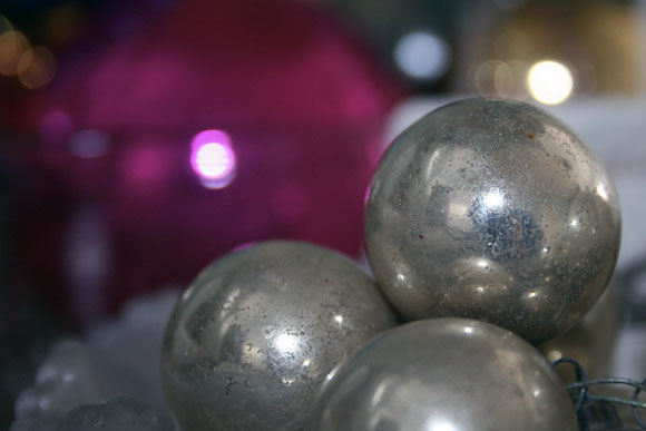
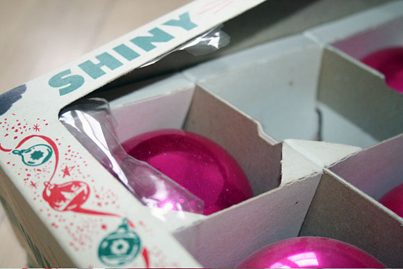
VINTAGE GLASS ORNAMENTS. You can never have enough. Well, I suppose you can, but we break at least a half a dozen a year so we keep a ‘cushion.’ I place them in bowls and vases and on mantels & trees. My kids love to view their reflection in them (like mini gazing balls) and my husband loves to shout ‘don’t drop!’ when they are doing so. Alas, they don’t always listen so the broom is always close at hand.
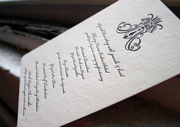
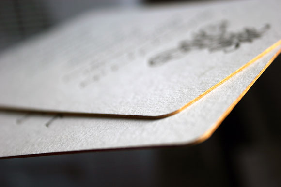
We love this vintage-modern letterpress menu from our Nevis wedding invitation suite. Gold edge painting and a true black letterpress ink. Sent to us by Real Card Company in Seattle, Washington. Enjoy!
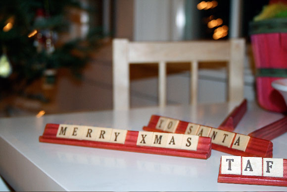
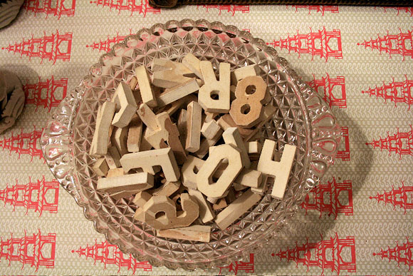
VINTAGE ANAGRAMS: I can’t get enough of letters. And words. And small messages. So I keep wooden letters on hand. And people find them irresistable. They can’t not create with them. (Try it.) Even my kids keep busy — writing EEXHD and TAF and GRAHAM IS GREAT.
This letterpress favor tag, a customized piece from the Kurai letterpress wedding invitation suite, is a great idea instead of the traditional candied almonds or other material gift. You make a donation to your favorite charity, then leave a sweet little keepsake card at each guest’s place informing them of the donation. Very sweet and very green too. 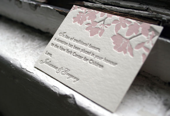
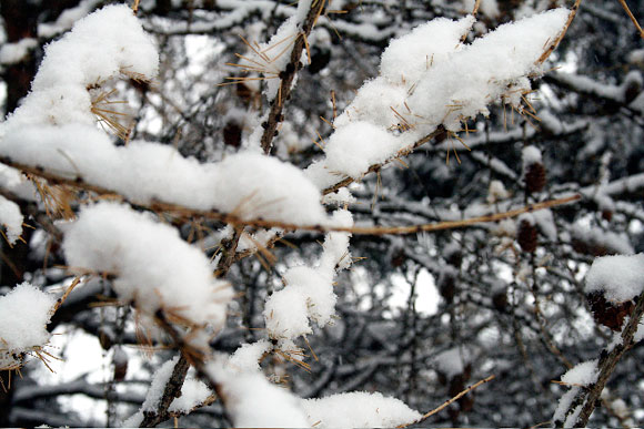
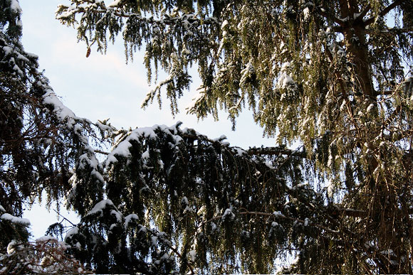
OUR YARD IN WINTER. My memories are filled with trees. As a child I spent a lot of time daydreaming, looking skyward through branches and leaves and blooms. In the winter, I favored making snow angels to snow men (less work, more reverie). Another chance for recumbent repose. As I point my camera north I recall just how it felt: cheeks chapped, arms and legs akimbo, mind filled. I can even taste the falling flakes.
We love the sophisticated play of patterning going on in this letterpress wedding invitation for a cool December wedding. This was a custom design based on several of Smock’s wedding patterns. The folio interior is the Rowe pattern in taupe, and the folio exterior is the Virielles pattern in sea mist (with our custom folios, you can choose any of our inks and any of our patterns for the interior and exterior). The invitation is letterpressed in taupe and sea mist, two hard-core classic and elegant inks. Sent to us by our friends at Real Card Company. 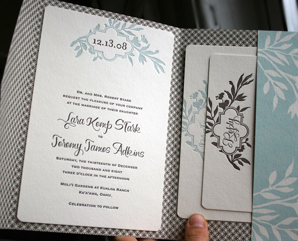
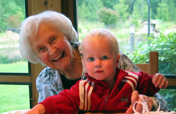
MY NANA. Who is 99. And lovely. And fading. And a huge inspiration (for her artistic nature, her attention to detail, her love of beauty). Here she is when she was a touch younger. Just a touch. This is how I will always remember her.
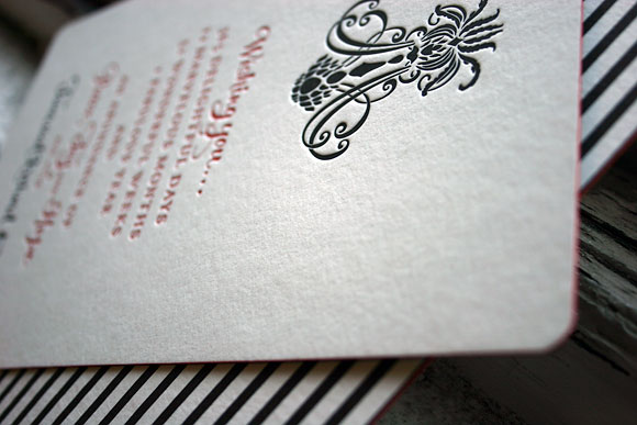
We’re still feeling the (letterpress) holiday spirit here at Smock…thanks in part to all the great custom holiday cards we’ve had on our presses lately. This was an elegant, cool & fun holiday design that we printed recently, based on our Nevis wedding invitation . What a creative customization….red and black letterpress inks, red edge painting (wow! it really stands out against the black), the seneca stripes pattern in black for a backing, and the sottern envelope liner in black. The mix of patterns & the accents of red create such a good energy. This custom holiday card came to us from Events in Houston.

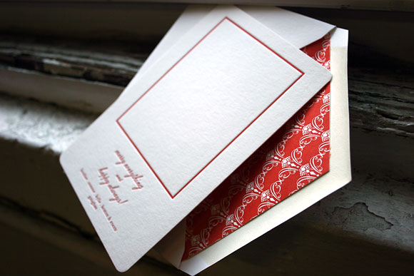
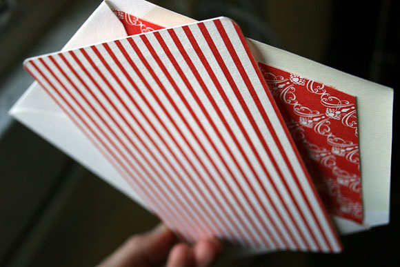
We’re getting in the holiday spirit over here at Smock, thanks to snow, 4 degree mornings, and….some great custom holiday cards that are leaving our shop! Check this one out — the envelope liner (geneva pattern) + backing (seneca pattern), both in red, just made us swoon. What a cool combination. This card came to us by our friends at Cotton Idea Studio in Laguna Beach, California.
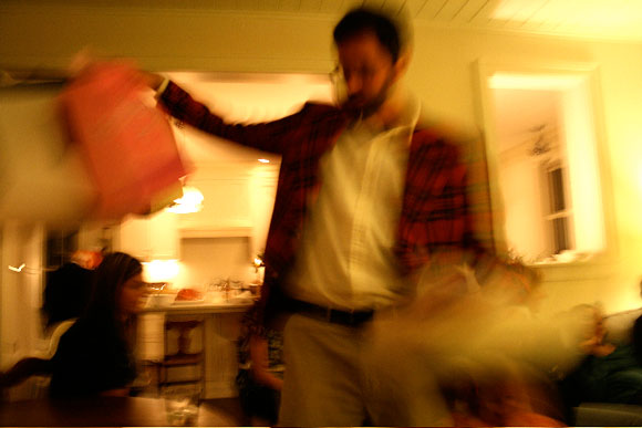
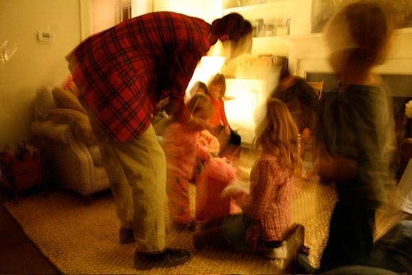
This jacket. For so many reasons. First, it heralds in the holidays (which, at our house, begins with november birthdays). Second, it reminds me of childhood parties filled with a mob of parents and cheek kisses and tom collins and clinking glasses. Oh, and the special privilege of staying up way (way) past my bedtime. And lastly (and perhaps most importantly) is the fact that my husband looks quite dashing in plaid.