Mollie and William customized our Palmes design for their June wedding by pairing dove and silver inks with our elegant tawny matte foil. Their wedding invitations featured all three colors on the front and our Everett pattern in dove ink on the back. An Oxford patterned envelope liner in silver ink added a nice contrast to the soft color palette, and the patterns from the invitation were also shown on the reply cards and website cards to tie everything together.

letterpress inks: dove + silver | foil: tawny matte | fonts: smock ruby + cranbrook | paper: 2-ply white | size: S-8 + S-5 + S-3| envelope liners: oxford pattern in silver ink | rounded corners | customization #: 21458 | Judy Paulen Designs
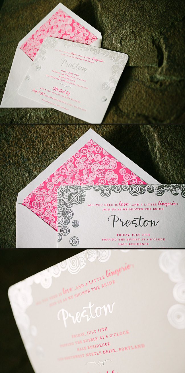
We worked with Uptowne Papers to create these tasteful lingerie bridal shower invitations for Preston. Our Halifax design was customized with our bubbly Bodin border and elegant rounded corners. A fun, feminine color palette of neon pink paired with silver matte foil made for an eye-catching invitation, while bold hot pink envelope liners added the perfect finishing touch.

letterpress ink: neon pink | foil: silver matte | fonts: smock harrison + wallis | paper: 1-ply white | size: S-8 | envelope liners: granby pattern in hot pink ink | rounded corners | customization #: 23505 | Uptowne Papers
This youthful take on our Tatra invitation combines a playful color palette of ocean, lime, and sea mist inks. We’re loving the pattern play between the design elements on these letterpress Bat Mitzvah invitations and the Rainier patterned envelope liners!

letterpress inks: lime + ocean | font: kipling | paper: 2-ply white | sizes: S-8 + S-6 + S-5 | envelope liners: Rainier pattern in ocean, sea mist and lime | customization #:22528 | PS Paper
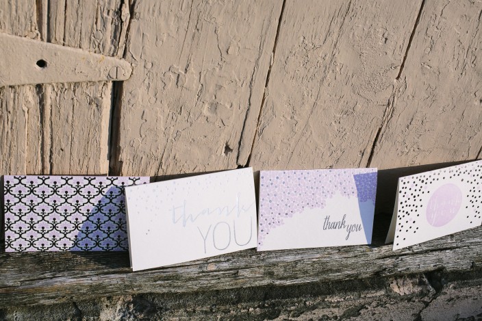
Today we’re sharing a few of our favorite wedding thank you notes – a must-have for anyone tying the knot! Wedding thank you notes can be simple and sweet, or you can choose a style with colors and design elements that reflect your style and personality as a couple. Here are a few styles that we love – but be sure to browse all of our thank you notes to find the one that’s right for you!

Metallics are more popular than ever right now and for good reason: design elements in silver and gold complement just about every color under the sun! Get the metallic look with our Script 2, Thank You Script, Classic Heart and Thank You Shine cards.

Gold foil with black letterpress ink makes for a statement-making card. From the top: Thank You Laurel 2, Brighton 2, Thank You Star, Script 2 and Gold Anchor.

Classic gold or rose gold paired with taupe has a softer, more romantic look – from the left: Chevron Thank You 2, Marav, Tatra 2, Merci, Cameo, Sparkling Thank You.

If you’re infusing blue into your big day, check out our Guild, Chevron, Brighton, Cambridge, Papaya, or Script thank you notes!
You can even work with us to create custom thank you notes to match your wedding invitations and save the dates (find a Smock dealer near you!). Be sure to take a look at some of our favorite bridal shower thank you notes, too!
There are lots of exciting events that go hand-in-hand with weddings: engagement parties, bridal showers, rehearsal dinners, welcome parties, and farewell brunches. While many couples will purchase wedding thank you notes to give thanks for gifts as a couple, we think it’s extra special for a bride to have some of her own stationery when it comes to writing bridal shower thank you notes. We rounded up a few of our favorites below — we love these for bridal shower thank you notes, but many of these cards can pull double-duty and work well as wedding thank you notes, too!

Rose gold is both feminine and romantic – and looks gorgeous next to our taupe letterpress ink. Get the look with our Leaves, Cameo, Classic Heart and Sparkling thank you notes.

Our new Papaya suite features pale blue letterpress ink with a pretty coral colored ink for a fresh, fun look. From the left: Papaya, Terrace 2 and Rainier notes.

Is yellow your color? We love seeing yellow inks paired with gold foil, but you can’t go wrong with gold foil by itself, either. From the left: Yellow Rose, Cambridge 2, Gold, and Thank You Script cards.

If purple and silver are more your style, check out our Grayling, Thank You Shine, Mineral Flowers and Platinum Thank You cards.

Can’t get enough of the color pink? Our Aztec and Kersey Note cards are ideal if you love pastel pink, or check out our Thank You Heart, Thank You Laurel, or Pink Heart cards if hot pink is your color.
Be sure to shop all of our note cards and thank you cards to find the styles that are perfect for you! All of our folded thank you cards and notes are available as singles, six packs, and thirty packs — and our thirty packs come in a small keepsake box! Visit our shop now >>
We worked with The Social Page to create these sleek custom wedding invitations for Amanda and Christopher’s country club celebration. The couple customized our Chablais invitation with silver matte foil and black ink, and used our Stella calligraphy font to emphasize key text throughout the suite. A custom map was included on the directions card to help guests find their way, and a chevron patterned envelope liner added a chic finishing touch!

letterpress ink: black | foil: silver matte | fonts: smock plaza + harper | paper: 1-ply white | sizes: S-8sq folio + S-6sq + S-5sq | folio exterior: pearl pattern in blind deboss | folio interior: unprinted | envelope liners: van pattern in black ink | customization #:18384 | Social Page
We worked with Michael and Jessica from JCG Events to create these darling letterpress baby shower invitations for their shower! The invitation features Ruby — one of our exclusive calligraphy fonts — in taupe letterpress ink, and was edge painted in neon pink ink. The return address was also printed in neon pink ink, and the couple had the envelopes addressed in neon pink ink to match. They even purchased vintage postage to match the look of the shower (including an Audrey Hepburn stamp – for baby Audrey!). For the celebration, Jessica and Michael hosted a beautiful, Italian-inspired event at Villa Woodbine in Miami, complete with vibrant centerpieces, a DIY headband station and a gelato cart. Head over to Style Me Pretty to see more photos and details from this beautiful baby shower! 
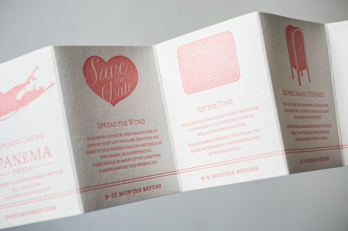
Our Smock Dealers are always dreaming up amazing things for us to print! We usually see lots of wedding invitations, save the dates, and social stationery, but from time to time we’ll get a unique project like this one from Ipanema Press in Cold Spring Harbor, New York. Adrienne shared the inspiration for these cute accordion style stationery timeline cards – a helpful piece that she bundles up with baker’s twine (like a little present!) for her brides and grooms.

We love to offer our brides gorgeous custom designs and also keep them organized and on track! When planing a wedding there are so many projects to juggle. This pocket sized stationery timeline is a great reminder for when items should be ordered and when to mail them out. My clients love to know what projects are next on the list and are always so thrilled when every task is completed in time!
We specialize in custom illustration, so we definitely wanted to include samples of that on this special piece. We love to experiment with different colors and thought this neon peachy pink was especially gorgeous. With letterpress you are able to print these amazingly vivid shades that you just can’t achieve digitally, so we wanted to take advantage of that!


letterpress ink: (custom) pantone 912 | fonts: submitted | paper: 1-ply white | sizes: 15 x 4 custom accordion fold (3 x 4 when folded) | customization #24115 | Ipanema Press
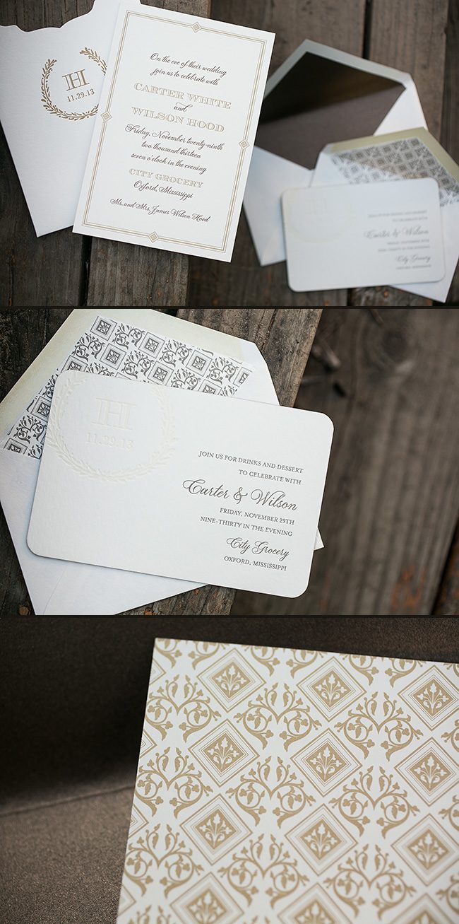
We worked with Elizabeth at Fresh Ink to create these custom letterpress rehearsal dinner invitations. Printed in gold and mocha letterpress inks, the invitations featured our plaza calligraphy font and a custom patterned backing. The invitations tucked neatly into a Juliette style sleeve, which included a gold letterpress printed monogram and our Balsam Wreath cartouche. A separate invitation for evening cocktails was also created to coordinate with the set, and the custom pattern that was printed on the back of the rehearsal dinner invitations was repeated for the envelope liners. All of the pieces combined to make an incredibly elegant invitation set!

letterpress inks: gold + mocha + taupe + coconut blind deboss | offset back patterning: croft pattern in gold ink | fonts: smock plaza + carrington stripes + worthington | paper: 2-ply ivory | sizes: S-8 for sleeve + S-6 | corner rounding | envelope liners: metallic antique liner + custom pattern in taupe ink | sleeve: customization #:20377 | Fresh Ink
We worked with Buchanan Ink to create this preppy take on our Emory invitation, which features our Smock Spencerian calligraphy font and gold matte foil stamping. Navy stripes in our Sherbrooke pattern help transform this deco design into a more traditional invitation — perfect for a Southern plantation wedding.

letterpress ink: navy | foil: gold matte | fonts: smock spencerian + cooper | paper: 1-ply white | sizes: s-8 + s-5 | customization #: 21629 | Buchanan Ink

