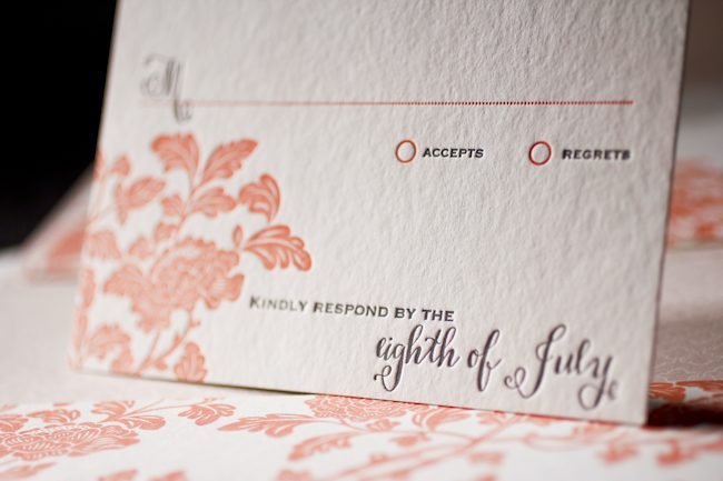
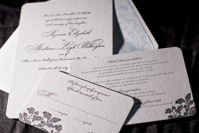
We’ve really fallen for these elegant Rhon letterpress invitations submitted to us by our friends at Village Invites in New York City. The cascading vines provide the perfect balance of romance and sophistication to this suite. Tossing in a metallic platinum envelope liner adds a touch of shimmer and makes this set even more stylish.
inks: black + dove | fonts: lazlo + etienne | paper: 2-ply white | printing: letterpress | liner: metallic platinum| size: S8SQ

Letterpress wedding invitations and greeting cards from Smock have been spotted in some amazing places lately, and today we’re excited to share the features that Smock has been a part of this fall! For their Fall 2012 issue, Inside Weddings magazine included a custom wedding invitation set from Smock that featured a letterpress sleeve and combined two of our most popular designs: our floral Rhon design paired with elements from our more modern Dawson design.

Brides magazine featured one of our new, foil stamped wedding invitation designs and matching invitation sleeve — our whimsical Tatra customization — as part of their November issue.

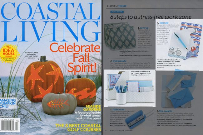
Coastal Living included several of our products in their October 2012 issue as part of their “8 Steps to a Stress-Free Work Zone” feature. Our Bicyclette and Chatham scratchpads ($7 each) and our Breakers notebook ($9 each) are perfect reasons to take a break from technology to write down notes the old-fashioned way.

Stationery Trends magazine featured one of our new holiday cards as part of their Fall 2012 issue — our Joyeux Noel card (which features letterpress and gold foil stamping) was included in a piece all about gold.

And of course, we can’t forget about the amazing bloggers who have been featuring Smock online these days — Oh So Beautiful Paper, Discover Paper, Going Home to Roost, Young House Love, Bustle Blog, and Creative Wish — we appreciate your recognition!
These letterpressed save the dates were submitted to us by our good friend, Aileen at Aileen Invitations in Miami Beach, Florida. Our Rhon design looks truly sensational printed in our lavender and pewter inks. There are certainly times when a softer color palette works best and this is definitely one of those times! We print save the dates for all sorts of occasions and these save the dates happen to be for an engagement celebration. We can’t help but feel that the lavender ink represents gracefulness and charm while the pewter ink helps keep this set looking refined. Purple hues have always been connected to royalty which makes these save the dates all the more classic. The couple chose our payette pattern in lavender for both the offset back patterning and envelope liner – which ties this whole set together nicely.
inks: lavender + pewter| fonts: etienne + auden | paper: 2-ply white | printing: letterpress | corner rounding |back patterning: payette in lavender |liner: the payette pattern in lavender | size: S6

Sneak a peek at this beyond beautiful letterpress Rhon invitation suite submitted to us by our friend Casie at Francis~Orr Corona del Mar in Corona del Mar, California. The color combination of verbena and taupe transforms the look of this set into something almost vintage! And everyone knows yellow represents sunshine and joy! We can’t help but feel this yellow hue helps radiant happiness about the couple’s big day. Our rhon pattern in verbena on the pocketfold’s exterior adds the most elegant touch to this sensational suite! We always enjoy working with Francis~Orr because they submit some of the most creative invitation sets!
inks: verbena + taupe | fonts: smock spencerian + stockton | paper: 2-ply white | printing: letterpress | corner rounding | folio exterior: rhon pattern in verbena | folio interior: payette pattern in taupe | liner: the payette pattern in verbena | invite size: 5.125 x 7.75


One of our greatest reviewed Rhon designs, brought to us by Margaret at Scriptura. Having struggled to find just the right color combination, Margaret eventually struck gold…or should we say, “struck papaya?”

The papaya ink worked very well with the offset shell and lettepressed pewter. The addition of the program fan was a great way to tie everything together — the full set looks amazing.

inks: pewter + papaya | fonts: graham + smock bescal | paper: 2- ply white | liner: caspian in shell| folio exterior -rhon in papaya, interior – caspian in shell | printing: letterpress + offset
This design won an honorable mention in our Smock design competition for the first half of 2011. This twice-a-year competition recognizes outstanding and inspired designs submitted by our beloved dealers.

Merging the design elements of Haddington and Rhon, Alyssa from Judy Paulen Designs shows just how to balance a letterpress wedding invitation set.

Particularly stunning was the pale blue of our Lake ink used as an envelope liner which complimented the Pewter of the design and text, making an elegant wedding invitation.

inks: pewter + lake | fonts: bickham swash + bickham script | paper: 2-ply white | invite size: S-8 | liner: ganval in lake | printing: letterpress | edge painting: lake
This design won an honorable mention in our Smock design competition for the first half of 2011. This twice-a-year competition recognizes outstanding and inspired designs submitted by our beloved dealers.
We’re fairly partial to pretty letterpress save the dates around here and this customization of our Rhon design that we printed a while back is no exception. It’s printed in clover and black inks for a fresh, summer-inspired look. Many thanks to our fabulous friends at Union Street Papery in San Francisco for bringing us this awesome save the date!

These bright and elegant letterpress bat mitzvah invitations were printed for our good friends at Aileen Invitations in Miami. Featuring our Rhon design, they were printed in espresso and tangerine inks with envelopes lined in our payette pattern in tangerine. Pretty calligraphy accents and Hebrew text are the perfect finishing touch.


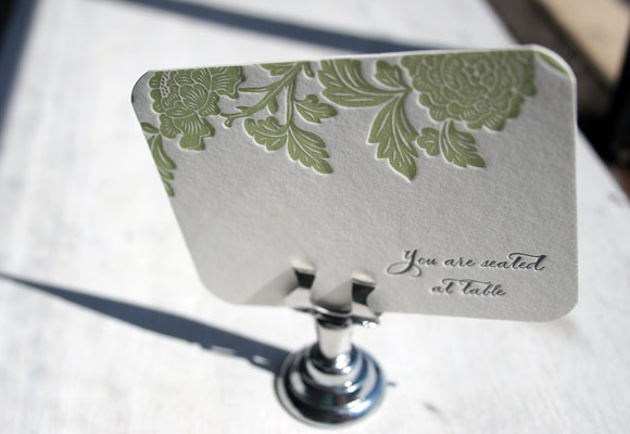
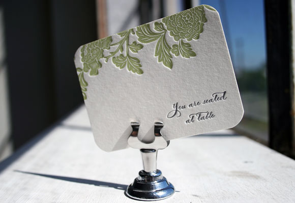
We printed these charming little letterpress escort cards for Write For You in Washington, DC. They’re a customization of our Rhon letterpress invitation design, printed in spring and pewter inks featuring our Smock Spencerian calligraphy font and corner rounding.


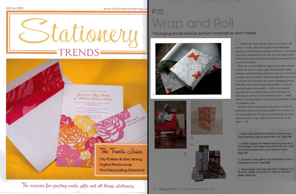
Here at Smock, we absolutely love Stationery Trends a fabulous trade magazine dedicated to all things stationery and paper. This year we were thrilled to be featured in Stationery Trends several times, including a piece about our double-sided 100% post consumer recycled gift wrap in our Calliope design in the winter issue…

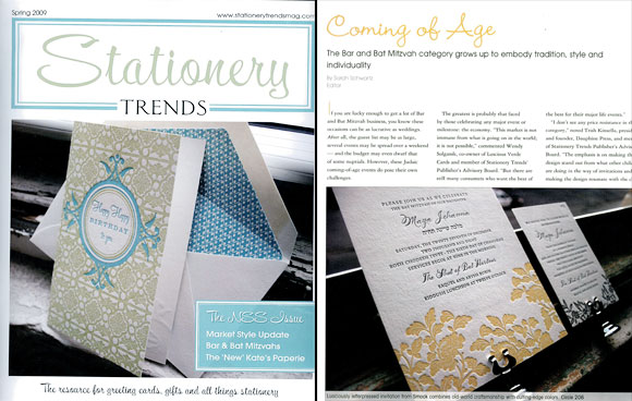
In May, with the National Stationery Show fast approaching and just in time for Smock’s first birthday, we were completely excited to see one of our letterpress birthday cards, our Happy Happy Birthday to You card, on the cover of the spring 2009 issue of Stationery Trends! Coincidentally, the magazine was also celebrating their first birthday and wanted to showcase a great birthday card on the cover. We’re sincerely honored that they chose one of ours! Inside that same issue, they also showcased a beautiful customization of one of our letterpress wedding invitation designs, Rhon, which we printed as a letterpress bat mitzvah invitation.

Thank you so much to the folks at Stationery Trends for a great publication and for continually supporting Smock!


