Baby announcements are just plain fun! We love the adorable little dragon artwork that was submitted by Union Street Papery. He looks like he’s excited about the new arrival too, as he playfully bounds over the granby pattern. The use of the same pattern for the liner was a great addition when chosen to be printed in reverse.
inks: wisteria + sage | font: worthington | paper: 2-ply ivory | printing: letterpress | offset liner: granby in wisteria | card size: S5-SQ | customization #: 16022 |

If this is the measure of what we can expect from Peak Xperience, we can’t wait to see what letterpress wedding invitations they send next! This was the first order from our new store in Malaysia, and we couldn’t be more impressed. The custom map as well as an embellished monogram make this invitation set simply beautiful.
inks: orchid + pewter + wisteria | fonts: cranbrook + smock plaza | paper: 2-ply ivory | printing: letterpress + offset | custom offset map | offset liner: reversed halifax in wisteria | invite size: S8 | customization #: 15526 |

You just might say we have a soft side for pastel ink colors letterpressed on our thick 2-ply bamboo paper-and you would be right. Take a look at these elegant Engadine invitations submitted to us by our good friends at Salutations in Chapel Hill, North Carolina. Softer hues have a way of looking peaceful and calm, without being over the top. The highlight is of course the gorgeous folio offset printed on the interior and exterior in the coolest colors to keep things modern. There is a real warmth seen throughout this suite and we adore it!
ink: sea mist + wisteria | fonts: smock harrison + graham | paper: 2-ply ivory | printing: letterpress | corner rounding | folio exterior: virelles pattern in wisteria | folio interior: pippen pattern in moss | invite size: 5.125 x 7.75

Brought to us by Kate’s Paperie, these gorgeous letterpress wedding invitations and matching letterpress save the dates were printed in wisteria and silver inks. They feature a pretty patterned backing in our champlain pattern in wisteria and showcases our Graham motif from our Social Occasions album. The envelopes were lined in champlain printed in reverse, wisteria on white. This client took advantage of our free save the date promotion, good now through December 31, 2009.


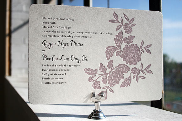
Finally, the moment you’ve been waiting for breathlessly for weeks – it’s time to wrap up our first ever Smock Design Contest by sharing our first place winner! This absolutely stunning customization, brought to us by our friends at Real Card Company in Seattle, was the clear favorite, taking our ever-popular Rhon letterpress wedding invitation design and completely reinventing it into something extraordinarily special. We loved it before we even printed it and seeing is believing – the end result is truly beautiful! It was a real favorite of Smock’s Creative Director, Amy Graham Stigler. From the soft romantic colors, pewter and wisteria, to the asymmetrical layout featuring a unique variation of the Rhon floral motif and horizontal orientation, Amy loved how this design was truly personalized to make a one of a kind creation.


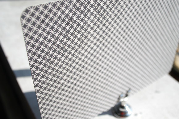
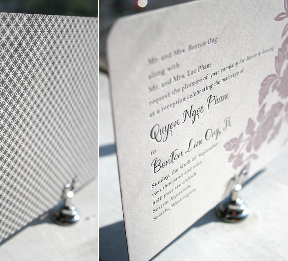
Letterpress printed in soft wisteria and pewter inks, this invitation also features chic patterned backing in our rowe pattern in pewter.


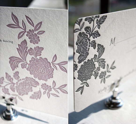
While the letterpress invitation itself was printed in 2-color letterpress, the reply card was letterpress printed in 1-color in pewter ink. We love the play between colors and patterns in this incredible set – it’s both elegant and formal, but still fun and just a touch modern. A huge thank you to Real Card Company for collaborating with us on this incredible customization and congratulations on winning the first Smock Design Contest!
For more fabulous customizations of Smock’s letterpress wedding invitations, check out the rest of the honorees in our Smock Design Contest for incredible inspiration!
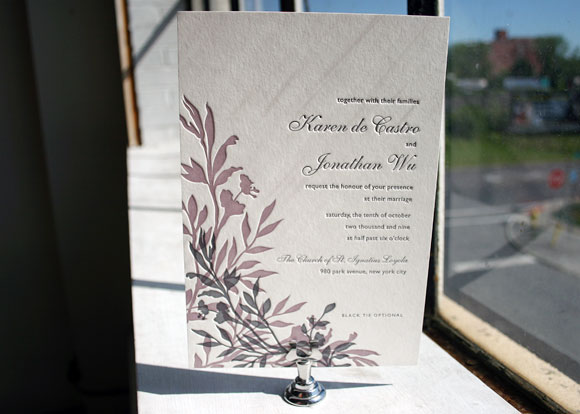
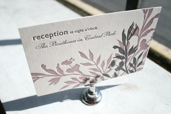
The first of two honorable mentions in our Smock Design Contest brought to us by Judy Paulen Designs at Bloomingdale’s in New York, we’re completely in love with this chic customization of our Engadine letterpress wedding invitation design. It’s printed in elegant wisteria and pewter inks and features our playful Etienne and Shaw fonts for a finished design that is the perfect blend of traditional elegance and modern sophistication. The set also includes a really lovely letterpress reception card that makes the most of a play between the script Etienne font and the clean look of the sans serif Shaw font. It’s minimal and simple, but still fresh and completely chic.


Thanks so much to our friends at Judy Paulen for sending us this beautiful customization!
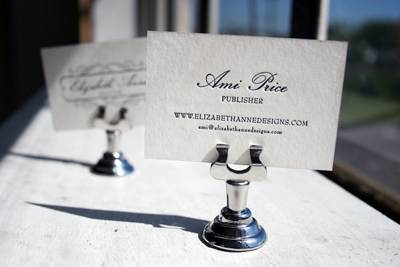
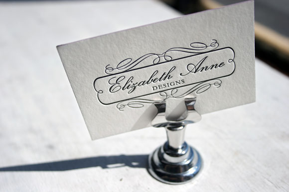
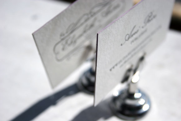
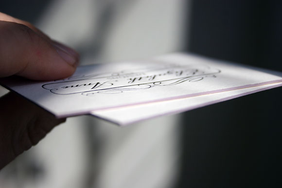
It may go without saying, but around here we are absolutely in love with letterpress business cards – they have become one of our favorite things to print! Letterpress business cards make a lasting first impression, so we’re always excited to design and print them. These particular cards are among our favorites of those we’ve recently printed. Completely custom, featuring the logo of one of our favorite wedding and lifestyle blogs, Elizabeth Anne Designs, these were printed for publisher Ami Price. They are on beautiful 2-ply bamboo paper in 1-color letterpress in classic black ink, paired with edge painting in our wisteria ink that adds just a touch of whimsy. These cards pay homage to classic calling cards, while still being a bit unexpected and fresh. Ami chose a slightly scaled down size that makes them truly unique and one of a kind. We love them!
