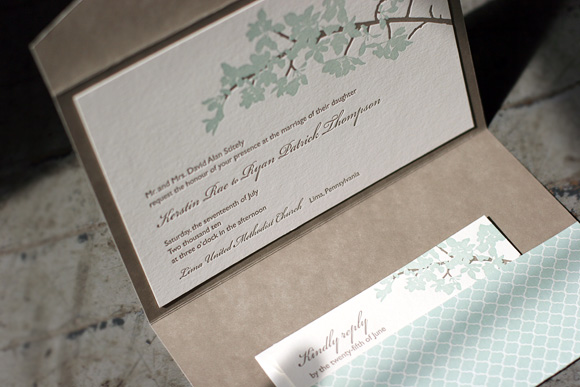
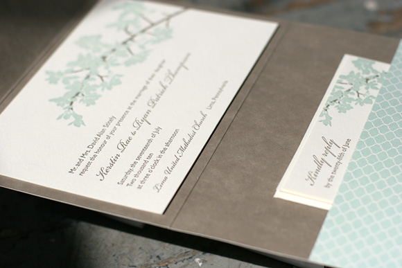
At long last it’s time to share the winner of our latest Smock Design Contest! This stunning customization of our Kurai letterpress wedding invitation suite came to us from Salutations in Charlotte, North Carolina. The design is printed in sea mist and taupe inks, enclosed in a custom folio featuring our sinclair pattern in taupe on the interior with our signature champlain pattern in sea mist on the exterior. Our special guest judge, Kristen Magee of Paper Crave, shares, “This invitation is ultra elegant, and I love that it’s feminine without being too feminine. The soft florals and script font are delicate, romantic and balance wonderfully with the more straightforward sans serif font and pattern on the pocket fold. The understated color choices are also nicely balanced, making this a design that would appeal to both women and men.”
We can’t thank our friends at Saluations enough for working with us on this incredible design and a huge thank you to Kristen for taking on the difficult task of judging the contest. Stay tuned for our next batch of design contest winners in early 2011!


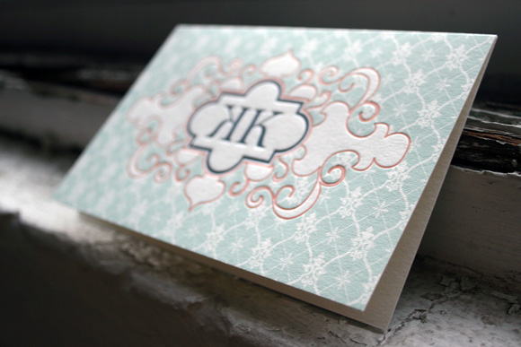
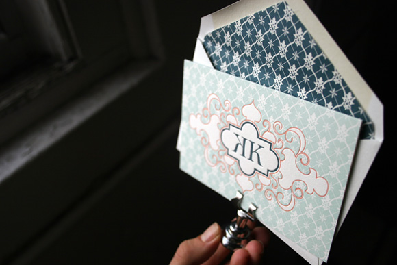
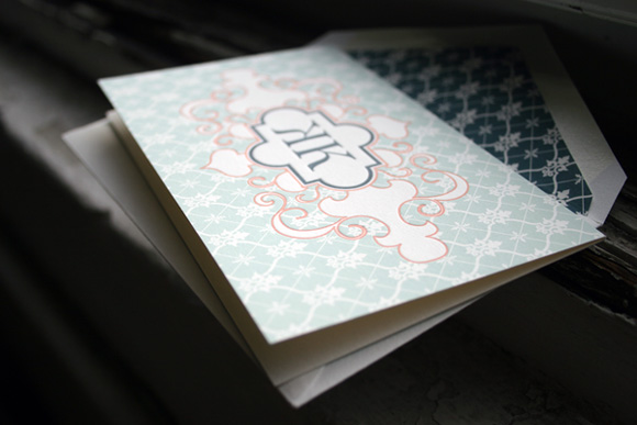
As we near the end of our Smock Design Contest honorees, it’s time to share our 1st runner up – a beautiful custom letterpress social note brought to us by Francis-Orr in Corona del Mar, California. This design is truly unique, printed in seamist, papaya and midnight inks in a vibrant combination of color and pattern. The background of the card is our willoughby pattern in seamist and the patterned envelope liner also features our willoughby pattern in midnight. Guest judge Nole Garey of one of our favorite bogs, Oh So Beautiful Paper, loved this design and says, “A gorgeous mix of pattern and color! The papaya ink around the monogram creates a beautiful contrast against the pale patterned background. I’m also just as smitten with the juxtaposition between the flourish design details and strong serif type of the monogram. Gorgeous!”


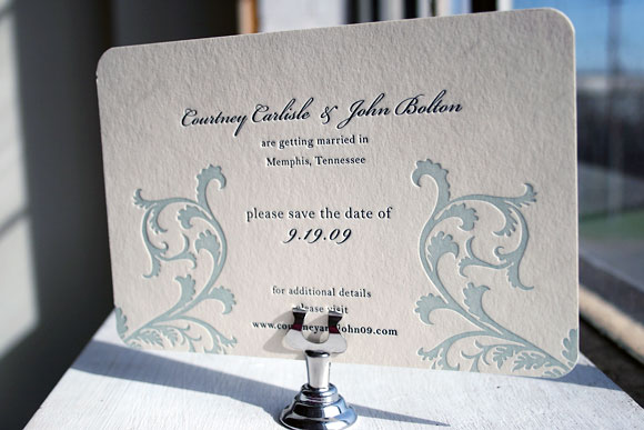
It’s a bit ironic that we have sun and summer on the brain today given the blinding snow currently falling over Central New York, but our dreams of sunshine can’t be deterred – we can’t wait for spring to get here! This time of year we start to get a lot of inquiries about invitation designs particularly well-suited to waterfront, beach or destination weddings so we thought we’d dig up some of our favorites from last year to share with you. There’s nothing like the promise of warm summer breezes to get you inspired, snow or no snow.


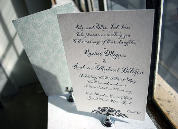
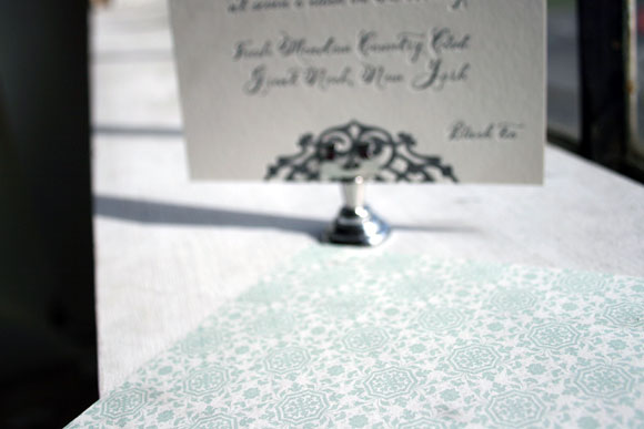
This first invitation is our Lashar design printed in pewter ink using our Smock Spencerian calligraphy font. The back of the letterpress invitation features gorgeous patterned backing printed in sea mist in our lesina pattern.

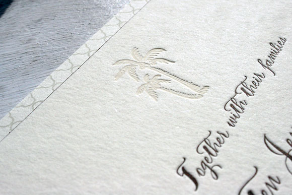
This invitation was a beautiful custom version of our Haddington design, printed in espresso ink and blind deboss. The palm tree motif was a custom addition to the design, making it perfect for an elegant destination wedding.

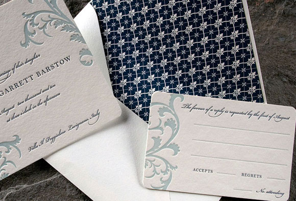
Brought to us by our friends at Peabody Papers in Columbus, Ohio, this version of our popular Vettore design was printed in midnight and seamist inks. The flourishes from the Vettore design were modified in such a way that they remind us of water and waves without being literal.


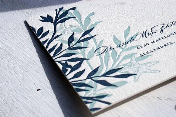
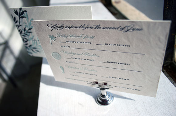
This custom version of our Engadine design was printed for the folks at Luxe Expressions in Atlanta. It’s a letterpress reply postcard printed in midnight and seamist that features pretty ocean-themed motifs. The card also includes space for guests to reply to multiple weekend events, which is a great option when designing your stationery for a destination wedding.
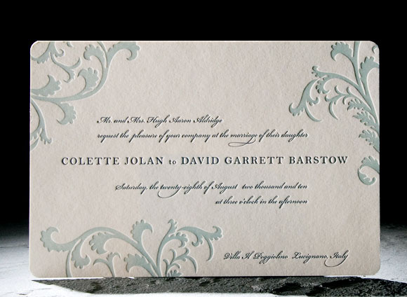
Vettore has long been one of our favorite letterpress wedding invitation designs and judging by its popularity, Smock customers agree! And as lovely as it is, it’s easy to see why so many people love Vettore!


The original Vettore design is printed in sea mist and midnight inks for a look that is romantic and a little bit vintage. The excitement of seeing how couples make the design their own never fades and we love some of the latest adaptations so much so that we just had to share them with you. How gorgeous are these?

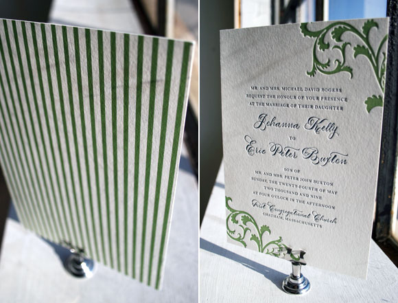
Vettore printed in clover and midnight with a vertical orientation and pattern backing in our seneca pattern, brought to us by the folks at Peabody Papers in Columbus, Ohio. We love how this puts a fresh and modern spin on the design, especially with the extra special touch that comes from using our Smock Spencerian calligraphy font.


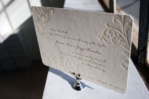
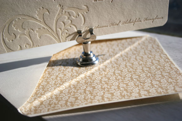
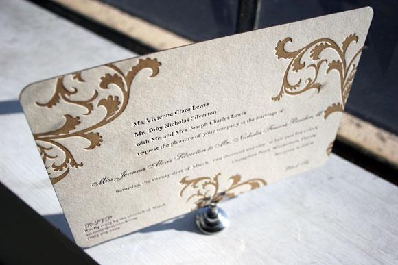
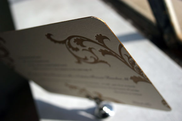
This incredible customization uses gold ink paired with blind deboss and it’s utterly sophisticated matched with the lined envelope in our clairveaux pattern printed in gold ink. A big thank you to Paper Chase in Margate, New Jersey for this classy take on Vettore!


We absolutely love edge painting and this lovely customization from Pearl Beach Paperie in Orlando, Florida is a perfect example of why. We love the eggplant and gold inks paired with the gold edge painting as it is so incredibly chic and luxurious.
Seeing what our awesome Smock stores dream up with their clients is thrilling for us and truly inspiring. We love seeing how creative and playful they can be with ink colors, embellishments and patterns and we can’t wait to share more great Smock customizations!
